
There is a lot to cover on Wednesdays. We should know, as collectively, we read an insane amount of comics. Even with a large review staff, it’s hard to get to everything. With that in mind, we’re back with Wrapping Wednesday, where we look at some of the books we missed in what was another great week of comics.
Let’s get this party started.

Archie #3
Written by Mark Waid
Illustrated by Fiona Staples
Review by Ken Godberson III
It is so weird to actually like Archie. Seriously, 90% of why I loved “Afterlife with Archie” was because seeing these archaic characters be tortured for perpetuating that wholesome 50s Americana image that never existed. Now, because Mark Waid and Fiona Staples are sorcerers, they have won me over. And they do it by modernizing without being trite about it but still maintaining the spirit.
This issue introduces Veronica Lodge in full and Waid manages to maintain that snobby rich girl attitude but make her completely human in the best/worst way ever: being the new kid at a public high school is not great. Especially when you go from some rich preppy school to a public school. And her first day manages to show her haughtiness but also a very human side to her. Her interactions with Betty are the highlight of the issue.
And yes: It’s so sad that Fiona Staples is leaving after this issue. Yes, I know, she’s got to go off and make the pretty pictures with Brian K. Vaughn and we’ve got some great artists on deck, I get that. But she set such a tone for this series. Character design, body language, facial expressions (of highlight here are the looks between Jughead and Veronica) are just so wonderfully done it’s downright criminal. Plus, she drew Archie’s thoughts as cartoons instead of text boxes and, being that Mark Waid is the writer, I had insane Impulse flashbacks. Being that Impulse is my favorite superhero in the genre: that’s a massive plus.
Final Verdict: 8.3- Mark Waid firmly establishes the central quartet of the book and Fiona Staples finishes out her run in style.
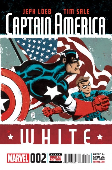
“Captain America: White” #2
Written by Jeph Loeb
Illustrated by Tim Sale
Reviewed by Stephenson Ardern-Sodje
From the legendary pairing that brought you “Daredevil: Yellow”, “Spider-man: Blue”, “Hulk: Grey”, comes the second issue of a heavily nostalgic comic book that feels… confused in more ways than one.
Carrying on exactly where the previous issue left off, Cap, Bucky, and the Howlin’ Commandos are left for dead at sea after Germans shoot their plane down over enemy territory. Obviously our daring heroes survive the fall and, after a brief semi-submerged stumble, they make it to land…
…And that’s pretty much it as far as storyline goes. Loeb’s pacing for this series feels as glacial as a Cap-sicle (sorry, I couldn’t resist) and given that the end-goal of this series is pretty much set in stone I had hoped he’d be using it as a vehicle for a different take on the classic Cap story rather than such a by-the-numbers retelling.
Sale is doing a solid enough job of recreating the classic “Commando Comics”-style artwork for this series with Fury and his men but, oddly enough, it’s his rendering of Cap that lets this book down visually. In comparison to the more physically realistic members of the team Cap’s cartoonishly huge body and stoic, impossibly square chin simply reinforce the criticisms that people level towards characters like Cap and Superman: they may be perfect but they can also be perfectly boring.
If I’m honest, there isn’t much more that can be said about the content of this issue that James didn’t cover far more comprehensively, humorously, and very accurately, in this review last month. However, it amazes me that, given both the comic and cinematic universes are agreed that Bucky’s retconning into adulthood was for the best, Marvel have decided that now is the best time to relieve the questionable relationship between their All-American Hero and a nubile, impressionable orphan boy. Cap’s internal monologue reads like a love letter to ‘the one that got away’, including gems like ‘we have to find hope in the most unexpected of places’ (close up on a nervous-faced Bucky) and ‘we get attached to these things when it’s the people that we lost that we should stay attached to’ (while cradling the boy wonder in his Herculean arms), while Bucky’s hysteria at the possible loss of Steve early on in the issue comes across less like the worry of a comrade in arms and more like the passion of an eromenos.
Continued belowThis book feels like it’s being pulled in two very distinct and separate directions. It’s as though Marvel were looking for both a throwback to a more ‘innocent’ era and a flagrant attempt to stoke the fires of Stucky shippers (as long as they don’t think about the fact that the only thing bigger than Steve’s biceps in this series is the painfully obvious age gap between these two star-crossed lovers). Add to all that the fact that any empathy we might have felt for Steve at the death of his ‘best friend’ is undermined by the very obvious existence of The Winter Soldier, and “Captain America: White” starts to read less like the work of two comic-book powerhouses channelling the spirit of the golden era of comics and more like some rather unsubtle and meandering fan-fic.
Final Verdict: 2.0 With so much new and exciting stuff going on in the Marvel universe right now I can’t think of a good reason why you’d pick this up instead.

Grayson Annual #2
Written by Tim Seeley & Tom King
Illustrated by Alvaro Martinez & Raul Fernandez and Jeromy Cox
Reviewed by Matthew Garcia
Despite his best efforts, Tim Seeley — as always, working off a plot by himself and Tom King — cannot seem to inject “Grayson” Annual #2 with any life. Though there are some fights, some big monsters, and some attempts at throwing an emotional connection between Dick and Clark Kent (something about being “Just a guy”), nothing in the story really takes off. It doesn’t even feel like the creative team were altogether much invested in the outcome of the book.
After recruiting his former teammates to help him take on Spyral, Dick Grayson is ready to come in from the cold. He’s interrupted, however, by the recently depowered Superman (don’t worry, Seeley fills you in on everything that’s happened to the Man of Steel more than a couple times so you’re not lost), who mistakes Dick’s graceful dive for a suicide leap. And then the Fist of Cain attacks.
The plotting’s rote, with nothing to it that feels fresh or exciting. It comes off rather like Seeley had a list of storybeats he needed to hit, and he punched out the whole thing quickly so he could move on to something he’s more interested in. The book barely establishes a rhythm, taking on a more “And then this happened . . . and then this happened . . .” approach rather than letting any of the narrative elements flow together. The art by Alvaro Martinez and Raul Fernandez isn’t bad (remember, this is the company that regularly publishes David Finch, so their standards aren’t exactly high to begin with), but just boring and forgettable in this book. The action lacked tension and kineticism, the pacing felt rushed yet droll. Even the attempts at emotional moments felt abrupt and phoned in.
As a series, “Grayson” has the capacity to be exciting, sexy, fun, and intriguing, and it’s often one of the more interesting titles DC’s releasing. Yet, with none of those elements coming together for the “Grayson” Annual #2, this book never exactly does anything. It’s not terrible, it’s just boring.
Final Verdict: 5.0 – a forgettable endeavour from a team capable of so much better.
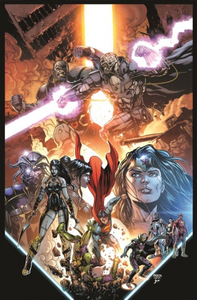
Justice League #44
Written by Geoff Johns
Illustrated by Jason Fabok
Reviewed by Keith Dooley
The Darkseid War continues to be waged with shocks and excitement aplenty in “Justice League” #44. In this fourth part of Geoff Johns’ epic story, the combination of the world of the New Gods and the Justice League retains its momentum toward the stratosphere. Johns’ interpretation of Gods new and old will have people who recognize these characters cheering or gasping (or both). New readers will be just as mind-boggled as well. Johns has a deep love for the League and Kirby’s creations and it shows in his reverence of as well as updating of lore. We’re only into the fourth part and it already seems like a lot of crucial and world-changing events have already happened. This issue, like the previous ones in this storyline, is both epic in nature and very personal. We worry about these characters and delve into their minds as if we’re with them on this harrowing journey. And what could be more exciting than seeing Darkseid and the Anti-Monitor clash? Maybe that shocking last page?
Continued belowJohns’ partner and assuredly co-storyteller is the immensely talented Jason Fabok. His art becomes more nuanced and bombastic with each issue. He brings this large cast to glorious life and is responsible for expressing the emotion and depth of each one of them, whether they’re hero or villain. The terror in Wonder Woman’s eyes and face in this issue is palpable. If the Goddess of War can be this terrified, then we know events have escalated to unimaginable heights. And Fabok depicts those events, whether they’re literally ground-shattering or personal to an individual character, with a sense of urgency and awe.
Brad Anderson colors Fabok’s art with an electricity and fire that is called for in this type of story. The abundance of orange and yellow emit the heat and claustrophobia of war. Anderson doesn’t use dazzlingly bright colors for the heroes or villains, yet his muted stylings still bring an air of both reality and the extravagant. This is, of course, a superhero book. But it is one where even the coloring contributes to us caring about the fate of our heroes.
“Justice League” #44 is brilliant storytelling that juggles a lot of characters and story beats. Yet the creators do it with finesse and pizzazz and never allow this epic to get bogged down in exposition or unneeded dialogue. Every moment counts and it’s a thrill ride that makes it one of DC’s best titles.
Final Verdict: 9.0 – This current arc of “Justice League” continues to be the best one so far that Geoff Johns has written during his four-year tenure.

Stray Bullets: Sunshine and Roses #8
Written by David Lapham
Illustrated by David Lapham
Reviewed by Matt Allegretti
Buckle up and get ready for a wild ride! David Lapham’s masterful character-driven crime epic continues with “Stray Bullets: Sunshine and Roses” #8, a disturbing issue that focuses on the ruthless killer, Kretchmeyer and his involvement in Beth’s plan to steal Harry’s money. Kretch is a fascinating character, always frightening, and impossible to read; there is a sense on every panel that he could snap. The opening sequence on the paddle boat sets the story in motion, as Beth discusses her plan to steal Harry’s money but leaves out the fact she plans to flee Baltimore afterwards with Nina. Sensing that Beth might not be telling the truth, Kretch decides to take matters into his own hands–blood and mayhem ensue.
Like many of the issues, the story is told in a non-linear style, alternating between a conversation between an unidentified person on September 1st and a series of events that happened in the month leading up to the conversation. Although slightly confusing, this structure is effective in setting up the moment of Kretch’s betrayal and the frightening reveal on the final pages of the unknown individual’s identity (a scene sure to get under your skin.)
Lapham’s art style is both cartoonish and realistic, a balance that works perfectly for the pulp crime story he’s telling. In this issue like most of the series, he uses an 8-panel grid that is especially effective in the silent scene with Kretch after he finds out he’s been betrayed. In just eight panels, Lapham effectively shows Kretch’s unsettling transformation into a killer. He conveys the anger and psychological pain boiling under the surface by the way he draws Kretch, sitting in his car, expressionless, on the verge of a nervous breakdown. It’s great cartooning. The scene that follows is horrific and unexpected in the best possible way.
Final Verdict: 8.8 — Endlessly intriguing, “Stray Bullets” continues to be the title I most look forward to reading every month. Lapham’s flawed characters are fully realized and It’s easy to immerse yourself in the cruel world he creates. “Stray Bullets” is a blood-soaked masterpiece.
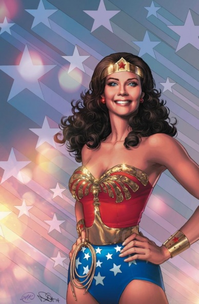
Wonder Woman ’77 Special #2
Written by Marc Andreyko
Illustrated by Cat Staggs, Richard Ortiz, Jason Badower, and Drew Johnson
Reviewed by Brian Salvatore
“Wonder Woman ’77” was DC’s rather intelligent gamble on continuing the success they had with “Batman ’66.” As a television property, Batman has aged far better than Wonder Woman, in part because it is so campy and stylized. For as iconic as Lynda Carter is in that role, there is very little else about the show that resonates in today’s pop culture. Batman had the Dutch angles, the bright colors, a dozen easily identifiable villains – Wonder Woman has her spin move. So, instantly, the prospect of making a comic adaptation is more difficult for Andreyko and co. than it was for Jeff Parker and the wonderful rotating cast of “Batman ’66” artists.
Continued belowAnd it is the artists here that sink “Wonder Woman ’77.” Almost nothing about the look of the comic reflects the late 70s. All of these artists are talented folks, but their look is so rooted in 2015 that it is hard to even know that you’re looking at a comic set nearly 40 years ago. Sure, all the artists can draw Carter’s face/costume well, but the surroundings don’t reflect anything about the show or the time period. Part of what makes “Batman ’66” work is that every person is dressed in the most 1966 way possible, and everything is reminding you that this is a story set in the past. Almost nothing about this book reinforces the setting, aside from the occasional bow-tie or pendant on a male character, or a slightly vintage looking top on a female. Even the villains aren’t done on a 70’s TV budget – Solomon Grundy looks CGI’d, instead of painted grey like Lou Ferrigno.
Because the show’s tone isn’t very memorable to folks who didn’t grow up watching it (nor has it been reran in the way that Batman has), the book’s lack of visual connection means that the stories themselves don’t necessarily feel of the time, either. These are decent Wonder Woman stories, but they don’t feel like anything other than lesser versions of what we’ve been seeing in the “Sensation Comics” digital first series. For this series to work, it really needs an identity that matches the tone and look of the 70s show, and this book doesn’t come close.
Final Verdict: 5.4 – A disappointing swing and a miss.


