
On last week’s Robots From Tomorrow episode, we took a look at the long line of anthology titles Dark Horse has put out over their thirty-year history. While there have been a lot more releases than you (or I) probably remember, the one book that first comes to mind for this topic is “Dark Horse Presents”. “DHP”, besides being the publisher’s launch title, can truly be looked at as a barometer of where Dark Horse is as a company on any given month. Hitting stands back in June of 1986, the first volume of “DHP” ran 157 issues, carrying it all the way up to 2001. That’s a lot of comics no matter how you look at it, and given that “DHP” is a genre-mixing anthology, the different flavors at play over those years are too diverse to do justice in a non-visual medium like podcasting. So today we’re going to take a look at some of the comic’s high points and standout covers, and hopefully get a better sense of just how a small, B&W indie anthology comic turned into the best-known anthology title in the American comics market.
The One That Started It All
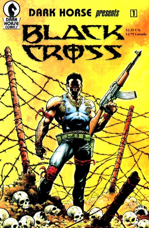
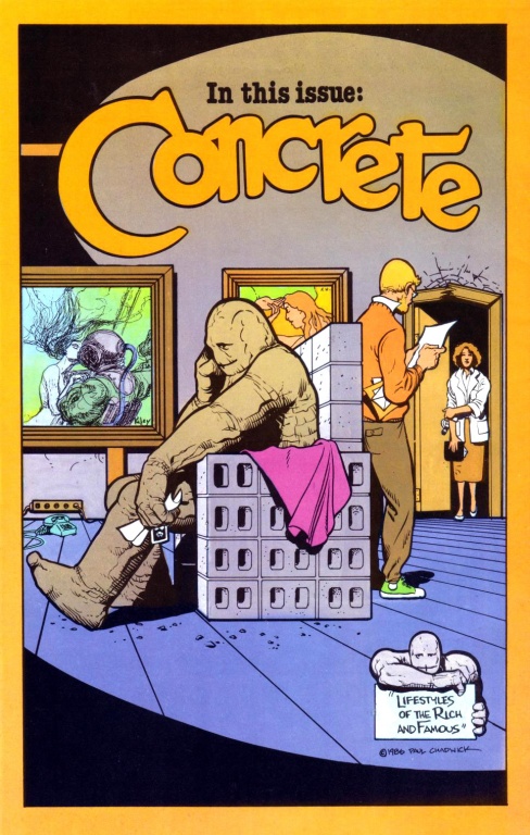
So why are there TWO covers? Because the Black Cross image is the front cover, while the Concrete image is the back. And I find this dichotomy really interesting when you consider the type of company Dark Horse became. “Black Cross”, exactly the type of tough-guy action material you couldn’t throw a rock without hitting in the mid-80s Reagan America, would get the average fan of the day to pick this book up. But in Paul Chadwick’s “Concrete” you hit something completely and tonally different before you even finished the comic; a Kirby-visual protagonist dropped into the middle of a Lawrence Kasdan-esque world. Both creators had just come off stints at Marvel and were looking to prove something, and with “DHP” #1, they did.
And They’re Off!


The success of “Concrete” gave “DHP” an instant credibility; selling 30,000 copies in their first week will do that. But anthologies live and die on the strength of the whole, not just one particular strip. These next few covers showcase some of the book’s early lineups, which included both properties from outside creators:
- Michael T. Gilbert’s Mr. Monster
- Bob Burden’s Flaming Carrot
- Eddie Campbell’s
- Geof Darrow’s Bourbon Thret
As well as “DHP” originals like:
- Trekker
- The American
- Delia & Celia
- Bob The Alien
- Zone
- Homicide
- Masque (precursor to The Mask)
“DHP” occasionally played around with Big Two homage covers, like issues #20 and 32 to “Superman Annual” #1 and “Flash Annual” #1, respectively. They would go to continue this trend throughout the run. But what we also see here is the start of “DHP”‘s (and every comics anthology, really) trying to balance the need for showcasing the issue’s content versus a powerful single cover image. Keep an eye on how many covers have multiple images versus the single image.
Grudge Match


Can’t talk about Dark Horse without bringing up these two, can we?
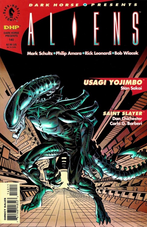
Issue #24 came out concurrently with the first “Aliens” miniseries, which was another early hit for Dark Horse. Issues #34 and 35 each had another short story with the Aliens and the Predators, respectively, leading into issue #36, which ran a prologue story for the first “Aliens vs Predator” miniseries. Interestingly enough, “DHP” #36 is the first place the term “Aliens vs Predator” ever appeared.
Continued belowMiller Time!


By the time the title’s fifth anniversary rolls around, everything was coming up Miller. The Fifth Anniversary Special ran the first installment of ‘Sin City’ (later ret-titled ‘The Hard Goodbye’ like Star Wars was called ‘A New Hope’) with the regular title putting out the other 11. Miller would commandeer at least 7 of the covers during that run, and make appearances on the rest. He also holds the distinction as being the only creator to have an entire issue of “DHP” all to himself; issue #62 is just the last installment of ‘Sin City’ running 22 pages.
The rest of that year saw the debut of John Byrne’s Next Men and the transition of John Arcudi’s ‘Homicide’ from police procedural to the more focused story of one Axel Karnhaus, aka The Creep. Both would spin off into their own titles eventually.
Hitting Their Stride


From year six on, we really see “DHP” hitting its stride, mixing up creative styles and having a little something for everyone in each issue. Is there another comic you can think of that would have an issue with Eddie Campbell, Moebius…and Jim Balent? Granted, we’re talking pre-“Tarot” and “Catwoman” Balent, but still; that was a lineup that raised an eyebrow, to be sure.
The book experienced its first editorial shift in issue #88, going from Randy Stradley to Bob Shreck, who would soon bring on Jamie S. Rich as assistant editor, only to hand the book off to Rich completely at issue #125, with Stradley returning with #135. But that’s getting a little ahead of ourselves…
Issue #88 is also significant for being not only the first time Hellboy appeared in “DHP”, but also the first Hellboy story Mignola both drew AND wrote! His earlier appearances were scripted by fellow ‘Legend’ creator John Byrne, but for ‘The Wolves of St. August’, Mignola went solo. That story also snagged the main cover slot for all four consecutive issues, although didn’t get the solo issue treatment given to ‘Sin City’.
You Don’t Look A Day Over 99…

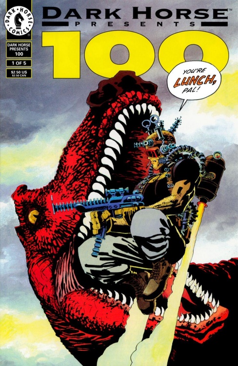


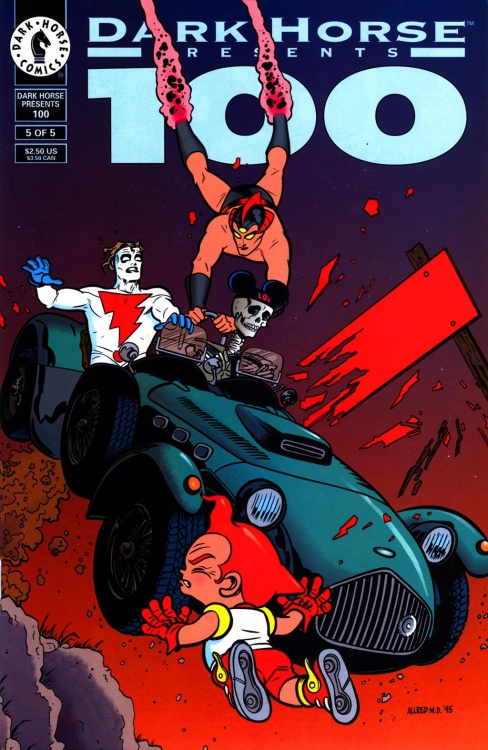
“DHP” getting to issue 100 was an event so huge it took a 6-issue miniseries to commemorate! Those aren’t variant covers, BTW; each issue had completely different interiors as well, focussing on a different genre: Heroes, Action, Horror, Science Fiction, Slice-of-Life, and Toon. So between the five Dark Horse issues and the one ‘zero’ issue from the late, lamented “Heroes Illustrated” fanzine, the title’s centennial celebration brought you 168 all-new pages of comics in a single month!
The Home Stretch


Coming out of the Issue 100 celebration, Shreck & Rich kept things going at a pretty good clip. In hindsight, looking back at these issues you can kinda see the type of eye for material that would serve the two well when they left Dark Horse for Oni Press in 1997: pre-DC Ed Brubaker, Paul Pope, Roger Langridge… A brand of alt cartooning that was a little too mainstream for Fantagraphics but too indie for the Big Two.
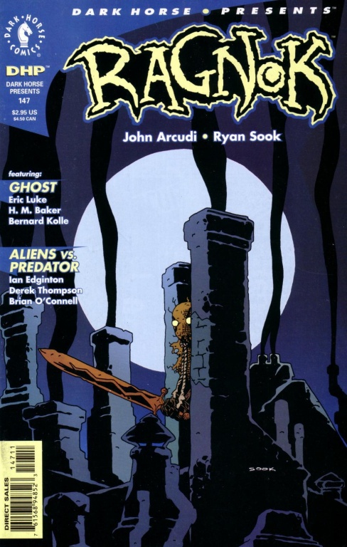
Stradley’s return didn’t mean a complete reversal from that type of material, but by this point in the 1990’s, there had to be an allowance for more recognizable licensed properties to bring in readers. So instead of one out of four strips being an ‘Aliens’ one, you’d wind up with “DHP” being a flip book with a “Buffy” strip on one side and a creator-owned strip on the other. Case in point, issue #147: one ‘AvP’ strip, one ‘Ghost’ strip (from Dark Horse’s “Comics Greatest World” superhero line), and an Arcudi creator-owned shot that felt to me like a “Rumble” trial run.
We also see the very late-90’s move away from the flat logo graphics to a more rendered, CG version that at first blush looks more interesting but very quickly becomes a lot more limited and less versatile than its simpler counterpart. Another instance of just because you CAN do something doesn’t mean you necessarily SHOULD.
And then, the end. Issue #157 brought the first volume to a close, but in a weird bit of synchronicity, gave comics another perennial favorite a la “Concrete” (although NOTHING like “Concrete in content”) in Eric Powell’s “The Goon”.
“DHP” would make a return to the Web in a pairing with MySpace in 2007, before returning to local comic shops in 80-page print issues in 2011 and then again in slimmer 48-page issues in 2014. These subsequent volumes would bring full-color interior artwork with them, something the first volume never included.
Winner’s Circle
Anthologies are, almost by definition, a mixed bag, so I can’t definitively say that every issue of “DHP” is a winner, but given the amount of talent the book contained over its first 14-year run, I’d be willing to bet cash money that you could find something that interested you if you grabbed a random issue or two from the back issue bins.
Sadly, given the sheer number of rights in play for most of these issues, that’s where you’ll have to look for these comics. There were three “Best of DHP” trades put out during the title’s initial run, but they are also now out of print (although worth tracking down). Some of the shorter strips (like ‘Race of Scorpions’ or ‘Zone’) were collected in one-shot single issues that might be easier to track down than their “DHP” counterparts. Some of the larger strips (a la ‘Concrete’ or ‘Aliens’) have their installments collected in their respective later omnibus collections.
But however you happen to run across this material, do yourself a favor and give it a read. If it was good enough to launch a comics company, it should be good enough to make it to your “Buy” pile!


