

Welcome to The Harrow County Observer, Multiversity Comics’ dedicated “Harrow County” column. This installment we’re looking at Cullen Bunn and Tyler Crook’s processes from the the earliest breakdown to the finished pages. And as always, T.T. Wosker looks into the dark shadows and finds something looking back… You can read all about her discoveries below the interview segment.

This latest arc, “Family Tree,” greatly expands the cast and mythology of “Harrow County”. Here we meet Emmy’s biological family, a group of god-like people. Cullen, could you talk us through the process of breaking this idea?
Cullen Bunn: I’m not sure when the idea came to me exactly, but it struck like a lightning bolt and I called Tyler right away to see what he thought. I loved the idea of introducing what is essentially a pantheon of gods into the world of “Harrow County,” but I knew that they wouldn’t work unless we got them ‘just right.’ A big part of that was on Tyler’s shoulders in the design stage, so if he had shot the idea down, we wouldn’t be telling stories about those characters.
Tyler Crook: I remember my wife and I were running errands when Cullen called me up with the idea for the family. I was kinda onboard from the word go, which is interesting because I typically dislike stories about gods or godlike characters, but the way Cullen pitched it to me just felt right. For one thing it felt really appropriate with way that Emmy was born out of a tree. For another thing these characters seemed flawed and ignorant in interesting ways.
Cullen, “Harrow County” is a serialized story—the “Family Tree” arc is a story in four parts (and even this arc is a piece of a larger whole)—and yet each issue functions with self-contained elements. Like in issue #14, you open Emmy’s adoptive mother and close with her too, yet she doesn’t show up in #13, #15, or #16. Even as issue #14 progresses the rest of the story, it’s also got a special focus on Emmy’s mother.
Cullen: My hope with every script is that even if it is part of a longer story, it can stand on its own with a beginning, middle, and end. Even when there are elements that continue to the next issue, I want the reader to feel like they got the whole story. It doesn’t always work out that way, but I’m always trying. In the case of Emmy’s mother, she has been sort of a mystery since the series began, and I was saving any revelations about her until just the right moment. This felt right to me, because we were dealing with issues of family. It also felt right to move past the story of Emmy’s mother fairly quickly, as now we’re delving into this ‘new’ family of hers.
So Tyler, what do you do when you first get a script?
Tyler: The first thing I do when I get a script is put off reading it. Haha. Usually Cullen is a couple issues ahead of me. So when the script comes in I’m neck deep in an earlier issue. So it usually takes me a couple days to find the time to sit down with the script and give it a good read. Then I put it aside and get back to the issue that’s on my desk.
A few weeks or months later I’ll pick it up and reread it. And I start with the layout process, which is basically me going page by page and figuring out how to tell this story.
Do you find that the time away from the script after the initial read through helps with the layouts?
Tyler: Yeah. A little bit. It gets to sit there in the back of my head slowly percolating. But because I have so much other stuff on my mind I don’t get the chance to over think it.
This issue introduces many new and important characters. I thought we could talk about the design of each one. Let’s begin with Levi, a character that was designed by Carla Speed McNeil for issue #9. How involved were you with his design?
Continued below
Tyler: That design is all Carla. She sent in those two sketches and we talked it over a bit and decided that the skinny version was the one we wanted so that’s what we got. Like all designs though it didn’t really survive first contact with the page. As soon as the characters are moving around and talking they tend to change pretty quickly into a slightly better character.

I imagine Mildred was another character that was quite easy for you to design.
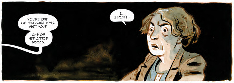
Tyler: Haha! Yeah. There was actually a little bit of back and forth about how invisible she would be. There are a few places where I felt like we needed to see her a little bit. But we never see more than a faint indication that someone or something is there. I have to admit I do enjoy drawing her.
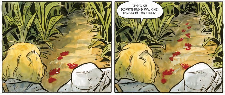
I like the impact on the mood of a scene those bloody footprints of hers have. Straight away the tension ramps up.
Tyler: That’s good to hear. The bloody footsteps appearing out of nowhere was something I worried would be hard to get across to the reader.
Cullen: We talked so much about those bloody footprints! I admit, as I scripted those pages, I struggled with how the angles would work, but I also knew Tyler would nail it.
Actually, I found they led the eye really well, especially in the last few pages of issue #13.
So let’s talk about Willa. I’ve got Cullen’s description for her here:
Willa is a thin woman, always knitting with a pair of terrible looking knitting needles. Her fingers below the first knuckle have been gnawed to the bone and they are always bleeding.
Straight away she sounds like a challenge. Especially getting those fingertips to read clearly.
Tyler: The hard part was remembering that she was supposed to have bloody fingers at all. I haven’t gone back to really look, but I’m pretty confident that I forgot to bloody up her hands in a few spots. Le sigh.

I like what Cullen gave you for Kaine’s description:
Kaine is a bearded man. Insects (and sometimes other horrors) crawl in and out of the long, tangled, filthy hair of his beard.
It’s evocative, but vague enough to give you lots of room to play with the design.

Tyler: Yeah, Cullen is really good at writing cues like that. It’s similar to how he writes his panel descriptions. There’s enough there that you know what’s important, but vague enough that there’s a ton of room to add your own ideas.
For Kaine I figured he would like kind of like a wild mountain man so I started googling ‘wild beard’ and quickly fell in love with the Indian esthetic yogi look. So that’s the basis for his look.
Cullen: My business cards read ‘Purveyor of the Evocative and the Vague!’ That’s actually a fair description. Comics are a collaboration, and if I was an artist I think I would hate to have every little detail described for me. I’d want room to play. So I try to give the artist a sense of the mood I’m trying to go with. Nine times out of ten, they amp up the mood so much!
In the case of Corbin, I feel like your design brought a lot of character that wasn’t in Cullen’s initial description.
Corbin has gone to great lengths to make himself look more like the dead. His nose is missing, leaving only a gaping hole. His lips have been cut away from his teeth.
Where’d this guy spring from in your head?
Tyler: That one started with me looking up photos of Richard Corben. I thought it would be neat to make this character an homage to one of my comic book heroes. So he kind of looks like him if he had no face. Haha. One part of making himself look like a dead person is to dress real nice like he got buried in his best suit. And I really liked that contrast between his ruined face and his nice clothes.
Continued below
That’s a good point. You don’t see a lot of the risen dead dressed in their Sunday best, and yet that’s what most of them would be wearing.
Tyler: Yeah!
This is where I’m curious about Cullen’s impact on the design. After the initial designs was there much conversation about what to accentuate or rein in?
Tyler: Not a lot. There is always a little discussion, and if I was way off I’m sure Cullen would let me know, but for the most part we seem to just like what the other person does. I feel like good collaborations for me work like good improv theater. They have that ‘yes, and’ rule where you are never supposed to negate your collaborators ideas, but rather constantly build on what you each bring to the situation. That’s kind of how this feels.
Cullen: Amazing. Tyler and I have never discussed the ‘yes, and’ rule of collaboration, but it is maybe one of my fundamental ideas of great collaborations. I was introduced to the idea years ago, while working my day job, and it was one of the greatest lessons I ever learned. Now I know why Tyler and I work so well together!
Tyler: I feel like that’s how Carla and I have dealt with Levi. She drew him in his first appearance and then I drew him in my style and he morphed a little bit. Now Carla just finished up another story arc and I can see some subtle changes that make him look a little more like how I drew him. But I also saw some stuff in how she treated the character that I’m excited to start doing.
That’s an interesting way of putting it. And, like Corbin’s suit, I like the way you add visual details that hint at further story. It makes the world feel that much bigger than it would if Corbin was, for example, wearing the tradition Grim Reaper garb.
Tyler: Oh my gosh. I never even considered drawing him like the Grim Reaper! That would have been so weird! I think the thing is I wanted these characters who are very ‘godlike’ to feel as human as possible. These characters are just normal jerks who happen to live forever and can do magic stuff. So I felt like they should dress like normal jerks. I also wanted them to feel rooted in the world and the time period. So Corbin gets a high waist pants and super fat ties and Kaine gets a tank top and blue jeans.
They also feel unique to “Harrow County.” You couldn’t drop these characters into just any old fantasy tale.
Tyler: That’s good! That what I’m hoping for. Stories like this are supposed to transport the reader to a different place and that place need to be as specific as you can make it in order for it to feel real.

Lastly, there’s Odessa. Now this is a character where you actually departed a bit from Cullen’s description.
Odessa is a plump black woman. She is always surrounded by birds and other animals.
So obviously birds and animals vanished.
Tyler: I know! I can’t remember if there was any reason I decided to omit the animals. I probably just forgot. If I did have a reason it was probably that drawing her surrounded by animals in every panel would have killed me and my drawing hand. I’m sure you’ve heard how comic artists feel about crowd scenes.
Yes, I remember vividly Brian Hurtt’s vexations with the hordes of owls in a scene in “The Sixth Gun.”
Tyler: Haha. Poor Brian.
Cullen: You guys. This is only going to make me write more panel descriptions with even MORE animals in them.
Odessa kind of took on a matronly appearance, or perhaps a boarding school head mistress. I liked the duality it gave her, in that she could play as this instructive and welcoming character, but later transform into someone that has to deliver harsh punishment…

Tyler: Yeah, I like that a lot too. I think as we learn more about the Family we are going to find that they all have some complex motivations. Some are petty and some are altruistic, but there’s a lot of contradictions within them that I think make them interesting.
Continued belowAnd unpredictable.
Tyler: Exactly! That’s part of what makes them scary! They are like adults when you are a kid: extremely powerful and wildly arbitrary!
Cullen: And they are completely not human. I see them as these otherworldly creatures trapped in an earthly form. But their motivations and desires are completely alien to us.
And of course the final character in this scene is the Meeting Lodge itself. And here I’m curious about how much overlap there is between your layout and design phases, as I imagine they sort of feed off each other.
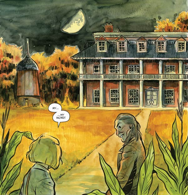
Tyler: It can be kind of a chicken and the egg problem; how do I layout the scene without knowing what the building looks like, but how do I design the building before I know how it relates to the story? Typically I’ll opt for doing the layouts first because I want to make sure that the design first and foremost works in service to the story.
For the Lodge I really only needed something impressive and magical looking. I think the script described it as looking like a southern plantation and that was it. So I referenced a bunch of plantation buildings. I found one in particular that had a weird looking silo thing right next to it, so I swiped that idea. Then I decided to make it red because it felt like it undermined the dignified air that most plantations tried to cultivate. It made it look a little evil and a little bawdy. And then to make things easy on myself, I decided that it was a magical building so the inside didn’t need to make sense in comparison to the outside, hence that super long hallway with no doors.
You certainly primed readers for that kind of flexible reality prior to Emmy’s entrance into the Lodge thanks to the way the scene is night ahead of her and daylight behind her.
The scratched-out paintings and photographs in that hall was one of my favorite details from this arc. Again, I can’t help but wonder who did it. And this is where I felt like the narration and images were doing too different jobs: the image says ‘this is creepy’ whereas the the narration says ‘this is familiar, you belong here.’

Tyler: Rad! That’s one of the best things that comics does: it can tell you two totally different things at the same time. It’s going to be fun if we ever work out how those faces got scratched out. It’s pretty clearly established that the Lodge appears of its own accord when it’s needed. Maybe it is also in charge of scratching out the faces when it needs to.
Oh, see my mind never even went there. It’s somehow even creepier if it’s the house that’s doing it.
So let’s talk about your pencils to inks to color. This is something I’m in awe of, and I love watching each new process video you post on YouTube. For the double-page spread over pages 17 and 18 in issue #14, I expect you must’ve been thinking about how to give that scene depth early only. You’ve created planes of depth, where the foreground characters are inked, and further back into the image the inks slip away and it’s all pencils and watercolor.

Tyler: It’s kind of a subtle thing I guess but when we are in the Lodge the environment is all pencil while the characters are inked. That was me sort of trying to make the place feel less tangible than the characters, maybe more magical.
That double page spread in particular took some time to develop a composition that worked. It’s one of those drawings that has to do a lot of stuff. It needs to clearly introduce all the characters, it needs to indicate relationships, and it needs to look kinda cool. And to top it off you have to deal with the physical gutter of the book running down the center of the image. The only thing I regret about that spread is that Willa has her back to us in that big panel. It would have been good to see her face, but I wanted it to look like these characters were all talking to each other just before Levi and Emmy came into the room and it would have been weird if they were all facing the same wall like in a studio sitcom. Haha.
Continued belowConsidering Mildred is there too, I like to think she’s front and center, and would be blocking everything except that she’s totally invisible.
Lately, when a new comic comes in to review, I’ve taken to opening the PDF and looking at the pages laid out as thumbnails. I find it makes me more attentive to what the color is doing in the story. There’s this thing with color where you can look at a panel or a page and get a little sense of it, but comics are about movement, and to really see that, you need to step back and see the journey that the colors take. And when I do step back, I love seeing the planning that’s gone into it. Like this. Here’s “Family Tree.”

The thing is, you don’t do your coloring on a computer. You have to commit to a choice every time you put the brush to the page. So how do you plan out the direction of your colors?
Tyler: It varies. One of the main drivers of color in “Harrow County” is the time of day. There’s not a lot of electric light so nights are dark and days are bright. I do have one good trick that was inspired by a thing I saw Matt Wagner doing. It’s a neat way of outlining a comic book.
I’ll take a sheet like this and I’ll write out notes about how many pages each scene is and outline the goals of each scene along with the emotional impact I want to see in the scene. It’s helpful because I can see the whole issue at the same time and I can get a feel for how the reader needs to be led from point A to point B. The colors sort of start to choose themselves at that point.
Issue #13 must’ve been a real challenge because it’s all set in a cornfield, so you don’t have much room to change colors, and yet there’s a moment—a happier, less spooky moment—when Emmy and Bernice bump into each other.

In that moment, the composition of the frames changes so that the corn is almost framed in the edges of the panels. Once you add the color, it fills the scene with this blue and yellow sky… which perfectly matches the blue and yellow worn by Emmy and Bernice. The scene becomes an island of blue and gold in the middle of an issue full of green.
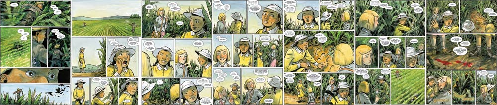
Tyler: Woah! I hadn’t noticed, but you are totally right. That issue is basically one scene so what I was trying to get at was a feeling of moving from outside the corn to being completely immersed with corn leaves creeping in on you from all sides so that when they finally reach a clearing at the end of the issue you think it might be a relief but … you know, this is “Harrow County.”
On the topic of composition, I have to mention this page from later in issue #13, when Bernice mentions she’s afraid of Emmy.

I love the visual gulf you created between them. In that second panel, Emmy looks small and alone with this vast emptiness above her. Virtually all the yellow (even the yellow in the sky, which had been there in the previous scene we discussed), Bernice’s color, vanishes in that panel.
And of course, in the third panel that growing distance is portrayed very literally.
Tyler: Yay! I’m glad you brought up this page. I’m really proud of those first three panels. It’s all about the relationship between Emmy and Bernice. In the first panel I was trying to show how Bernice felt about Emmy using their relative sizes in the panel. Bernice thinks Emmy’s power is big and scary. So we see Emmy is huge compared to Bernice in that panel. But then we see how Emmy feels about herself. She’s kind of small and alone down there at the bottom of the panel. And then finally in the third panel we see the reality of it: they are both young witches coming into their power but in spite of their friendship they are doing it alone. Then after that stuff starts happening and we need to focus on the mystery of what’s in the corn. And we get to see the two of them come together. It’s one of those rare times when I try very intentionally to show this stuff and it’s subtle enough to not feel forced, but not so subtle that the reader isn’t aware of it … at least I hope.
Continued belowI felt it the first time around, but I became conscious of it on the reread while preparing for this interview. I like the way you can put these ideas in a person’s head in a way that feels like it’s coming from an emotional place. We live the scene with the characters a little more instead of merely observing them.
Tyler: That’s my favorite thing about storytelling is finding that emotional core and coaxing it out in a compelling way. I like stories to be about people. Even if the story centers around extraordinary events, I want the reader to come away with an emotional experience. I want them to empathize with the characters.
I also have to mention this page from issue #15.

It’s essentially an extended scene of exposition, and very serious, and yet there’s those fantastic signs in there. Who’s idea was that?
Cullen: Those signs were in Wilson County NC for a while. My dad used to tell me about them all the time, and he even drove me past where they used to be. The signs were pretty much gone. Just one wooden sign remained, the words faded so that you could no longer see them. There are still places around the country where you’ll see signs like that. Just a couple of days ago, I was driving to St. Louis and passed a series of them. They weren’t nearly as much fun, though, because they had a political message on them.
Tyler: I was vaguely aware of these kinds of signs before this. There are a lot of places in America where you can get on a long lonely stretch of highway and signs like these start popping up. Usually it’s advertisements for a restaurant or something. I’ve never seen one as weird as this “Harrow County” one though.
I’m amused by a page simultaneously having two very different tones without feeling divided from itself.
Cullen: That’s what I like about it the most. To some degree, though, I think those signs are kind of creepy, too. I mean, they are talking about a woman who murdered her husband… and I always got the notion that the kids themselves were writing this story of ‘mama and papa.’ Anyway, it was always funny to me, but in an uncomfortable way.
Let’s talk about the final stages now. Cullen, as Tyler’s pages come in, do you find yourself revising the script?
Cullen: Very rarely do I revise the script after Tyler’s pages are done. Typically, Tyler letters his thumbnails, so I know how everything is going to look before the final art arrives. Even then, the scripts for “Harrow County” are pretty set by the time Tyler gets to them.
Tyler, you do all your own lettering. In fact, you even do the lettering on the “Tales of Harrow County” backups. Can you tell us how you developed the “Harrow County” letter style? I’m particularly a fan of the lumpy speech balloons.
Tyler: I feel like lettering gets the short end of the stick in most modern comics. Back in the day lettering was the first or second step in making a comic. Now it’s the very last thing and you can tell. A lot of lettering doesn’t feel like it belongs on the page, it looks like an afterthought.


So I do the lettering over my layouts and then print out my layouts with the lettering to pencil over. That way I can see the lettering as I pencil and I know exactly how much space is needed. I take kind of an old school approach. I want it to look kind of hand drawn in spite of the fact that I’m lettering in Adobe Illustrator. I think the biggest influence in my lettering is Jeff Smith’s “Bone.” I definitely have my own style but I try to get a similar expressiveness out of my balloons and lettering.

That’s really cool. I had no idea you did that, but now that you say it, it makes perfect sense, and it shows in how the elements sit nicely together in the panel. I love “Bone’s” speech balloons too. Again, they’re nice and lumpy.
Continued belowOf course, you also do hand-lettered sound effects. This is something I think works really well for the series, because digital sound effects always seem to pop off the rest of the comic to me, especially in a watercolor comic like “Harrow County.” Of course, sometimes you want the sound to pop off, but other times you want it sit in there almost invisibly, and this is where sound effects hand-lettered onto the page really come to life.

Tyler: Thanks! Yeah, I’m a big fan of making the sound effects part of the art. It just looks a million times better than digital lettering. When I letter Carla and Jenn’s pages, still do the sound effects by hand (using a stylus and Photoshop) rather than using a font.
I just read issue #17 last night and I noticed your sound effects at work there. I had to marvel at how naturally they fit into the scene.
Tyler: Thanks!
Of course, there’s a whole other side of the process: editorial. Daniel Chabon, would you can to enlighten our readers about the work you do on “Harrow County”?
Daniel Chabon: Tyler and I joked a bit about this recently as I feel like my editorial notes on Harrow have become lighter and lighter over time.
In the early stages of this project my notes were much more extensive. I wanted to make sure we launched “Harrow County” effectively. I knew it was great, but because something is great does not mean it will sell well in this market unfortunately. The first issue and the first cover are what’s going to lock in our reading audience so it needed to be 100%. It needed to have enough story and be compelling enough to make readers want to come back a whole month later for the next issue where it competes with a wave of new #1s.
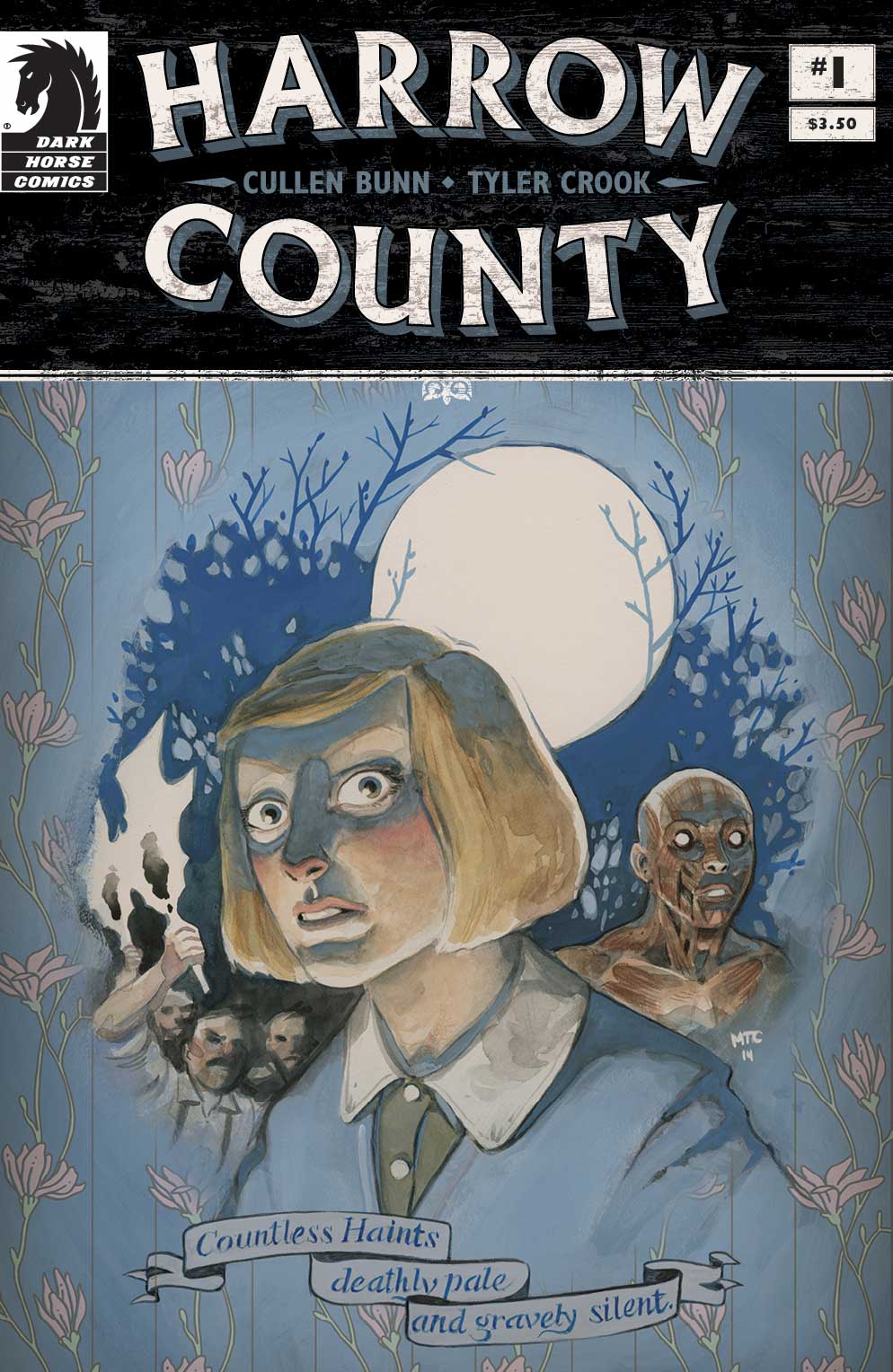
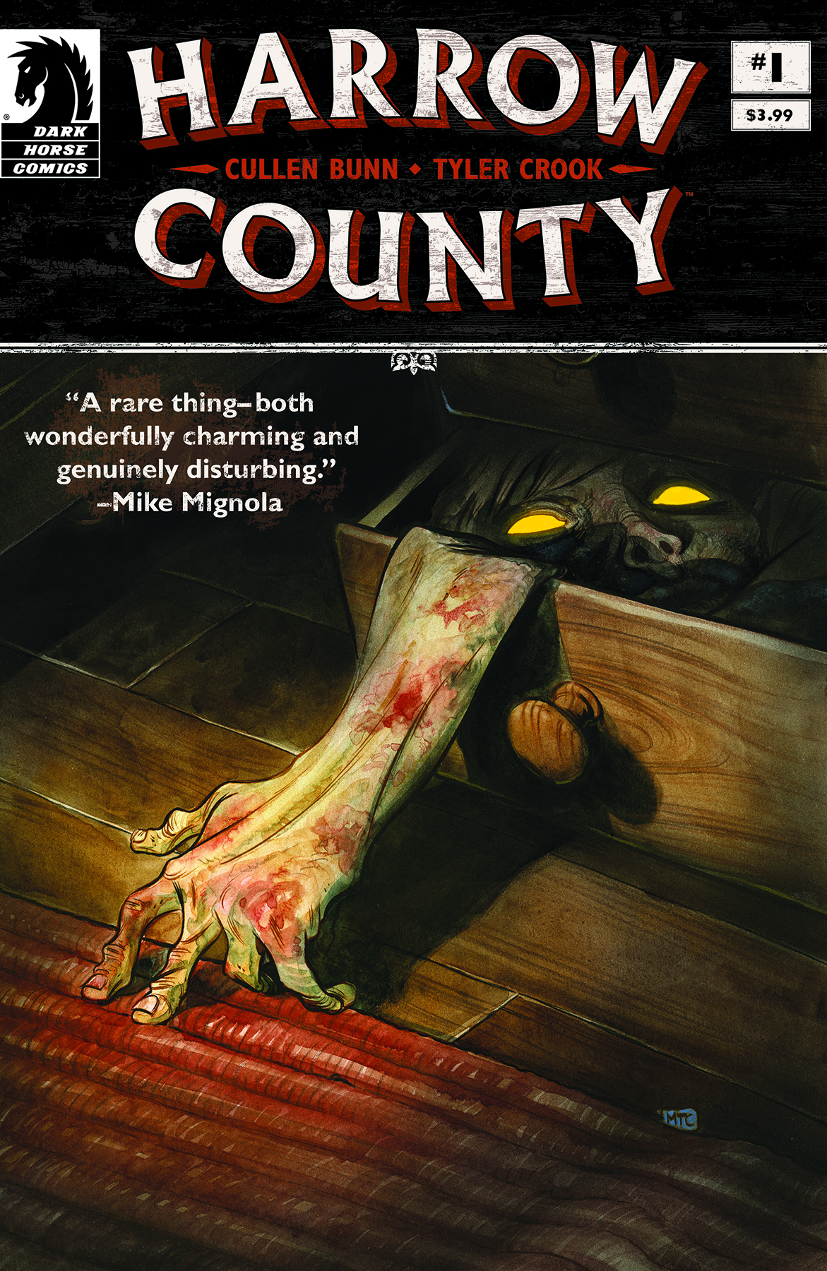
I remember I sent lots of notes in the beginning. We replaced the original first issue cover, which featured Emmy with a wallpaper background behind her, with the Tattered Skin in a drawer cover, which we thought would be much more compelling to folks who have no idea what this series is about. We added that Hester Beck prologue scene after feeling like we need something a bit more at the beginning. More background, more story. We all went back and forth on that first issue a lot and the results paid off.
Throughout the series, I work on cleaning up typos and watching out for consistency in-house so Tyler can keep moving ahead on the art. I’ll give notes on story, make sure Cullen’s scripts are clear enough for Tyler, but really, in the end, I want my notes for creator-owned to be suggestive. I don’t want the creators to lose their voice on their ideas. So if I tend to [send] a lot of notes at once it’s really meant to be conversational. Not that I’m right, but here’s what I’m thinking as I’m reading this and what the reader might think too.
We just got the script for issue #22 from Cullen and I may have had one or two small notes. We just got the colors in for issue #19 and I don’t think I had any notes for those. At this point in the game I think both Cullen and Tyler have hit their creative groove. They’re really shining here and their visions are in sync. I don’t want to disrupt that.
Tyler: Aw, man! That cover just kills me; I hate it so much. Every time I see it, I’m reminded how important editors can be.

Oh dear reader, there is no longer a demon at our door. While my longest readers may think that now, after generations of monster and beast looming just beyond our perception, we have cause to celebrate. Well, know that it weighs on my heart to say that such flights of fancy are merely that, the fanciful longings of a frightened populace.
Continued below
Not since Hester Beck has a dark one walked so freely amongst us. Ever since that starless night at the base of a twisted, old oak, we have been free of suffering the direct presence of one who openly holds both haint and beast at her command. Ever since that horrendous, yet crucial, event we have held the seals, tightly securing all that is good and decent in the county we call home. Yes, there have been breaches, but thus far this has been akin to the church mouse who has taken up residence in the wall of your home. A close nuisance of seldom consequence, leaving droppings where we’d rather they didn’t. A creature in out midst, but just beyond concern.
This is no longer the reality of our world.
The creature is no longer at the door.
She is now, again, in our midst.

In a county this small, it becomes a simple task to know your neighbors. You watch children grow, become adults, raise children of their own. I’ve lived in close proximity to Isaac Crawford’s farm my entire life, save for those few, tumultuous years spent as a young writer seeking experience in the wider world. In my time away little changed. The land wasn’t always Isaac’s, but it almost feels as if it could have been. It’s hard to remember otherwise. I remember his wife. I remember the old oak on his land.
And I remember the night he brought his supposed daughter home.
Emmy, with eyes sharp and bright, has always carried that indefinable energy that Harrow County residents know so well. It was an energy we burned from the human form of Hester Beck, releasing it into the ether to find new shape, new form, restarting the unbreaking cycle of evil incarnate. An energy, a shape, a form that we would spend the next eighteen years referring to as, ‘Emmy.’
Emmy with her mother’s eyes.
Readers, my guilt is tremendous. It has weighed upon me for nearly two decades. I knew, always and forever, Emmy’s true nature. I knew who she would become, but said nothing. I’ve peered into the deep, dark pool of evil that exists just beyond the perception of most, examined the heinous truths that any rational thinker would close their minds to. Armed with such terrible experience, I saw Emmy for what she truly was almost immediately. Even though it was as clear as the morning sun cresting a distant tree line, I denied it. To myself. To you, the reader. I wanted so badly to be wrong. I needed the truth of this young child to be mundane and unremarkable. I needed her to live a life the likes of which has been lived countless times before.
I needed her to simply be.
Our needs often go unmet, I’ve learned.
Often, but not always.

Thus enters the latest guilt I shall carry to my grave. A grave that seems closer than it ever has, as my own body stiffens with age, leaving me to relearn every action that once was automatic. On that day, the day I pass from this cursed plane, I will remember this final sin.
Emmy came to me.
She was not alone. In her company was a man who I dared not engage or even lay eyes upon. She knew of a recent difficulty that had arisen in my personal affairs. I dare not divulge any further details, for fear of exposure, so I will simply say that I found my self in an interpersonal conflict that seemed extreme in its nature. The root of deep concern with no obvious solution.
Emmy knew. Logic defies how it would be possible, but she knew. And she righted it. A human suffered, and in the darkest recesses of my heart I rejoiced. My burden was lifted, though in its place I found one greater. That child is cursed, and in a moment of weakness I allowed that curse to spread to me. I have been stricken ill by her sinister virus and, I am ashamed to say, in that moment I welcomed it. After years in its proximity, I was not strong enough to resist the call of the cursed when I heard it. Overexposure had left me without inoculation.
Continued belowHaint Emmy has caused me to take ill.
I have become that of which I fear.
I have become haint.
T. T. Wosker is an author of great renown and reputation. A life-long Harrow County resident, Wosker’s published works include “Are There Haints on the Moon?” and “When the Boy Did Not Return,” both available in paperback.
“Harrow County” #17 comes out this Wednesday.

The Abandoned, that hulking figure with haunting yellow eyes, rarely leaves his ramshackle cabin deep in the woods of Harrow County. But it wasn’t always so. Illustrated by guest artists Carla Speed McNeil and Jenn Manley Lee, this issue is the first of a two-part story that explores the Abandoned’s past and reveals secrets about the very foundations of Harrow County.


