

The Multiversity offices are full of diverse opinions – cats vs. dogs, Marvel vs. DC, beards vs. well, actually, everyone is pretty pro-beard. But besides for beards, the other thing we all agree on is Jordie Bellaire’s work as a colorist.

Colors are an under-appreciated piece of the comics puzzle, and colorists often times go unnoticed. So, for Bellaire to pop up as a topic of discussion at all is a bit of a minor miracle, but her work speaks for itself. She was nice enough to chat with us a little bit about the process behind coloring comics, collaborating with writers and artists, and what the future has in store for her.
What the immediate future has in store for Jordie is yet another gig (keep reading to see just how busy she really is!) coloring the upcoming run of “Ultimate X-Men” by Brian Wood and the amazing Mahmud Asrar starting with issue #24. Be sure to check that, and her million other projects, out!
Check back later today, as Jordie will walk us through step by step of the coloring process!

How did you get into coloring? It, along with lettering and layout/design, are the unsung heroes of comics.
Jordie Bellaire: I began mainly out of love for comics and growing desire to pay rent! I had just moved to New York City, having graduated from Ringling School of Art and Design with a major in illustration. I did some illustration gigs and I really love illustration but it was tough after school. I met my boyfriend Declan Shalvey in New York City right around then. He was very supportive and really pushed for me to work in comics somehow. He was definitely more adamant about me illustrating comics -not coloring them- but it’s just how it worked out! I tried for two gigs, didn’t get them and then was offered a job coloring three short stories in the final IDW issue of “Angel” called ‘Yearbook.’ After that I got my first mini-series at Boom within three months of only starting coloring. “Malignant Man!”

I’m sure many of our readers aren’t familiar with what a colorist’s job actually entails. Let’ start with the basics — how do you physically do your work? Is the process purely digital, or is there a physical, hand coloring, element to what you do?
JB: I only work digitally and I scan a lot of textures and I primarily try and create most of my own brushes in photoshop.
So, you get a piece of inked art, awaiting your colors. Where do you start?
JB: I send the work to my flatters or my amazing assistant, Jordan Gibson, to be prepared. They separate the lineart shapes for me into different colors so I can grab them easily when I begin coloring. After they have been separated I begin choosing the schemes/atmospheres I want for the page then I just render and finalize the work!

Many of our readers are probably not too familiar with the concept of flats, so would you mind indulging us and getting a little more specific about what exactly a flatter does?
Flats are the basic separation of lineart and shapes that will be colored objects. It’s a lot like just “coloring in” the shapes as you see them. A jacket is a jacket, brown, this blonde girl is a blonde, yellow. A colorist then uses these shapes to easily get around the page while coloring. It’s less like painting in this way because when you’re painting–you can’t go grab a dress and change the tone or even avoid coloring other objects near it–unless it’s been flatted.

That helps a lot, thanks! “Mara,” “Manhatthan Projects,” “Journey into Mystery,” “Nowhere Men,” “Comeback,” “Captain Marvel,” the backups in “Action Comics” — your workload is pretty insane. On average, how long does it take to color a page? And did I miss any of the books you’re currently coloring?
Continued below
JB: Because of my workload, most pages can only take me 1-2 hours each. There isn’t really a whole lot of room for slagging around and being super picky with my work! Which is a shame, I’m a huge perfectionist and I wish I could go back and over and over on it all but deadlines are deadlines!
There are a lot of titles I can’t talk about but right now..I think your list is only missing “Blackburn Burrow” (12 Gauge Comics/Amazon), “Rocketeer: Hollywood Horror” (IDW) we just finished “Rocketeer: Cargo of Doom” as well! “Action Comics” are just backups I do with Chris Sprouse. We’ve got a few more lined up but I don’t know if I would say they are ongoing at all.

How does your role differ based on the artist on a project? Nick Pitarra is worlds away from Michael Walsh, for instance, so how does the style of the work change your process?
JB: I normally just try to think of each book as a brand new experiment. I do feel like sometimes I must be repeating myself…but luckily, everyone seems to think the work feels varied! However, a lot of that has to do with the subject of the books I’m on. “The Manhattan Projects” isn’t anything like “Comeback,” for instance, so I’m allowed a lot of fun and stretching between the two. “Journey into Mystery” isn’t anything like the “Winter Soldier” issues I’m working on so I don’t need to worry about having an Asgardian theme blend in with the dark worlds that Butch and Brubaker have created. Most of the writers/artists I work with are all so different that I think it all just happens naturally. I also think a lot about films whenever I color a new book so in the same way that Alien looks nothing like Wizard of Oz–there are the sort of things I try to think about when I color a book.

I assume it differs from collaborator to collaborator, but how much input do the various writers and artists you work with get into your colors? Is your palette somewhat dictated from others, or do you have carte blanche when it comes to your piece of the puzzle? With “The Manhattan Projects” in particular, there is a very clear blue and red color wheel you make use of — how did that come to be? Was that something that originated with Jonathan or Nick, or was that something you brought to the book?
JB: Not really! I think most of the collaborators I work with are extremely open to working with me and thankfully, for some reason, valuing any input I have for the look of the book. On some books like “The Manhattan Projects,” Jon clearly had a vision for the red/blue sequences. His idea was based in the scheme of reds/blues which allowed for browns and oranges and weird colors..I kind of went right in and said, “No, I’m not going to do this but how do you feel about this pop-crazy-red-blue-stuff.” and he was like, “Yep. Sold!” I’m happy that they allowed me to use the really garish reds/blues though. I also overlay weird textures on those sequences and don’t use them anyplace else in the book–which I hope sets it apart from the rest of the world.
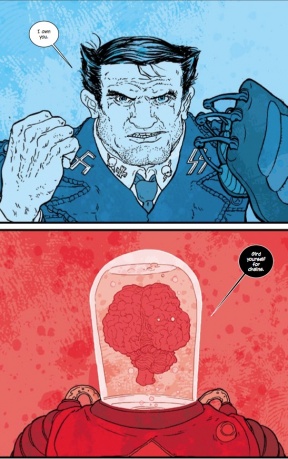
I have hypothesized in the past that, in the world of “The Manhattan Projects,” blue represents innocence or goodness, with red representing brutality and evil. Issue #7, more than any other, sort of messes with that theory, but is there a method to what gets a blue hue versus a red one?
JB: Jon has a very heavy hand with production in the book. It’s definitely his brain-child. Issue #7’s big red/blue sequence was a series of headshots and drawings that Nick did in no particular order. I colored them in a varied style but something coherent.. but when it got to Jon…Jon plotted the headshots the way he wanted them to read for the story. Something chaotic and brilliant. Therefore, the whole issue comes off very scattered when it comes to the whole color theory of it. Everyone is very, very focused on the meanings of the colors but I think it’s important to remember they are just symbols. Jon is always playing around with these color symbols on the covers too. He’ll throw you for a loop just when you think you understand it. That’s just how it is!
When using a color as the dominant hue for a panel/page/scene, how do you make decisions regarding various shades of that one color? Obviously, blue is more than just one simple color, but how do you make the most of that unified color while still adding depth and diversity via the various shades?
JB: Saturation, hue and value! That’s the key master to the gatekeeper of colors.

Do you have aspirations to write or draw comics of your own? What other comics skills do you possess besides coloring?
JB: I’m currently writing some things in my head. I’m also “working” on drawing a comic of my own with my great friend Jeremy Lambert called “Masque.” It’s an Edgar Allen Poe inspired tale – plus it’s horrific and ghoulish. It’ll be hard to find time to draw it though…he wrote it over a year ago now…! I’m sorry Jeremy, one day!!


