
Got You Covered is back with another look at the best covers of the month. At the end of each month, we’ll be sharing the absolute best (in one writer’s mind) in comic covers for the month. Unlike before, they won’t be ranked, they’ll just be listed alphabetically with explanations as to why each is such a great example in the art of comic covers.
Share your thoughts in the comments about what were the best covers in the month, and thanks for reading.

American Vampire: Second Cycle #2
Art by Rafael Albuquerque
Hasn’t Rafael Albuquerque grown tremendously as an artist? I mean, look at this piece. It’s so powerful and unique in its look, being so completely Albuquerque just in how it was brought to life. While the foreground image of Pearl is certainly a potent one, the background that finds the destruction of her farm raging is where it’s at. I love Albuquerque’s brush work to create the swirling disaster striking behind her. It’s simultaneously beautiful and disturbing, and the spatter effects and raw, jagged lines throughout create even more destructive urgency to the page. Clearing it up at the top for the credits both accentuates the imagery below and just makes sense, and I am perpetually impressed by the improvement of both his technique and design as he moves further into his career.

Conan the Avenger #4
Art by Fiona Staples
I think it’s funny that in the same month where The Rock’s “Hercules” so desperately grasped to the lion versus Hercules imagery that this simple, beautiful, raw cover by Staples managed to use a similar concept with greater success. While there are so many things that can be said about Staples’ art, the one thing I really want to highlight here is her ability to boil down the character into one cover. Does anything seem more Conan than fighting a lion over a ledge while holding its scruff and trying to straight up shank it at the same time? No. Not at least anything I can think of. Fiona Staples rules.
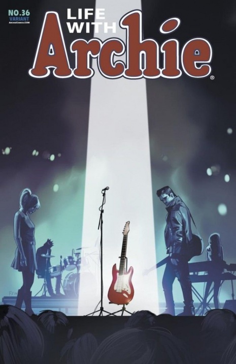
Life with Archie #36
Art by Fiona Staples
Speaking of Staples, she actually has two entries in this month’s list, neither of which are for “Saga” interestingly enough. We saw this cover a while back, as it’s a variant to the death issue of “Life with Archie”, but I wanted to share once again how damn perfect this is. It’s instantly iconic and filled with meaning and story, as The Archies are at a concert with the spotlight where their fallen frontman would normally stand. It’s such a fantastically poignant concept, and the execution – from the shadowed figure work to the pitch perfect coloring – is off the charts amazing. Let me reemphasize: Fiona Staples rules.
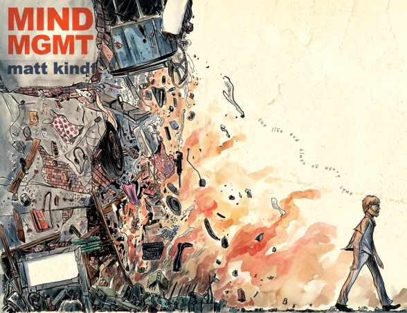
MIND MGMT #24
Art by Matt Kindt
An artist who has increasingly been appearing in this column, Kindt’s cover here is another beauty that combines a lot of the things we love about his work – the atypical lettering effects, the raw bases the art goes on, the watercolors, the two thousand word pictures – into one two page cover. This issue is touted as a great jumping on point for new readers, and a big reason for that is arguably the fact that the cover boils so much of Henry Lyme’s story down to one image. I love this book, and covers like this are a big reason why.

Ms. Marvel #6
Art by Jamie McKelvie
I love me some “Ms. Marvel”, but I gotta give Mr. McKelvie props, as his cover work on this book is a big reason why. He does such a phenomenal job of representing Kamala in single images that they are the perfect pairing and starting point for the comic itself. This one, which finds Kamala catching up on life’s events on her phone while she uses her powers to wipe out a bank robber, is both hilarious and just beautiful work by McKelvie. Kamala’s charm often comes from her relatable nature, and is there anything more relatable in 2014 than using your phone at highly inappropriate times? I don’t think so.
Continued below
The Punisher #8
Art by Mitch Gerads
In an arc about The Punisher in jungle combat, is there anything more perfect than this cover? Gerads perpetually impresses, but this simple of image of a bloody pile of jungle warfare gear is stunningly spot on. Surrounding it with only white space – no real background – is another choice that really brings the piece to life, but doesn’t this cover just underline the terrible life choices Frank has made? Someone needs a massage or something to bring that tension level down a few hundred notches.

Steed and Mrs. Peel: We’re Needed #1
Art by Stacey Lee
I’ve honestly never seen Stacey Lee’s art before, but this cover makes me very much want to see more of her work. This is a completely stunning cover. Obviously he has a good foundation to go off of, as Emma Peel aka Diana Rigg is a great subject, but her rendering of Peel is enough to make a person fall in love with the character and certainly take the book home. It’s a beautifully composed piece, with the background only doing enough to accentuate the elements Lee wants to – everything in the foreground – and I love the titling to the series staying very much out of the way as well. But the showcase here is Lee’s character work. An exceedingly lovely cover by someone I’m looking forward to seeing more from.

Supreme: Blue Rose #1
Art by Tula Lotay
Is there anyone in comics who had a bigger July than Tula Lotay? For many, “Supreme: Blue Rose” was a coming out party for her, and it was well deserved: her work was absolutely stunning. This cover is where it all started, quite literally. I love her work, which combines heavy inked lines with dynamic, feel oriented coloring. It’s impossible to compare, but her work to me feels like if you found a perfect amalgamation of Mike Allred’s pop expressionism and general joie de vivre with Tommy Lee Edward’s digital painting and comic realism. Her Diana Dane on this cover is gorgeous, but the colors make her feel like a warrior just waiting for her war. It’s a stunning piece, and the design elements only elevate it more. Even the titling helps push this to another level, as they’re simple with the sans serif style, but arranged in a unique fashion. This is a superb comic book cover, and Lotay is going to be someone to watch going forward.

Velvet #6
Art by Steve Epting
There are a lot of reasons why this cover is fantastic, but the first I wanted to mention was this: doesn’t this feel like a paperback cover for a spy novel? It feels like something that would be on an old paperback for a Ian Fleming book, and I’m sure that’s what Epting was going for in the design of this. If he was, then top marks to you, Steve. This is a beauty, and such a great emulation of that format. Beyond that, I love seeing Epting unleashed on this book because – and not to devalue the genre – but he’s so much more than superheroes, and his fierce, capable Velvet and the faded London behind her are perfect examples of that. This is such a fully realized book, with an identity completely its own, and it starts from the cover and moves on from there.

Wonder Woman #33
Art by Cliff Chiang
How great is Cliff Chiang you guys? His run on Wonder Woman is nearing its end, but this cover is so beautiful, with its super thick inked lines and limited color palette creating a powerful yet wounded Wonder Woman image that in its own way is instantly iconic. Chiang’s an artist who excels at creating an image that weaves together incredibly well on all levels, and this one does that with its simple yet bold design. When it’s all said and done, we’ll likely look back on Azzarello and Chiang’s “Wonder Woman” as an all-time great run, and this cover is just once quick example as to why that is.


