

In the first edition of 2013’s Got You Covered, I take a look at my five favorite covers of this week and even highlight my least favorite cover as well. Check it out below, and thanks for reading.

Art by Greg Horn
This week I want to give a shout out to the worst cover of the week. Typically, I don’t do this, but the situation called for it. I know that Avengers Arena, to a degree, is capitalizing on The Hunger Games, but I’ve been entertained so far and enjoy the book overall. This cover is awful though in the way it just tries to visually mimic the Mockingjay logo on Catching Fire. It’s one thing to be inspired by something, but to completely hijack visual cues from it? That’s just low.

5. The Phantom Stranger #4
Art by Jae Lee
I have to say, there were a number of covers contending for this spot, but when it came down to it, The Phantom Strange won because it had one of the greatest tiebreakers of all: Jae Lee. His art floors me every time, and I love the usage of white space and the simple showdown between the Stranger and Constantine (a very clean cut Constantine at that). Little details such as the spell coming through his puffs of smoke was quite brilliant, and for a book I don’t pay attention to, this one sure made me pay a lot of attention.

Art by Charlie Adlard
Yay to Charlie Adlard’s 100th issue! Yay to Rick and The Governor meeting up again! This solid issue came with a wrap cover that highlighted the greatness Adlard’s been bringing to the table for quite some time now. Superb detail, emotive characters and an exceptional sense of story bring the best out of this cover, and show exactly what we’ve been dealing with when it comes to Adlard’s work. Plus, it’s always great to see our favorite characters brought to life in full color.

Art by Alex Ross
Isn’t this what dreams are made of? Alex Ross illustrating canon Star Wars characters? Man oh man, this is a gorgeous cover, and in many ways, it would fit alongside any of the original trilogy movie posters. The sense of storytelling and design to it is spectacular, and as per usual, no one brings a sense of reality to the fantastical quite like Ross does.

Art by Jeff Lemire
Before I talk about this cover, I wanted to talk about the issue: this was one of the more perfect finales I’ve ever read. Very heart wrenching, left us in a good place, wrapped the story, you name it. It was really, really beautiful.
Now, to the cover. It’s an homage to the first issue’s cover, and I love the growth to it. Gus has aged, the leaves behind him have aged, but you can still see the little guy that we’ve, in many ways, fallen in love with over the previous 40 issues. The guy is just so damn lovable, and in his twilight, we get a pitch perfect visual reminder as to where he’s been and where we’ve come from. Lemire completely nailed this issue, from front cover to last page, and this cover will always remind me of just how special this story turned out to be.
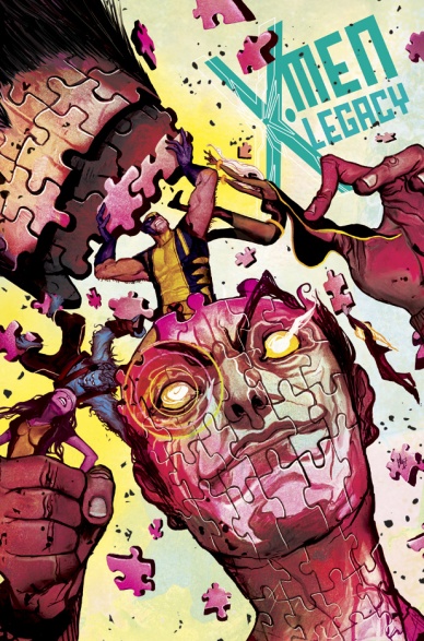
Art by Mike Del Mundo
As much as I loved Sweet Tooth #40, I’d be lying if I didn’t say I was more impressed by Mike Del Mundo’s fourth cover to X-Men Legacy. What a freaking knockout this is, with glorious coloring, note perfect storytelling and really ingenious design. Del Mundo should get a lot of credit for the work he’s doing on this book, as it is some of the best straight up Big Two cover work I’ve seen in some time. This might be the best yet, with #6 waiting in the wings to take that spot.


