
Francis Manapul is an artist that never allows you to ask the question, “Who drew that?” His style is inimitable and distinct, and he has been using it with great success the past few years, mainly on “The Flash” for DC Comics. As co-writer and artist on the book, Manapul has, perhaps more than any artist/character pairing in the New 52, completely owned the look of his book. Even when the book has a fill in artist, Manapul’s visual influence is all over the book. Check out this chat about his process, his approach to covers and title pages, and what artists he’s digging right now.
Was there a “eureka!” moment for you when it came to deciding to draw comics? What were some of the books and artists that influenced you early on?
Francis Manapul: Jim Lee is an obvious one. I was in a book store with my mom, while in line I saw a comic spinner rack. On it, was an issue of “Uncanny X-Men” featuring Captain America, Wolverine and Black Widow on the cover. Looking inside, Jim’s art just blew me away. I didn’t know comics could look that cool. I was hooked since then. I also really enjoyed the works of Mike Weiringo, Marc Silvestri, Joe Madureira, and Art Adams.
Every school seemed to have a kid who could draw one hero. In my school, a guy could draw Spider-Man and Venom well, and got requests all the time for them – who was the first character you mastered drawing?
FM: I don’t recall ever mastering one character. During my early teens when I got into drawing, Image Comics had just launched so I was drawing almost every new character they came up with.
Do you think that growing up in Canada give you a different experience with comics than your American counterparts?
FM: I don’t think so. We had access to the same books. Being born in the Philippines, I felt like it gave me a bit of an insight of what North American culture was like. For better or worse, thats what I used to try and fit in, when I moved to Toronto as a kid.
What was the first step you took in your professional career? How did you get your foot in the industry’s door?
FM: Having read interviews from other artist such as this one, I knew that I had to put together a portfolio. I was a pretty determined 16 year old, so at that point in time I started attending local conventions to show my work. Through local conventions in Toronto, I met other artists and writers who were all trying or had just broken in. Through those connections I met J. Torres and a couple years later I contributed to a book called Love in Tights for SLG. From there Monster Fighters for Image. Even with books published, I still worked full time at Auto Trader. So I continued to attend conventions showing my published work and supplementing that with samples of DC and Marvel characters. That eventually lead to doing a fill in work at Top Cow, and form then on I could finally call it a career.
Your style is one of the more easily-identifiable in all of comics – you always know when you’re looking at a Manapul comic – when did your inimitable style start to take hold? Were there elements or techniques that you eventually eschewed because they didn’t fit with what your style was becoming?
FM: Thanks, I appreciate that. One of the defining moments of my career was a brief encounter with Rudy Nebres. Being a fan, I had purchased an original art from him and I had mentioned that I was an artist as well. He eventually came by my table and looked through my work. He said to me smiling “You didn’t ink this… I like your work, but you’re not a real artist until you start doing so.” He was right. Up to that point, I wore my influences on my sleeves as a penciler. So I started inking…. It was a horrible disaster! I couldn’t control the tools, and it really put me out of my comfort zone. But I kept at it, and instead of trying to ink like the way I pencil, I started letting the inking dictate how I was drawing. Accidental as it was, the style I have was purely based on my short comings as an inker. I’m just glad that it all turned out well, and readers have responded positively to it.
Early in your career, you did a lot of cover work – how does doing a cover differ, process wise, from doing the interiors of a book? Do you feel pressure to “sum up” the issue in its cover, or is there a freedom to drawing a cover that doesn’t need to fit a certain criteria?
FM: I don’t really think of myself as a cover artist. I prefer doing interiors. I really enjoy the rhythm you develop with the sequences, and I find a single image like a cover to be limiting. That said, there are tons of artist that excel at covers and are able to convey a lot of story in a single image. I’m just not sure if I’m one of those guys.
You get a script in the mail, and it is time to start work on it. What is your process like for creating the book? Do you read the script all the way through before even focusing on character design or thumbnails, or are you doing that as you read on? Typically, how long does a regular sized issue take to produce?
FM: Well I write “The Flash” with Brian Buccellato, so I’m part of the process from start to finish. Brian and my’s typical work flow starts with a phone call. We’d discuss what the story would be about, then start picking away at what the plot would be. From the notes that we’d write down, I’d start breaking down the story in thumbnails. From there we’d start scripting the book. Depending on how many revisions we have to do, we typically spend about a week to a week and half to write an issue. Every now and then I’ll get four to five weeks to draw a book. However it’s more typical to get three weeks for me to pencil, ink, and tone the book. I’d prefer to get more, but you play with the cards you’re dealt. Brian is usually just a few days behind me for the colors. All in all we can put a book out the door in about a month. We’re a small team, but the tightness of it allows us to be very efficient.
Your DC work has gone from cosmic soaring (“Legion of Super-Heroes”), to Earth-based flying (“Adventure Comics”) to running (“The Flash”). Have you found that you’re enjoying drawing things more akin to real life, or is this simply a coincidence?
FM: The Flash is one of my favorite characters of all time, so for me it’s a dream to be drawing him. However I’m most fond of drawing the environment that “Adventure Comics” was set in. I love American farm lands, and drawing small towns. I’m really fond of Norman Rockwell inspired aesthetics.

With the re-launch of “The Flash,” you’ve found yourself writing as much, if not more, as you’ve been pencilling. How does being on the writing side of things affect how you draw the book?
FM: What I love about writing and drawing the book is having the ability to change things on the fly. Knowing what the intent of a scene is, I don’t have to be so literal with what was written. I can make it more dynamic, as long as I’m able to accomplish the goal we had set for the scene. It’s like being the writer and the director of a movie.
You and Brian have a pretty self-sufficient creative relationship – you both co-write, you pencil/ink, he colors. Are you finding the scripts that you and Brian write up are less detailed than they might be if you were writing for another artist?
FM: Absolutely. Some of our scripts can be just a few lines, but end up covering numerous pages. Sometimes we have to remind ourselves that we have to throw in a few more details so that our editors would actually know whats happening in the book. Our scripts are also quite unique as our scripts can often include thumbnails of the entire issue. Our editors love that, as it gives them an idea of what the whole issue can look like at a very quick glance.
Your use of brushed greys and watercolors in your commission work makes your line at conventions especially epic (as a guy who stood in line for one, I know!). How do you incorporate those techniques into your more traditional comics work, when you know the work will be colored and printed in a way that won’t necessarily highlight those elements?
FM: My work process for my commissions is just an abbreviated version of my comic pages. I use most of the very same tools, my comic pages just tend to be tighter and cleaner than my commissions. The main difference is that my comic pages are just in black and grays. I use a combination of traditional inks, along with water colors for the gray tones. Before I send my pages to Brian for coloring, I convert my black and gray art work into a different color tone. Using a color scheme that would enhance the aesthetic of the scene, I’ll change the hue from warm to cold colors. I find that doing this, gives the art a really unique feel.
In your run of “The Flash,” we have seen a slew of Rogues re-designed for the New 52. How much input did you have into these redesigns, and is there another character in comics you would love the attempt to redesign?
FM: I redesigned all the Rogues in the New 52, they pretty much just let me have a go at it. Of course they have to go through approval process, but they were pretty open to the versions I had given them. I don’t really have desires to redesign characters, if it makes sense for the story, sure let’s do it. Other than that, it’s not something I seek out to do.
We have just begun to see the Reverse Flash in the New 52. The new design has eliminated the classic color-reveresed costume that Eobard Thwane famously wore for something darker. What was the impulse (pardon the speedster pun) to make such a fundamental change to the character’s appearance?
FM: The main reason, being that he’s more or less a brand new iteration of the character. Our story needed a villain that would look physically scary, and manifest a lot of the fears of what Flash could have become had he gone down the wrong path. The story dictated the look of the character and in the Reverse Flash Villain month issue, you’ll see exactly what I mean.
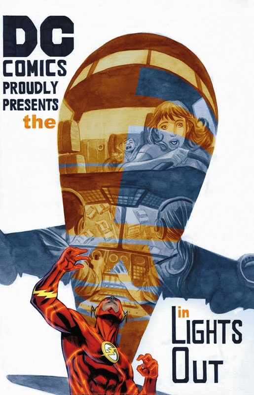
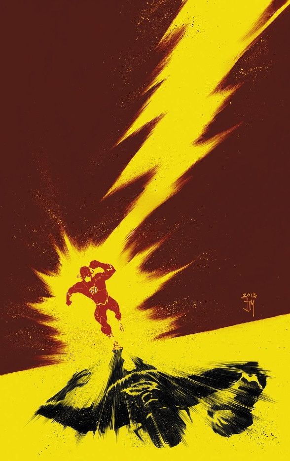
Your title pages on “The Flash” have been, hands down, the most creative in comics over the past few years. How do those pages come about? Is there a lot of trial and error involved?
FM: I can’t take credit for those title pages at all, I’m just doing my best impression of one the greatest cartoonist we’ve ever had, Will Eisner. It was his art, and his words that inspired me to become a better storyteller. I felt the need to pay homage to him when I finally got the opportunity to write and draw a book. Some issues are harder than others, and some I plan meticulously and others I just improvise as I start to draw the page. I try to be flexible about it.
If you could pick another artist to pencil a book you’ve scripted, who would you like that to be?
FM: Brian and I have had the pleasure to script issues for artists like Marcus To, Scott Kollins, Marcio Takara, Scott Hephburn and we’re about to work with Chris Sprouse. Needless to say we’ve had an embarrassment of riches when it comes to fantastic artists. I’m currently enjoying the work of Duncan Fegredo, and James Harren, as well as Dan Panosian.


