
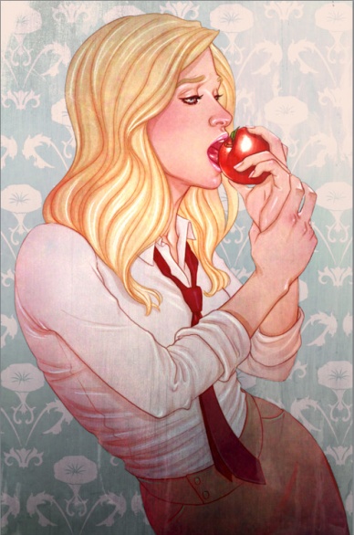
Today on Artist August, it is my pleasure to present to you a chat with one of the most talented artists working in the industry today: Jenny Frison. You might recognize Jenny Frison from any number of covers that she’s done in her already illustrious career — featured on IDW’s “Angel” series as well as DC’s “I, Vampire” and currently seen covering “Revival” at Image as well as other books, Frison presents an evocative style to her covers and pin-ups that steal the eye’s attention from elsewhere, holding on to the reader’s attention span and demanding to be taken home and added to their personal collection.
It’s almost like dark magic, really. So I guess this is an interview with a powerful sorceress as well as an artist, which is fun.
Read on as we discuss working in the industry, why covers over interiors and her work on “Angel” and “Revival.”
Let’s start with my favorite starter question: Jenny, why comics?
Jenny Frsson: Hmmm…why not?! I guess I’ve always had a love of comics. When I was little, there was this Wonder Woman play school storybook and tape that my parents got for me and my sister. I thought Wonder Woman was the coolest! I didn’t really read a lot of comics as a kid, but I used to get a MAD magazine at the airport every time we went on a trip. When I was in high school I decided to mix it up on one trip when I saw Adam Hughes’ first Wonder Woman cover. I was like “Holy crap! That’s amazing!! I want that job!” My freshman year in college, I took a comic book/comic strip art history class and was totally hooked. I knew I had to be involved in the industry somehow.
What is your background as an illustrator? Where did your initial interest as an artist come from?
JF: I used to draw constantly when I was little. I was a really awkward kid and didn’t have a lot of friends, but everybody always seemed to think it was cool that I could draw so I felt like it made me special. My parents made sure to enroll me in whatever art classes they could find in the area. When I got to high school, I pretty much stopped taking classes. It really wasn’t until college that I got back into art.
I specialized in illustration in college and focused on book cover illustrations. After that I went to the Kubert School for a couple of years. I decided I really wanted my job to be creating book covers…but that comics were the books I loved to read the most, so that was the industry I shot for.

Fans of your work primarily know you as a cover artist, such as the mainstay cover artist for Image’s “Revival” right now. How did you get started with this?
JF: Well, “cover art” is pretty difficult to get into mainly because its hard to talk publishers into putting your art on the cover of their book when you aren’t the interior artist and you don’t already have a wide following that will pick up the book just because your art is on the cover. It was really slow going at first. The first job I ever snagged was for Tim Seeley’s “Hack Slash”. I met Tim at a drink and draw in Chicago and gave him my card. He checked out my website and asked if I would do a cover. I had no idea then how much we would end up working together. Now I share a studio with him and do regular covers for his book, Revival.
Was there any particular reason you moved more towards covers than interiors? What do you find more conducive to your work process with covers over interiors?
JF: Really, I love covers. I love working on an entire image from start to finish. I love that I can combine different techniques to create a whole image. I think interiors and covers both involve the same recipe, but the measurements of the ingredients are different. With interiors, the number one most important thing is the story telling. Above style or color scheme or shape or movement, etc. the most important thing is its ability to translate a story (with all those other things adding to make the story better!). With a cover, story telling isn’t unimportant, but the most important thing is to create one singular compelling image to drive a reader to pick that comic up instead of any one of the hundreds surrounding it on the shelf. That’s the “problem” I find myself more interested in “solving”…it’s not always a win, but it excites me more and it feels more natural to me. I think I’m not as effective at the storytelling aspect, although it’s what drove me to illustration in the first place.
Continued belowYou have a particularly evocative painted style that we don’t see too often in comics. Can you talk a bit about your process in creating covers?
JF: Sure! In terms of coming up with a concept, it really depends on the case. Some covers, I get a script and come up with the concept based on a scene or something that really strikes me. Sometimes, I get specific direction from the creative team…maybe an idea or concept they want the cover to embody. Sometimes they already know what they want and I just get a loose sketch. Sometimes, nobody knows what is going to happen in that issue so they just tell me to come up with something iconic but nothing specific.
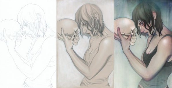
Once I’ve got an approved sketch, I usually work to tighten it up for myself. Before I go to final pencils, I usually have a pretty tight sketch of how everything will look. I like to get all the messy “figuring out” part out of the way then so I can keep my final pencils as clean as possible since that’s my final linework. For most covers I create, I do about 50/50 traditional/digital. Once I finish up the linework (graphite on Bristol), I print it out on grey paper and do a tonal drawing with copic marker, graphite, and white chalk. I prefer to do as much as possible of my rendering by hand. It’s more fun to me than digital rendering…and more intuitive for some reason. Once I finish that, I lay them together in photoshop and color it digitally. I usually have a pretty good idea in my head of what sort of color scheme and what I want the overall look to be when I start coloring. Most of the coloring process for me is just picking all the colors and then making a billion adjustments to try to get the right look…sometimes I’ll end up with a completely different look by the end. That’s what I love about digital, it’s so easy to adjust things, and a lot of times I don’t know what I’m looking for until I see it.
Looking at your DeviantArt page and some of your early contributions, I’d say the line between where you were and where you are in your career is pretty clear. Looking back, how do you view your older work and artistic habits?
JF: Well, I’ll definitely say my work has evolved since I started working, but I’ve had that account for a while so there is stuff from college in there…I suppose I don’t really consider anything from before I began my career in my “body of work”. Unfortunately, I’m a bad “online presence” so I don’t update or edit that page nearly as often as I should. I should probably get on that….
One of my favorite “runs” of yours, so to say, were the covers you provided for the IDW Buffyverse books, “Spike” and “Angel.” How did you get involved with IDW in doing the covers to these series?
JF: I met Tom Waltz from IDW at my first SDCC. I was there looking for work and dropping off sample packs of art. I kept in contact with him for a while and it was probably a year or so before he found anything to put me on, but I ended up working on covers for Lora Innes’ “The Dreamer” for them. I think Chris Ryall saw those covers and decided to try me out on Angel. It was a totally great gig. I got a lot of freedom on the covers and, since I had been a big Buffy and Angel fan in high school and college, it was a pretty big deal to me. I really enjoyed working on them.
Pulling back a bit, how did you get involved with “Revival” as the main cover artist for the series?
JF: I don’t really remember how it initially came about. I’m good friends with both Tim and Mike. They had been talking about wanting to work on something together and wanting to do something creator owned for a while. I think the first time I heard anything about it, Tim and I were out for a drink and he was telling me about wanting to do a story set in the town he grew up in. I’m a little familiar with Wausau and he was telling me about all kinds of weird things that happened there (and tend to happen in small towns). He explained the basic plot to me and I remember getting goosebumps. I think the whole conversation started because we were talking about how I wanted to work on something new, ongoing, and more creative. He said “when we get it going, you can do covers”. I remember thinking: “ohh…I hope that really happens.
Continued belowToday, I work in a studio called Four Star Studios with Tim and Mike as well as Chris Burnham, Sean Dove, and Joshua Emmons. It’s been really cool to work so closely with the boys and be present when they discuss the story and watch the plot evolve.
One thing I don’t think gets discussed a lot is the role that a singular cover artist can have with a series and its consistency. As a fan of comics yourself, do you prefer when comics have a mainstay artist providing cover art for the book rather than multiple artists?
JF: I don’t know…I suppose I prefer they either have the same cover artist to create a body of work…part of the brand, or always have a new, different artist each month like a showcase. I loved seeing James Jean’s covers on “Fables”, but I always thought all the different artists Tim got to create covers for “Hack/Slash” was really neat, too. I have no problem with there being a billion variants from a handful of artists…it just seems less effective in a series. It’s hard to come up with the best striking image when you are essentially competing against other artists on the same issue. But it sells more comics so it is definitely effective from that perspective.
Is there any series that you’ve provided covers for that you’d call a particular “favorite”?
JF: I love Hack/Slash. I think Cassie is super fun to draw. She is this really dynamic mix of tough and vulnerable that I find totally interesting.
Are there any series or characters you’d particularly love to do covers for?
JF: There’s not really anything that I’ve been dying to work on that I feel is missing for me, but I did discover my love of comics through Wonder Woman so I guess maybe that. I don’t know that I would be a great match, but I still love her.
As female artist who draws a fair deal of popular women in comics (Cassie is a great example, Red Sonja recently and the Revival covers), how do you feel about the current representation of women in the comics medium? In what ways do you think it could improve, or even in what ways would you like to push it to improve?
JF: I don’t think I can really comment on the representation of women in the comics medium as a whole…I think that’s too vast and varied for me to really have an answer I would be comfortable with. I wouldn’t want to make a generalization. I will say that I don’t mind a sexy image if it is appropriate to the story or character. Sometimes the material calls for something like that. And sometimes it doesn’t. Ultimately, I think there should be room for a little bit of everything in a medium as multifaceted as comics.
Sometimes it’s just up to the viewer whether they like it or not. Also, I think there is a big difference between sexy and slutty so, for me, just making something risque or suggestive doesn’t make it vulgar. I like Red Sonja’s chain-mail bikini and I love drawing her sexy and strong and fierce. I don’t want to shy away from drawing her body. That said, however, I probably wouldn’t draw her spreading her legs and sucking her thumb, because that isn’t her. And I don’t want to see a bunch of other characters created who wear chain-mail bikinis…we’ve already got one. Personally, though, my favorite characters are ones who aren’t defined by how much clothes they wear. In Revival, Martha wears sweaters and jeans (and a sweatshirt of course!) because that’s what people wear in Wisconsin in the winter. But we’ve shown her in her underwear and even nude in the comic. Sometimes showing skin isn’t about being sexy, it’s about story telling.

Looking ahead at your career, are we going to be seeing more interior work from you in the future? Do you have any projects that you’re looking to particularly get off the ground?
JF: No interiors. I love covers! I’d love to figure out how to do something creator owned with covers. It’s been something floating around in my mind for a long time. Maybe an illustrated story or just a series of paintings. I definitely can’t complain about where my career is right now, but it would be neat to work on something that is all mine or something where I am a more integral part of the creative process.
Continued belowWith today’s modern technology, artists have the opportunity to switch between traditional pencil/ink solutions to more in the digital frontier. Do you have any particular preference between the two?
JF: I think they both have their merit for sure. I love getting my hands dirty and holding actual drawing materials in my hands. But I work in a field where quick turn-around is key. Digital coloring allows me to make quick decisions. With digital, every decision I make is easily and quickly adjustable. It allows me to be fast. I would love to do more actual painting, but probably not for commercial stuff just because it takes more time. I’m lucky to have developed a fast process that allows me to utilize both traditional and digital techniques.
Where do your artistic influences, in comics and outside of, come from?
JF: I think it’s no surprise that I’m a huge Alphonse Mucha fan. I find a lot of inspiration in religious art, portraiture, vintage illustrators and painters. Rackman, Dulac, Leyendecker, Waterhouse, Al Parker, Gil Elvgrin. I also find a lot of inspiration in fashion photography and more modern artists and illustrators. James Jean and Joao Ruas, Rockin Jellybean, Aaron Horkey, Michael Hussar, Gail Potocki, Audrey Kawasaki, Aiyana Udesen, Tracie Ching. And probably a hundred others that I can’t come up off the top of my head. In comics, obviously Jean and Ruas still apply, Adam Hughes, Phil Noto, Amy Reeder, Steve Morris, Ming Doyle…and again, hundreds more!
To top us off and add some levity to our artistic discussion: it’s the post-apocalypse and you’re wandering the wasteland with a psychic familiar at your side. Would you prefer a dog or a cat?
JF: Easiest question on here: dog. Definitely dog. Unfortunately, however, I don’t have a dog…I do have two cats though. Demon Warrior and Ookla. But they would be worthless in the post-apocalyptic wasteland…they are practically worthless right now.


