For those that don’t know, Multiversity’s a pretty big fan of artist Christian Ward. I remember the day “The Infinite Vacation” #1 came out very well, if only because seeing Ward’s art for the first time was a revolutionary look at an almost unmatched talent in comics. He blew our minds in that series and in damn near everything he touches, and we were just waiting for the right project for him to become a household name in comics.
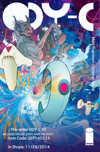
That project, my friends, is “ODY-C” at Image Comics with writer Matt Fraction. Launching November 26th with its Final Order Cutoff arriving next Monday (tell your retailer you want it, Diamond code SEP140533!), this book is the gender-swapped retelling of Homer’s classic tale “The Odyssey”. Everything we’ve seen so far has been spellbinding, and the online-only prologue that depicts the Battle of Troy in short form shows us the potential of this series with mad geniuses like Ward and Fraction working on the project.
We’re clearly excited, and we wanted to do what we could to dig more into it, so we reached out to Ward to talk about the project, what he and Matt have in store for us, some of his plans for the art, and much more. More importantly for many of you is the fact we also can exclusively reveal five pages from the first issue of this book – the first five pages after the eight-page gatefold sequence that will open the book – to further prove that maybe, just maybe, this is a book that you’re going to want. Also, enjoy some amazing process Ward shared as well, which you can find at the bottom of the interview. Take a look, and big thanks to Ward and our friends at Image Comics for helping us put this together.

It’s been a little while since we’ve seen a major multi-issue project from you, at least since “The Infinite Vacation” with Nick Spencer. What made “ODY-C” a project you couldn’t resist taking, and how did you first get together with Matt on it?
CW: Well, really it was working with Matt that I couldn’t turn down. We got to chatting over Twitter first, talking about the films we love before getting around to our mutual appreciation of Barbarella. It was from this that we starting the ‘wouldn’t it be cool if..’ chat that led to us creating our own sexy, kick ass women led sci-fi adventure epic.
Your art often has a grandiose, larger than reality feeling to it, and that’s probably necessary for something like a psychedelic space opera version of Homer’s “The Odyssey.” What about the project and working with Matt do you feel fits what you like to do as an artist, and has anything about the project surprised you so far, either in an exciting way or a challenging one?
CW: “ODY-C” has constantly surprised me and I love that. It’s grown from a relevantly simple of idea of ‘hey, what if all the Odyssey guys were gals and all the gals were guys?’ to very much being its own beast. Matt is a genius. I can honestly say there’s not another book out there like it. Working on something as fresh and exciting as this, with someone like Matt who has this huge love for the medium and pushing it beyond its boundaries is incredibly exhilarating. With “ODY-C’s” foundations in the classic poem and its outlook to psychedelic hardcore science fiction it’s apt to push my page layouts and style to different places. Although it is important to always keep the storytelling at the forefront, and there are times that we keep it simple. Quite accidentally, there’s been touches of Mucha to some of the pages and I love that that’s happen organically.
When your partner is bringing his A-game, it makes you up yours also, and this project has everything I’ve ever wanted to draw in a book.

Naturally, the players from the story being gender swapped means they’ll need new designs, but given the nature of the story you’ve needed to go the extra mile when it comes to finding the right look and feel of characters like Odysseus and Athena. Were you just unleashed in finding their look, or was that something you worked closely with Matt on? Where did you turn to for inspiration on these characters?
Continued belowCW: Matt’s been very gracious about letting me go off and go wild. It’s been great fun surprising him with what I come up with. It’s important each design is informed by the character though, rather than just being based on what looks cool. In regards to the the gods, I researched each one, making notes on their personalities and also the symbolism associated to each. For instance, discovering that one of Apollo’s symbols is the raven and that he is also the god of darkness, it seemed to make sense that ours would have a touch of goth about her. Aesthetically, I’ve tried to reference the classic Greek design associated with the story. In particular with Odysseus’s armour. It’s important that that DNA is present.
The look of “ODY-C” has influences from everything from burlesque to fetish wear to Hindu iconology to Alexander McQueen to euro sci-fi. Despite its old roots it definitely has a POP feel. Despite our grand influences, the books going to be a hell of a lot of fun.
Much has been made of the epic 8 page spread that is opening the first issue. What can you tell us about it, and what kind of special challenges does such an undertaking put on you as an artist?
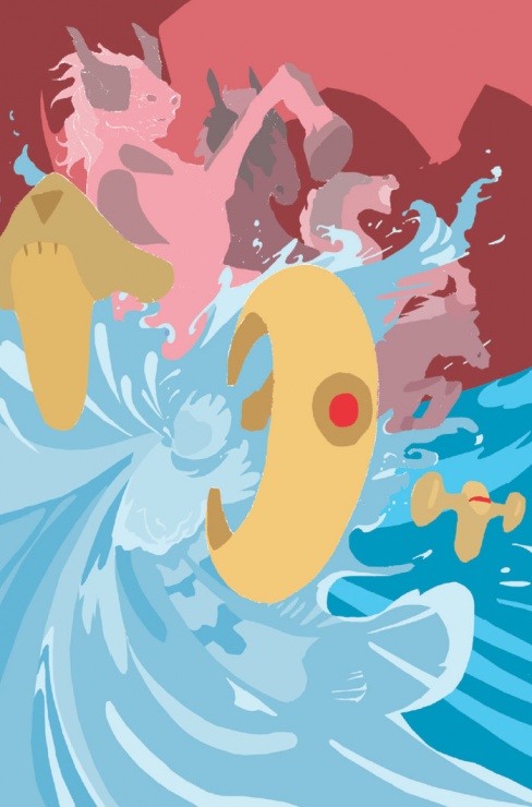
CW: I can tell you it features the aftermath of the the intergalactic war that kicks off our story. There’s piles of bodies, giant moon worms, cosmic jelly fish, alien vultures and 3 of the most kick ass warriors you’re ever likely to meet, in this universe or the next. The gatefold has been by far the most challenging piece of art I’ve ever produced, not solely because my desk just isn’t that big (Matt had me on the floor on my knees for this one). It was important that the image flowed and worked as a single image but also had elements of interest in each of its 8 pages. It took a long time to crack. I created about 3 different versions of it digitally before I settled on the design. I had to then deconstruct this into 8 interlocking parts (like a jigsaw) that I could print out, lightbox, draw them out and scan in, then reconstruct in photoshop. Almost half of the time spent on the whole first issue was spent on those 8 pages, but we’re thrilled with it and I can’t wait to see it printed.

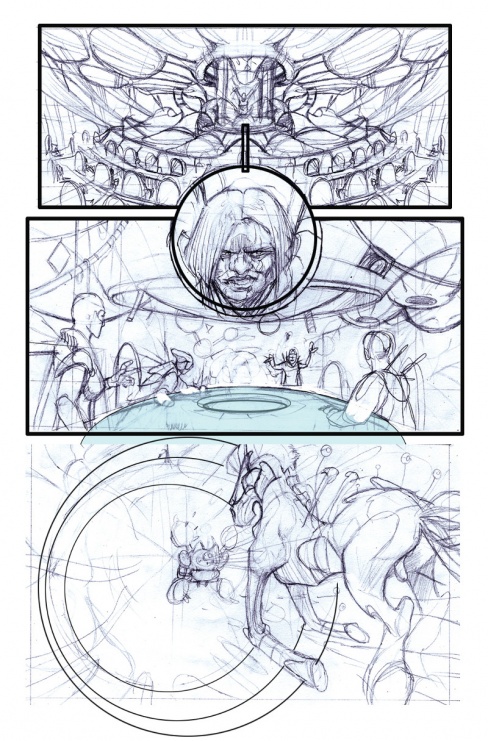
I know you work both digitally and with traditional elements, but I’m curious how you bring “ODY-C” to life from start to finish? What’s your process for each level of your art, from layouts to colors, and what tools do you use to bring it to life?
CW: This is definitely something that I’m playing with and streamlining as I go. The general process goes like this – First I do a digital rough in Photoshop, then depending on how worked up this comes out I print it off and use a lightbox to either draw it up as a rough page or final pencils. When drawing I tend to use harder pencils, ranging from 6h to 2h when it comes to the final pencils. I like there to be a variety in the density of different lines, lighter lines for the contours of the face, for instance, and a bolder line for the outlines. I play with the levels in Photoshop to take the lines to a nice solid black.
The main difference with the pages for the first issue is I’ve been working with a flatter, Dee Cunniffe, who’s been helping with the heavy lifting. He helps to get the pages prepared for the colouring process. He adds a layer of flat colours over my pencils which I can easily select when I add my own colours. Dee’s been a godsend. Working with him means I am able to have the same level of layers in my colours that I’ve done in my previous projects despite the now monthly schedule. As always the final colours are made up with several layers of gradients and scans of watercolour paint which I cut up digitally and apply to different parts of the page.
Continued below
Context is everything, and with the hugely altered location and time period in this adaptation, things are going to change, like the famous Trojan Horse becoming what seems to be an organic, living siege beast rather than a wooden horse in the prologue story. Given how much the context has changed, how much does that change your approach to the look and feel of the story? Is it forcing you and Matt to reassess how certain elements that might have worked in the original tale would or wouldn’t work in your version?
CW: What I love about the book is how it’s transforming into it’s own. We now have this core conceit that although it has been inspired by Homer, is unique to our story. This conceit is so strong in fact that even if you took away from “ODY-C” everything associated to “The Odyssey” we’d still be left with this amazing sci-fi story, able to stand on its own merits. I think what is important is engaging with the heart of the original tale rather being a slave to the details. That being said, it’s the finding how to use those details and adapt them into our universe that is creating the excitement. Like I said Matt’s a genius and how he’s weaving our story with Homer’s is awe inspiring. All of “The Odyssey” is in “ODY-C” but it might surprise you where and how.
One of the things that always astonishes me about your work are the colors. We know what your process is – and getting a flatter sounds hugely important for you – but I’m curious as to how you prefer to use color in your storytelling? Especially in a story like this that is completely fantastical, I imagine we’re going to see a real kaleidoscope of color in the book.
CW: Thank you. It’s funny because the colour developed like that because I originally felt insecure about my pencils. It was very much about filling in the gaps that I perceived to be missing. Regardless colour is such an important part of the story telling. In “ODY-C”, I want the colour to reflect the mythological quality to the story we’re telling. I want it to a have a hyper reality rather than reflecting ours. When looking at Hindu iconography, the depiction of the gods are so saturated by colour. I like the idea that the colour in the world of “ODY-C” is enhanced by the presences of our gods. More so, the colours will intensify whenever gods show up. In fact there’s going to be 3 levels of colour saturation in the book; one for the the general story, one for both when we find ourselves in space (I want the universe to feel like it’s full of life and have parallels to the sea that Odysseus’s traverses in Homer’s poem) and/or there are elements of magic or an interaction with the gods and then finally I’ll be turning the colours up to 11 when we’re in our version of Mount Olympus.
I may also play with colour coding each world in some way, but this is something I’m only just started exploring. Whether that means that they’ll be specific palette for each world our hero finds herself in, or whether they’ll be a colour byline or motif featured in each I’m not sure yet.
I think one interesting element from the prologue is the heavy usage of circular and quadrilateral shapes in the page design. Not even just in the page design, but in the visuals themselves, repeating and working together throughout. It creates a very unique reading experience, but I have to ask, what makes that a motif you like to use? I seem to remember similar elements used in “The Infinite Vacation” as well.
CW: I’m glad you’ve picked up on that. Circles will play a big part in the design of “ODY-C” (even the logo is created using 4 circles). Circles seem right for this. Represent two things. Circles feel very feminine but equally represent the planets in space. Concentric circles represent the journey home – traveling to that point in the far far distance. I like the idea of playing with the structure of the page and introducing graphic symbolism but equally it’s important that emotional response comes first. As a reader if you don’t connect to the characters then you’re not going to care about their story no matter how ‘cool’ a layout is or striking the style might be. It’s always a balance between pushing the page to allow the structure to have something to say, to contribute to the story rather than it just muddy the water.
Continued belowI have to ask, do you have any personal history with the story? Was it one you particularly liked before, or was it one you had to familiarize yourself with as you got to working on it?

CW: This is interesting, because I only know the story through its influence on and references in western culture as well as in other adaptations. I know the beats but I’ve never actually read the poem. My fiancee Catherine (who’s Canadian) was aghast that this sort of mythology isn’t taught in UK schools and bought me an academic edition of the book which I’ve got at hand to refer to. The funniest thing is my first exposure to the story was in a France-Japanese animated television series called Ulysses 31 which played on TV here in the UK in the 80’s, which was in itself a sci-fi retelling of the story. I was huge fan of that show as a kid so it’s very gratifying to be working on its twisted weird baby sister now.
Be totally honest: which part of the story are you most excited to bring to life?
CW: I’m actually looking forward to doing the Locust Eaters in the next issue. We’re going very trippy with that. Circe’s story will be interesting and of course the Cyclops. I’ve been excited to draw Cyclops issue ever since I designed her. Honestly though, I can’t wait to draw all of it.