

Welcome to The Damned Speakeasy, a column dedicated to “The Damned,” created by Cullen Bunn and Brian Hurtt from Oni Press. This time I’m talking to writer Cullen Bunn about “Ill-Gotten,” and artist Brian Hurtt and colorist Bill Crabtree talk us through their work on the covers for the next arc, “Prodigal Sons.”
If you missed the first Speakeasy, you can find it here.


“Prodigal Sons” has not been forgotten, however. It will be re-released (this time in color) in “The Damned” #6–8 when it returns in December. Why did you decide to do a new arc in between two old ones?
Cullen Bunn: A lot of thought went into this, actually. We had a number of options when it came to re-releasing the series. One idea was to start with single issues reprinting the “Three Days Dead” story in color. But we also wanted to have some new content right at the beginning. So, we went with re-releasing “Three Days Dead” in trade paperback, followed by the ongoing series. The “Prodigal Sons” story is important to us, but it doesn’t really serve as a good jumping on point, so we decided to start with a story no one has seen yet. Our hope with “Ill-Gotten” was that it would be a great story for folks who had never even read the “Three Days Dead” arc.
I imagine this arc was quite a challenge for both of you. After all, for new readers “Ill-Gotten” has to act as an introduction to the world, but for returning readers it had to add something new and avoid plot redundancies, and it had to do so without undermining “Prodigal Sons”. How’d you approach this problem?

In addition, the pacing and tone of this arc is pretty different than the first. In many ways, I see this story as much more ‘noir’ than the first.
I think adding some new characters like Pauly and Deidra really helped to set this story apart, too. They allowed us to explore different attitudes toward the demon world.
The Pauly and Deirda element is key to the workings of this arc. Through them “Ill-Gotten” introduces the world of “The Damned” all over again, but in contrast to way we saw it through Eddie’s experience. We see the full soul selling experience through Deidra; we get a beginning, middle, and an end.

Cullen: I wrote Pauly and Deidra into the story early on, but while I always intended for Pauly to have a big (and tragic) role, I didn’t initially have big plans for Deidra. I wanted her to give the readers an example of those who are cursed. After she first appeared, though, Brian and I talked a lot about her and decided that she needed to be much more important in order to really sell the tragic, noir tone of the series.
We also got to see a new side of the demons—the human faces seen by those that haven’t sold their souls. This was a nice visual way to explain a lot about the workings of “The Damned” world, introducing the element of a world unseen by the general populace. Does this extend to the way some of the more extreme cursed, like the Wyrm, are seen?
Continued belowCullen: This was a new element that Brian and I came up with when we started revisiting the world of “The Damned.” I remember back in the day, we talked a lot about how these demons might blend in with the world at large. I think there’s even a line in the “Prodigal Sons” story where someone sees a demon and says, “Are they wearing masks?” That never really sat well with me, and that line is changing when we re-release those issues. This just makes a lot more sense, I think, and it adds a nice new layer to the terrible fate of those who have sold their souls. I think, however, that those who are cursed with terrible disfigurement look the same to everyone who sees them. It’s sort of tragic. The Wyrm, for example, can never show his hideous face in public because he’d cause mass panic.

That’s interesting. So there’s a slight adjustment on the original concept? On revisiting “Prodigal Sons,” did you find there was much you changed to get it more in line with the version of the world you’re creating now?
Cullen: Other than the one little item I just mentioned, I don’t think we really changed anything from the original concept. And, really, the visages of the demons was just something we never addressed in a very concrete way until now.
Looking ahead, beyond even “Prodigal Sons,” is an arc called “Daughter’s Danse.” This is an arc you’ve been teasing for over nine years now. What can you tell us about it?
Cullen: Brian and I always intended to follow “Prodigal Sons” with a story entitled “Daughter’s Danse.” This tale would focus pretty heavily on Maura, the daughter of Bruno Roarke whom we introduced in “Prodigal Sons,” and it would also dig deep into the mythology of the demons and the history the exile of the Verlochin. It’s a dark, exciting chapter, setting up some really cool things ahead. I’ve had a detailed outline of the arc, including some scans of thumbnails Brian drew on a whiteboard at my house one day, sitting in a file folder for almost a decade. While there are a few things I’m tweaking now that I’m revisiting it, it still follows most of the major beats we had planned long ago. I’m thrilled to tell this tale.

Brian, since “The Damned” returned, I’ve noticed your covers are shifting away from simply line art, introducing tone. They certainly stand apart stylistically from what you were doing on “The Sixth Gun.”
Brian Hurtt: Standing apart from Sixth Gun covers was at the forefront of my mind as I approached doing new covers for “The Damned.”
I’ve done over sixty different covers for “The Sixth Gun” and all of them had to contend with the logo’s banner—or bar—that ran across the middle third of the image. That was a monthly challenge to figure out how to design a cover around that logo. There were successes and failures, but for the most part I was happy with what I accomplished.
When it came time to do “The Damned,” I was so excited to go back to the classic poster-style cover art of most comics. I wanted to be able to use the whole page again! On top of that, I wanted to set these covers apart both stylistically and tonally from what I had done before.
I have been doing ink wash commissions for years now and I love working in that style. With “The Damned,” this seemed like the perfect opportunity to try that style out for cover art and to see how it meshed with Bill’s colors. I started relatively subtle at first because I wanted to see how it would work out. As I’m still doing it eight covers in, you can assume that I’m pretty happy with the final results!
I remember struggling with this one. I had many different ideas and takes for this cover but they were all falling flat. A lot of the times—for me anyway—that is because I am trying to put too much information into the image. When that happens, the result is a cover that is too busy—too unfocused.
Continued belowThis particular issue features the first appearance of a major new character. After reviewing the story again, I decided that I wanted to underplay his appearance on the cover. In essence, I wanted his reveal to be in the comic and not on the cover. I also knew that I wanted to be vague about the ‘well-being’ of Eddie as well as his relationship to this new character. After I had those two elements decided on, it just came down to me settling on an image. I tend to dwell on covers over the course of several days. Sometimes that means I’m aimlessly doodling in my sketchbook in my free moments. And, almost always, it involves staring at my bedroom ceiling at three in the morning.
I don’t remember when this particular cover came to me but I do know that it popped in my head fully formed. This wasn’t a case of distilling an idea over several iterations.

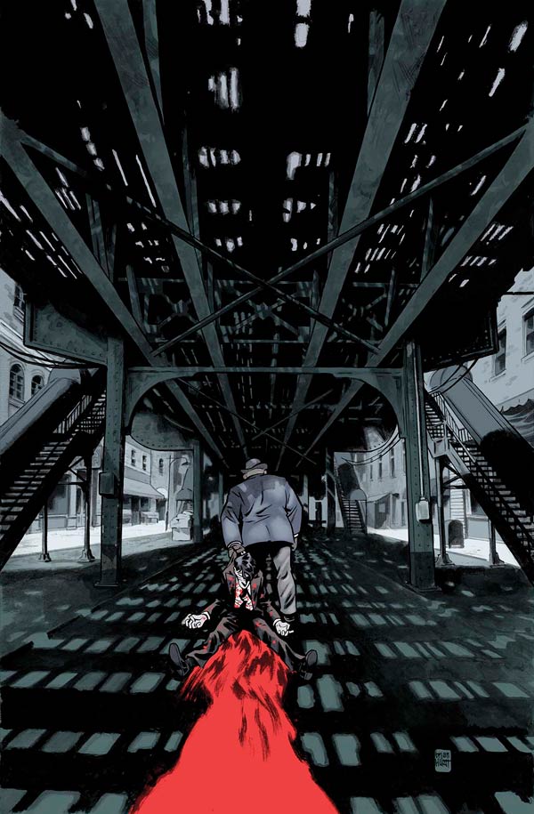
I like that this new character debuts with his back to the reader, which retains the mystery. It’s a cover that raises questions. After all, we know how dangerous Eddie’s corpse is, so it’s immediately significant that this person is dragging Eddie around by the collar rather than touching any of his limbs. I imagine you put a great deal of thought into the questions your covers raise.
Brian: You’ve hit the nail on the head. A good cover is often a question or a mystery. That’s how I approach it at least. I hate to spoil story elements on a cover but at the same time, a cover should be representative of the story within. It should also entice a reader. So, it’s a balance trying to create a cover that is compelling, that doesn’t spoil the story, and that is representative of the story. By trying to accommodate all those guidelines, the end result should end up being a cover that presents an unresolved question. Even if the question or the mystery is, ‘What happens next?’
Once I had this image in my head it was just left to me to execute it. I knew that a core element of this image was going to be the elevated train the figures are under so I started pulling up all the images and reference I could find that would help me sell this. I ended up stumbling upon an old photo that was almost perfect in its composition. I then decided to do something that I rarely do—trace the photo.
For all of these covers I’ve been doing the initial drawing digitally and then printing it up full size and tracing the original drawing on a light box. In this case, I was able to drop the old photo into the digital file and then manipulate it so that it was the scale and orientation that I needed. The elevated tracks themselves are pretty close to the original source material but I tweaked it here and there to make it my own as well as completely redrawing the background buildings and environment.
Once I had the rough pencils completed and light boxed it was on to the fun part! The inking stage of any piece is always the best. It’s all downhill from at that point and I’m just having fun pushing ink around the page. For this cover (as well as all previous Damned covers) I was using a #2 Round sable brush. It would have been either a Raphael or a Windsor & Newton. The ink I use is Sumi ink. After a bunch of experimentation over the years, Sumi turned out to be the one that most clicked with me. It is light on the brush and “fast” on the page without sacrificing the black of the ink. In my experience, most India inks are either a rich, beautiful black that is heavy and can tend to get ‘gunky’ on the brush, or they are versatile and light—allowing the brush to fly around the page—but tend to look more watered down and gray. For me, Sumi seem to split the difference. I don’t know that it is the most ideal for ink washes (ink watered down to varying degrees to get different tones) but it works for me. After I’ve inked in all the blacks I then go in and start building up the grays—the ink washes. This part takes HOURS. It’s a long process for me because I always tend to be apprehensive and I start too light with my tones—it ends up being layer on layer of ink wash as I build up the values to where I want them.
Continued belowBill, considering the cover you get from Brian isn’t just line art, but has graytone throughout and even a layer of blood splatter, what was your process once you got a hold of it?
Bill Crabtree: This cover is a good example of how an image that’s been solved for black and white has to be re-evaluated in order to succeed as a color composition. When Brian first gave me this image that arrow shaped area below Eddie wasn’t designated as blood. Or rather, he intended it to be blood, but I didn’t realize it. That is a crucial part of the composition, because it leads our eye right to the central point of focus. Given that that the area under the bridge would most likely be dimly lit, I was having a difficult time figuring out how to make that area pop. I tried making the area under the bridge one muted color range and the rest of the image a different one. It still wasn’t great, because to really separate those two areas I was having to push their color identities to the point where the cover was losing its grim mood. When Brian told me that the entire area below Eddie was blood everything fell into place.
The #7 cover’s an interesting one, as it almost reads like it’s black and white, even with the final colors. Can you talk about how you settled on the design for this one, and how you make a cover with so little color in it pop?

Brian: The one thing I knew going into this cover is that it would take place in the Purgatory-like realm from the book. This three-issue arc features quite a bit of that location so I knew it would feature on the cover to one of these issues. It made the most sense as the ‘middle’ cover allowing me to bookend the arc with covers that take place in the ‘real’ world and feature the new player in the series.
I had actually had a different ‘Purgatory’ cover in mind for this series, at first. There was a version that I’d been living with in my mind for the past year or two. But, when it came time to do the actual cover, I realized that it didn’t work. It was based on an event that doesn’t take place until the next issue so I ended up having to, regretfully, scrap it.
The good news was that the image I ended up going with came to me pretty quickly. I already knew the ‘where’ of the cover as well as the ‘who,’ I just had to figure out the… ‘what,’ I guess? As with many covers, there was a lot that I didn’t want to show the reader. That actually helped here as it narrowed the subject of the cover considerably.
It was when I started sketching it out that I also realized that I wanted the main figures to be the same scale on all three covers (approximately).
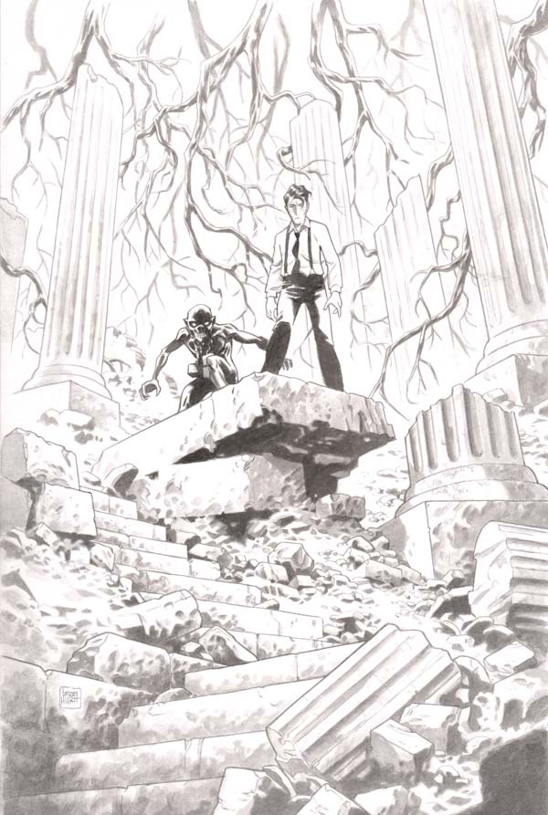
My approach to inking this cover is different than any I’d done before in that I wanted to do the whole cover in only ink wash. I thought it would lend itself to the mist-shrouded, ethereal landscape of Purgatory. I also had this notion of the center of the image being the darkest—and drawing the eye—as the grays got lighter and less distinct as they moved away from the center. After doing a couple passes on the piece I realized that I just didn’t have a broad enough range of value and I ended up making the center of the image—the figures and the rock they stand on—much closer to black.
The end result is one of my favorite covers that Bill and I have done.

Bill: I believe I may have pushed the central area of the composition all the way to black. I know I did something to increase the contrast. This cover was an interesting one for me in that the requirements of the image forced me to do something that I’m extremely uncomfortable with as a colorist: “drawing” over top of the artist. It’s my feeling that the colorist’s job is to play a supporting role to the artist and that the integrity of the original line art must be preserved. The white areas of the image are yours to do with what you will, but you don’t mess with the artist’s lines. The most I’ll normally do is turn some of the black lines into color holds, or do a gradient within an area to sell an explosion or torchlight, etc.
Continued belowAs I worked on this image I realized that to really convey a sense of a mist shrouded world I was going to have to partially obscure some of Brian’s art. I tentatively began adding fog and as I went I was pleasantly surprised to be able to sense where it ought to go. I decided to add the faintest suggesting of an icy blue overlay for the image, just to give it a little more specificity and keep it from being strictly black and white.

Brian, we’ve got some of your roughs for the #8 cover here. Could you talk us through them?
Brian: For these pencils I am working digitally using Clip Studio Paint. This explains all the magentas, pinks, and light blues. I love working in magentas, pinks, and light blues. The different colors indicate different layers that I’m working on in the file. This makes it easier for editing the image—moving things around, resizing, etc.

This first image is what I would call my layouts. It’s a hot mess. Layouts always are and always should be. There is no need to be precious in this stage.
The second image is what I call my ‘rough’ pencils. Here, I am starting to refine the image—adjusting scale and proportions, starting to define the faces and other details. Some artists are comfortable going straight to inks from here but I am not one. Experience has taught me that if I haven’t figured it out in pencils then I will absolutely screw it up in inks.
The last image here is my final pencils (or, in the particular case of these “Damned” covers, my ‘first’ final pencils. I still need to print it up and light box the image). This stage is all about nailing down the image as tightly as I can in the pencil stage as I rarely tweak the image in the ink phase. The inks are all about pushing the lines thicker and thinner to bring weight and clarity to the drawing.


This is the one “Damned” cover that I approached differently in the inks phase. I was traveling when this cover was due and was without my inks and brushes. Without those on hand, I went back to inking the way I did on “The Sixth Gun.” I used Zebra Disposable Brush Pens as well as both Micron and PITT pens for all the line work. When it came to adding tones I decided to take this opportunity to experiment with using Copic markers. I’ve seen other artist use them to great effect and I’d been wanting to give it a shot myself. Though I am fairly happy with the final result (given that it was my first time trying them in this fashion) I still feel the organic feel of ink wash lends itself better to this book.
Bill, you went much bigger with colors on this cover. All the others so far have been comparatively subdued.
Bill: That was really just based on Brian’s color notes and the subject matter of the image. The background was smoke and flames, so everything else is is a response to that. This is one of those compositions that is designed to have the figures read as a group silhouette against the background. I definitely thought about Frank Frazetta as I worked on it. I added a shadow overlay gradient at the bottom of the mound of figures in order to push the eye toward the main characters.

The “Prodigal Sons” arc begins in “The Damned” #6, coming out December 13, 2017. Final order cut off is November 20.
Written by Cullen Bunn
Illustrated by Brian Hurtt
Colored by Bill Crabtree
Lettered by Crank!Eddie has the unfortunate gift of never staying dead. It has come in handy as Eddie walks a tight line between different Prohibition-era mob families, between the demonic and the human, and between our world and the dark afterlife. Yet after years of playing every side in this world of crime and violence, there are those that a re determined that Eddie finally stays dead this time around.


