What else is someone suppose to do after editing the Eisner Award-winning monthly digital magazine PanelXPanel? How about also become one of the most unique and respected letterers in modern comics? Sounds like a lot for someone to do but that is exactly what creator Hassan Otsmane-Elhaou has done very early in his comic career.
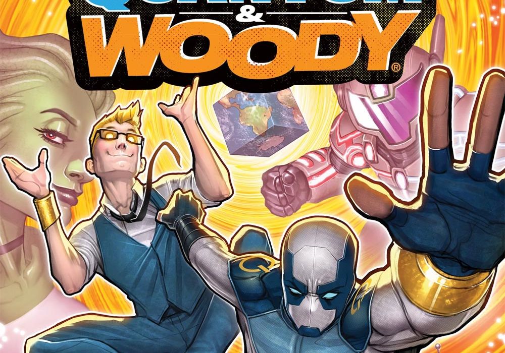
One does not have to look any further than Hassan’s recent work on the Valiant series “Quantum & Woody” for examples of his stand out lettering. With writing from Christopher Hastings and art from Ryan Browne, Hassan and the team relaunched the series “Quantum & Woody” about “the worst superhero duo in the world.”
To learn more about Hassan’s work on “Quantum and Woody” and his approach to lettering we were lucky enough to speak to the man himself. Below you will find our interview with Hassan discussing what makes up good lettering, how it can be used effectively in comics, his approach on Quantum and Woody and more. A huge thanks to Hassan for taking the time to talk and answer our questions. If you want to see Hassan’s amazing work for your self the first trade of “Quantum and Woody” is available in shops and online November 4th!
One anecdote I have heard a lot when it comes to lettering is you only notice bad lettering. The idea being good lettering is not noticed by way of becoming part of the art and servicing the story without disrupting readers. I am sure it’s more nuanced an idea than that but for the sake of this already long question, I will go with that. It is hard to argue against that idea and I don’t think it is inherently downplaying lettering but it does seem like there is lettering that goes above and beyond to elevate stories and can and should be something a reader can pick up on and appreciate. To you how do you personally recognize or distinguish “good” lettering?
Hassan Otsmane-Elhaou: What I say for this is that really the baseline of what lettering should be is to be readable. So that’s like, balloons in the right order to create a flow, a font/approach that’s legible, and tails that allow you to see who is speaking. If you can hit those, your comic will be readable in the simplest sense. What I think elevates lettering to the next level is when it becomes additive to the story. I think this is essentially the same for all the roles working on comics, too, and you can arguably take that same idea of anything should be invisible — until you want someone to notice it. Good comic book art should probably be invisible because if someone stops to notice how well-rendered a panel is, they’re out of the story. Unless what you need them to notice is for story reasons, right? You want things to be additive, to add something to the story when they can.
I think when we hear this idea that good lettering is invisible, I don’t necessarily outright disagree, but I don’t think it’s the out and out rule. It should be invisible when it needs to be, and it should be visible when it needs to be. It feels like the phrase stops too soon, for me, which is where it can sometimes feel like it’s downplaying lettering. It seems to get treated often as something outside of the craft side of making comics, more of a technical skill that is almost analogue, in that sense of either it’s bad or it’s working in its invisible way, but it feels a lot more nuanced than that (though, of course, I would say that as a letterer ).
But anyway, talking of adding the story via lettering, this can be things like the balloon style and the font choice, which can become graphic decisions that have an impact on the reader. I shared an image on Twitter a while back of different approaches to one line of dialogue in a balloon, with different sizes, different balloon styles, all that, and it was interesting to see the responses of what each balloon did for people. But all these choices mean a reader takes it in different ways, reactions, and interacts with it differently, and you have a direct impact. As I say, colours, fonts, sizes, balloon styles– all these are graphic choices that have an impact on story
Continued belowI’m trying to round this off in a succinct way, so I guess to say how I recognise good lettering is when I feel like the lettering is working to add to the impact of the story, rather than to just try and not get in the way.
To build off the question, I think there is a fear of also doing too much and there being a fine line between elevated lettering and it becoming something that takes away from the story. Where do you feel that line maybe and how do you work within that in your work?
HO-E: Honestly I’m sure I go too far in many cases, hahaha! I think my internal motto is I’d rather reach for something and maybe land a little far and have an editor pull me back than to just not reach at all. I remember chatting to an editor for another publisher and him saying the thing he liked about my work, for the right book, was how loud I can be, haha. I’m sure some people hate that, but I guess this is an extrapolation of the previous answer, and what I want to strive for. But this is the nice thing about editors, right? And Heather is of course one of the best in the biz, and she’ll tell me if something isn’t working, or if I can push something more.
There’s a wider comics theory point there, too, which is that I think comics naturally are encased in a high level of artifice. This is really exciting to me, because it means that even in “realistic” stories, you can work everything at a higher level than you can do in something like film or television. Grounded for comics is probably very heightened for film, right? So you can pitch what you’re doing higher and it can still feel “real” within the confines of the comic. You present these images in the comic, and the fact it requires the reader to actually breathe life into them means that the comic is deeply tied to the reader. If they like it, and they buy in, they are bringing the comic to life, and so they’re naturally invested. That is gold for storytellers, because the range of what you can pull off is sooooo huge. I was reading some of the Morrison/Quitely “Batman & Robin” stuff the other day, and there are all these wonderful sound effects that Quitely draws into the art, made out of the shapes of the things that the SFX represent. Like there’s a BANG that is written in the blood of a character getting shot, right? Ridiculous. Insane. Doesn’t make any sense if you stop to think about it, and yet– because I’ve bought it, it makes absolute sense in that world. Comics are so unique for this.
In case this is not a topic you mentioned in the previous answers but it is something I see in your work a lot that I wanted to ask about. I know it’s in “Quantum and Woody” and almost all your other lettering work but it’s the use of lettering to help push and maintain the eye lines of readers. I know it is something you have covered a lot in Strip Panel Naked with page and panel work guiding the readers and I think lettering is something that helps aid in that. Is that something you take into account when lettering especially with the placement of bubbles or boxes?
HO-E: Yeah this is the flow I mentioned earlier. You need the balloons to be readable, in the right order, but you’re also using the balloons basically as arrows to push the reader around the page. If you look at comics artists and their pages without the balloons on them, you will probably be able to read them pretty cleanly. The order should make sense, often artists build a flow themselves into the page to guide direction. Lettering, however, is probably the most important part of guiding the eye on the page. There have been eye tracking studies (sorry to be boring here) that show that actually most readers go from balloon to balloon, and they “read” the image afterwards. So actually, if you follow those studies, you realise lettering placement has the opportunity to really punish a reader if it’s done badly. I try to create a flow through the page then because of that, try and allow each balloon to really lead nicely into the next, panel to panel. Sometimes the art will really dictate where the balloons go, and it can force your hand as a letterer, but I do try and make a nice flow through a page.
Continued below[I have a good image for this I’ll attach]

I am never sure where the general reader’s understanding of the lettering process is at. Is there an understanding of how much does the letterer actually creates or what falls into the lettering category? With your work, especially “Quantum and Woody” if you are looking at a page, what on it is something you as the letterer are creating and adding to the page? For speech bubbles are you drawing them? Are sound effects something you add? Are you sometimes creating fonts?
HO-E: I may have covered this in the previous answers, but essentially it’s drawing the balloons, choosing the fonts, laying out the text, and likely doing the sound effects. For the most part in “Quantum & Woody,” Ryan Browne did most of his own SFX, but I snuck a couple in there. Within each of those are a myriad of decisions and approaches, though, of course. Choosing the font, there are a million different ways to do balloons, the balloon stroke style, the balloon styles, how rough or hand drawn, how clean and digital… there are many different ways to make lettering look unique to each project.
What are the tools of the trade for you when it comes to your job? What are you using to letter? Is there a routine you have as well to help you either music, podcasts, looking at other work, etc to help you when you are working on a project?
HO-E: Most professional comic book lettering is done in Adobe Illustrator, which is vector software. I also use Photoshop a lot of the time to draw my sound effects, which I do via an iPad Pro and the Apple Pencil thing. I “watch” a lot of TV in the background, or listen to a lot of radio. There’s a radio station in the UK called Smooth, which basically plays like the same 20 songs from the 70s and 80s. I don’t tend to listen to a tonne of podcasts, because I tune out and then my brain switches back to it and I realise I’ve missed the past half an hour of what they’ve been talking about. So it’s exclusively TV I don’t really need to pay attention to, or some old music. At the moment there’s been a lot of Frank Sinatra, actually.
On the boring side, I tend to run a really busy schedule between lettering, PanelxPanel, Strip Panel Naked and other bits and pieces. So I try to be pretty organised. I don’t have anything too fancy for that, but between the basic Mac Calendar and Notes app, I use both to keep everything running somewhat efficiently.
I have always been impressed in the way you bring a style and tone to the lettering to match the style/tone that titles you are working on are trying to establish. With “Quantum and Woody” the more playful and wackiness you brought or the type settings in a book like “Undone by Blood.” What is your process for feeling out the tone of a book and matching it?
HO-E: Yeah a lot of this is the art, I think. You mentioned “Undone by Blood,” which is very much a reaction to the premise and the script, though, where we had the story but also a novel-within-the-comic, and I wanted the artifice of that to be present on the page. So predominantly its an art thing– I look at the artists’ line and try and figure out a look that would make it appear as though the letterer had lettered it themselves. If I can pull that off, I feel pretty good. But on top of that there are also story and genre concerns. If you look at something like “Quantum & Woody” for example, you just have to look at Ryan’s art to know you got to go big and wacky. I think it would be a detriment and a disservice to his work on that comic to not try and match what he’s doing and build on it, right? It also wouldn’t look like it was part of his art if I didn’t do that, it’d look like the balloons were just sort of slapped onto the page. It needs to feel as one.
Continued belowI think this comes back to the artifice point, too, in a broader way. There’s so much we’re asking the reader to kind of go along with, even down to the fact that we’re looking at these drawings and imagining a reality from them. I think if we put too many things in the way, you’re allowing less space for other artifice. Like if the balloons don’t feel as one, you’re creating unnecessary tension in the page and the art that causes conflict for the reader in a way that can be a distraction from the story. I’ve been really lucky in that I’ve been able to work with such a range of cool artists, and I think doing that has pushed me to go in all these different directions stylistically.
I’m aware I maybe didn’t answer this question directly, so specifically I’m looking at the line quality of the artist and the general style, and what things they choose to exaggerate. I want the line quality to be similar to their inking style, and then I lean on genre and overall style to dictate things like fonts.
What did you find for “Quantum and Woody” what was your approach and did it evolve from issue to issue as the story itself progressed?
HO-E: Yeah so as above, really leaning into what Ryan was doing was the big thing. The loudness of the whole thing, how fun I wanted everything to be, that was all just reacting off of Ryan. The way it evolved was really just by pushing it each time, and responding to what Chris was doing in each issue, which had their own self-contained stories. So it’s just trying to come up with fun approaches each issue, but still maintaining the overall “Quantum & Woody” look we established.
With a book like “Quantum and Woody” that relies heavily on humor which is often achieved through pacing and timing is there a lot of back and forth with you as a team to make sure all parts are coming together?
HO-E: Honestly not a tonne, but this is true in many cases in comics, with the deadlines we work to. I’d say this is part of the skill of putting together a creative team that meshes, so if it worked for readers, you’ve likely got Heather Antos to thank for a lot of that! We’re all responding to different parts of the process, but comics are incredibly additive. The artist builds off of the script, the colorist builds off of the script and the line art, the letterer builds off of the script, the line art and the colours. So if everyone is working on the same level, we’re all engaging with the work on the page in each layer as it comes.
As someone who has a really great understanding of the medium and the process behind it, who do you feel are some of the letters in comics who either changed or are changing the way lettering is done in comics?
HO-E: There’s a lot of hand letterers that you can cite, like Tom Orz, Annie Parkhouse, Todd Klein, John Workman, Costanza… What you saw when people were hand lettering was a lot more freedom in terms of creative decisions that would come more naturally in the hand. I think the transition to digital lettering essentially re-made the job, and it really did turn it into something quite different. What is great is to look at what made a lot of those hand-lettered comics work, and try to bring that into the digital world, which was maybe missing a little bit when digital lettering first started to become ubiquitous. Now, with digital lettering, I think people like my Letters & Lines co-host Aditya Bidikar, Nate Piekos from Blambot, Tom Mauer, and Becca Carey are making interesting decisions in their work that always make me want to check out what they’ve been working on.
I have to imagine a lot of people know you from your Strip Panel Naked work or maybe that little Eisner Award-winning PanelxPanel magazine you run. With the amazing quality of work you do with comic journalism and analysis, how did you get into lettering work? With the success of PanelxPanel why is lettering something you continue to remain passionate about?
Continued belowHO-E: I got into lettering before starting PanelxPanel actually, because I tried it after putting a comic pitch I wrote together (that went nowhere). It was one of those moments, like when you hear The Beatles for the first time, and everything just clicks into place. I fell in love with it almost immediately. It’s hard to describe why, honestly, I think for my brain it just becomes an incredibly satisfying process. I really like the collaborative aspect of comics, and if you’ve seen PanelxPanel it’s probably apparent that I also love designing things, so it probably feels like a natural combination. But yeah, lettering just clicked for me. I absolutely adore it.
A question I know writers and artists get asked a lot is how does someone get into the profession. If there is someone who is passionate about the idea of lettering or for comics in general, what is advice you would give someone who wants to become a letterer?
HO-E: I’m not sure how useful my answer is, because it’s quite specific to me, as someone who had built something of an audience through talking about comics before I managed much success as a letterer. But on the lettering side, I just practised a lot, tried to reverse engineer the things I really enjoyed in other letterers’ work, and searched to find as much work as I could. I applied for as many lettering jobs as I could, did as much practise in my spare time as possible, and tried to share it as wide as I could. I got incredibly lucky in that someone gave me a break on my first publisher comic (as in, non-indie, I guess you’d call it), and then another creator also recommended me for something. So I guess keep working, make connections, and really just hope for that lucky break. I never like excluding how important luck genuinely is in much of this, which is not really a good bit of advice, but if you get the body of work behind you, I think you probably increase the chances of that luck.
In more practical terms, I think Jim Campbell’s lettering blog is a really great place to learn the basics of lettering, and then from there, just analyse what you’ve found interesting in other people’s work, and just practise, practise, practise.


