Lettering is a piece of the comics industry that gets overlooked quite a bit. Beyond just the lettering that we see on the page, there is an entire world behind that page, which involves balloon placement, font choices, and other decisions that are discussed and labored over before we ever see a single letter on the page.
John Roshell has been creating lettering fonts for Comicraft for over 25 years, and has just launched Swell Type, a new company where he will continue to create new fonts for uses in comics and elsewhere. We got to chat with John about lettering, the new company, and his first font under this new label, Hyperspace Race.
After the interview, read the full press release announcing Swell Type to the world.
A few years ago, we did a Lettering Week, and it remains one of my favorite things we’ve done at Multiversity, as it shone a light on a very important, yet frequently ignored part of comics. So, to begin, can you walk us through the lettering process? How involved are the letterers in picking their own fonts? Is there a lot of editorial discussion of the lettering, or is it somewhat the ‘final touch’ on a page?
John Roshell: The letterer gets the script and artwork from the editor or creator, and it’s our to interpret the words visually, and integrate them with the artwork in a way that makes for an enjoyable reading experience.
Font choice (or creation) is a part of the process. Every book is different — sometimes the writer, artist or editor will have a specific preference, sometimes they might describe a general feel they want to have, and sometimes it’s totally up to the letterer.
If it’s up to me, I think about which fonts fit the art and story — either style or genre, or simply the pen lines looking like they could have been drawn by the artist. That was our goal with the handwriting fonts Comicraft made in the late ‘90s and early 2000s, such as Jim Lee, J. Scott Campbell and Joe Mad — we wanted fonts that would resemble how the artist might have lettered it themselves….except more readable!
You’ve been making comic fonts for nearly 30 years. What goes into your process for making a new font? Is it often times sparked from a project needing something specific, or does the inspiration strike out of the blue, and then is applied to a project when the right one comes along?
JR: It’s about 50/50 specific need vs. “I have an idea and want to see it exist.” Wherever I go, I am constantly taking pictures of signs and lettering — much to my family’s annoyance — and sketching ideas. I love the process of taking just a few letters — whether it’s a sign I saw or a logo I designed — and figuring out how to construct the rest of the alphabet. Sometimes a single letter will inspire an entire font!
If you’d asked me 20 years ago, I would have expected to have run out of ideas by now, but I still have so many fonts I want to make, I will probably never get around to them all.
After so many years at Comicraft, what made you want to strike out on your own with Swell Type?
JR: Time was the main reason for my pulling away from the Comicraft lettering and design work. As much as I enjoyed those projects and the people I got to work with, client jobs always took priority over my making a font that might not pay for itself for several years. But I turn 50 this year, and realized if I was ever going to take the plunge and give myself fully to what I enjoy doing most, I’d better hurry up!
And I think I’m at a good point in my career, where I have a lot of knowledge and experience, and have the energy and enthusiasm to launch a business and get the work done. I’m really excited right now about all the possibilities ahead.
Continued belowIn the press release for your new company, Swell Type, it mentions that you will be documenting the process of new font creation on social media. For those of us that are ignorant to the process, what typically is the first place you start with a new font?
JR: I have folders full of reference ideas, and shelves full of books, and sketchbooks full of ideas for a few letters or even whole alphabets. Reference-wise, I try to pull from places I don’t think that other type designers are looking. For a long time Comicraft had the “old comic book” realm to ourselves, and there’s still corners of it that we want to explore. Richard’s been drawing some really need sound effect alphabets while looking at the Marvel monster comics of the ‘70s that will hopefully get released this year.
I will often look for a common link between two or three different pieces of inspiration, to try to arrive at someplace new. When I get to the point where a font is feeling like “me”, and not like something anyone else would have made, then I’m on the right track. Then the challenge is extending the logic through the rest of the characters, and trying to make them all interact well together. Font making is both art and a puzzle, and I love it.
Who are some of, in your opinion, the best letterers working today? How did our staff do in our Year in Review this past year?
JR: I have to admit I hardly read comics if I’m not working on them, so I’m not up on who’s lettering unless we’ve corresponded about fonts. I’m familiar with the three you chose, and they all do quality work (and are great to interact with). Matt Krotzer and Taylor Esposito are two other younger letterers who are doing it right. I’m starting to work with Sara Linsley on a project for the Comicbookfonts website, and she’s doing really thoughtful work on the very different process of manga translation.
If you could de-mystify or clarify one bit about lettering for our readers, what would it be?
JR: There’s just one rule — tell the story. That should guide your every decision. Most of the time staying off the figures and important objects — basically being invisible — communicates the story best. But if a huge word or a huge sound effect will tell what’s happening better, then be bold, cover that art!
Good lettering weaves a spell in the reader’s brain — once they are into the story, you want to keep them there. You don’t want them stopping to decide which balloon they’re supposed to read next, or wondering what’s hidden behind a balloon, or trying to figure out if a letter is an “h” or a “b”. If that happens, the logical brain kicks in and the spell is broken.
A good letterer is sensitive to the story, creative and careful not to make mistakes.
Finally, tell us a little about your latest font, Hyperspace Race.
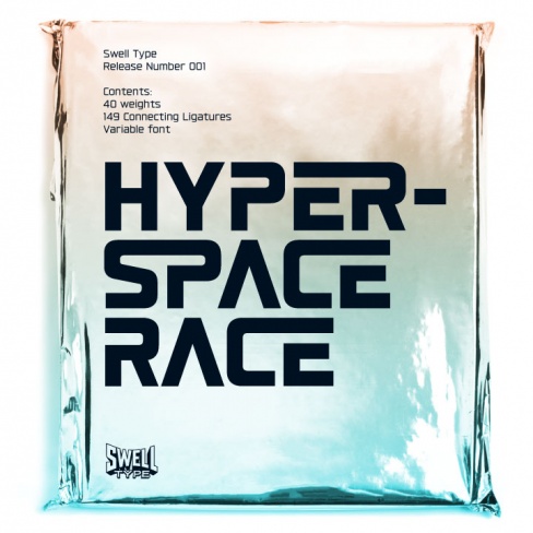
JR: There’s a lot of Comicraft fonts that I’ve long wanted to expand into larger families. In this case, I took the regular weight of Space Race and began stretching it wide, then narrowing it as tall and skinny as I could get it, and then making each as bold as they could go. I was digging the results, especially noticing how certain weights resembled fonts I’d grown up loving like Eurostile and Univers (even before I knew what fonts were!)
Since everywhere along the way from narrow to wide and light to bold felt like a potentially useful font, it ended up with 40 weights, plus a variable font so that you can choose any point on the spectrum you like. If you haven’t tried a variable font before, check out this site — pretty nifty!
When I was nearly finished, I decided it needed one more feature. Since this was the font that would launch Swell Type, it needed something really sexy that would hook people who didn’t care about weights and variable features. So I sliced pieces out from letters like B, P and R and joined other letter pairs, and suddenly it got all Star Wars/Blade Runner/Star Trek the Next Generation. I made this an option you can turn on and off, and called it “Warp Speed Mode”.
Continued belowYeah, I’m out of control. I just love making fonts.
COMICRAFT’S FONT DESIGNER LAUNCHES NEW FOUNDRY
Swell Type Pays Tribute to Graphic Language of Golden State
SANTA BARBARA, CA. – You’ve seen his typefaces in comic books worldwide, on grocery store shelves, in Pixar movies and on billboards from coast to coast. After 27 years of designing for the award-winning Comicraft studio, John Roshell — creator of the iconic Angry Birds, Black Panther and Daredevil logos — is now launching a type foundry that pays creative homage to the Golden State’s iconic visual styles.
Roshell’s new Swell Type foundry builds on decades of design experience as the creator of fonts for Spider-Man comic books, the Clash of Clans video game and James Cameron’s upcoming Avatar sequels. It takes inspiration from the artist’s home state, presenting fun, friendly, functional fonts inspired by everything from California’s Gold Rush and fruit-crate labels to its surf and skateboard culture, Silicon Valley, aerospace industry and entertainment biz.
Swell Type begins with the same lively energy and accessibility for which Comicraft’s fonts are known and loved, but offers designers more complex and versatile font families with more weights and features in a wider variety of styles. The first release is HYPERSPACE RACE, a sleek 40-weight font family with elements of 1980s arcade games, new-wave album covers and sci-fi movie posters (and it’s the font you’re reading now!) The HYPERSPACE RACE collection ranges from extra skinny and condensed to ultra-wide and heavy with a variable font that lets you select any possible point between — and includes a Blade Runner-meets-Star Wars alternate mode you have to see to believe.
“Since the early ’90s, I’ve enjoyed an immensely creative working relationship with John, and I’m looking forward to his next wave of releases through Swell Type with eager anticipation, and to continuing our work building the Comicraft font library together,” says Comicraft’s President and First Tiger, Richard Starkings. “Everyone who has worked with John in the field of comics the last 27 years knows his commitment to quality and originality. As he steps out of our niche industry and into the mainstream, I hope that the world of typography at large is ready for him!”
Swell Type will introduce new fonts quarterly. All year long, fans can watch Roshell work through the process of bringing a font to life on Instagram and Twitter, from researching and sketching to finessing the final harmonious curves of each alphabet. SwellType.com also reveals the creative stories behind the custom fonts he has designed for video games, movie merchandise and comic-book artists alike.
Roshell will continue to add to Comicraft’s font collection, supervising new releases and updates to the studio’s library of nearly 300 classic font families, and managing the library’s distribution on Comicbookfonts.com, Myfonts, Monotype, Fontspring, Adobe Fonts & Creative Market.


