
Last month, DC released “The Green Lantern” #1, the start of a new ongoing series by the superstar team of Grant Morrison (“Final Crisis,” “The Invisibles”) and Liam Sharp (“Wonder Woman,” “Wonder Woman and Batman: The Brave and the Bold”). It was a stunning debut that showed a really fresh take on the Green Lantern Corps, a property that, by many accounts, had started to feel a little stagnant as of late. Morrison and Sharp created an issue that felt expansive, fun and, more than anything else, like the first chapter in a wonderful, long story.
We were thrilled to have Liam Sharp talk with us about the book. We spoke about his process, working with Grant Morrison, and a certain character that you’re going to absolutely love in issue #2, which hits stores on Wednesday. Thanks to DC for making this chat happen!

So, one of the things that has been so remarkable about the first two issues of “The Green Lantern” is how I feel like, its instantly recognizable as your art, but it is totally different than what we’ve seen you do at DC over the last couple of years. So, I guess my first question is, when you’re approaching a new project like this, are you looking for a way to do something brand new or does the script just speak to you in a way where that happens naturally?
Liam Sharp: I think it was literally the case of it being science fiction rather than fantasy. The stuff I was doing with “Wonder Woman” and “The Brave and the Bold” was very organic and I guess it was as much about landscapes, and natural forms like rocks and trees, and Celtic designs and magic, things like that. And even down to the castles they were very… sort of craggy and organic. This is a very different feel, as you say. I still think there’s an organic element to it, but there’s also, you know, you’re dealing with things that are made of metal and space ships and alien technology and just that all by itself, takes you in a different direction. But, then there’s also the aspect of aliens as opposed to ogres, and that lends itself to a different kind of aesthetic as well. But, so much of what was on the page was in the script, so I tried not to cut any corners.
Yeah, I wanted to ask about the script. I had the pleasure of speaking to Yanick Paquette at New York Comic Con. And I asked him, yeah know, “What does a Grant Morrison script look like?” And he said, “Well, if I understand correctly, everyone’s scripts look different. He really tailors the script to the artist he’s working with.” So when you got these scripts, what did it look like for you? Was it insanely detailed, or was it very loose?
LS: I think, because we’ve been talking for a couple of years, two or three years, about doing something together. And I think because he’d been aware of the work I’d been doing, particularly on “The Brave and the Bold,” I’d been sort of sending himself and showing him the pages as I was progressing, he instantly had a sense that I could handle detail. So, he didn’t pull any punches on that front. So, for instance, panel two, which actually isn’t even that big panel from the first issue, panel two, page two is something like four pages long in the script. It was just… it was crazy. But he’s very chit chatty in his scripts as well. So, he’ll digress about influences and childhood experiences and what he’s thinking about and why he’s thinking about it.
It is very detailed, but it’s also quite open. He does leave me room to explore. He’s like, here’s your basic five panels for this page, four to five panels, but if you can think of a better way, just go for it. Often, I just stick with what he’s done, but it’s nice that I have that trust, and he just pretty much leaves me to it, to be honest.
Continued belowIt certainly shows the trust in the script and in the art, because there are such ambitions ideas here. And, every panel seems to have new creatures, new landscapes, all these incredible things, and unless there’s trust between the creators, that can feel very stifling. But, this work really breathes. Wen you were looking at this script, are you first thinking about, “Hmm, what sort of world am I going to inhabit this scenery?” Then what? The backgrounds first? The characters come first? How do you go about constructing the page based on what you read?
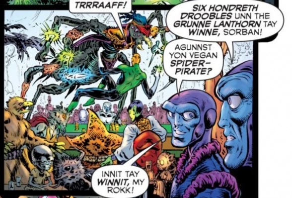
LS: Each issue so far has had a very different feel. The first one was obviously an introduction, so we have an introduction of deep space with that and the whole casino planet. And then we’ve got hell on Earth, and that’s its very much kind of rogue movie. We were keen to land that. And then of course he goes to Oa, and the whole thing begins in earnest. This, the second issue, we get more of the police procedural. So, its like, okay, the interrogation. Setting up the environment for that. What its like there and that crazy long shot of him. The city and the tiny figures and then he gets a little bit closer to them as he enters the building and then, big close up as he enters the interrogation room.
That kind of stuff is a lot of fun! But, it also meant that that second issue is quite formal in terms of the layout. The issue that I’m just wrapping up now, issue 5. Is a… It’s a much more gothic affair. So we kind of really played with, extremely organic kind of layouts you haven’t really seen since the 70s I guess. Classic “Vamperella” type. Layouts. Very rounded and curved and different. And that is then gonna follow the issue after that. Which is gonna hearken back to 60s almost. And 50s type stuff. So, the issues tend to suggest, how am I going to approach it?
And also, I think the tone too. Because, some of them are funnier than others. Especially in the first two, the characterization of Evil Star is hilarious, I thought.
Yeah. I just finished reading issue 2 and there’s was a lot of really funny Evil Star stuff in there.
LS: Yeah! And he goes there and it just humorous logic to it. But it still, we ended up liking him! That’s to display the fact, that he’s incredibly nasty. We’re having a lot of fun with that stuff. Issue 4, is a much more, sort of, serious, quite dark issue. So, all of those things, just play into the way that I approach each issue.
Yeah. It’s funny that you mentioned, sort of, an issue that you’re working on now being, sort of that more, classic 70s layout. I was talking with a few folks, who read the first issue. And they said, there’s something really, that reminds them of, sort of, late 80s early 90s Vertigo, in the way you laid out the first issue. And I thought that was a pretty astute observation. So, when you were laying out that first issue, was that a touchstone for you? Or was that just a happy coincidence?
LS: I think a lot of British artists, come from a sort of, Mid-Atlantic tradition, in a way. So, we’ve been influenced by, European comics and also they are, sort of, Native comics, like 2000 A.D. But, also heavily influenced by American comics. And, Grant made the point that it seemed like… it seemed like the European comics, 2000 A.D., and mainstream American [comics] had all got together, had a threesome, and this was their strange offspring.
Haha, that’s an image.
LS: It’s completely ridiculous. But, I get exactly what you’re saying. My influences, so much, come from all of those areas. And, in that sense, working with Grant was great because it afforded me an opportunity to really, dove into, the passions I have for all of those different kinds of material. If all of those aspects are coming across, then that’s great. That’s what I would hope for. So, in terms of the layouts, I think, once I saw in print, I definitely got that 80s vibe, late 80s vibe. I sort of intentionally stayed away from the look and feel of the books from the 90s and 2000s and everything too. Because, there’s just no way you can follow on from someone as good as Ivan Reis. He’s just so amazing that you can’t even begin to play in that arena unless you’re going to embrace the full on, super heroic aspect of it. And I think we’ve just wanted to take a swerve away from that, and try something very different. Otherwise, what was the point, in a way, yeah know? That’s been done, and done, and done, and so well, by Geoff [Johns] and Ivan and the other people who’ve been on those books.
Continued belowBetween our 60+ staffers and people on Twitter and in our comments, I get to talk to a lot of people about comics. And, after the first issue, and I heard a few people say, “I couldn’t believe that Liam Sharp could do such incredible cosmic work.”
For a lot of our readers, they may feel you took a good chunk of time off from doing regular, monthly, super hero comics, even though you were working consistently. So, I think a lot of folks are just getting to know you in the last couple years. Even though you have this, very, very rich past in comics. And, I think they’re surprised at the breadth of your work, and that’s a great compliment to you. If you’ve only read “Wonder Woman” or “The Brave and the Bold,” you have this very specific idea about what your style is like. I think its so cool to see people exposed to this cosmic side of your work But, once I opened the book myself, I thought, “Oh of course. This just feels so perfectly like what you’ve been doing. But just in a different location”
With “The Brave and the Bold,” I would look at those pages and I’d think “I can’t wait to one day see this without the dialogue balloons” because there was just so much detail. I want like an oversized, just plain, raw art version of that. I want to see every little bit of detail. And when I opened up “The Green Lantern,” I had the same feeling. But, its such different detail. Its such a different beast.
LS: Right.
And I wanted to particularly talk about, in issue two, the character of Volk. Which is a volcano head on a human body Green Lantern. There is so much amazing, detail, in every panel you draw of him. And, its different, and its this, like, evolving creature. So, when you are approaching a character like that, is your first instincts that you want to flesh it out as completely as possible? Make it this detailed, unique, thing. Or, are you concerned about just conveying the simple physics of the guy? I know he’s been not a new character, so there is obviously reference available for it, but I guess I’m asking, when you are presented with a Green Lantern with a volcano for a head… where does that start in your head? And when do you say, okay, that guys done?
LS: Right. I think that he was interesting, cuz, if there’s one character that I probably did go back to “The Brave and The Bold” approach on, it was him. So, I was using the same kind of textures and I felt as though his head was in the mountains, as a piece of landscape. So, I just approached it as that, really. Like, he’s just a walking mountain. We had fun with him. Its like, okay, so which bit of him is alive? We basically came to the conclusion, he’s a magma being. You know? And the alive bit is the magma. And, the rest of its kind of a construct to keep him in place and he uses concentration to make the cloud of smoke above his head. You’ll see a face in it if you look hard in some of them. Ya know? And that was almost accidental. Its funny, the first cloud I drew in, my wife said, “Oh I love his face” I hadn’t seen it. It was totally unintentional. Then I saw it, and was like “okay! This has to be a thing”
I was talking to Grant about it, and he was just laughing his head off. He’s got these really wide apart eyes and that funny, little, long mouth and… So, soon as we saw that it was like yeah we love that. It became sort of… once you see it, you can’t un-see it. And then its kind of fun to look for it. Its not in every one. But when you see it, its got kind of a charm to it. I know that Jessica Chen, our editor, she always loved it when he turned up. He just gave her glee. She kind of squeed every time I sent a new page with him on it. We had a lot of fun with that.
Continued belowIts funny you say about, not being in the mainstream, superhero world. It was never my desire. These books are very hard to get onto. Ya know? There’s a huge map of competition and I guess somewhere in the 90s, sort of fell of the radar it terms of editors. You end up taking whatever jobs you can. Its not to say I wasn’t glad to have them, and I wasn’t putting my heart and soul into it. But it was never a sort of plan to move away from the main stream. But I think, sometimes, ya know, when you end up doing that, working on letting go type books. You are taken in a creative direction that you don’t expect. And that can actually push you as a creator.
Absolutely!
LS: So, coming back to this after all that time. New things like, “Gears of War,” if anything, that book has elements of “The Brave and The Bold” and “Green Lantern,” because it was Sci-fi, but it was still on the very kind of, rugged, landscape. I think, that was my… that was 10 years ago now. Which is crazy! But, if there’s a line at all from my early, sort of mainstream stuff to what I’m doing now, the “Gears of War” work, that was probably the sort of, middle point.
So, I want to talk about your process for a moment. So, when you get a script, typically, how long do you work on each page? I know that this is an answer that varies based on the page. But, just generally, what does your page take you?
LS: I actually shoot for a page a day. Obviously I don’t always achieve that. The cityscape for instance, that one took about 4 1/2 days, all in.
Wow!
LS: I just kept going back to it. I wanted it to be as epic as I could make it. I just wasn’t satisfied. So I kept going back and tinkering and tinkering until, it just, adding more and more detail. Then it got really kind of, a little bit, too industrial. And I wanted it to have some life, ya know? And to twinkle and to have lights. City of a million lights. So, then I added all the lights right at the end and that really kind of finished it off. So its not just this cold, sort of hostile place. Its got a bit of heart to it to.
Are you working with pen and ink? Are you working digitally?
LS: Mostly I’m traditional pen and ink brushing. I use Pentel brush pen, for the most part. Then, some fine lined stuff for, sort of, little details. But, there are areas where I’ll sort of import the art that I’ve drawn and then tinker with it in digital. I think, particularly with technology, you might as well take advantage of the tools because they’ll give you this, sort of sharp edges, and a sense of construction that you don’t always get from sort of, organic drawing. So, I’m playing around a bit. As we get on and there’s more cosmic stuff, certainly an issue for more of this cosmic stuff. I brought in a little bit more Photoshop into that one. I think it’ll be obvious, where, generally when you see, planets or anything that requires a little bit of distance. And I didn’t want just solid blacks with hard lines. I’ve turned into create sort of, gray scale art in Photoshop. Which, Steve [Oliff]’s just done an amazing job coloring . He’s just brought it to life. I’m so pleased with what he’s doing as well. Its amazing!
Between Steve and Tom [Orzechowski, letterer], working with you, its simply the most gorgeous book on the stands today. Hands down.
LS: hank you! Well, its a real veteran team. I just turned 50 and I’m the kid of new kid. But, working with those guys, is like, its just a trip really. Its amazing!
I don’t want a spoiler, but, tell us whether its a construct or a character, or a setting… what’s one of your favorite things you’ve drawn, in an upcoming issue, that we should looking out for?
Continued belowLS: There’s a four armed character coming up in issue 4. We all really, really fell for. We just thought he was great. I’m very keen to see what reaction is to him… I don’t want to give anymore away. But he took us awhile to come to the conclusion how to deal with a character. But he’s just really cool! And, unexpected I think. There are so many things in every issue, there’s more than one character that we slightly fall for. I think, like in issue 2, obviously there’s Volk. But, I really liked the nurse towards the end.
Yes! I loved the old fashioned uniform.
LS: Yeah! Well that was fun too! W had this concept, there would be certain things that would be universal, no matter what planet you’re on. Lets say, hospitals always going to have a red cross on the side of it. Because, wherever you are, there’s got to be a universal symbol or something if you find yourself injured or… need to know where to go. So, that’s kind of a neat idea. And also, I like the way that she’s kind of, sort of, feminine around how the idea that, Hal just attracts interest from everyone.
We were at New York Comic Con this year and we asked every creator we talked to, this question. But this questions is tailor made for you right now. Which is, if you had a Green Lateran Ring, what would be your go to construct? How has the boxing glove, what would be your go to thing you would make with your ring?
LS: Ah man… That’s really tough. What would it be? That is really… actually, really tough. I think a pair of wings.
A pair of wings? I like that.A lot of artists said a pencil. Because that’ll do the work for them.
LS: Well, you’d still have to do the thinking though.
Yeah, but your hand would be much more relaxed I presume.
LS: There’s that. But, no. I like the idea of being able to fly. Mind you, that ring would give you that anyway. So, Maybe that’s not… maybe a pair of wings is not self defeating slightly.
No! The wings are classy!
LS: Yeah. They’d look good though, wouldn’t they?


