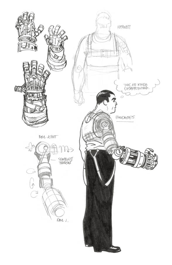

One thing I love about Mike Mignola’s books is the massive sketchbook sections they have. I return to them frequently, I simply cannot get enough. Today a new book is out, Lobster Johnson: Get the Lobster! and, as always, the sketchbook section is excellent. But, like I said, I simply can’t get enough, and I present to you Mignoalversity’s expanded sketchbook, featuring material not collected in the trade. And to walk us through it, I’m talking to Tonci Zonjic, the artist behind the series.
I hope you enjoy it. (I know I did.)
When you were first approached about working in the Mignolaverse, you were offered a two-issue Abe Sapien story, I believe. However, when Lobster Johnson: The Burning Hand came along, you opted for that instead. What was it about the Lobster and his world that attracted and challenged you?
Tonci Zonjic: Yes, first I was offered the two-issue Abe Sapien story (that was later drawn by James Harren), and a few weeks later they asked if I’d rather do a five-issue Lobster book, so I said, “Of course!” Both sounded good to me. I wasn’t particularly picky at that point, really, and all the characters are interesting. Lobster Johnson being set in 1930s New York was very appealing, though.
The series certainly suits you. You’re frequently referred to as “THE Lobster Johnson artist” in Hellmail.
TZ:That’s an extremely flattering title, but I will happily put it on my business cards.
Get the Lobster! is your third story, so you’ve been working in this world for a while now. What’s your process with John Arcudi like when a new story kicks off?
TZ: Well, on the previous book, Get the Lobster!, we talked a bit about what I’d like in there, without getting into any specific plot stuff. Just the tone, the speed of story. Then, a couple months later John apologetically sent me a script that had nothing to do with it. It was literally the exact opposite. And it was definitely the right choice ― much more interesting and much more fun! I’m not sure how he manages to up the stakes and the level of mayhem. For the next book I remember getting a three-word note about what’s in it and I laughed like the madman on the streetcar. And again, when the first script arrived, it was still surprising and more fun than I expected.
I usually also get a handful of photo reference from John, and we may talk a bit about particular things as they pop up ― on the new book we had a bit more back-and-forth because certain things needed to be specifically designed to fit the plot. (It’s hard to talk about this without spoiling it.)
Other times I’ll just send him e-mails about Kenjiro Ishiyama’s lumpy bald head or Albert Dorne’s eyebrows, and those will find their way into the book.

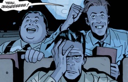
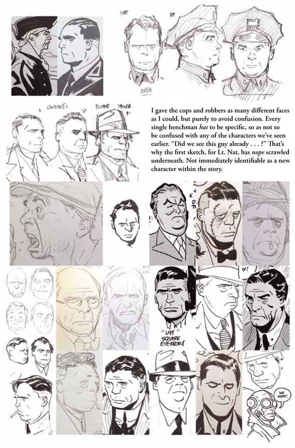
Ah yes, Albert Dorne’s eyebrows. You mentioned these in the sketchbook section of Get the Lobster! while talking about creating a visually distinct supporting cast. This is something I see as a real strength of yours, especially in Caput Mortuum. Those two guys in the cinema at the beginning (and the exasperated guy sitting in front them) are so fully realised in their design.
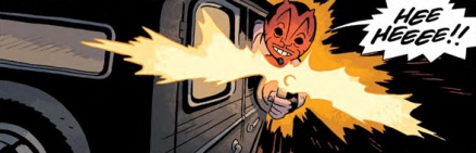
And you pick facial elements that make good profiles. In the first issue of Get the Lobster! you introduced the Dr. Waxmax and the two Cossaro brothers right on the first page. Each one was so physically distinct that later in the same issue, when they were in silhouette, they were still distinguishable from each other and recognisable as the same characters from earlier.
TZ: Some of that is in the scripts ― Waxman was described as very thin and tall, one of the Cossaros was very fat, and the other one had a missing arm. Those are the easier ones, since you get the immediate difference in the shape and size of the figure. The rest of the characters are much more towards the middle, more average-looking. I try to keep it pretty naturalistic, so that eliminates certain exaggerations (although if we can get Jose Munoz to draw something in that universe, it’d look great.)
Continued belowFaces are another part where I have to make sure enough variety happens in the big shapes, since they have to work with my rather simple inks, but again, trying to keep it within certain naturalistic parameters. I could get away with a Pruneface-like character once, if all the other characters look pretty normal. I don’t want too many crazy-looking characters. Too much of it just becomes… too much. It just makes you read it in a much different way.
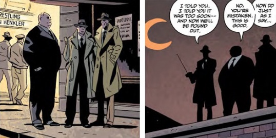
Yeah, it’s just as important to have certain characters blend into the background, especially when you’re dealing with crowds of people. The features become an accent that makes them stand out. Like Mr. Isog in The Burning Hand. While the police were talking to Cindy at first crime scene, all the people in the background blend into each other, except for Isog, who is shorter and dressed in white. He’s different enough to draw the eye.

TZ: That’s John again ― maybe I should stop this interview before it’s revealed that it’s really John behind all the interesting stuff.
But that’s why it’s so great to work from his scripts ― he has a really good sense for the visual, and even if a character is described in a few words, all those words count. Isog is a big (pun not intended) character so he was pretty well defined right from the get go. In that scene, extra credit also goes to Dave Stewart for not making a person in white stand out too much. (Him being next to the whiteness of the balloon helps as well.)
Yeah, never underestimate Dave Stewart.
TZ: In the script I’m working on right now, there’s a scene with two guys, referred to as “Mook 1” and “Mook 2”. That’s already plenty to work from. And it makes me laugh (which is important when you look at the script for weeks on end). The only description beyond that is that Mook 1 is “a prick”, and the other one’s “a nice guy.” I start there and try to be interesting about it ― they are bit players, so not too interesting, but still…

While I draw, accidents will happen that are impossible to predict, so now Mook 1 has a “lumpy face” just because my hand wobbled while I was laying the page out. And the other one is kind of tall, but has the wrong face for a tall person, or a nice guy, really. Sometimes very interesting characters come out from rough thumbnail drawings. “Maybe triangle for a face would work!” or “one eye way off ― that’s something I could use somewhere.”
I like that the language of the era seeps its way into even the parts of the script the final comic readers will never see. It’s interesting how characters come out of mistakes too. I’m guessing as a younger man Mook 1 overestimated himself and ended up tied to a chair getting his face beaten up.
TZ: Hopefully, it influences the final result. Actually, it definitely does, because it affects how I draw it. (Take that, Mamet!)
It’s great to see that you already came up with the story for Mook 1, based on nothing but a lumpy chin. This is the best part. I mess up because a cat jumped at my elbow, guy gets a weird chin, I decide to keep it, and it turns into a whole story. More things happen in comics this way than people are really aware of. You do something on accident, or put in something in the background, and later it becomes important. Even if it isn’t huge, it can make a difference. In The Burning Hand, I’d put in an airplane in Lobster’s hideout, and later John used it to set up the big scene with The Black Flame.
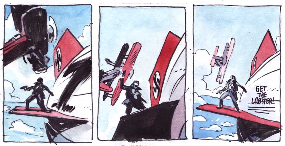
OK, so obviously you can’t show us any of the stuff you’re working on right now, but it’d be great to get a look at how you break down a sequence from one of your prior stories. On Twitter you were showing a few glimpses from your layouts of the chase sequence at the beginning of the fifth issue of Get the Lobster! and I must admit I’d love to see more.
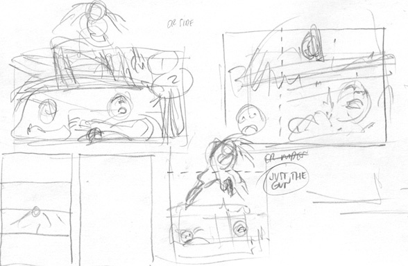
Continued belowTZ: It’s the perfect sequence, since it’s the one I spent the most time figuring out. I remember during our move from Croatia I had to cram a few loose sheets of thumbnails of the Lobster jumping together with our boarding passes. Inevitably, I lost those thumbnails in the meantime, but there’s a bunch more. So. Here’s the layouts for pages two and three:

I do these as spreads always, so that the beginning of planning the chase scene starts with the last panel on page two, with Waxman running off. A silent, stable panel. Then the Lobster comes in, a reverse shot, guns blazing, literally. Two panels have similar proportions too, which is not an accident either.

These pages were pretty straightforward, and they don’t differ much from the thumbnails I did in the margins of the script.

For a very short time I considered adding an extra panel of Waxman landing, but decided not to. Something about having just the three panels appealed to me, and it helped slow things down before all hell broke loose on the next page.

So the Lobster prepares to jump at the end of page three ― and then I lose my mind trying to figure out how exactly he jumps. Here’s the final layouts:

Because of the move I mentioned, there was several weeks between the Lobster preparing to jump and jumping, and I used a lot of that time to try things out for this two-panel sequence. The rest of page four is easy ― all the other panels are there on the script margins. But that first one, not so much.

There’s a bunch of papers in my closets with thumbnails for this jump. Just trying every single option I could think of. To be clear, I don’t do this all the time, on every scene. But this one was just one of those sequences that took that much. (At least it was an action scene — sometimes it can be a very dumb, invisible scene, and you spend a lot of time trying to seat people in the panels in the right order, or some such thing that nobody notices except fellow lunatics.)
Isn’t that often the case? You put so much effort into certain elements just to make them invisible to the reader.
TZ: The reader really shouldn’t be thinking about how hard it was to do, yeah. You want it to look good and interesting, but ultimately, the important thing is for it to move. If anyone wants to study it afterwards, that’s something else.
Eventually I moved the sketching into Photoshop because it enabled me to try out even more options. Hooray. Here’s a somewhat chronological exploration:

For each of these, there’s probably five more of slightly bigger, smaller, rotated, wider, flatter, more dynamic, less dynamic, simpler, more complex. And throughout, I imagine the page turn in my head – he’s about to jump — flip the page — he’s in the air — but how, exactly? It’s kind of an equivalent of animators flipping those sheets back and forth, checking the transition. You do that a million times.
As always, when I finally figured it out, the only thought I had was, “Why didn’t I just do that right away?” So it goes. In any case, that was it for page four, and it was on to page five, which promised the same kind of trouble.
The Cossaros’ car, now without anyone at the wheel, goes out of control, and hits one of the parked cars, basically. I will spare you the thumbnails for that bit, where I try to figure out the geography and the parking situation. It definitely didn’t get as bad as the previous page, because I was exhausted, and decided to use the strong side of comics, which is total disregard for geography.
Continued below
When you read this, you don’t generally think about it. The Cossaro’s car swerves towards the parked cars in the foreground, and then we see a reverse shot of the crash. BANG! Lobster jumps off, and the other Cossaro flies out through the windshield.
The thing is, he would fly straight into a wall. Because cars are usually parked in front of buildings.
I tried figuring this out in the thumbnails, exploring parking cars on corners and such, but there was simply no space to set that up anywhere in the past four or five panels… so I just didn’t include the background, and you don’t think about it at all (I hope). And there’s a big sound effect in the background to distract you as well. I get to appear very stylish while solving this.
Sometimes you kill yourself trying to set up accurate geography, which is really difficult in comics, and other times you use this to your advantage. You have to love comics.

Yes, I remember for The Burning Hand you meticulously laid out the Lobster’s lair for Cindy’s tour in issue two, and then again for the Arnie Wald’s attack in issue four.
TZ: Well, as I wrote a bit in the sketchbook section back then, I didn’t really set it up in issue two so in issue four I had to go back and reverse engineer how the warehouse looks exactly. For the most part, it matched up. Though even in issue two, where I hadn’t drawn a map of it, I had to come up with the basic layout, since I knew the direction they’d be moving in. Precise geography is hard to do without making panels into diagrams, or making them too wide or too high up, and losing the character’s faces. It’s always a push and pull between these factors. Sometimes you lose the space because you have to see the facial expressions.
I imagine working out your action sequences has an extra level of difficulty because in Lobster Johnson the lead is not the point of view character. The story unfolds from the viewpoint of the crooks or the Lobster’s crew or Cindy or the cops or even just a regular Joe in the street. His action sequences aren’t so much about his experience of them, so much as they are about what it’s like to watch him in action. So when the Lobster makes that car to car jump on page four, it’s not about fear, it’s about being grand and cinematic.
TZ: I wouldn’t say it makes it more difficult, but it does make me more aware of the viewpoint we’re seeing the action from, yeah. That’s a really good observation. Just the other day I was drawing a shot where we see the Lobster for the first time in the book and he’s not big in the frame ― he’s on a rooftop and we see him from the street. The impulse is to make these shots big and splashy, but what do you get from that? There is no information there if I just make it a big panel of the Lobster. We know how he looks. It just takes up space. So moving him further away adds the space, the setting, the viewpoint of someone else in the scene, the relationship, while keeping the same amount of information about the Lobster (“he’s here”).
In Lobster books we almost always go that way. There’s a lot gained by seeing it from a bit of distance, instead of everything being a closeup. It makes it more cinematic too, as you point out.
And we don’t really see almost anything in life in closeups. I wouldn’t make that into a rule or anything, but in some sequences it helps the feeling of being there. Or, that’s the idea.
(Also, with a character like the Lobster, we don’t really ever get into his head, so it makes sense we don’t see him up close too much. And when we do, it’s weird a bit. Who is that guy? What is he thinking? In every book there’s a few panels of him just looking at something, and those are always closeups.)
Continued belowThose panels always seem to emphasise the alien quality of the character, especially when half of his face is covered by goggles.

In Get the Lobster! there’s a sequence in issue 2 when the Lobster visits Cindy at her office and there’s another shot in there like that. It’s just the two of them again, so it has that more intimate feeling to it. I found it emphasised how little Cindy knows about the Lobster as a person. In the reverse panels on her, you can see how flustered she is. It was a nice touch that her hair had come out and fallen over her face a bit. She’s normally so together, but not it that sequence.

TZ: I wish I’d remembered to connect the two scenes. It’s exactly the kind of stuff I latch on to. But yeah, the changing dynamic is often presented through space. I organized the right hand page much more than usual, to give it a specific rhythm, the pauses and the small beats of looking at the gun. That second panel is probably one of my favorites in the whole book.
And that was my favourite page in the whole book. It’s another one of those sequences that demonstrates the point of view in Lobster Johnson stories. Readers are made to empathise with Cindy, not the armed man crouching in the window, his face hidden in shadow. Not to mention the panels on the Lobster are rotated to one side, so the reader can feel Cindy doesn’t know where she stands with him. Her point of view shots are off-balance.
TZ: Very happy to hear that! Yeah, we see even less of the Lobster’s face here, he’s completely monolithic and impenetrable. For a moment there’s a real threat there.
I’ll be very interested to see where you take these two in your next miniseries. Perhaps we’ll see part three of this series of moments between the two of them.
TZ: So far they haven’t really crossed paths, but when they do, I’ll definitely have to connect it with the two scenes we discussed earlier.

TZ: There’s a trap I see in interviews where, depending on who’s being interviewed, having lots of black is presented as more difficult, or not having any spotted blacks is presented as more difficult (“you can’t hide stuff in the shadows” and so on) ― the truth is, they each present their own set of problems. I just tend to think with shadows more than lines, so I often plan the panels around those relations of big shapes. I love how it looks when it works, and obviously this kind of book is perfect for it. For the daylight scenes, I try to go lighter and leave out the heavy blacks, since I know Dave will add the shadows, and hopefully the approach strikes some kind of balance, where it’s less about shadows and more about light.
Also, before you go, I love your covers. There’s a bunch of thumbnails in the trade of Lobster Johnson: Satan Smells a Rat that I return to frequently. You came up with so many wildly different ideas, and then when you settle on something, you explore so many variations. It’s fascinating to see them come together.
TZ: Thanks, Mark. Covers are tough. It’s always impossible to tell if a cover is interesting, and most times when I send them off I think “this is the one they send back because it’s boring.” I’d like to think this gets better, but Mike seems to have the same kind of worry still, according to his sketchbook sections, so I guess that’s just how it works with covers.
Continued belowWhen I was doing the thumbnails in Satan Smells a Rat, we didn’t know what most of the stories would be, so the sketches are all somewhat general, focusing on light and design. That sounds like it’d be a good thing, having free reign, kind of, but it actually makes it harder. Any bit of information usually results in more interesting covers – location, props, even tone of the story, it gives you something to play with. Any foothold’s good.
In the the trade for Get the Lobster! you were given the space to talk about them in a little more detail… except for the cover for the fifth issue. I thought I’d give you the opportunity to do so here.
TZ: I knew right away that I wanted that one to be in the daylight, even though by then I knew the action in the issue would be happening at night. I thought it made it more dramatic, because the Lobster seems so much out of place in bright sunlight ― he seems to be in trouble! No place to hide. And since all the covers are usually pretty dark, it’s always a challenge to make them bright or colorful.
Unfortunately we have run out of time. It’s been awesome talking to you, Tonci.
TZ: Thank you ― it was great to talk to you. We have to do this again for the next one. Some crazy stuff in there…
As I said earlier, Lobster Johnson: Get the Lobster! is now available in trade paperback. Pick it up, and definitely check out the sketchbook section. There really is some fantastic stuff, as you can see from the preview below…