
Channeling more technicolor glitter than the 1980’s or Prince’s wettest dream, “The Wicked + The Divine,” has turned up the comic world to a mythic ride of brash wit and bold story-telling. Gillen, McKelvie, and Matt Wilson, cleverly weave a world where gods are reincarnated every 90 years as pop-stars in a cycle called the Recurrence. “The Wicked + The Divine” succeeds in how like and unlike our world it is.
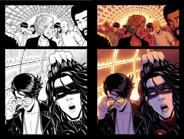
It’s no surprise that artist McKelvie and writer Gillen are succeeding in their newest creation. The two strike a supreme balance between their sparse dialogue and cinematic, character-driven panels. The writing and artwork only gets better with Matt Wilson’s attune delivery of colors, though, as he fittingly finds the proper mood per panel. Whether Wilson’s adding pink flames to highlight the glory and intoxication of an exploding building or filling an underground subway with the electric green shadows of a murder of crows, Wilson delivers the glitz and glam of the show while still grounding it in a stark, realistic scene. In a book like this where the mythos is only important as how it relates to the real world and isn’t forthcoming so much as a strip-tease, Wilson provides the balance between the fantastical and the mundane.
As “The Wicked + The Divine”‘s first arc comes to a close today, it felt a good time as any to talk about how the coloring of this world works as a short follow-up/addenudm to James Johnston’s Team #WicDiv interview from earlier today. In order to explore how exactly you color courtrooms, jails cells, rock concerts and South London to be fit for the gods, I sat down with Matt Wilson at NYCC ’14 to talk more about coloring and talking about coloring in comics, because if us reviewers are hell-bent on unveiling the magic of “The Wicked + The Divine”, certainly there are better ways we can talk about the coloring.
What are some personal pet peeves when it come to hearing reviewers discuss coloring? Are there any particular topics within coloring that you wish were covered more within reviews?
Matt Wilson: As far as words go that don’t really work… The words they use work, but the vocabulary is a bit limited which is understandable. It is, especially if you’re just getting in to understanding it. There’s a lot to learn, and even colorists use terms differently.
I think the only thing along those lines that is kind of like a pet peeve is when they are describing the artist’s work and they use words to describe coloring but they don’t talk about the colors or the colorist. So they’ll say, “Oh McKelvie’s work is so colorful,” but they won’t talk about the colors in the panels and what they’re doing, or the colorist, and I don’t think they even notice it all the time.
What are some helpful ways to gain that language of composition for reviewers?
MW: I would assume just Wikipedia-ing color theory, and that would probably do wonders. I haven’t looked at it on Wikipedia [Laughs] but I’m sure that would do wonders.
You can break colors down into a lot, but the three simplest things would be: hue, value, saturation. And once you understand what those do and how those work you don’t have to use those words in your reviews, but knowing how they work will help you understand color in your review and why things are working. Like, “Oh things are lighter or darker,” which would be value, but there’s also color temperature so that has to do with a hue like blue or red. All of those choices do something to a panel and it’s worth discovering what those things are to truly understand how their combinations work together, or not, for that matter.
I feel like anyone interested in color theory in comics should just read on color theory, not just think about color theory in comics. In art school I took a color theory class and learned in color theory class how to do what I do now. All of those books are still useful to me. Really, just take a book out from your bookstore (or Amazon to not sound like an old man) and take some time to read a little about it, and it will open you up to more ways to see color.
Continued below
“The Wicked + The Divine” has such a balance between dark and playful writing. It’s funny and bleak, so how do you go about deciding how to color a panel when it’s meant to do these multiple things? Like, for example in issue #2 when Luci’s in jail and Laura is visiting her. Luci’s making cunnilingus jokes, looking like the fabulous Annie Lennox, but we are also watching a scene of desperation where no one is coming to get the Devil out of jail and even the Devil knows how little pull she has.
MW: I mean certainly there is a literal starting point, which is a jail cell. And so there are photo references and things you can look up to start you down a path. And you certainly don’t have to color it just like what it actually looks like. But there there’s a reason that you look at a jail and think, “Hmm, that’s kind of depressing.” It looks institutional. It has a certain repetitive feel, so I look at those pictures to get some ideas.
Then I read the script to see what is going in terms of story, and then I decide which is more important, to represent something literally or to represent something emotionally in color? Sometimes, they are the same. Sometimes they are at odds. That jail sequence in particular… There is not a lot of variation in the color, or in the background, so to me that makes it feel a bit claustrophobic. It gives me a feeling that Luci is trapped there.
And we find out in issue #4 that Luci wasn’t trapped in there, but that was the idea going in and the impression that we wanted to show. That vibrant god did all those vibrant explosions earlier is now trapped in this almost colorless box, y’knmow? Which is the opposite of their bright and colorful performances. So that’s a case where the mood and the literal intention kind of match up to what I wanted to do with color.
For those interested in what Luci will do now that she’s escaped her static, cold jail-cell, “The Wicked + The Divine” #5 comes out today, finishing the first arc of the supreme series. Will Amatersau actually speak to us? Will Laura make a difference? Will Baal break shit up? We will see.


