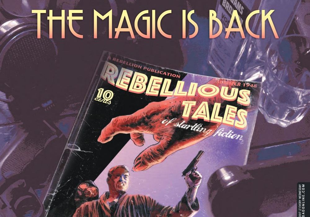

Welcome, Earthlets, to Multiver-City One, our “2000 AD” weekly review column! Every Wednesday we examine the latest offerings from Tharg and the droids over at Rebellion/2000 AD, the galaxy’s leading producers of Thrill-Power entertainment. Let’s get right to it!

NOW ARRIVING
Hope: . . . For The Future, Part 7
Credits: Guy Adams (script), Jimmy Broxton (art), Simon Bowland (letters)
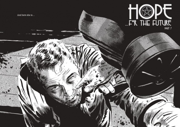
Greg Lincoln: Guy Adams’ “Hope…for the Future” was another 2000AD strip I’d never read before and for several reasons it’s one that grabbed me right away. First off I happen to like urban fantasy. Adams’ blending of weird occult magic with the recognizable tropes of hard-boiled ’40s Hollywood noir made it real easy to get a feel for the story. 2000AD’s editorial preface gave a great background precluding the urgent need to track down the rest. This chapter taken on its own had a lot of emotional hooks and art gave the world a lot of texture and life. Lastly, Guy Adams has also written a chapter that in a just five pages does tells a full, if short, story.
Guy Adams’ Mallory Hope is your typical lost it all, made a deal with darkness, hoping to get his family back type of Private Investigator. Adams’ and Broxton tell us in a few panels that his current case is going nowhere. He goes to himself in drink and runs into his current client Eileen Ritzi. She’s similarly in despair but because of her missing child and her, oh not so perfect or glamorous, Hollywood life. Both make a horrible and inevitable decision to take solace in each other. It’s a full if short story, it’s one you can feel and recognize and it’s oh, so noir. The complication of an occult presence and magic make the eventual fallout all the more foreboding.
Jimmy Broxton’s photorealistic black and white art fits the era so well giving that noir film feel to the story. He may only have light, shadow and texture to communicate the feeling of the scenes but he makes the best of all those tools. He uses visual tricks like tight camera angels, close-ups, panel repetitions and scenes cast in shadow to tell the tale, all fitting for iconic film genre. Broxton also does some neat things with patterns and texture on the page that play with perception or draw the eye. The page that explains Cade, the occult presence attached to Mallory, may be a static image but given a ghostly, eerie life through a background that distorts perception a bit and the ghostly occult writing overlaying the nun like figure. He also uses that texture trick to create what look like bruising to attract attention late in the script hinting at Eileen’s deeper story that isn’t spoken about but is obvious.
Simon Bowland plays some clever games too using two distinct font styles to create a more genre fitting narrative. The few conversations that take place look hand-lettered and are nearly inconsequential. Mallory’s story is told mainly in exposition using a lettering style that looks like an old typewriter. This exposition, to me, reads a lot like a noir voiceover track and plays really well given that convention of private eye genre. It may make reading “Hope” a bit like a novel with illustration but it’s one that works well the way it’s played.
NOW DEPARTING
Grey Area: Code Six Twenty-Four, Part 2
Credits: Dan Abnett (script), Mark Harrison (art), Annie Parkhouse (letters)

Rowan Grover: Chapter 2 addresses the problem of alien asylum seekers posed in the last comic with considerable gusto. The ETC squad try to have them accepted, or at least attended to, when their deadbeat commander Grell pushes them away saying he’s just ‘following orders’. It’s a brutal compromise that makes you feel astounded at the Earth’s actions yet Abnett cleverly lets the squad find a loophole in the Earth Law that allows them to get to the ship. Abnett ensures it’s a satisfying turn of events, yet it feels like a bit of a cheaply earned plot device.
Continued belowHarrison’s art is super shiny in an almost day-glo, nostalgic manner here. This is not unusual for his art, but moreso here, every scene seems to have glowing light source that warms up the whole scene with a radiance. It’s great for the denouement of the story, yet tonally it’s a bit disorienting when Grell is telling the aliens to bugger off. However, you can see that Harrison on a line by line scale is delivering some of his clearest, punchiest art. Grell is a highlight here, coming off as a mix of everyman and sneering manager every time he grins in Bulliet’s defeated face. And I can’t fail to mention everytime Harrison pens the refugee ship I’m floored by how beautiful and grand it looks.
“Grey Area” caps off its last (for now) prog by leaving a question of ethics in everyone’s minds. Mix that with Harrison’s big budget sci-fi visuals, and you have one of the most solid progs in recent history.
THIS WEEK IN 2000 AD
Judge Dredd: Ouroborous, Part 4
Credits: Michael Carroll (script), Paul Marshall (art), Chris Blythe (colors), Annie Parkhouse (letters)

Greg Matiasevich: It’s the end of the line for the Ghost Train this week, as Dredd and Vega chase down the dealers giving out lobotomies with their drugs. Will the cop and the criminal be able to work together long enough to bring these crooks to justice?
Carroll and company wrap things up a little too quickly this week, if you were enjoying ‘Ouroboros’ more for the plot destination than the character journey to get there. T’s were crossed and I’s were dotted, but the ending felt abrupt given the three strips of lead-in. That said, the more satisfying aspect of ‘Ouroboros’ for me was the reintroduction of Paradox Vega and the building of their odd couple relationship. Slow and methodical character building, brick by brick and story by story, is one of the strengths of “Judge Dredd”. Stories like ‘Ouroboros’ might feel more filler than killer at times, but they can ultimately serve both the short-term AND the long-term of the strip.
Speaking of long term, co-creator John Wagner returns next week to kick off a story looking at the continuing fallout of one of the biggest Dredd epics ever: 1982’s ‘The Apocalypse War’!
The Alienist: Inhuman Natures, Part 3
Credits: Gordon Rennie & Emma Beeby (script), Eoin Coveney (art), Ellie de Ville (letters)

Alice W. Castle: After last week’s pretty epic revelation of time travel tomfoolery being the cause of the central murder mystery of “The Alienist: Inhuman Natures,” this week takes a more subdued route to explore the effects that’s had on Reggie. As you can imagine, being catapulted through time and witnessing something as awesome and awful as a lorry running over someone has somewhat dampened Reggie’s mood.
Gordon Rennie and Emma Beeby’s writing continues to flirt the line between weird and wonderful with a chapter that follows Reggie as he drinks away his visions only to be confronted with another vision from beyond time. There’s something of an intentionally stilted tone to the writing that I enjoy that captures the arch dialogue and mannerisms of period storytelling and that, combined with Eoin Coveney’s intricate and moody artwork that relies on heavy shading and rich blackwork gives “The Alienist” a strange, uncanny vibe.
And all this leads to yet another reveal that could potentially turn the story on its head as we see that the figure hunting Reggie is none other than Miss Vespertine herself! Or is she?
Greysuit: Foul Play, Part 5
Credits: Pat Mills (script), John Higgins (art), Ellie de Ville (letters)
Ryan Perry: Pat Mills really makes an effort to step aside and shine a light on John Higgins here. He reels his story back and lets most of the installment focus in on the action. This leaves the reader open to possibly being a little disgruntled as the book opens, however, that doesn’t last long as connections to the last issue are quickly made. The main qualm I have with Mills’ writing here is his stylistic choice in how to define and detail the henchmen in the story. He uses word boxes that read like descriptions the henchmen have written about themselves. This doesn’t jive with everything else going on in the story or what’s being said in those very text bubbles. A highly trained assassin wouldn’t write you an eighth graders definition of a resume to tell you about their work. There is a cool little bit of character development at the end where it’s displayed and the reader is told that our main character is a character that holds grudges.
Continued belowHiggins’s art here is the star of the show as I’d said before, but I don’t know that the book is better for it. Higgins isn’t a dynamic enough artist to consistently portray action as the focus of his book. It looks odd. Scenes generally look posed and flat. Rarely does a character actually look like they’re making the motion that’s attempting to be displayed. His spacial relationships between characters also seem off. The depth of say a character swinging his fist doesn’t always align with the depth of the character he’s supposed to be hitting, therefore a lot of the panels look stilted and awkward. The color pallet here is what really saves the art. It’s filled with oranges and greens that give the art a vibrancy and livelihood, not portrayed by the actual linework.
That’s gonna do it for us this week! “2000 AD” Prog 2044 is on sale this week and available from:
- The 2000 AD Newsstand app for iPad and iPhone,
- The 2000 AD app for Android devices,
- 2000ADonline.com in print or DRM-free PDF and CBZ formats, and
- Finer comic shops everywhere
So as Tharg the Mighty himself would say, “Splundig vur thrigg!”


