
They say a picture’s worth a thousand words, but a comic cover might be worth even more. Hell, in today’s day and age, if it’s good enough, it’s worth $3.99. After all, at least in our minds, comic covers have three main goals:
1. They’re supposed to pitch the comic to potential readers
2. They’re supposed to represent the story within
3. They’re supposed to be excellent individual pieces of art
With an increased emphasis on design and more outside the box thinking, comic covers are in a better place than ever, and because of that, the competition was as fierce as we’ve ever seen it amongst our voters. Who made our list? Find out below, and please, share your favorites in the comments.
Note: All of Multiversity’s 2014 in Review awards are based off of all of the contributing writing team voting to decide each rank. Every list is combined with equal points for every voter, and the results are what you find below.
Looking for the rest of our 2014 in Review entries? Find them all here.

5. Declan Shalvey
Why he made the list (David Harper): Shalvey’s been one of my favorite cover artists in the past few years, to the point where I interviewed him just to talk about cover art for our column Artist Alley, but this was a power up year for him. He’s long been very good, but this year? He became truly great.
Whether it was his work on “Moon Knight” (which has one of the simplest yet most powerful cover designs in comics), his “Death of Wolverine: Captain America & Deadpool” cover or the above cover to “Savage Wolverine” #23, we saw an artist elevating his work to even greater levels with thoughtful composition, exceptional design, and incredibly effective storytelling.
That “Savage Wolverine” cover is one of my favorites of the year, as its such an understated yet potent image that displays so much knowledge and understanding of the character. It definitely helps having Jordie Bellaire colors on there of course, but as someone who has seen a lot of Shalvey’s linework, I can tell you this: his black-and-white work is similarly incredible. With “Injection” coming in 2015, I think we’re just reaching the tip of the iceberg of what the guy is capable of. Declan Shalvey in a creator-owned environment? Prepare to have your minds blown, people.

4. Fiona Staples
Why she made the list (Brandon Burpee): Fiona Staples’ cover art on Saga has been nothing short of, to use a synonym of the book’s title, epic in quality. Her covers pop among all others each and every month. In theory, a cover should draw the attention of a potential buyer and Staples appears to have this down to a science. Her use of one basic color scheme per cover works wonderfully to frame her art as well as draw said reader’s eyes to the book. It’s an excellent tactic that is both underused and underrated.
Staples covers not only work to attract new readers but also deftly speak to the ongoing audience of the book. Her covers give you insight into the contents of the book while also providing iconic shots of the cast. I mean who wouldn’t love to have a framed print of issue eighteen, featuring the breakout character of the decade, Lying Cat?! Covers of this quality don’t come around all the time. For those of us that consider ourselves cover connoisseurs, Staples’ Saga covers are to be treasured. For those that are new to comics these covers will be remembered fondly later in life as igniting a passion for the art form that are comics and more specifically comic covers.

3. Chris Samnee
Why he made the list (Greg Matiasevich): There are various schools of thought about how best to compose your cover image. You can go abstract or specific, collage or single image. None of these are more ‘right’ than the other; they can all work beautifully. And I can say that because Chris Samnee uses every single one of them with a skill that stupefies readers and (probably) enrages other artists. From his mountaintop postcard on “Elektra” #2 to his Eisner-esque “Shadow: Year One” #10 to his Kurt Wagner character study on “Nightcrawler” #1, Samnee is the goods. Look at that last one in particular: not only does Samnee give us a wonderfully rendered Nightcrawler in the foreground, but the X in the background keeps the collage manageable by breaking it into separate panels while also letting the reader know this is an “X” book without an X being in the title. Plus, having him teleport through each panel is both a nice reminder of his power and an illustration of how he can navigate through the various social strata of the X-universe unlike just about any other character. That’s a hell of a lead-in for the book, which is what a great cover should be.
Continued below
2. Jenny Frison
Why she made the list (Drew Bradley): I’m going to explain Frison’s place on this list with an anecdote.
Earlier this year, I had the opportunity to take a friend to a comic shop for the first time. He was previously aware of comics, and had read some from a grocery or somewhere when he was younger. After hearing me talk about them enough with some other readers, he decided to jump into the hobby. He was intimidated by the volume and nervous about where to start, so he asked me to come along as a guide. He had some ideas about what he wanted – Spider-man was at the top of his list – but I pointed out various books as we walked down the alphabetical row. Before we got to the R section, he had already spotted one of Jenny Frison’s “Revival” covers. He snatched it up and barely heard me tell him about it as he flipped through. Then he looked through the stack at some of her other covers. “I want to read this. It looks awesome.”
He bought a nice pile of books, but aside from a Spider-Man book, “Revival” was the only one he wanted before I tried to sell him on it. Don’t get me wrong, Seeley and Norton are great on that book. But Frison is the one who sold it that night.
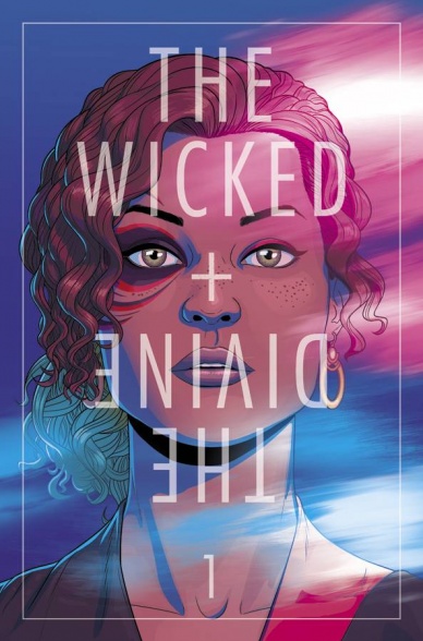
1. Jamie McKelvie
Why he made the list (Zachary Wilkerson): Jamie McKelvie did some fantastic cover work in 2014. He kicked the year off strong with the two part close out of “Young Avengers” and helped spark a revolution with his contributions to “Ms. Marvel.” However, we all know there’s one reason why McKelvie is the #1 cover artist of 2014. The Wicked + The Divine.
McKelvie’s covers on “The Wicked + The Divine” are nothing short of a comic book phenomenon. His simple but iconic portrait style covers made WicDiv one of the most strikingly gorgeous books on the stands, while also sparking an internet wildfire (to be fair, Matt Wilson’s colors are equally important, but that’s another article). Fans the world over have been inspired by these striking images, with homages and cosplay saturating social media. The sensation has even spread to other Image books, as several December titles will feature variant covers by McKelvie in the “Wicked+Divine” style. I myself wait with excitement for each month’s “The Wicked+The Divine” solicitation, not for the brief future plot tease, but to see what new magic McKelvie has wrought.
Let’s be honest; comic book covers are often overlooked. They are the first thing we see, but they are often the first thing we forget once we crack open an issue. Worse yet, we often place the value of a cover in its rarity, in its secondary value. The value of McKelvie’s covers stem from their quality, not their distribution ratios. For his part in elevating the comic book cover and for sparking a paradigm shift, Jamie McKelvie is the best cover artist of the year.


