

It’s that time of year! The Multiversity Year in Review is here, and from now until Thursday, December 22, we will be talking about favorites in a variety of categories. Let us know what we missed in the comments!
5. Mike del Mundo

(Brian Salvatore) If Mike del Mundo only did covers for “The Vision” this year, I still think he would deserve a spot on this list. His work for that series plays on the domestic tranquility that the Visions tried to pass off, but failed miserably at. His style is so different than Gabriel Hernandez Walta’s, that the covers truly became the forward facing facade, which allowed the interiors to be all the more devastating. Did any cover artist this year do anything that significant for the book he/she was on? I don’t think so.
Of course, that is discounting his other work, like his stunning “Star Wars: The Force Awakens” variant, his breathtaking “Carnage” covers, or his beautiful “Civil War II: The Fallen” cover. Taken together, del Mundo did some of the best work of his career while hardly touching an interior page. With him joining “Avengers” as the regular artist, I hope he still finds time to craft covers because, frankly, there are few better.
4. Dave Johnson

(Greg Matiasevich) Dave Johnson being named one of the best cover artists of 2016 should surprise absolutely no one, as “Reverend Dave” has earned six Eisner nominations since 2001, and winning one of them in 2002. Since he essentially gave up interior work back at the turn of the century, Johnson has honed his cover craft to effortless excellence. Or seeming effortless excellence, because combining this level of concept, layout, color choice, and execution every single time he puts pencil to paper just does not happen without effort. A lot of effort. It’s easy to focus just on his linework; that thicker, slightly chunkier line that still feels lively. It’s easy to focus on his facility with broad humor and tense drama in his images. But the topic that first came to mind when I got this assignment was his colors. Not that Johnson favors a particular palette the way that Franchesco Francavilla does, but his color choices always help (and never hurt) his covers.
You’d think that would be a given, but there are so many covers racked next to Johnson’s work that have elements working at cross purposes. Part of this has to boil down to more than one creator working on a cover (in this case, a separate artist and colorist) and their efforts working at cross-purposes. A cover with busy linework, for instance, really needs a sensitive colorist to separate elements and give the reader’s eye somewhere to land. Someone like Jordie Bellaire or Dave Stewart would know how to “light” the “stage” that the penciller has set. But Johnson’s cover game, like the rest of the artists listed here, is strong enough that Colorist Johnson can adjust his coloring to compliment whatever choices Line-Artist Johnson feels a particular cover needs.
Case in point: Johnson has been providing variant covers for “The Flash” since Rebirth. The Flash has been portrayed as giving off an increasingly elaborate web of lightning as he runs. This web, like Superman’s cape, is used to help convey movement is this static medium. It can, however, automatically make a simple layout incredibly busy. Lesser artists would keep the rest of the coloring business as usual and just slather the lightning on top. The Reverend, on “The Flash” number 8 for example, not only keeps the lightning for overpowering the composition, he shades it white instead of Flash yellow AND darkens the background & Barry’s costume to make it pop even more. It looks like a simple cover, and it might in fact be a simple cover, but so many other covers trip up over the simplest ideas that seeing one executed this well is a treat. And Johnson just gets better from there.
Continued below2016 was another great year from Reverend Dave. If every cover artist listed and took notes from his sermons, just think of how great 2017 could be.
3. Becky Cloonan

(Vince Ostrowski) Becky Cloonan has been rocking comic book covers for a while now, but in my mind, she ascended to a new level in 2016. Of course, she does solid work at DC with covers for “Gotham Academy” and “Shade the Changing Girl”, showing her typically keen eye for design that celebrates the tone and personality of the books. But it was the “Southern Cross” and “Punisher” variant covers that really caught my eye this year. Her work on “Southern Cross” uses stark close-ups of characters in perilous or mysterious situations, calling you you to open the pages of the book and find out what’s going on. The “Punisher” variant covers alone tell a story about who the person at the center of the image is.
And while this isn’t comics, have you seen the Castlevania print she did? It ended up as the cover to Mondo’s vinyl release of the Castlevania soundtrack, so it fits the bill as far as cover work is concerned and it’s an absolute wonder of gothic fantasy chic. It’s one of the best singular compositions from a comic artist this year.
2. Declan Shalvey
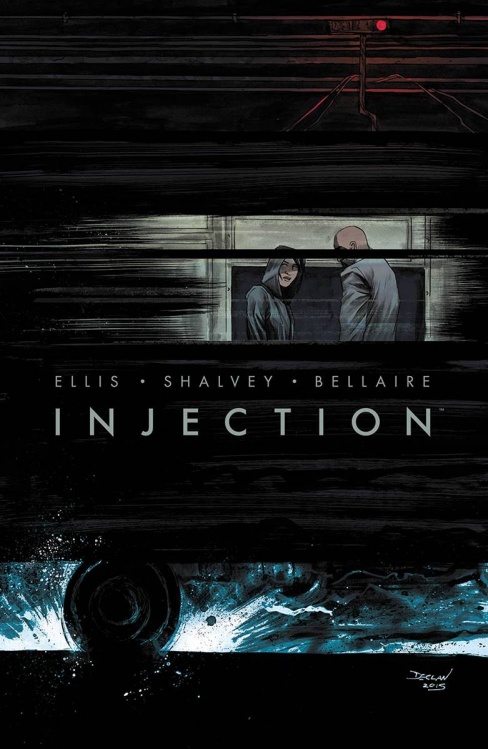
(Chris Thompson) Declan Shalvey’s cover game is strong and this year has only seen it grow and develop. Dec is one of those rare artists who understands that a good cover isn’t about being flashy or obvious, it’s about crafting an image that stays with you long after the initial impact is forgotten. He employs a subtlety that can catch the eye of an editor, as well as a general punter, bridging the gap between the two to make sure a comic ‘lands’. Just look at his “Injection” covers, or his recent Marvel variants . . . and don’t get me started on his Batman. I could tell Declan had an eye for a great image long ago — his con sketches were always so impressive — but he’s refined that skill to the point where it seems he can do no wrong. I don’t know if that means he has a drawer full of unused sketches and concepts hidden somewhere but, in terms of curating what we see, he continues to do an impeccable job month after month. Add in Jordie Bellaire’s wonderfully complementary colours and you have a creative team that few can hope to match.
1. David Aja

(Walter Richardson) David Aja might not have had as many covers out this year as some other notable cover artists, but those that were published? Good lord. Most notably, you had his two regular Marvel cover gigs: “Scarlet Witch” and “Karnak.” Much like his “Hawkeye” work from his celebrated run with Matt Fraction and Annie Wu (and others), both series have a trend of consistent colors that gave each series a certain cohesion (red, black, and white for “Scarlet Witch,” and green, black, and white, with the occasional bit of red, for “Karnak”). It wasn’t just a matter of having the same artist on the book, but an example of a conscious eye working toward a unifying style.
In a way, it’s the opposite of what John Cassaday did on “Planetary.” In both of Aja’s series, it worked just as well as Cassaday’s approach in giving the books a distinct identity that was immediately apparent. And that’s not even getting into the brilliant sense of composition he brings to each of his covers. And, I can’t lie — his (above) variant for “Punisher” #5 is easily my favorite cover of the year and one of my favorites of all time. For that alone he probably would have made my top five.
Editors’ Notes
Brian: This feels like a cliche at this point, but covers have never been better. Due to the proliferation of variants, there are even more covers out there than ever and, while I think many variants are totally unnecessary, they gave us some of the best covers on this list. In fact, all of the featured artists did/do a lot of variant work. That “Punisher” cover alone somewhat justifies the existence of the variant.
Mike: I feel like if there was a list that someone could’ve put some safe money on, it was this one. I mean, these folks are sort of the who’s who of mainstream comics covers, right? Sure, there are folks who could be added to the list, but it’d be hard to argue anyone off of it.
Matt: Sometimes this is the only place you get to see the majority of a creator’s work in a given year. For instance, Becky Cloonan didn’t have any new sequentials out, but we at least got her covers. Same with Paul Pope.


