

It’s that time of year! The Multiversity Year in Review is here, and from now until Friday, December 22, we will be talking about favorites in a variety of categories. Let us know what we missed in the comments!
3. Todd Klein

It feels strange to write about Todd Klein as one of the best letterers of 2017, when this really could be any year from the last three decades, but it feels especially appropriate this time around. Todd’s lettering has graced so many seminal works over the years, yet the thing that sets him apart is the ability to look both forward and backward while keeping his feet firmly planted in the present.
You just have to look at Todd’s website, as well as checking out his healthy social media feeds, to discover a wealth of information on the history of design and lettering. Beyond his own work, I often look to Todd’s posts for inspiration or just a lesson in classic design, in a medium that sometimes feels like it’s forgotten the art. Todd moves with the times, but continues to display an awareness of the traditions and processes that brought us here.
But what of 2017? What makes this year so special? Aside from his longevity and tenacity, the sheer fact he’s still out there producing as a vital creative force, I would have to say it comes down to his work on “Black Hammer” with Jeff Lemire, Dean Ormston, and Dave Stewart. A lot has been said about his three collaborators, who are boldly acknowledged on each issue’s cover, but Todd’s lettering is an integral part of the unique visual identity this book has forged.
As the new jewel in the crown at Dark Horse, “Black Hammer” is becoming a force to be reckoned with, but a lot of commentary about the series is incomplete without delving into the impact of the lettering as well. I guess the ultimate praise for a letterer is their work blends in seamlessly and goes unrecognised. People only seem to notice bad lettering. It’s important to highlight that which is good and special in a market where the words are just as important as the pictures and lettering dances the fine line between both.
So, hats off to Todd Klein – a man who has rightfully earned his place in the history of lettering and design – and who fights to keep that place with each passing year. That kind of drive is admirable on its own but, when coupled with a continually impressive body of work, provides a shining example for all those around him. I hope I can write such glowing praise of the other people on this list in three decades time. – Chris Thompson
2. Clem Robins

The role of a comics letterer is an interesting one, seeing as how the best of them should go unnoticed by the reader. Usually this is a matter of thoughtful word balloon placement and letterforms that suit the art they accompany. In that way, Clem Robins stands amongst the best of the best, but there’s something special to his work that seperates him from the pack.
Over his years of work on “Hellboy” and its related Mignolaverse series, Robins has found a voice that’s as crucial to the final product as Dave Stewart’s. His contribution to the work of Mignola and others is immediately recognizable, with a number of idiosyncrasies that have become visually synonymous these titles. Beyond his letterforms, there’s the way he conveys shouting by giving the word balloon a thick, colored border. Or how he’ll emphasize a word by bolding it and making it two lines tall, with standard size text stacked beside it. And then there’s his approach to balloon tails, which get pretty jiggly when spookier characters enter the scene. These are crucial elements to the stories he helps to tell, as is evidenced by his obvious absence on the Mignola books he doesn’t touch.
So while there are a great many letterers doing fantastic work every week, few contribute to the overall look and feel of the comics they contribute to like Clem Robins. – Mike Romeo
Continued below1. Clayton Cowles
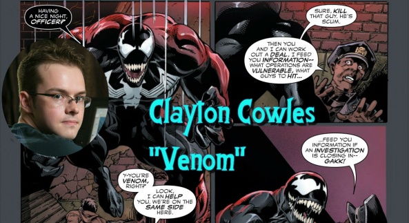
Lettering is an art form. Yes, really, it is. Lettering can make a book easy to follow or impossible to keep track of but at its core, what it really is is giving characters in a comic book a voice. Clayton Cowles, for my money, is the master of that. He’s a name that comes up any time someone mentions lettering and even for those who don’t know all that much technical stuff behind lettering, still know who he is. For me, this two works that highlight just what he can do are “Daredevil” and “The Wicked + The Divine.” In “Daredevil” he does the basic things all letterers do but he also tries to inhabit something very street level hero in his lettering. His font choices help make the series feel very much like “Daredevil” in the sense that it’s a little less careful and more gritty in its effects. It feels like his work is a part of the story instead of laying on top of it like so much lettering does. This is a quality that he brings to “The Wicked + The Divine” in a really meaningful way that doesn’t get early enough credit.
In “The Wicked + The Divine” his lettering gives these characters a voice. These aren’t normal people living in a normal world and they aren’t even superheroes. They are actual gods and it becomes Cowles’ job to give their words some kind of impact and he does that in such a clever way. Cowles gives each character a specific template and this what literally gives them a voice. Their balloons are specific to them, as are the fonts and the colors so each time they say anything, you can kind of hear it in your head. You aren’t just looking at these words but feeling it and experiencing it because of the extra effort put into this. When I think of this book’s interior pages I always think of the black and white balloons for Cassandra and the changing font size of the way Woden speaks. This is as close to audio as you can get with a visual storytelling medium like comic books and it can only happen when someone is as talented as Cowles. – Jess Camacho
Editor’s Commentary:
Brian: I find it fascinating that two of our three choices have been lettering for 30+ years. This is one area where comics have attempted to improve with technology, but have failed in doing so. On that same note, it is refreshing to see such great work from Cowles, who is by far the youngest of the bunch here, giving us hope that all the best lettering isn’t behind us.
Matt: I think the best letterers are the ones who draw the comic itself. I think a book where the words go down first and the art is built around it read better and have a stronger personality. Also by being part of the art, the bubbles and captions don’t stick out so badly. For letterers who come in after the fact, there’s no doubt these people are good at what they do. I mean, they do a lot with what they’re given and it’s their creativity with making sure a book is readable is impressive. Of course, like you said, these guys are all pros who’ve been doing this for years, so it’s safe to say they know what they’re doing.


