

It’s that time of year! The Multiversity Year in Review is here, and from now until Friday, December 22, we will be talking about favorites in a variety of categories. Let us know what we missed in the comments!
This category is one of our most subjective – what does it mean to breakout? Does that mean you’re suddenly a household name? Does it mean you got your first paycheck? Our choices don’t really exist on either of those planes, but somewhere in between.
3 (tie). Jon Davis-Hunt
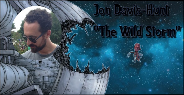
I was, like I suspect a lot of people, a little surprised when Jon Davis-Hunt was announced as the artist on “The Wild Storm.” I was aware of Davis-Hunt’s work on “Clean Room,” but Warren Ellis’s flagship book for his new imprint seemed destined to have a more established, superstar artist on it. But thank goodness Ellis knows what he’s doing more than I do, because Davis-Hunt has been a revelation. His work is extremely crisp and precise, but is also brimming with life and chaos, and is perfect for this slow-burn of a title. He is equally adept at showing big, epic fights, where the pages deconstruct into small panels of extreme detail, as he is at showing the mundane bureaucratic ennui that somehow even exists when dealing with alien technology.
For my money, no one this year drew better hand to hand combat or designed more interesting technology than Davis-Hunt. “The Wild Storm” retains a surprising levity, a jarring brutality, and page after page of simply stunning artwork.
3 (tie). Jorge Jimenez

Jorge Jimenez has been doing a lot of work with at DC these past few years. Most of it has been centered around The New 52 “Earth 2” titles, but when Rebirth started, the Superman family nabbed him up and he’s been putting out some of the most beautiful comics in DC’s stable. Last year, Jimenez drew one of our best single issues in “Superman” #7 and another beauty with the Swamp Thing/Supers team-up in “Superman Annual” #1. This year, Jimenez and Peter Tomasi launched “Super Sons” in February, featuring the shenanigans of Damien Wayne and Jon Kent, which has consistently month after month been some of DC’s finest. I talked about this series a few months ago with Paul on the Comic Syllabus, as it’s my favorite new series of the year, in large and overwhelming part to the utter joy Jimenez brings to the craft.
Jimenez is the perfect fit for “Super Sons,” adding in the perfect amount of cartoon finesse to really sell the partnership between Damien and Jon and the legacies they’re both trying to live up to. In the first two arcs, Jimenez has continued to improve every issue. His second arc is some of the most beautiful Teen Titans art I’ve ever seen. Jimenez also recently had some pages in “Batman: Lost,” and in a book that featured art by veterans Doug Mahnke and Yanick Paquette, Jimenez was the standout. Tackling some of the alternate worlds shown to Batman in the Dark Multiverse, Jimenez nailed the varying sequences given to him in this heavy metal interlude, proving he has a range of talent sure to be utilized on many more titles in the future.
DC has Jimenez on an exclusive, and for good reason, as he brings such a different approach to comics than many of the other DC “house style” artists that blends fun and manga-esque tones with a really beautiful sleekness . I can’t wait to see Jimenez continue to grow and evolve, and make more really exciting comics. – Kevin Gregory
3 (tie) Tyler Boss

In October of this year, Tyler Boss paid homage to The Replacements in a clever variant cover for “The Archies” #1. As much as that piece epitomizes Boss’s unique aesthetic, not to mention his affection for and mastery of ’80s nerdcore culture, it’s his incredible work on the series “4 Kids Walk into a Bank” that simultaneously catapults his name up this list and makes that book so essential. From his refreshingly unexpected, yet intuitive, panel work to brilliant character designs to a seamless mixture of cinematic wide shots and dramatic close-ups, Tyler Boss walks the fine line between paying homage to the visual vernacular of the past with spot-on clothing styles, boxy vehicles, and countless other minor details. He also carefully avoids the trap of arbitrarily including extraneous elements that may be accurate but ultimately have nothing to do with the central story. Indeed, throughout the entire 5-issue run of “4 Kids,” Boss’s consistently solid visual direction sets the stage for deeper exploration. With a discerning sense of visual rhythm and gift for juxtaposition, Boss’s real talent lies in finding humanity and humor in even the gloomiest moments while shining a light on the dark underbelly of whimsical teenage daydreams run amok. For Boss, the line between comedy and tragedy is very, very thin, expertly communicated in a character’s sideways glance, raised eyebrow, wry smile, or subtle body language. And nowhere is this more apparent, or effective, than it is in the brilliantly rendered fantasy sequences kicking-off each issue. As the titular characters Stretch, Berger, Walter and Paige “make believe” while playing Dungeons & Dragons (as they do in issue #1, for example), they don’t just mimic their alter egos or try to speak and act like them, they actually fuse together with their fantasy counterparts, creating hybrid beings that live in both worlds at once. It’s an incredible visual feat and dazzling narrative sleight of hand that you really have to see to fully appreciate. Without a doubt, Matthew Rosenberg’s scripts are witty and well written, but Tyler Boss takes the book to an entirely different level, turning Stretch, Berger, Walter and Paige into true pop culture icons in the process. Any competent artists could have taken Rosenberg’s script and simply mined it for visual sight gags while building a clichéd story around teenage angst and insecurity coupled with cheesy nostalgia. Instead, Boss taps into the reader’s emotions while directing attention toward what actually matters. His artwork is definitely stylish, funny and fun, but in the end, it’s just straight-up great storytelling. – John Schaidler
Continued below3. Emil Ferris
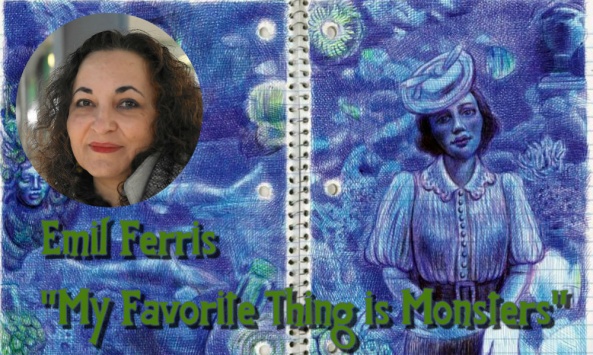
Emil Ferris, where have you been all my life?
This year the good folks at Fantagraphics released Ferris’s graphic novel “My Favorite Thing is Monsters,” and it hit the comics world like a lightning bolt. Rendered completely in ballpoint pen on lined, spiral-bound notebook paper (move over Jim Rugg), “…Monsters” is an exquisite example of boundary-pushing comic art. It’s a hefty tome that stands head and shoulders above nearly everything else that’s been published this year. And it’s her first published comics work.
Her art is a treat to linger on. She’s got this incredible way of using the weight and texture of a ballpoint pen’s line to her advantage, creating shapes and contours that seem to push forward from the page. Every one of her pages have this tactile nature to them, as if you’d be able to examine them by running your fingers across their surfaces. This comes from the way she deftly crisscrosses lines in tight formations to create a type of hatching that expands and contracts to communicate the bends and folds on faces and clothes.
The color choices in “…Monsters” is just as fascinating as her line work. Constricted to the colors available in ballpoint pens (black, blue, red, green, etc.), Ferris uses blending and spacing to create an incredibly wide array of tone and value. She’s able to create a palette that defies the restrictions of her chosen medium, as is evidenced on page after page of her nearly 400 page masterpiece. – Mike Romeo
2. Bilquis Evely
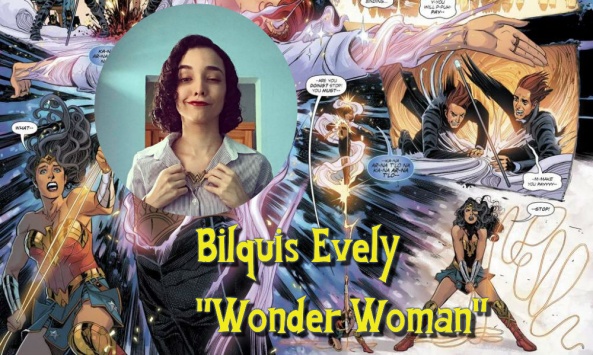
Hailing from Sao Paulo, Brazil, Bilquis Evely’s linework brings a certain South American meets European comics flair to the traditional bombastic style of North American comics. Evely has been in comics for a few years now, but after grabbing people’s attention with some high profile work like the “Batman Annual” and a reimagining of Sugar & Spike in “Legends Of Tomorrow” in 2016, she was really put on people’s radars in 2017 by working with Greg Rucka on “Wonder Woman.”
It’s telling that an artist who only worked on 6 issues of the 25 issue run and was rubbing shoulders with Liam Sharp and Nicola Scott could leave such an impression. Evely’s style feels both at home in North American comics and unique among them. With a focus on deft characterisation and dense detail, her pencils bring a crisp, crosshatched fluidity that at once feels like a gorgeous tableau and offers itself to her emotional storytelling.
Even just perusing her Instagram shows an artist with a focus on the small, intricate details that build the world of a comic and the people who inhabit it. Bilquis Evely has only just left her mark on comics and I can’t wait to see where she goes from here. – Alice W. Castle
1. Nick Derington
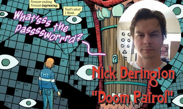
Nick Derington came out of nowhere. His joyful pencils have given “Doom Patrol” a tone like nothing else the characters have ever experienced. The more lighthearted approach to the work has really given the scripts a more accessible style to the point where you can hand nearly anyone the first trade of “Doom Patrol” and one of the first responses they might have is: that’s a beautiful book. Derington is always game to go as weird as Gerard Way’s strange scripts call for, despite the inherent beauty of the word. Unlike some of his peers, Derington exceeds in drawing action and momentum as well as nearly all of his fight scenes carry a dynamic sense of energy that translates to the page.
The artist can seemingly pull off anything, with a cat/human hybrids littering the pages alongside bodies of all shapes and sizes. The average issue of the series also packs in some extra creatures and weirdos which always posses striking designs. Derington hits a supreme sweet spot in how he continually references past works in the DC Universe to mix and match his art with. There’s a level of experimentation in the work that is hard to match anywhere else in comics.
With so much expression found in his art, Derington’s pages are never boring, even when the artist is tasked with creating a normal talking head scene. There’s always something strange going on in the background or a character contains a strong expression which carries the page and attracts the eye. “Doom Patrol” keeps the weird blossoming and with Derington, at the helm of almost every issue I look forward to what the artist will achieve on the series in the months to come. – Alexander Jones
Continued below
Editor’s Commentary:
Brian: We had a lot of internal debate among the editorial staff – as we tend to every year – about what exactly ‘breakout’ means. It’s one of those terms that means something different to everyone. But I think no matter how you define it, all of our choices took huge strides this year, whether in technical ability or, more likely, simply came into greater prominence. We’ve had this category for a number of years now, but I think this is the best list we’ve compiled thus far.
Alice: Something that strikes me about this year’s picks is how unique their style is and how emblematic that was of our need for new and unique stories in 2017. From Nick Derrington and Bilquis Evely bringing a softer, almost European flair to DC comics with their intricate pencilwork to Tyler Boss’s stark, characterful linework and structural playfulness to Emil Ferris’s experimentation with the medium of ink. Even the two more “conventional” (for lack of a better word) artists on this list, Jorge Jimenez and Jon Davis-Hunt, brought something unique to their takes on the world of superheroes and bombast to make something that we’ve never seen before.
Matt: I think the staff chose a varied style of artists this year and echoing, you, Alice, it’s interesting to see a bunch of people trying to achieve all kinds of different things with the medium. It reminds you of how big comics are and can be. Some of these people have been toiling away for years only to finally make a huge impact here. Others came bursting out of the gate. It’ll be great to watch them grow and change and evolve over the years, pursuing whatever corner of comics they’re going for.


