Welcome to the Multiversity Year in Review for 2020! While this has been, by many accounts, a terrible year, there were a number of fantastic comics released in 2020, and over the next ten days, we’ll be highlighting our favorites across 25 categories. If you want to give your thoughts on our picks or share your own, feel free to do so in the comments!
Best Colorist
Color artists are responsible for color (obviously), but also so much more than that. They add texture to a comic, and visual effects. Color can direct the eye, helping guide the reader to the most important parts of the story, while also setting the pace. Our colorist award is named after Dave Stewart, because he was the best for so long. He’s not the only great in comic book coloring though, so here are our favorite groovy colorists who helped make 2020 comics fabulous. Dave Stewart is not eligible for his own award.

3. Nathan Fairbairn
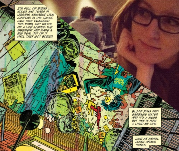
Color artist Nathan Fairbairn also had a great year in comics. Fairbairn’s palette changes according to the shift between bleak drama in “Die!Die!Die!” and the title’s visceral violence. His softer blue palette for the dramatic scenes is so complex and has so many different shades. Issue #13 explores the use of negative space in the color, lining a row of guns behind a wall. While Chris Burnham’s pencils capture some of the best moments in this scene, the colors balance out the incredible amount of detail on this page. Despite having a wide array of colors on the page, Fairbairn is really good at carefully directing the eye and making sure the hues are not too vibrant and don’t distract from the art. The smallest details are colored by Fairbairn on the page. Even the incredibly small pictures have the tiniest shades of color that make the world of the book seem incredibly vibrant. Burnham’s detailed pencils on a plane look fantastic but they look even better when the tips of the machine have bright blues and other spaces have solid grey outlines. Whenever I see Fairbairn’s name on a book there’s cause for celebration, I hope this stellar output continues into the next year. -Alexander Jones

2. Tamra Bonvillain
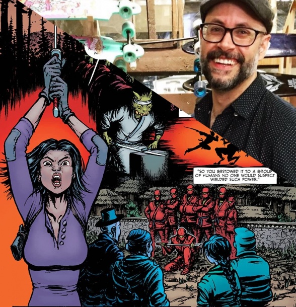
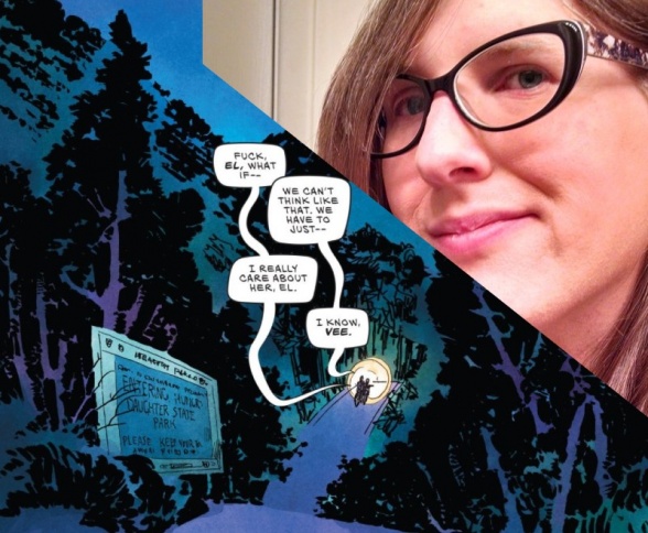
Stop me if you’ve heard this one sometime in the last four years. Tamra Bonvillain is a great colorist and deserves to be recognized as such. Her palettes often lean bright and poppy but never overwhelmingly so and never do they look flat (unless she wants them to.) Take a look at any page of “Doom Patrol: Weight of the Worlds” or the utter bonkers experimental absurdist. . .thing that was “Ludocrats” and you’ll see what I mean.
That said, 2020 was a year where, I would argue, she was able to really flex her coloring muscles. She gave Dani’s art on “The Low, Low Woods” a clarity without sacrificing the scratchy horror embedded in every panel. The warmth present in “Weight of the Worlds” remains but is transformed into something oppressive and gritty, rich and dark and horrific. Her work on “Stealth” grounds the fantastical elements, with heavier shadows and a depth of shading, while fantasizing the grounded elements, upping the saturation on a hospital scene or layering blue and purple outlines that bleed into each other during a bout of disorientation.
And then her coloring on Dan Mora’s “Once and Future” art? Otherworldly and ethereal but bright in a way only a comic can really capture. The use of green in particular gets my attention every time. There’s a reason we recognize her talent, year after year after year. When it wants to be showy, it is. When it wants to blend into the art, it does. When given a Big 2 comic, her work keeps titles like “Captain Marvel” feeling unified. That’s the power of a damn good colorist and Tamra is one of the best. – Elias Rosner

1. Jordie Bellaire
In ancient Greek mythology, there was a hierarchy of power. At the bottom there were the gods. Above the gods, there were the titans. And above the titans there was Multiversity Comics’ 2020 Dave Stewart Colorist of the Year award winner Jordie Bellaire.
Continued belowJordie Bellaire is an absurd talent. While recently, she’s been flexing her writing muscles, she’s still far and away the best colorist in the comics game. Everywhere you look- from the Big Two to Image to indie publishers, Bellaire is there and she is killing it. She’s so talented, in fact, that she’s knocked three-peat Dave Stewart award winner Matt Wilson clean off of the list.
Perhaps the most noteworthy aspect of Bellaire’s talent is her insane versatility. Just take a look at some of the big books she’s been working on this year. At Dark Horse, Bellaire is doing incredible work complimenting Leonardo Romero’s crisp, old fashioned pencil work on “The True Lives of the Fabulous Killjoys: National Anthem.” Her colors manage to be muted and make the book feel full of life at the same time. With Kelly Thompson’s new run on “Black Widow” at Marvel, Bellaire is doing absolutely wonderful work bringing Elena Casagrande’s pencils to the next level. Simple but bold, Bellaire’s colors are an absolute necessity for. The visual language of the comic. At DC, she’s giving her all on the stupendous “John Constantine: Hellblazer” where she brings alternately brings rougher, grittier textures and smooth, clear visuals depending on the issue.
Jordie Bellaire stands head and shoulders above just about anyone doing comics coloring right now. Not only is Bellaire a helpful partner to the artists she works with, she makes herself a vital part of each and every book that she works on. A comic book with Jordie Bellaire on its team is actively better for having her input. A superlative artist who just seems to be getting better, bolder, and more creative with time, Bellaire is making a mark on the comics industry that’s sure to be historic. Long may she reign. – Quinn Tassin


