Welcome to the Multiversity Year in Review for 2022! We’ve got over 25 categories to get through, so make sure you’re checking out all of the articles by using our 2022 Year in Review tag.
What’s so cool about comic art in 2022 is how much variety you can find. There are artists who use traditional pencils and inks, artists who do digital paintings, and artists who make art much as a video game designer would. You can find artists who strive for photorealism, artists who express themselves through cartoon, and artists who capture emotion through abstraction. We try to cover the whole multiverse of comics here, and that comes across in the many different styles in this, our list of the best comic artists of 2022.

10. Andrea Mutti
If there is one word I can use to describe Andrea Mutti, it is: versatile. Take a look at some of the series that show up in a Google search for his name. “Maniac of New York.” “Nottingham.” “Star Wars: Knights of the Old Republic.” “Batman Eternal.” “The Girl With The Dragon Tattoo.” Give Andrea Mutti a genre, and he can adapt to it flawlessly, from period pieces to horror to classic franchises. He can easily fit into a house style, all while making it his own.
It’s that last characteristic of his work that stood out for me most this year, noticed while reading “The British Paranormal Society: Time Out of Mind.” This was his second work within the Hellboy Universe, and he takes his experiences from that first work (the 2019 Hellboy Winter Special) here to another level. He knows what visuals make a story in the Hellboy Universe succeed, but turns them on their head by interpreting them in new ways. With a lighter hand on his pencils and just the right amount of detail, he creates an idyllic English village that turns out to be anything but. It’s the perfect uneasy peace to add to the horrors that our main characters find themselves in, the kind of horror that comes from the mundane that just seems ever-so-slightly off. The smallest of details explode with life under his pen, creating a multi-layered world that enhances the script without overwhelming it. In Mignola stories that have multiple layers, Mutti works within and alongside all those layers superbly. And there’s no doubt that his degree in geometry plays into his art style, a keen mathematical sense of shape and proportion.
While I enjoy Andrea Mutti’s chameleon-like qualities throughout comics, his work in the Hellboy Universe has me wanting him to make a long term home there sooner rather than later. – Kate Kosturski

9. Sana Takeda
There are some artists that just speak to something deeper inside you. It just goes beyond liking their art style. For me, Sana Takeda is that kind of artist and storyteller. As someone who grew up hunting for what little Japanese animation, movies, and TV shows I could find in the mid seventies, I think the esthetics of her art touch something in that kid in me in a way that even most manga I read now sometimes don’t. There is something about her sense of proportion, her soft subtle use of color, and her skill with drawing faces that express emotion and reach into my soul. They communicate easily whether they are the non-human, demi-human and human-like faces of the creatures of “Monstress,” or if they are the all too human sometimes masked or double masked faces of “The Night Eaters.” For a painterly style like hers it’s also her ability of convert motion and flow that makes her art so stunning. She’s got the same knack that Sanford Greene does to make you see motion in a moment caught in the panel. Marjorie Liu calls her friend and collaborator a “ferocious artistic powerhouse” and I for one agree.
Sana Takeda has been working in the US comics market since leaving Sega as a 3D art designer. She mainly worked for Marvel under C.B. Cebulski and drew an Image book that he wrote along the way. I didn’t see any of these, but I did encounter her art when she worked with Marjorie Liu on X-23, which I really enjoyed. Like many people I didn’t really notice her until “Monstress,” which from the initial solicitation grabbed my heart and didn’t let go. It is one of the few books I still get. This year we got a few issues of “Monstress” and the horror graphic novel “The Night Eaters – Book 1: She Eats the Night.” This book was like being reintroduced to an artist you love. After so long working on the multiple Hugo and Eisner nominated and award winning non-European fantasy post-war tale, it’s cool to get something new, fresh, and different; to rediscover her art again.
Continued belowThis book showcase her ability to breathe life into a modern realistic world plagued by the same pandemic we are living in. She gets to show off her flare for both modern and fifties fashion and her ability to make comics versions of some very recognizable historic figures that are long gone. Her art in “The Night Eaters” draws you into this creepy new world in the subtlety of her art, colors, and pacing. You can smell Ipo’s ever present smoke and greenery, hear the wind in the leaves, and feel the chill as the scenes get dark and the horror starts to creep in. The art and character expressions will make you smile and laugh and feel something. Whether it’s your first encounter with Takdea’s talented and skillful storytelling or, like me, a first reencounter, it’s a body horror experience worth seeking out. – Greg Lincoln

8. Bilquis Evely
It may come as little surprise that Bilquis Evely makes Multiversity’s list of favorite artists of 2022, but what should surprise you (it sure astonished me!) was that Evely only had two books released over the course of the year, both of which were the concluding chapters of “Supergirl: Woman of Tomorrow.” Evely’s work on this revenge quest tale is unassailably great, a visual spectacle that manages to hit all the right notes of “retro-futurist space western” with aplomb. Her Kara Danvers is a classic beauty, with hair that never fails to fall (or float) in thick waves and bountiful “S” curls, and her body language and soulful, expressive eyes show the true pain and “weight of the world” King’s version of Supergirl is meant to carry. And the environments! Evely understands how to mix the familiar with the alien to create some truly beautiful, and often unsettling, imagery. Do yourself a favor and grab the trade paperback for this title and flip through the pages – you may find yourself beginning to flip quickly, and then resting longer and longer on splash pages of beautiful space vistas, or stuffy, claustrophobic passenger ship cabins full of Jim Henson-like alien creatures, or on wonderfully drawn faces that exude emotion. With hundreds of intricate lines, be it filling in the curly beard of Krem, the charismatic villain, or detailing the hilt work on the sword Supergirl’s companion carries, Evely leaves it all on the page. It is this pure and passionate and skillful dedication to the expression of ideas – of tone, of setting, of emotion – that completely elevated this Supergirl miniseries, and why she has endeared herself to the Multiversity team for 2022 and beyond. – Johnny Hall

7. Daniel Sampere
Comic book artist Daniel Sampere showed off an incredible level of artistic talent in the pages of “Dark Crisis on Infinite Earths” with writer Joshua Williamson this year. Sampere is great at drawing vivid pages that have characters rendered with adept precision. A page with Yara Flor and her horse Jerry from “Dark Crisis on Infinite Earths” #1 shows Flor striking a dynamic pose that serves the story and keeps the reader fascinated. Sampere has shown an impressive level of storytelling ability throughout this series to complement the striking pose and framing of characters. Sampere is also able to evoke the emotions of Jonathan Kent as Superman in a really special way throughout this title. When Jon suffers pain his emotion is perfectly captured through a frayed expression. The storytelling is clear no matter how complicated some of the plot aspects of the series can be in certain moments. “Dark Crisis on Infinite Earths” calls for an artist who is able to capture a range of elements. In the second chapter of the series, readers get a closer look at the new aesthetic of Pariah and his Dark Army. When it calls for Sampere to draw upon the dark fantasy elements of the series, Sampere has always risen to the occasion. The third chapter of “Dark Crisis” strikes a nice balance between showing off some of the creepiest Green Lantern versus Pariah moments of the series to-date while displaying massive crowd scenes. Sampere is able to make each character in a massive crowd stand out from the next one. There’s another moment in the third issue that shows Sampere’s skills off beautifully as Sampere has a ton of heroes talking outside a hospital waiting room. On this page, there are ten individual characters on a panel that takes up one third of the page. Cramming this many characters in a moderately-sized panel takes a ton of skill and Sampere rises to the challenge. I can tell each character apart easily in these sequences. Sampere’s work on “Dark Crisis on Infinite Earths” is precise, lush and enthralling. I’m incredibly excited to see what Sampere’s next project at DC will be in the coming year. – Alexander Jones
Continued below
6. Elsa Charretier
Elsa Charretier is someone who has been on my radar since I saw her illustrating all-ages “Star Wars” comics. She has the clean, bold style evoking Jack Kirby, and though that’s a cliché at this point, it’s undeniably true. You can even see a hint of Darwyn Cooke. Her characters aren’t covered with little lines and details, they have iconic faces outlined in thick lines. They have huge eyes, and a crooked smirk, and shiny hair. This was the year she really got to go wild with “Love Everlasting,” a book that plays on a lot of iconography you don’t often get to see in a comic. She gets to work in the classic 50s romance style, with more than a little bit of “Archie” mixed in too, but she also is drawing from romance novel covers and glossy romcoms. Not only that but every issue, she completely reinvents the characters and setting, with just enough of a central style to work. But more importantly, issues look very different from each other. Charretier is putting out a little artistic tour de force, tied to a single series. She also never passes on an opportunity to work on some of the coolest series in comics. “Department of Truth” is usually a work of scratchy chaos, practically the opposite of Charretier’s style. It shouldn’t of worked but, of course, it did. This year she definitively showed the versatility of her flashy, clean style. I can’t wait to see her work in every genre. – Jaina Hill

5. Valerio Schiti
Valerio Schiti is far from the most prolific artist among Marvel’s current favorites, but he’s been assigned to some of their biggest series, including Jonathan Hickman’s “Inferno” (the final issue of which came out at the start of the year), and “A.X.E.: Judgment Day,” 2022’s epic Avengers/X-Men/Eternals crossover, penned by Kieron Gillen. On both series, he’s had to tackle some really dense plotting and writing, casts of thousands, giant landscapes and spectacles, as well as countless cool hero/villain portraits, and fit them all into 30 pages at a time – somehow, he manages to make it all look effortless.
Naturally, a lot of credit must be given to Schiti’s writers, but Schiti does an exemplary job of making sure every panel on these carefully composed pages look equally exquisite, regardless of what he’s drawing. So much of his work is defined by Marvel’s colorists’ lavish house style, but look carefully at Schiti’s inks, and you’ll see how essential he is to their work, with his considered distinction between light and shadows, providing a range of depth for the colorists to consider while doing their work.
Something that was striking about the “Inferno” finale and “Judgment Day” opener was how much of them were just characters talking: the latter in particular frames its events with an extended conversation between Moira X and the Eternal leader Druig. It could’ve been perfunctory, letting Gillen’s script do all the heavy lifting, but Schiti renders it as interestingly as the calamitous events depicted alongside it, constantly changing up the perspective of the characters shown, and the office setting, to keep it as fresh and dynamic as the spectacle interspersed along with it.
I wonder – if he wanted to – if Schiti could create exciting comics about characters just talking, without any action or awesome character entrances whatsoever. – Christopher Chiu-Tabet

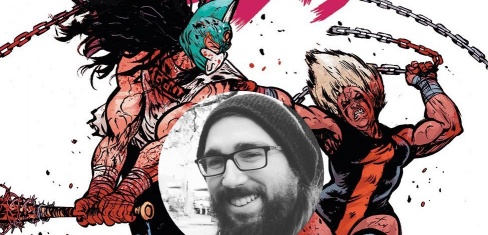
4. Daniel Warren Johnson
It’s probably not surprising to see Daniel Warren Johnson on another “best artist” list. DWJ has become a mainstay in the comics world, writing and illustrating comics that combine bombastic and creative action with heartfelt and sensitive storytelling. From the healing power of metal to the self-actualization of a cosmic horse-man, Johnson’s art is equal parts epic and emotional. This year, he brought that energy to “Do A Powerbomb,” which combined the over-the-top melodrama of wrestling with the journey of healing between a father and daughter.
Is it possible for one person to have multiple magnum opus’? (Opai?) Because it certainly seems like that’s Daniel Warren Johnson’s goal. If you follow Johnson on social media, you know he’s never been shy about using wrestling to inspire his illustrations. In “Do A Powerbomb,” those illustrations are not allusions; they are front and center. His panels capture the drama, athleticism, and excitement of watching a live match. If you remove the narration, you can still follow the story, which is the mark of the exceptional visual storytelling you expect from DWJ. But it’s more than that. His ability to capture nuanced emotions is next level, and his creativity in developing backgrounds and character designs is phenomenal, all while creating one of the most fun comics on the stacks right now. As long as he produces comics of this quality, you should expect to see him on this list for years to come. -Joe Skonce
Continued below
3. Evan “Doc” Shaner
When we talk about art in comics, some folks are praised for their panel construction and page layout. Others get love for their kinetic sense of action. Still others are highlighted for their facial work, allowing emotion to be delivered effectively without dialogue. But the best artists combine all of those into a word that is, perhaps, overused, but when accurate, perhaps the single most important descriptor for a comic artists: storytelling. And, when talking about storytelling, Evan “Doc” Shaner may be the finest artist working today.
Shaner is a sought-after creator because his pages do more than the fair share of heavy lifting for getting the script into the head of the reader. Shaner isn’t organizing his pages based on finding moments for his art to shine; if anything, Shaner will occasionally sacrifice a big moment to make the page and story flow better. When you’re reading a Shaner comic, your eyes flow from panel to panel and page to page, because Shaner designs his books to serve the story more than anything else.
The good news is that Shaner is also one of the finest draftsmen in the business, and so those pages, designed to further the story, also happen to look absolutely brilliant. For “New Champion of Shazam,” Shaner has made all of the scenes of superpowered Mary be as bombastic as anything he’s done before, but has pulled back to make the scenes of Mary as a college student or big sister seem smaller, more claustrophobic than before. He does this by giving Shazamary (I’m so, so sorry) more space around her, while plain ol’ Mary is usually in more constricting panels. It’s a small touch, but it makes a huge difference in conveying Mary’s feelings about her current situation. – Brian Salvatore

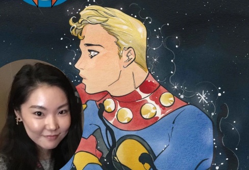
2. Peach Momoko
2022 was a year of gorgeous looking books. But the one series that kept impressing me with each subsequent issue wasn’t so much a series in the traditional sense. Marvel’s carved out a little corner of the House of the Ideas for international comics star Peach Momoko to play in. And her “Demon Days” and “Demon Wars” one-shots have been my favorite books to just look at. Momoko’s brilliant blending of traditional Japanese art with superheroics. And personally speaking, I’m a sucker for reimagining classic characters anyway.
But what makes her art appealing is more than just turning The Hulk into a yokai or Juggernaut into a samurai. With using a more traditional painted style, you run the risk of the characters looking still or lifeless. And comics as a medium rely on that kinetic energy, even with just ink on a page. It’s the difference between your cast posing or being posed. But Momoko’s work strikes that narrow balance between the two, giving us something that looks illustrated, but feels alive. Although that dichotomy has been one she’s played with her entire career. When asked to provide an artist’s statement for a showing at Portland’s The Lovecraft bar, she claimed “I only illustrate the females in my artwork. You can not [sic] tell by the expressions if they are dead, or if they are alive.”
Considering that her “Demon Wars” books have made more than a passing nod to “Civil War,” she’s loosened up with the “only females” restriction.
It’s worth noting that Momoko has said in interviews that her first influences were early from American comics, coming to the more traditional artwork after traveling abroad. And not just the historic pieces, but mid-20th century folk styles as well. It’s also not hard to see more than a little Junji Ito in her work. She lists horror films as a major influence on her art. And judging from her earliest black and white prints, and some of her more gruesome color work, she’s earned her place next to him in the sequential world.
But what really sells her work are the small flourishes and details. The way her branches sway. The curls of her smoke and flame. The crackle of Psylocke’s psychic weapons. For as much as she preferred the clean chiaroscuro of her early black and white, her color work is phenomenal. The layered reds and yellow flames of her “Ghost Rider” covers contrast nicely with the dark grays and black backgrounds that fill the page. But we’ll discuss more of her covers later. Spoiler alert.
Continued belowWhether it’s incredible green oni, sentient Yoroi armor, or a warrior in a blue falcon helmet, the Momoko-Verse has provided us with brilliant design work. And her vibrant style brings them to life with amazing fluidity. And I’m looking forward to “Demon Wars” bringing us even more Momoko-ized versions of the Marvel Universe. Also, her symbiotes are super freaky too. Seriously! Her Venom and Carnage are like huge and smoky and… okay, I’ll stop. – Chris Cole

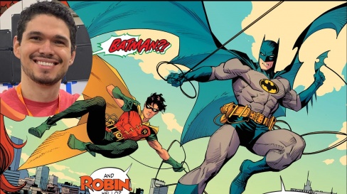
1. Dan Mora
Dan Mora was so good in 2022 that he is ending the year (or maybe kicking off 2023, depending on how you look at it) essentially crowned as the artistic face of DC Comics’ mainline ‘Dawn of DC’ publishing initiative. That feels like a massive deal. Nearly every reference to what we have been told is a year-long meta-narrative has been accompanied by one or another of his art pieces. Each of DC’s major Justice League characters got their own Dan Mora pin-up to decisively communicate to audiences that a page is being turned at the company. He has anchored the Mark Waid-written “Batman/Superman: World’s Finest” with art so clean, iconic and timeless that they even decided to build the next era of the Superman titles around his style with new costumes designed by him. I almost wish they would let him design the entire DC universe. Think Jim Lee’s contributions to the ‘New 52’, except for a decidedly more optimistic era. Eye-popping work like this is a balm for cape comics art that can easily become stagnant and outdated. DC is home to a lot of great artists currently working in-house, and even more that they could dial up if they needed some ad material to move units, so it really speaks volumes about how well Mora’s powerfully feel-good art presents these characters as the icons they are.
What makes Mora so good? Pick up any issue of the aforementioned “World’s Finest”, and you will be treated to a dozen different DC characters, all unmistakable in visual execution, and looking timeless as ever. You want action? Mora can do action. May I present issue #4, wherein Bruce and Clark do the fusion dance and become a hybrid Batman/Superman to take on a powerful foe in a way we haven’t quite seen before. You want hope? Mora gives you a masterclass in cutting darker themes, devilish villains, and some minor brooding (thanks to Batman) with the cockeyed optimism that a Superman team-up requires. There is an infectious sense of joy to Mora’s work that you can not only see in his engagement with social media, but within the work itself. When asked to draw a classic version of the Teen Titans in their 1960’s costumes, Mora gives you something that is very much done in his incomparable style, but that you look at and immediately mentally clock as something out of another era – in a good way! Waid threw a lot of stuff like that at him this year, and he hit dinger after dinger. And with how clean and classy Mora’s stuff consistently looks, it is simply amazing the speed at which he puts it out. Moving from “Detective Comics” early in the year, into “World’s Finest”, and reportedly continuing that gig while also doing issues of a new “Shazam!” title (also with Mark Waid) it would seem that we have an embarrassment of artistic riches on our hands in 2023. – Vince Ostrowski


