
There are a lot of comics out there, but some stand out head and shoulders above the pack. With “Don’t Miss This,” we want to spotlight those series we think need to be on your pull list. This week, we look at the haunting, vampiric meditation on British colonialism and the 9 panel grid “These Savage Shores.”

Who’s This By?
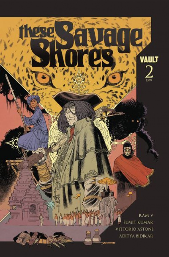
“These Savage Shores” is written by Ram V (“Paradiso,” “Grafity’s Wall”) with art by Sumit Kumar (“The Itch You Can’t Scratch,”) colors by Vittorio Astone (“Maxwell’s Demon,” “Zojaquan,”) and lettering by Aditya Bidikar (“Grafity’s Wall,” “Assassanistas”.)
What’s This All About?
The year is 1766. The place is Calicut, along the Malabar Coast. The East India company desires more than it currently has, hoping to build a trade route throughout the land, but cannot do so without the proper pretense. Enter Alain Pierrefont, the supposed protagonist, a vampire who has been tasked with convincing the Prince Vikram to find favor in the deal. But not all is as Pierrefont and the British pretend it is. Evil is not at home in this land and the story’s true protagonists are far more human, and far more complex, than the cold, white vampire we spend much of issue one with. For along these savage shores, the days are scorched and the nights are full of teeth.

So, Why Should I Read This?
Before I begin this, I must direct you to an article that I have no doubt many of you have already seen: Clair Napier’s article “Do I Hate the Nine-Panel Grid or Do I Just Resent Watchmen?”, over at Women Write About Comics. Breaking down the of the use of the grid in a variety of comics, with a special spotlight on its use in “These Savage Shores,” Napier’s article does a better job than I ever could of expressing the interplay between form, function and narrative and the ways the creative team utilizes it. Go read it and then come right back. Go ahead. This article will still be here.
You back? Excellent. Now with that out of the way, let’s talk the grid, or, more specifically, let’s talk borders and temporality.
There are few comics nowadays that still utilize the border of the page. Many have panel bleed to the edges, taking advantage of modern printing techniques, while others use the page as a panel, insetting the rest of the comic onto whatever is beneath it. In “These Savage Shores,” the border is ever-present, thin, trapping our characters within its bounds but giving them as much room to maneuver as they can. The same is true of the gutters: thin, ever-present, and always shifting but along predetermined paths. It provides a varied regularity that, even reading three issues in a row, does not begin to bore as Napier suspects, although, three issues does not a trade make.
However, it is clear that the creative team is not married to the modified grid nor the confines that it creates. There are pages that break the predetermined pathways, such as the hunter’s torch or two bats, while others emphasize the rigidity of the grid, widening the gutters to further emphasize the nature of the grid as a prison. Without the regular, these tiny moments lose their impact. Without the constant knowledge of where the lines of demarcation are, their disappearance holds less weight. And when a splash page is utilized, its presence commands our attention, blowing up a singular moment instead of breaking down a series of actions, transforming the page from a series of paragraphs to one singular statement.

All this is to say: it is apparent that the format of “These Savage Shores” has had a lot of thought of thought put into it, enhancing the themes and choices made within the confines of the art and words.
And what art and words they are. Despite being only three issues in, there is already a wealth of narrative and history to sink your teeth into. Each over-sized issue (sitting at 28 pages each) is never too dense nor too light. Part of that is due to the the aforementioned formatting, controlling the pace of the story, while the rest is down to Kumar and Astone’s gorgeous and rich artwork, supported by Ram V’s words and Bidikar’s rendering of them upon the page. It is clear, when trying to drill down to the root of why each panel lingers in the mind, that I do not possess the correct vocabulary.
Continued belowWhat makes a series of panels of thousands of bats clearing the view from above the Kori & Bishan remain just as long as the larger panels of the prince and others preparing to hunt the old leopard? Is it the lush details and moody coloring? Is it the utilization of shadows and cool vs warm colors? Or is it simply the emotional depth of the characters in Calicut that brings out the desire to linger, so as not to have to part company with them?

Perhaps it is the sum of the whole, of each moment cascading off of the rest. Of visuals that are a feast for the eyes while also capturing the melancholic and troubled nature of life in a world of hungry predators. Of words that obfuscate the true nature of a person while secretly revealing that which they so desperately try to hide. Of power and the quest for more. And of expectations, broken in ways that fix.
“These Savage Shores” is a slow but deeply engrossing comic, one whose story is best experienced issue by issue, with artwork and coloring that sings and words and lettering that captures the time, place, and feel of every character. It is a story filled with surprises but one that does not rely on them to keep your attention. Crafted with care and presented with passion, “These Savage Shores” is a series not to be missed.
How Can You Read It?
Issue 3 comes out today and is available from your local comic book shop or from your preferred digital retailer. While you can enter easily with issue #3, it operates better with issues 1 and 2. Track them down and I assure you, you won’t regret it.


