
They say you can’t judge a book by its cover. While that might be true for prose, it’s not entirely true for comic books. Comic books are a visual medium and more times than not, it’s the art that draws you in. With so many comic books coming out these days, a cover that stands out from everything else on a wall of new releases can determine how well it sells. I know that I’ve picked up new titles solely based on the cover.
It is with that in mind that we bring you Face Value, a column where we will be looking at the best covers in comics, both new and old, every two weeks. In my first column of 2018, I mentioned that I’ll be spending 2018 looking back on some of my favorite cover artists in the game. This month, we’re looking at the work of Stephanie Hans, someone whose work I admire so much. Her style and work is so unique. It often times reminds me of what Alex Ross has done but with far less realism and embraces sexuality and the general wonder of working with larger than characters.

Raven #5 by Stephanie Hans
This cover appeared on a column last year but when looking at her work as a whole, I couldn’t not include it. Everything about it – – from the coloring to the posing of Raven’s hand – – works. It’s goes above being a simple shot of a character’s face to something more special thanks to the feeling of magic in this coloring. The flecks of white and darker blues in the spell that Raven is casting really add something extra to the image. If this had been the first issue, I wouldn’t have passed.
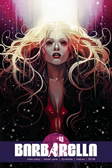
Barbarella #4 by Stephanie Hans
Dynamite is a publisher that’s kind of not great when it comes to bringing in women to draw and write their many, many female characters. When I saw this “Barbarella” cover by Stephanie Hans, I got deep into thinking about how great it would be had more women been brought on to tell a Barbarella story. This leans into the science fiction more than the sex appeal and I love it.

Jem and The Holograms #5 by Stephanie Hans
I read “Jem and The Holograms” and I had no idea that Hans did a cover for the series, which is really a shame. I like this cover because it looks like a photograph that would be used for a magazine, which really matches up with what series was. This cover also strays away from being too realistic with the styling and coloring.

Angela: Witch Hunter #3 by Stephanie Hans
Hans’ work with Angela is some of my favorite art in recent years. She just understood the character in a way that no one else really has. For the “1602” series during “Secret Wars,” she really leaned into the era. This is basically a Renaissance painting and I love it.

Phoenix Resurrection: The Return of Jean Grey #3 by Stephanie Hans
One of the most iconic imagery of Jean Grey and Scott Summers is Jean harnessing all her powers and asking Scott to look at her because she wants to see his eyes. It’s been done lots of times and it’s supposed to come off romantic. I don’t know if I get romance from this image, but I do get power and passion. It’s a gorgeous cover with an amazing use of space. With the beams and fire surrounding the characters, there is such power coming from it and of all the covers she’s done, this is probably my favorite.

Deadman: Dark Mansion of Forbidden Love #1 by Stephanie Hans
“Deadman: Dark Mansion of Forbidden Love” was meant to be a throwback to romance comics of the 50’s. Hans homages that time period with the positioning of the characters and adds a gothic flair in the colors. Even better, there is a holding back of being too sexualized with the lead character that really retains the right mood.
Continued below
The Wicked + The Divine #15 by Stephanie Hans
The goddess of the sun indeed. I mean, honestly, look at this. You can’t get any other meaning from it if you’re a reader of “The Wicked + The Divine.” Did she actually get sunlight onto the page? Maybe.

Storm #6 by Stephanie Hans
As you can see, Hans is great at creating beautiful imagery but she’s also very capable of doing things with more motion. This “Storm” cover is my favorite of that series because there’s so much happening here. There’s the action outside, there are the people watching it, and there is the recording on the phone. It’s a lot of moving parts but it’s still very much a Hans cover.


