
Have you ever wondered why comics are lettered in all caps? If you’ve been a comic reader for any amount of time, you’ve probably heard a variety of reasons, but unless you’ve heard of the Ames Guide, you’ve only heard the excuses. The true motivation for leaving out lower case letters has nothing to do with space, legibility, or quality of materials, and everything to do with time.
In the early days of cartooning (like, 1850s early), lettering was more of an afterthought than a considered element to the whole piece. Words were usually put in with just enough effort to be legible, but without any kind of guide or rule to keep them straight. The only reason they were put in by hand at all was to prevent the cartoonist from having to split his earnings with a type setter.

The Ames Guide was a simple but powerful tool invented in 1917. With the turn of a dial, this basic device provided an easy way to have straight, evenly spaced letters of any size. It also had an unintentional side effect. You can follow the link to see how it works in detail, but it’s essentially an easy way to insert temporary and consistent guidelines. Because of the way the alphabet works, five lines are required to make lower case letters: one line as an upper boundary, one as a lower boundary, one mid-height line to regulate the tops of smaller letters and features like the hump in an h or b, one sub-boundary to keep the descenders of letters like y or j in line, and one additional line below that to provide a space between lines of text. This last line would double as the top boundary in the next set of lines.
Capital letters, on the other hand, are all equal heights and require only three guidelines. The time saved by leaving out the additional lines was valuable, and it didn’t take long for comic strips to almost universally adopt the capital-only approach. By the time comic books first appeared fifteen years later, sentence-case had nearly vanished from the medium.
For decades, alternatives weren’t discussed, for good reason. It saved time, and the comic industry, especially the lettering portion, was too fast paced to consider anything different. During the golden age, books were being pushed through as quickly as possible, and no one was interested in slowing down the process. Plus, the medium was still considered childish, so no one was bothered when it wasn’t written in an adult style. Not to mention that it was a long reigning status quo, and most readers accepted it as just being the way it is.
As years passed and capitals became an ingrained standard, cartoonists found other reasons to keep using them exclusively. These are the reasons most commonly touted as being the reason for capital letters. The poor ink and paper quality tended to bleed, and capitals retained their readability better. They were more flexible when it came to showing emphasis. The constant sizes allowed for tighter packed letters, saving space. They were easier to read at smaller point font. They were easier to read, period.
What changed? In 1986, Frank Miller wrote “Batman: Year One” with sentence case captions. In 1988, Todd Klein lettered Morpheus with a sentence case font in “Sandman.” Neither were the first to experiment with lower case letters, but both of these were hugely successful, and success inspires imitation. Was it the lower case letters that made these good stories? No, but style is much easier to mimic than substance.
It was a slow progression from there, but there was a behind the scenes effort by various people in the industry to make comics more ‘mature.’ During the Jim Shooter years at Marvel, he pushed to have as few bold words as possible and put limits on what kinds of punctuation writers could use. At the tail end of 2002, Bill Jemas mandated all Marvel books would be in sentence case because he thought all capital lettering looked “childish.” The mandate was mostly lifted two years later, though the Ultimate imprint is still using lower case.
Continued below
The biggest blow to all-caps lettering was the internet. It’s become such a commonly accepted idea, most people have forgotten (or didn’t know) that all caps has only been equated with shouting since the popular rise of email at the tail end of the 1990s. Prior to that time, it was a less popular but still polite way to write things, especially for left-handed writers, architects, and people with poor handwriting.
So how many of the arguments in support of all caps still hold water? Nearly all modern comics are lettered by computer, which eliminates the time needed to draw the extra guidelines. Of course, it still takes time to make fine adjustments to accommodate the lines with descending letters like j and y. The quality of materials is much better, so bleeding ink isn’t a problem any more. Showing emphasis requires different tools in sentence case, but it’s not impossible to do. And doesn’t everybody know by now that all cap text is annoying and hard to read?
Well, that last part is actually a huge point of contention among people who care about these things. There have been lots of studies, lots of analysis, and lots of ambiguous results. Here is the most relevant research for comics: at the same point size, caps are read quicker and understood easier than mixed cases, with the caveat that readability decreases with the length of the text. Hence, caps work for short word balloons and billboards, but not for novels.
Are there legitimate (as opposed to aesthetic) reasons for switching to sentence case? If a creator wants their material used in an educational setting, then yes. When trying to teach fundamentals of reading, it’s vital the text follows the rules. Also, mixed case text makes it easier to distinguish between proper and common nouns. In an medium that regularly features the embodiment of fundamental forces like Dream and Death, or characters who are named the Wolverine or the Flash, it’s a little easier to distinguish them from their less proper counterparts.
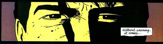
When you go to the letterers themselves, most of them are ambivalent about the whole thing. Gary Garou thinks lower case can add more personality to the text, but his main concern is legibility and efficiency. Most of the letterers and creators interviewed for this article series agreed both options have their uses, and that the decision should be made based on the individual book’s needs, not by some external mandate. When they did have a personal preference, it was nearly unanimous in favor of ALL CAPS. Writer Jeff Parker said they “feel specific to comics, which I like.” Or, according to John Roshell, “it just LOOKS like comics, dammit!”
IDW editor John Barber was the lone holdout in favor of mixed case, but even he was quick to admit they require more effort. “There’s more fine-tuning to do. But I think fundamentally mixed case is easier to read.”
The real question though, is what do you think? If you have a strong opinion one way or another, please share in the comments below.


