
Hello everyone, and welcome back to the second edition of Matthew’s Got You Covered, the column in which I look at the covers of books and decide if they get a 🙂 or a :-(. Think about that one scene from the Season 3 finale of Doctor Who. You know the one:

Right. Exactly.
Check behind the cut for this week’s top 5, and the second installment of the Blunder Award.

The Unwritten is just one of those books that, for years to come, will delight readers of all generations of comics due to it’s infinite relevance and meta-context as only one who really cares about literature can write. It’s been two years since the book started, and it still remains at the top of my read list whenever it comes out. And, as you’ll find is a trend this week, Yuko Shimizu the faithful cover artist of the series is just as much an incredibly important member of the creative team as Mike Carey and Peter Gross are for what’s inside.
With this week’s issue we are very delicately exploring the “birth” of Tom Taylor, as it were. His true existence has been a question since the beginning of the comic, as it has been hypothesized that he isn’t even really a real boy. The last issue gave us a glimpse of the implications of this and how Tom became real, which included himself as a young boy being trapped in a vat and force fed information by his “father” Wilson. This issue’s cover ends this story and, in a bit of twisted fate, sees the young Tom Taylor watching over the older Tom Taylor as our current Tom begins to realize just what was done to him. While Mike and Peter take 20 pages to give us the story, Yuko Shimizu manages to do it in one beautifully articulate cover.
The layout of this cover isn’t like most Vertigo covers. Yes, it has that ugly Green Lantern banner that all the books are currently and unfortunately placed with (you’ll see this sentiment a lot from me), but the logo remains emblazoned at the top with the creative team right under. Most Vertigo books leave all this information for the corner, but the Unwritten strays from this, even placing it’s barcode sideways instead of vertical. It’s effective in that it actually manages to take away even less from the color by Shimizu, covering up a side that is relatively parallel to it’s other half. We’re only losing bits of wire after all, and the less we take away from Shimizu’s art the better.

This is probably the least conventional of all the titles that I’ve picked this week. In fact, this cover is uniquely curious in it’s efforts. I find that a lot of the books I pick have similar styles and trends, but this one doesn’t feature any of them. However, it is still an intriguing cover, and it’s one that has certainly endeared me to check out the interior by it’s own merit.
Zircher’s image here is that of a split apart team of men in the shadows, which in it’s own way is commentary on the context within. We’re meeting the characters for the first time with this mini series, and we’re unclear as to who any of them are; the imagery is pitch perfect for that purpose. Cut apart and divided, we only get this very brief glimpse at the heroics we will assumedly follow, and Zircher invokes Francavilla’s timeliness and artistic sensibilities to get more of a pulp feel for this 1930’s placed comic.
The layout is also different. Thankfully, there is no Green Lantern banner to muck things up due to this being a Marvel cover. Instead, however, we get a question: “Who are the Mystery Men?” Placed in an irregular font, the cover begins to feel more like a poster, perhaps even a Wanted ad of a stylistic nature that invites the readers to discover just what is going on within. Mystery Men is given the biggest piece of the top banner as to differentiate the title from the question, though I feel that element may be lost on some less savvy readers. Furthermore, the number and conveniently formfitting Marvel barcode are placed in the lower left, definitively taking away from no element of the cover at all, with the creator names stacked neatly in the bottom center. As far as not taking away from the imagery, Marvel’s graphic design team has done a wonderful job of letting the cover stand on it’s own.
Continued below
Sean Murphy is perhaps the best artist whose work I don’t have a lot of. I buy what I can of his comics, but considering he only came to my attention due to his collaboration with Morrison on Joe the Barbarian, I will admit that I am pretty much playing catch up and finding my way through his career.
That being said, his work here on American Vampire is incredibly exciting. While Rafael Albuquerque is certainly an incredible talent in the main title, Murphy has such a visceral style all of his own that no one else can match, and when he gets going he really gets going. The cover here is almost like a movie poster: the evil vampires draped in blood red goose-stepping and carrying the Nazi flag in the background while our new heroes stand in black and white are posed, ready to take them out with their powerful weaponry. The heroes stand apart from the villain in a great way, and the setting in the background helps to really bring that “classic film poster” vibe to light.
The logo placement here, while unfortunately pushed by that awful Green Lantern banner, is fitting. The American Vampire logo sits behind the head of the Nazi, not taking away from Murphy’s work even while laying above the flag. Even the new bit, “Survival of the Fittest”, is cleverly emblazoned under the Ampire against the barrel of a gun and a flag. The creative team, barcode and price point are all placed in the lower left as per usual, detracting from the cover as little as possible and only obscuring a tiny piece that can be inferred from a general understanding of what castles look like.
Although, really? When it comes down to it? This cover is on the list because Sean Murphy is fantastic, and if you notice his work on anything you should immediately pick it up. I’ve tried this trick with at least 4 books now and so far I haven’t been disappointed yet.

Jock is perhaps the most unsung hero of the book Scalped. While he has never done the interiors for the title, Jock has been delivering wonderful cover after cover to the book that may just be the darkest book Vertigo is currently putting out. And anyone who has been following the book for quite some time will, just like with this week’s winner, always associate Jock as just as important a member of the creative team to the book as Aaron and Guera themselves.
Jock’s cover here, while unfortunately pushed a bit by that awful Green Lantern banner, gives you a taste of what you can expect of the interior comic. This dark and gloomy tree full of owls that are watching the events of the comic take place is a pivotal element of this particular issue, and their red eyes help to bring out their judgmental stare. The man in the trees, who himself is a character in the story, adds to that judgmental element as he stares out into the unknown, waiting for the events to come. Everything on this cover matters, and is a dark glimpse of what is to come. Even the horse in the corner of the cover ultimately has importance to the story, one that isn’t fully understood until the issue is then read.
The layout for the cover works. The Scalped logo emblazoned at the top (where the Green Lantern banner is and shouldn’t be, I continue to gripe), with the creative team and barcode/price point in the lower corner in that neat Vertigo style. It doesn’t take away from the haunting owls, and a close look at the cover will even reveal one of the owls hiding in the E of the title, which only adds to the creepy placement of the creatures (although I suppose that’s an accident). This is a bleak cover, but one that would assuredly draw some eyes.
Continued below
Honestly, I talk about Morning Glories so much at this site that people are going to think they’re paying me for this. Which they are, obviously, but that’s besides the point. Morning Glories is my favorite non-Marvel/DC comic right now, and the beautiful covers by Rodin Esquejo are as big a part of that as the mysteries inside.
The current arc of Morning Glories features all the kids except Casey getting their own one-shots that elaborate on their own personal weirdness. With this issue we get Jade, who is arguably the most polarizing member of the group due to her inherent weirdness. Jade is a character who is described in the book as someone with a Plath-esque view of life, and this cover nails that 100%. Cowering in a corner with streaks of light coming from some unseen window providing the only discernible light in her otherwise black and isolated existence. It’s dark, it’s dreary, but it’s perect.
The layout adds to the effectiveness of the cover as well. The Image logo and price point as well as the creative team’s names are all neatly lined up along the bottom in a darker fashion as to not take away from the cover, allowing it to maintain it’s bleakness. While a dark cover is certainly not the type to jump off the rack if you’re not looking for it, fans of the series certainly have a lot to look forward to as they pick up the title to take home.
Runners Up: Wolverine #10 by Jae Lee, Journey Into Mystery #624 by Stephanie Hans
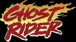
The Blunder Award Of The Week goes to whoever redesigned the Ghost Rider logo for Marvel’s Ghost Rider #0.1

I liked Ghost Rider #0.1. Honestly. I plan to get the first issue, and perhaps stick around for a bit. I found the writing quite charming, to be quite honest, and I’m interested in seeing what Williams has planned. However, when we compare the new Ghost Rider logo to the one before it, or even the classic one, the new one ends up just looking quite gaudy. Were the chains really necessary? And the flaming skull in the middle? Guys, I don’t mean to speak for everyone here, but I think we get it.
——————-
That’s it for this week’s Got You Covered. Here are your weekly stats, based on appearances on the list:
Adi Granov — 13
David Finch — 12
Jae Lee – 8
Dave Johnson — 8
Jock — 7
As a note, this week sees Jock bursting into the final five due to his inclusion in the number two spot. Good job, Jock. You have more than earned it.
Tune in next week for more eye candy.


