

Welcome, Earthlets, to Multiver-City One, our “2000 AD” weekly review column! Every Wednesday we examine the latest offerings from Tharg and the droids over at Rebellion/2000 AD, the galaxy’s leading producers of Thrill-Power entertainment. Let’s get right to it!
THIS WEEK IN 2000AD

Judge Dredd: The Eternity Hotel
Credits: Rory McConville (script), Dan Conwell (art), Jim Boswell (colors), Anne Parkhouse (letters)
Brian Salvatore: This week’s “Dredd” one-shot is a fun romp through history – literally. The strip begins in a very un-Dredd way, with a newly married husband departing from his wife, off to war. Both the setting and the sentimentality is odd for a “Dredd” story, and we instantly see why: this is just a luxury hotel, letting people step into history. But it’s not all gravy; people from all eras are time-displaced in a hotel, giving the venue an ‘authentic’ feel for the guests. McConville does a really nice job walking that line between everything feeling authentic, and then the walls start to collapse. This actually happens a few times throughout the strip, and gently leads to the realization that something is very wrong.
Conwell’s art is particularly impressive, as he has to draw future tech alongside neanderthals and snow-capped cottages. His work is fluid, and never feels as jittery or displaced as you may think such a scattered palette may cause. Though not particularly Dredd-centric, this is a fun strip to start off a new year or Progs.
Brink: High Society Part 12
Credits: Dan Abnett (scrip), Inj Culbard (art), Simon Bowland (letters)
Michael Mazzacane: If the previous strip was Abnett and Culbard dropping the pretense, part 12 of ‘High Society’ goes full bananas, fast, in a way you couldn’t expect from a “2000 A.D.” strip. As if Inj Culbard drawing Tillerson doing Nic Cage face from Vampire’s Kiss to the news that the answers to everything was in the Bermuda Triangle didn’t make things clear.
Another sign that things are starting to skid off the rails, the gutters are a different color. Normally they’ve been the traditional white, here they are replaced by hot pink that turns into a gradient ending in black. Everything about the tone and texture of the gutters clashes with Culbard’s art. Reading this vertically, via pdf, it actually made for a nice visual accompaniment as the gradient acted as a sort of timeline for the specific strip.
Tillerson becomes the star of this strip, as he is the one who is allowed to emote and move around. Interestingly Culbard keeps the visual language of the strip relatively intact, the framing is still tight and page layouts are the same, but without the need for subterfuge it allows them to insert Tillerson acting off his gourd and disrupt everything. Everyone else is given what in comparison looks like minimalist facial designs in order to not distract from Tillerson’s performance. Culbard does a good job with these background players, using their few lines to show the increasing unease in both Mariam and Gentry and maneuver Croker around when things take yet another turn. For as absurd as some of the moments in this strip is, it is visually sound in visually narrating these events.
Of all the things this strip does to go off the deep end formally and narratively, Abnett having characters refer to the missing CEO of House Junto “papa” is easily the weirdest bit.
I used to think I knew where this strip was going, that is no longer the case and it appears to be a wild ride ahead of us.

Skip Tracer: Louder than Bombs, Part 2
Credits: James Peaty (script), Paul Marshall (art), Dylan Teague (colors), Ellie De Ville (letters).
Tom Shapira: The best serials of the Galaxy’s greatest tend to be anchored by strong characters; characters whose appeal and ‘deal’ is obvious the moment they appear on the page. We know Judge Dredd, Johnny Alpha, Nikolai Dante etc. just by looking at them. chapter two of “Louder than Bombs” and I still don’t get the appeal of protagonist Nolan Blake – to me he appears to be another generic grizzled space cop, of that type you can buy a dime a dozen. The psychic powers are potentially neat addendum (if used creatively), but they can’t make the boring interesting.
Continued belowAnd that’s the problem with Skip Tracer, so far, it’s boring. It’s very well-made, Paul Marshall and Dylan Teague work well enough together to produce the sort of used-future-world the script calls for, but it just doesn’t feel new. The Cube is described as an overcrowded space-city in which cultures from all over the universe meet – surely is should be a boon for the artist to stretch out, go wild with crazy backgrounds, make the world unique; not here. Science Fiction of this type should be bold and exciting, this is just ‘same old, same old.’
This strip needs to pick up steam, and it needs to do it fast.
Tharg’s 3Rillers Presents: The Scorch Zone Part 1
Credits: Eddie Robson (script), Nick Brokenshore (art), Gary Caldwell (colors), Ellie De Ville (letters)
Greg Lincoln: Despite it predictable plot and its stock mostly nameless central casting heroes, ‘The Scorch Zone’ part one was rather engaging. Starting from the all too likely premise that climate change will make the temperate zones of the Earth un-livable Eddie Robson’s script presents a rather believable post apocalyptic story. Robson manages to use a clever mixture of tell and show to flesh out enough of the world and his protagonists to capture your interest. It could be that given a thinking persons background mental state of worry over an impending inhospitable future the MacGuffin he presents, silly or not, hooks us into the story he is telling. The twists Robson throws at you in this Twilight Zone/Black Mirror tale are predictable, but not in a bad way. This kind of story set up usually leads to aliens, robots, demons, angels or some kind of horrific culprit behind the plot so the appearance of the zombies, if that is what they are, fulfills our expectations.
Nick Brokenshire and Gary Caldwell don’t push any boundaries with their competent, clean pages and designs for this three off story. It’s clear and familiar storytelling and given the shallowness of the characters, thus far, a lot of the sense of investment must come from the humanity and horror they instilled in these few pages. We’ve seen these ruin filled post apocalyptic landscapes a lot in movies and comics and it’s a feat to create one that holds readers attention. Their art hints, like the script, hints at stories not being told and give the world an air of reality despite the shallowness of the details we gave about it. It’s well conceived storytelling all around that you don’t notice at first glance with a strip that might initially come off as filler.

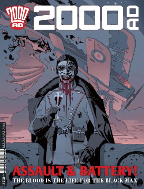
Fiends of the Western Front, Part 2
Credits: Gordon Rennie (script), Tiernan Trevallion (art), Annie Parkhouse (letters)
Kent Falkenberg: This week’s installment could very well be subtitled ‘A Brief History of Time and the Man-Bats.’ Gordon Rennie and Tiernan Trevallion spend their page count regaling us with the tumultuous legacy of vampires versus their more winged, feral brethren. And what could come across as something of a bland, encyclopedia entry is elevated by Trevallion devilishly effective art.
Let’s get this out of the way, “Fiends of the Western Front, Part 2” is framed almost entirely as monologue, with one character shackled in silver-forged chains. So while the setup might be a bit cliched – and Rennie’s script a bit too expository – there’s an atmospheric polish of menace and the macabre that keeps the entire chapter engaging. Trevallion pulls off a mix of Great War and German expressionistic aesthetic that might be the richest of that sort found ouivatside the confines of the Mignolaverse. It never feels derivative either. Throughout the flashbacks to the pre-history of these characters lore, Trevallion gives a frothy, unhinged quality to the humanoid beasts. And his attention to morbid, little details – one of these hybrids uses a vicious, jagged claw to wrench a tightly swaddled babe from its mother as a swarm attacks their prey – is genuinely unsettling.
“Fiends of the Western Front, Part 2” might not push the story forward in the most inventive ways, but Rennie has crafted a clever mythology and division between the flying, nightmarish creations and vampires. Regardless, Trevallion’s art means this story is definitely one to keep an eye on – and maybe the reason to keep another one open at night.


