

Welcome, Earthlets, to Multiver-City One, our “2000 AD” weekly review column! Every Wednesday we examine the latest offerings from Tharg and the droids over at Rebellion/2000 AD, the galaxy’s leading producers of Thrill-Power entertainment. Let’s get right to it!

THIS WEEK IN 2000AD

Credits: Rob Williams and Chris Weston (script), Patrick Goddard (art), Chris Blythe (colors), Annie Parkhouse (letters)
Rowan Grover: Williams and Weston kick off a new chapter for “Judge Dredd”, one that still reels from the “Day Of Chaos” and even has some secrets uncovered from “The Apocalypse War”. Williams and Weston have a lot of fun parodying the reality TV host with his excavation crew led by the charismatically truthful Dave D. Digger. He’s a character constantly complaining about how underpaid he is, yet he does it with a constant TV-ready grin and talks with a verbose, sprawling vocabulary that is hilarious to follow. Williams and Weston get even wackier as they bring in Sov Zombies that have been unearthed, also including a great Monty Python-esque sketch where one of their victims constantly cries “I HAVEN’T HAD IT!”. The chapter is capped off by a great appearance from Dredd himself, who lands like an action hero before being immediately rejected by the Sovs as they gain the upper hand, subverting audience expectations.
Patrick Goddard is a darn treat on art here, painting the high-detailed excavation sites of the prog beautifully. The opening scene has a touch of melancholy as Dredd drives past the abandoned Memorial Park, dilapidated and unkempt. We then get a great sense of levels and structure to the environment as Goddard uses the excavated land to give the scenes real depth. Aside from the environment, Goddard plays with high-contrasted emotions well. Once the Sov Zombies arrive, their victims are stricken great terror whilst they themselves bear emotions of grit and vengeance. Blythe also does a great job on colors, giving the excavation site a mostly gritty, earthy palette with an occasional flash of blue to remind us of that melancholic feeling. He plays well with glowing shading in the Zombie scenes to inspire terror and claustrophobia, making the flashes glow in small, sharp bursts amidst heavy black shading and coloring.
“Unearthed” starts off with a bang, with Williams and Weston injecting their typical wit into a well canonically established tale. Goddard provides some great high-detail art, while Blythe gives it a gritty yet dreamy, glowing life.
Survival Geeks: Dungeons & Dating (Basic), Ppart 2
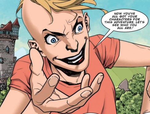
Credits: Gordon Rennie & Emma Beeby (script), Neil Googe (art), Gary Caldwell (colors), Annie Parkhouse (letters).
Tom Shapira: I will say this – this serial doesn’t waste time; basically bypassing a lot of the plot-rigging in favor of just straight out dropping our heroes inside a giant maze (of doom!), trusting that we all know the score of these things usually go and we can skip the ‘meeting a mysterious person in a bar’ bit. That being said – self-awareness is not, in itself, funny, the strip should either find some better gags or find a way to define the characters better, all the guys here seem to meld into a single whiny puddle, at least Sam is having fun.
Sam is possibly the most interesting avenue for exploration here, the idea that there are two versions of her and that one is ‘rigging’ the game in favor of the other; this is a world designed by men (well, a man) that has been taken over by a woman. It’s a fascinating notion, though considering the nature of the strip so far I do not believe we are about to get a thesis out of this one.
Googe’s art is still fun – bright and energetic. I wish he’d go a bit wilder with the character and monster designs, but seeing as the story is intentionally aping ‘generic’ fantasy tropes I can’t complain too much. It’s just a fun story to look at, from art to coloring to letters, constantly on the move; the creators seem to be having fun and so far I am with them.
Continued below
Credits: Ian Edginton(script), Leigh Gallagher (art), Ellie De Ville (letters)
Greg Lincoln: Wether you read the “Kingmaker” story from a couple of years back or not Ian Edginton’s follow uptake works pretty well. Pulling so heavily, near directly, from the well trod land of Tolkien’s Middle Earth,there is plenty familiar here to before he takes us into his tweeted, more “metal” version. The little person hero, Baliol, brought back something cursed from his trip “there and back again.” We are told the tale of how the firedrake dagger had played into the paranoia of the Boroughs folk as refugees arrived in their lands and nudged them deeper and deeper into xenophobia. Edginton brings in some necessary humor as Crixus breaks into the lengthy narration asking to be killed first so he wouldn’t have to hear more of the endless story of their lean into conservative extremism. The big moments that follow as the bird flipping Ebora appears to “save” them deliver a solidly entertaining resolution to the “Hobbit” inspired plot. Edginton makes some good real world points with this story given the way the West is treating refugees and leaning into xenophobia in some cases.
Leigh Gallagher had as much to do with the success of this chapter. He made the dry history told by Baliol interesting with his use of silhouettes compared to his deeply detailed other panels. The appearance of the entity that saved Crixus made a big visual statement beyond the prominent f sign being delivered in that bright apparition after all the dark panels that preceded it. But perhaps the most impressive artistic moment are the subtle shadows on the faces of Yarrow and Crixus on the final page. It’s a soft, subtle effect that calls just a little attention to it given the great execution of that shadow.

Credits: Guy Adams (script), Dan Cornwall (art), Jim Boswell (colours), Simon Bowland (letters)
Kent Falkenberg: A champagne supernova fizzles and dissolves away over the course of four uniform panels to reveal the shining and effervescent visage of Max Normal. “Pour me a double of what the hell with a dash of damn and shake it,” the dapper chap says, once finally uncovered. In these brief panels, Guy Adams and Dan Cornwall instantly distill their main character to his essence of effortless retro-cool.
But it’s a bit of a feint as well. “How the Max Got His Stripes, Part 1” opens with some formative sleight of hand. As the page unfolds, those bubbling bubbles turn out to be nothing more than soap smears across a window. And an old acquaintance of Max is shown to be performing the thankless, and apparently unnecessary task, of washing windows on an already shimmering Max Pad. It’s as though Adams and Cornwall are trying to orient us to the fact that all may not be as it seems, behind the pinstriped facade. There’s bound to be a bit of grit beneath the glamour. And maybe time’s up on what some feel is timeless.
As “How the Max got his Stripes, Part 1” unfolds, the two friends don’t just talk a walk down memory lane, they go strolling there in the flesh, only to find their old watering hole boarded up and out of business. This walk through their old haunts is seasoned with criticism of gentrification, hipster culture, and those living in perpetual awe of times long since passed. Adams writes Normal’s dialog with a rhythmic verve that allows the narrative to swing down these streets. It’s infectious and propulsive as much as it’s a bittersweet reminiscence about those spots where one once came of age. All the while, Cornwall’s art is delivered with fluid clarity. And he sinks himself into the facial and follicle follies of the hipper-than-thou with ruthless abandon.
Overall, Adams and Cornwall’s story is shaping up to be a clash of generations. This installment ends by seeding Normal’s burgeoning conflict with the roughest gang in the neighborhood – a cross between the Rugrats and Bill Paxton’s band of punks from the first Terminator. Whether this story will play out as biting satire or melancholic rumination remains to be seen.
Continued below
Credits Dan Abnett (scrip) Mark Harrison (art) Ellie De Ville (letters)
Michael Mazzacane: As project Ferdinand reacts havoc, you’d think this would be another exercise in Harrison’s art being colorful but hard to read. This largely isn’t the case as continued sound page design develop the sense of chaos while making things legible. Pages tend to be structured around a singular large panel, often of Ferdinand doing work, with smaller spot light panels surrounding it to highlight little moments of gore. Medium sized panels make up the rest of the page as everyone scrambles to try and put an end to whatever this is. While the previous strip was an effective exercise in slow burning tension, this one is all about the chaos and anarchy moments after it all went down.
Creating that sense of a mad scramble to try and contain or stop this things, turns these five pages into quite the thriller. It’s a different kind of pace from other “2000 A.D.” strips or recent “Grey Area.” Here everything is moving so fast and with the key orbiting panel, almost anonymous in the destruction, there isn’t much of a human connection. Even as Bullit and Face were out running Grell, they were the focal point. While the pace is up tempo it didn’t make this any faster a read or a light read. De Ville’s lettering does a good job of creating a sense of coherence across the strips various spaces and help guide everything.
Harrison’s art work for the Ferdinand attack is interesting. It is the normal mixture of various blends and extra effects but it feels like there is a slight disconnect from the line work. I don’t mean that in a negative sense, it helps to further the sense of chaos. It is as if the anonymous masses, and not-Stan Lee, are being separated from themselves like layers of an onion or their phasing out. All of it reinforces the sense of mayhem and commotion that is going on.
The second part of ‘Making History’ is a very effective kaiju segment with no apparent end in sight.


