

Welcome, Earthlets, to Multiver-City One, our “2000 AD” weekly review column! Every Wednesday we examine the latest offerings from Tharg and the droids over at Rebellion/2000 AD, the galaxy’s leading producers of Thrill-Power entertainment. Let’s get right to it!
THIS WEEK IN 2000AD

Judge Dredd: The Long Game, Part One
Credits: Michael Carroll (script), Mark Sexton (art), John Charles (colors), Annie Parkhouse (letters)
Rowan Grover: “The Long Game” introduces us to the latest hardass character to grace the pages of “Judge Dredd”, the spiteful and morally grey Sage. Carroll does a good job as introducing him as the private investigator/Punisher type analogue, helping out those in need who can’t afford to help themselves. He appears to help the Guinns free of charge at first, and after a few weird asides about his comrades being “PERFORATED BY DREDD HIMSELF.”, Carrol gives him a respectable origin story also tying him into the titular character. Sage goes to take care of the thugs assaulting the Guinns, with Carroll giving him some lines dripping in cliche like “THAT ENDS NOW. OR I END YOU.”. However, Carroll subverts the readers expectations cleverly in the end by having Sage charge a ‘protection fee’ of his own, revealing that he is no better than the people he hunts. Considering this is only part one, I’m intrigued to see where Carroll takes this character.
Mark Sexton has a clean, detailed style that works well for the dynamic action and violence that takes place in this story. The opening scene gives you a great sense of this, rendering all the mess in the back streets of Mega City One with towering train lines and busy apartment blocks. Even smaller scenes like the introduction of Vilmur and his thugs have a well composed busy-ness to them, with Sexton making everything works like an album cover in the limited space of a small panel. John Charles supplies colors here, and while they work great at providing a gritty look at the backstreets of this city, they can come off a little plastic looking with shading that feels a little soft sometimes, especially when Sage’s phone light flashes on his face.
“The Long Game” introduces us to a relatively cliche, but intriguing new character. With rock solid art and an interesting story hook, I’m intrigued to see where the creative team takes this one.
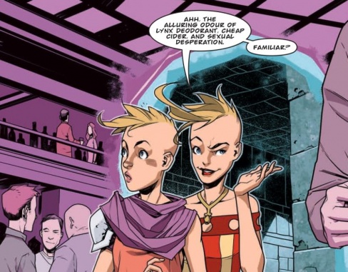
Survival Geeks: Dungeons & Dating (Basic), part 4
Credits: Gordon Rennie & Emma Beeby (script), Neil Googe (art), Gary Caldwell (colors), Annie Parkhouse (letters)
Tom Shapira: If the thing you like best about a serial is how quickly it rushes towards the endgame it’s the probably not the best of strips. “Dungeons & Dating” simply fails to rise above itself as both a comedy and a drama. Sam and Simon feel their relationship doesn’t work until they get another shot at revisiting their first meeting -at which point they decide that actually it was worth preserving for no discernable reason. It seems like the creators are invested in this couple, enough to make their love the lynchpin of this story, but they fail to make invested in it as well.
2000AD strips are not really known for their romance content (“Nikolai Dante” is the one exception I can think of – and even there it was more often lust than love) which should give “Survival Geeks” a chance to stand out in the crowd; but it just doesn’t manage to make it count; the relation between the characters never seem to rise above the level of the gags.
On the bright side – the art’s still nice, even if Neil Googe is forced to play within pre-determined realm of RPG fantasy (let him go wild! Let him design his own monstrosities!); there’s nothing mind-blowing here but it’s bright and colorful and just fun to look-at.
Still, it’s nice to know the creators understand “Survival Geeks” is the kind of joke best taken in moderation.

Kingmaker: Oroborous Part 4
Credits: Ian Edginton(script), Leigh Gallagher (art), Ellie De Ville (letters)
Greg Lincoln: ‘Oroborous’ part 4 has all the earmarks of being a middle chapter in a story but none of the downsides that comes from it. Edginton lays out some more of the worlds mythology and backstory in this part, he introduces his Stone People, this worlds version of dwarves. It’s an interesting story that is gloriously illustrated, but this chapter really shines in its talking heads scenes between Princess Yarrow, the dryad, and the orc Crixus. The verbal interplay between them shows a lot of how they feel about themselves. It builds complexity in their relationship with each other and expands their stories. The dialogue is wonderfully dry and witty in a heavy metal version of classic British humor. This chapter that could have been dry talking heads is very much full of life and color.
Continued belowLeigh Gallagher is a star making the scenery and characters look dramatic despite the lack of action in this chapter. The landscapes are very much part a character in this story, in more ways then just the fact that towards then end its as literally the remains of the Stone People in the story. Crixus,Yarrow and Ablard all visually pop off the page. The designs and colors Gallagher chose make the distinct, interesting and individuals you want to see more of. He made this peaceful travelogue story as exited as a story filled with action.
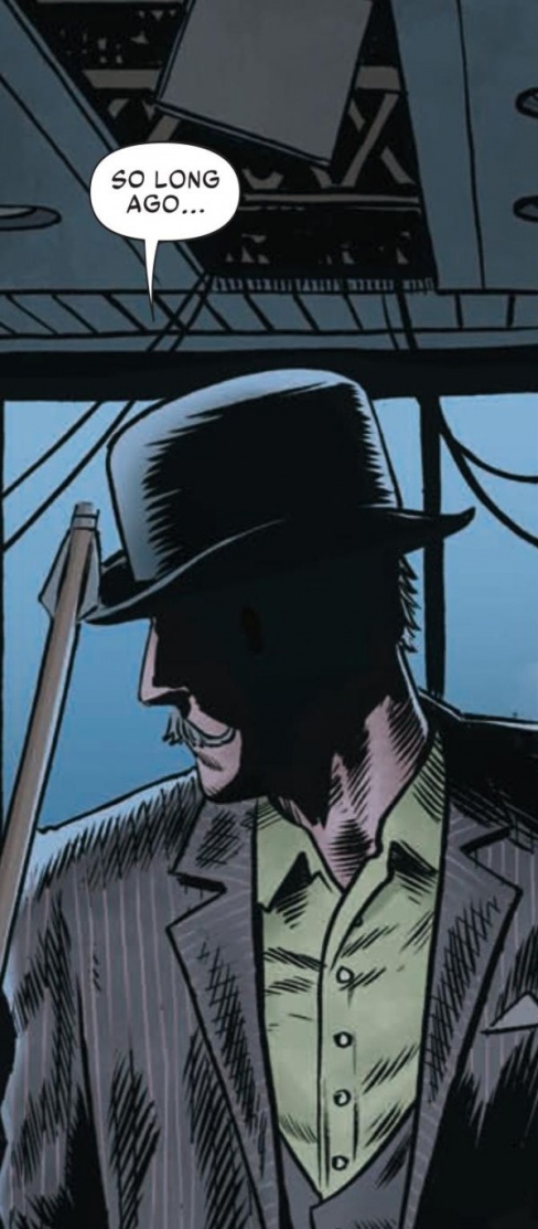
Max Normal: How the Max Got His Stripes, Part 3
Credits: Guy Adams (script), Dan Cornwall (art), Jim Boswell (colours), Simon Bowland (letters)
Kent Falkenberg: Strolling down memory lane takes us all the way back to the birth of the cool. Guy Adams and Dan Cornwall give Max ample room this week to reminisce back to the exact moment of his pinstriped genesis.
A scruffy street-kid in tatters and untied boots steals charred meat from a street vendor. A chase ensues. They race off across a snow-swept thoroughfare and into a happening Shuggy club. And once the grimy vendor gets on the jump on the kid, Max finds salvation at the hand of the coolest cat in the place. ‘How the Max Got His Stripes, Part 3″ has a simple through-line. However, it feels like Adams and Cornwall unearthed some Dickensian nook within the alleys and clubs of the Meg’s semi-distant past. “Christmas in a cube for you,” Max is threatened halfway through the race.
Everything still comes off with the left-of-center verve that the strip has been swerving with since the very start. The aggrieved vendor is decked out in an over-sized blue helmet that’s somehow makes the man look like a cross between Juggernaut and the characters in Tron, albeit in a greasy apron and looking slightly more ridiculous than that description implies. Cornwall does great work with his character design here here. With as awkward and as scruffy as Max and that guy look, it all makes Mo Bland look that much more resplendent and triumphant . “The sharpest crease in the wardrobe, the most perfect stripe in the sleeve,” he says, offering a hand to Max. And to see him is to believe it.
“How the Max Got His Stipes, Part 3,” might not be as madcap as what came before. But Adams and Cornwall’s tale is still slick as ever.
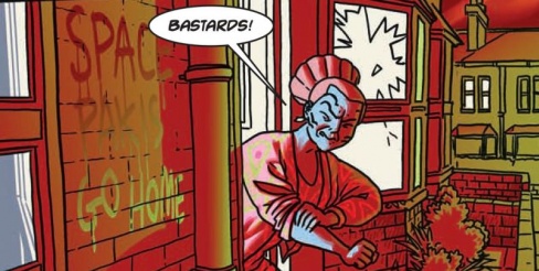
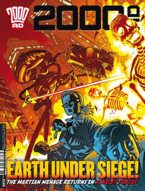
Scarlet Traces: Home Front Part 1
Credits Ian Edginton(scrip) D’Israel (art) Ellie De Ville (letters)
Michael Mazzacane: At first it seems like there isn’t much to the start of “Scarlet Traces,” as writer Ian Edginton and artist D’Israel spend the entirety of these opening pages setting up the looming Martian invasion. As far as setting the table goes, it dose that quite well. There is a bit more too it, how the omnipresent red light of the sun makes the strip appear to revel in the looming omnipresent threat. This strip establishes the basic plot, one extra terrestrial refugee family hunkering down for the invasion and a senior citizen who might hold the key to stopping the Martians, but the use of the red light to literally hang over – or color – everything helps to give this strip an extra necessary bit of tension.
By the opening page of the strip you’d be hard pressed to sense all that tension and fear in this alt-history 1960s. Sure we see black and white news casts of mass migration out of the planets major cities, but with the melodramatic commentary juxtaposed against the normal looking image of a family watching the news it plays as something of a gag. The tendency towards a gag is helped no doubt by the blue skinned extra terrestrial family that takes the place of the stereotypical nuclear human family. Edginton and D’Israel explore the racial tensions between these refugees/immigrants and their human neighbors at this time of high anxiety with a surprising twist. Using aliens to easily explore metaphorically xenophobia and Otherness is common practice in sci-fi, as we come to find out someone has tagged their house with an epithet. The twist the creative team give is recognizing not that this is some metaphorical racism that is being experienced, but that this kind of hatred has always existed this time the Other are aliens.
Meanwhile the government calls upon a senior citizen, Ms. Hemming, in their time of need. Tonally this scene couldn’t be more different, but the core expressive line work runs through both of them. D’Israel art plays is in this more contemporary Archie sort of mold. The pallet is punched in a and simple, given an ominous extra glow due to the encroaching red. Their line work itself is pretty standard representational art with just the right amount of cartoony expression that gives everyone a enjoyable dose of humanity. Overall this is a solid start to the new strip.


