

Welcome, Earthlets, to Multiver-City One, our “2000 AD” weekly review column! Every Wednesday we examine the latest offerings from Tharg and the droids over at Rebellion/2000 AD, the galaxy’s leading producers of Thrill-Power entertainment. Let’s get right to it!

THIS WEEK IN 2000AD

Cadet Dredd: Tooth and Claw
Credits: Mike Carroll (script) Nico Assirelli (Art) Gary Caldwell (Colours) Annie Parkhouse (Letters)
Christopher Egan: “Cadet Dredd: Tooth and Claw” starts off with the crash of a Judge transport ship. Returning home from a training trip to Mega City Two, the ship had to get around a huge rad-storm and didn’t quite get by unscathed. Something or someone shot them down. With a ship that is permanently downed, the cadets try to figure out their next move with their superior Judge Zand. Joe Dredd, his brother Rico, and Roxanne Vella all got through the crash with just minor injuries., leaving the other more injured cadets to fend for themselves back at the crash site. Luckily there were no deaths due to the crash, but their circumstances have not improved.
Cadet Vella narrates this story through a mission report. As the three cadets and Judge Zand make their way through the desert they meet a young Mutant woman named Muriel living off the land with her family and some trained dinosaurs and pterosaurs. The Judges soon get pulled into a battle between this family of farmers with cloned dinosaurs, and another group using decommissioned mech-suits to stake claim over this forgotten stretch of land. There is bad blood all around. Those who hate Judges, those farmers who hate each other, and with Mutants in the mix, there is tension between all three groups. Waging a battle with relics of a long over war, the Judges do what they can to assist, but it is soon evident that not everyone is suited to handle abnormal scenarios like this.
Carroll’s script is tight and interesting as it juggles a bunch of wild ideas, mixed into a post-apocalyptic Hatfields & McCoys type of story. It also does a lot to set up how both Joe and Rico Dredd will be seen in later years of their lives. Exciting and interesting to read, the action never lets up. It smartly uses Cadet Vella to see these characters from the outside, allowing her own experiences to shape how we see them, even if we have been reading about them for years. Gripping storytelling aside, it’s super cool to see dinosaurs and mechs wage war. Like a mix-matched action figure fight in the middle of the Cursed Earth. Assirelli’s artwork is fun and punchy. Even with the wild violence throughout, it still feels safe enough for a wider audience without dumbing itself down for older readers or getting to tame to appeal to kids. A solid one-shot outing for a young Dredd.
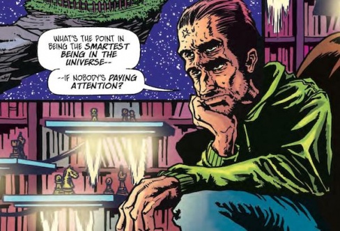
Abelard Snazz: The Only Way is Up
Credits Paul Cornell (script)Anna Readman (art) Pippa Bowland (colours) Jim Cambell(letters)
Michael Mazzacane: ‘The Only Way is Up’ is just an all-around delightful and well put together one-shot comedy strip. In many ways it feels like a throwback from its poking fun at Cold War era arms race paranoia, to Anna Readman and Pippa Bowland’s art and the general toxic narcissism of the titular lead.
Readman and Bowland’s art reads like modern 8-16 bit inspired video games, they are clearly influenced by a certain kind of inking and color process, but unlike their inspiration have contemporary production processes that allow them to evoke the aesthetic to make it cleaner and clearer. Bowland would not have been able to get the luminance effect on floating chess tables on the first page or subtle gradation on Snazz’ knee back in the eighties. In general, the color values are turned up quite a few notches even as they evoke the old limited color process.They are, however, still notably darker than we are used to. Compare Bowland’s work with Gary Caldwell’s in the “Cadet Dredd” strip right before this one. Bowland’s coloring would not pack the same punch if Anna Readman did not ink the pages, the way they did. There is something plainly gritty about them, and yet clean and obviously made through an aesthetic process not a production one. Together they create a strip that reminds me of Tim Truman and Sam Parson’s work on “Scout” it evokes a feeling of grit and dirt. Except, Readman and Bowland’s work still has notable moments of cleanliness where the power of contemporary production is able to let them have their cake and eat it to.
Continued belowCornell and Readman structure this strip wonderfully. After a few pages of setup the strip finds its rhythm as Snazz gets pulled deeper and deeper into a double helix of subatomic paranoia and anger. This repetition allows for a variety of cyclical page layouts that seems to happen faster and faster until you reach the end. The jokes and humor of this strip might be a bit dated but how they are executed on a formal level is worth picking at and considering.
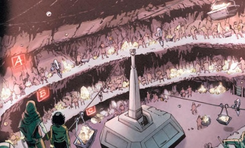
Venus Bluegenes: Threat Level: Zero
Credits: Liam Johnson (script), Aneke (art), Barbara Nosenzo (colours) Simon Bowland (letters)
Ryan Pond: Being sent into the Korvanium mines is a privilege only in the sense that the slavers don’t consider you a threat for one specific reason; gender. Venus isn’t very happy with the prison in the first place, but once the job is revealed and she realizes the scope of the task, she has to employ the help of her “chain mate” and some of the other prisoners.
Jonson has crafted a great script that never leaves me drowning in the world, but also doesn’t shy away from diving right in. As facts and revelations are introduced, it continues to expand the story in interesting and unexpected ways. Going back, the twist is littered with hints all through the beginning of the story that really make the reader question their own role in gender politics.
The artwork by Aneke is well done, and really captures the vast scale of the underground mine and does a great job of moving the action around that environment. There is a lot of detail in the smallest of parts, from the destroyed robot as Venus rips through it with a mining pick to the flaking skin as she fights back in rage. Nosenzo does a great job with the colors, especially since a lot of the backgrounds are predominately just a gradient of color.
Venus Bluegenes went into this prison mine to free the prisoners there, but a few complications and revelations later she found herself in a tight spot. Fortunately her actions inspired those around her, and they stuck around to help prove that the robots made a huge mistake, these ladies are no “Threat Level: Zero.”
Future Shocks: For the Man…
Credits: Karl Stock (script) Tom Newell (Art) John Charles (Colours) Annie Parkhouse (Letters)
Christopher Egan: This week’s Future Shocks “For The Man Who Lives Everywhen” is a goofy and somewhat thrilling throwback. Following the story of slimy physics professor Norman Collins who steals a time travel theory from his student Charlie Smart. Smart has a theory about being able to meet time travelers from the future. He finds it impossible to believe that if time travel is real, why had no one from the future ever encountered someone in the past. Citing it as foolish, Collins takes the idea and begins to work on a machine for receiving time travelers.
Prof. Collins makes one fatal error with the machine, however. He can’t stop all time travelers from various futures from arriving all at once. An insane story that never takes itself seriously, the scenario gets more ridiculous the longer Collins has the machine running. Coming into contact with myriad time travelers, even an older Charlie Smart who knows what Collins has done! With tongue planted firmly in cheek, Stock’s writing is very funny and eye-rolls with the best of them. Newell’s illustrations never punch down at the material, but rather embrace the absurdity of it while still feeling like a classic sci-fi comic. The same goes for John Charles’s color work. It pops and is cartoonish, but still takes the work seriously.
Feeling like a mix of The Twilight Zone and “Tank Girl” that carries a retro and pop-punk style. It flirts with a cheesecake style while staying firmly planted in work of more substance and real humor. A very fun one off that shocks more in its delightful silliness than violence or scares.

Anderson, PSI Division: Early Warning
Credits: Cavan Scott (script), Paul Davidson (art), Len O’Grady (colours), Simon Bowland (letters)
Noel Thorne: The Grand Hall is about to be attacked by aliens and only Anderson can suss out the threat in time! But all is not as it seems…
Continued below“Early Warning” is a really good Anderson short. I liked the twist at the end where Cavan Scott upends your expectations for what the alien really is. I also thought the theme of kindness was well-developed. The story opens in an especially lawless area of Mega-City One yet a random citizen (with the brilliantly 2000AD-y name of Bernard Cugsworthy) responds to cries of help. And, while MC-1 as a whole can seem an unfriendly place, the citizens band together when danger is perceived and the judges are down.
But the theme continues further as we find out the reason why the alien is there and how it’s trying to help humanity, just as Cugsworthy was also trying to help the alien (even if it looked like he was in trouble). It’s not just a laudably nuanced and interesting exploration of kindness but a clever juxtaposition of the real threat, revealed at the end: a destructive alien fleet chanting “ORDER! ORDER! ORDER!” compared to the disorder of MC-1 and the warmth and surprising kinship of its inhabitants.
Paul Davidson’s art is fan-nomenal! The sprawl of MC-1 is beautifully detailed, particularly on that first page with its signs (“Agro Cafe”) and absurd beggar droid enhancing the comic’s theme. The psychic image of the alien transposed onto Anderson’s head is an arresting one – I can see why it’s been used in this comic’s marketing. The full-page psychic vision Anderson gets from the alien grabs you while instantly making you alert of the dangers headed Earth’s way.
This comic really shows off Davidson’s artistic range. He draws convincingly kinetic action with the alien’s tentacles where you really believe the physical power it possesses, while also showing the reader expressive characters in various emotional states, as well as what a psychic crowd search looks like. And, frankly, anyone who can make munce dogs seem remotely palatable is one talented artist!
Len O’Grady’s colours perfectly complements Davidson’s art, making it look that much better. I liked the multi-colours of the alien’s skin – he could’ve easily coloured it one shade, ie. green, but I think the extra thought and effort made for a more compelling image, which I appreciated. The PSI judges’ silver helmets looked great and the full-page villain reveal is brought to life with vividly bright colours.
Good writing, even better art – “Anderson, PSI Division: Early Warning” is a really strong one-shot and a fine prelude to a future storyline that I look forward to reading. Here’s hoping this excellent creative team is kept together for it!


