

Welcome, Earthlets, to Multiver-City One, our “2000 AD” weekly review column! Every Wednesday we examine the latest offerings from Tharg and the droids over at Rebellion/2000 AD, the galaxy’s leading producers of Thrill-Power entertainment. Let’s get right to it!

THIS WEEK IN 2000AD

Judge Dredd: Three Kings
Credits: Kenneth Niemand (script), P.J. Holden (art), Quinton Winter (colors), Annie Parkhouse (letters)
Brian Salvatore: Part Detective Chimp, part anti-police activist, Noam Chimpsky is a recent, and quite welcome, addition to the Judge Dredd world. He and his band of vigilantes have taken up the case of a child stolen by the Judges for its clone DNA, which they feel makes the baby their property. An understandably distressed mother comes to Chimpsky for help, and he agrees to help her.
The script by Kenneth Niemand is fun and well told, with a cast of mostly unknown characters laid out clearly, allowing the reader to both understand and relate to these characters almost instantly. But the star of this show is, in this writer’s humble opinion, one of the two or three best artists working on 2000 AD today, P.J. Holden. Holden’s Judges are always vein-popping balls of anger and intolerance, but manage to fall just short of being truly monsterous. Holden’s art, perhaps more than any other current “Dredd” artist accepts the fact that Dredd is a fascist and anything good that comes from him is usually accidental.
Holden’s style, always incredibly expressive, mixes this story’s bleak tone with some old-fashioned slapstick and endless optimism. The script is fun on its own, but Holden’s art brings it to a place that allows a horrible dale of robots stealing a baby to become a lot of fun. Every page has a moment that elicits a huge smile, and when the story wraps up in a positive way, a big sigh is collectively released. What a fantastic start to this oversized issue, and a great way to close out this year of Judge Dredd stories.
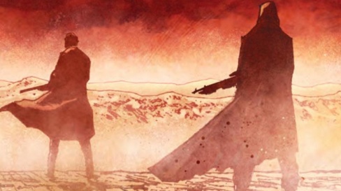
Strontium Dog: Once Upon a Time in Der Vest
Credits: Rob Williams (script) Laurence Campbell (art) Dulan Teague (colours) Jim Cambell(letters)
Michael Mazzacane: The creative teams “Strontium Dog” one shot does just about everything you’d want out of a strip. It tells an overall well done 8 page story that is a good introduction to the character of Johnny Alpha, while not giving readers a blunt exposition dump, and has that zany dark humor one would expect out of a Dreddverse story.
Laurence Cambpell’s line work is excellent, however, it is his page design that makes everything work. With a title like ‘Once Upon a Time in Der Vest’ the strip evokes Spaghetti Westerns and the tensions of tired people with guns. This feeling is achieved by rendering pages into a series of horizontal panels. Restricting the paneling in this way keeps everything in about the same aspect ratio, some panels are larger than others. These wide panels also clearly evoke the wide screen aspect ratio of film-TV, which Campbell uses to great effect in framing everything. The canard about using comics as storyboards for film-TV is overdone and misses the power of the medium. There is a cinematic adjacent visual language at work in this strip, but the power of Campbell’s artwork isn’t a panel’s individual greatness but the context that is created by putting 4-5 of them together on a page.
If there is one shortcoming of the strip, a late page reveal about the mastermind of the whole thing feels somewhat abrupt. It is visually set up; however, their appearance is sudden and out of nowhere. At the same time without that abrupt quality the strips final dark gag would not have nearly the punch it has.
‘Once Upon a Time in Der Vest’ is a plainly well done strip, it’s the kind of thing that might make someone interested in reading more adventures of Johnny Alpha across the Cursed Earth.
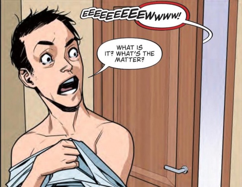
Survival Geeks: A Quiet Night In
Credits: Gordon Rennie & Emma Beeby (Writer), Neil Googe (Art), Gard Caldwell (Colors), Jim Campbell (Letters)
Jacob Cordas: You’re sitting around with friends reminiscing with mead of adventures you imagined. While your lives have drifted in different directions, you’ll always have the swords and sorcery to carry you through these trying times. How did you even find the time for it? Meeting regularly so you could traverse fictional country sides slaying dragons and dire wolves seems impossible now. You have responsibilities. You can’t spend your life rolling away the evenings.
“Survival Geeks: A Quiet Night” is a surprisingly beautiful take on the aging nerd. Gordon Rennie and Emma Beeby are able to extract the adventurer who misses the adventure and sync it to the tabletop nerd that misses their table. In a series that often leaned hard into being the silly “Die,” here it finds the heart that “Die” has never been able to muster. It’s quiet and reminiscent, a Bob Dylan song on days of yore for those of us whose friendships are defined by whether or not the GM will kill our characters.
Neil Googe’s art brings out this new maturity bouncing between the flat world of adulthood and the chaotic motions of youth. He ages characters naturally leaning into their natural evolution from wondrous to worn. It’s a depiction of a grounded future that every nerd knows and fears. No one wants to be the last one holding on to the plastic lightsaber.
His art is accentuated with Gard Cadwell’s colors. There has been a perpetual goofy strip to the series that, while not lost here, has started to erode with time. Modern moments in the story are muted with mellow baby blues and faded browns. When we jump to moments of the past (or the past starts to catch up to the characters), bright colors pop into panels. Ruby reds, amethyst purples, and emerald greens abound.
All of their skills come together in a heartfelt ending that make me excited to pass on my adventures in Faerun to a future hero. May the dice forever roll in their favor.
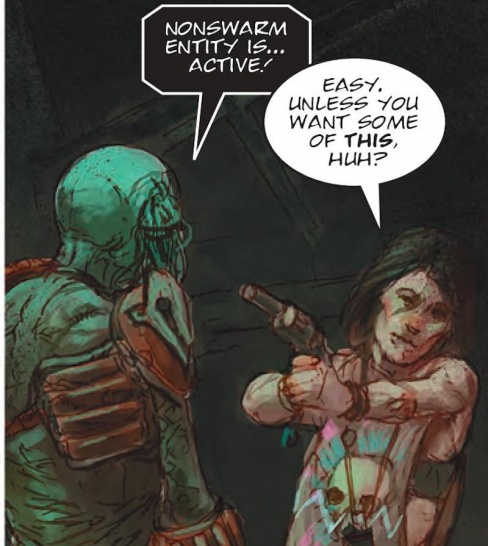
Visions of Deadworld: A Girl’s Gotta Eat
Credits: Kek-W (script), Dave Kendall (art), Annie Parkhouse (letters)
Ryan Pond: Finding an in-group and being accepted as you are is the central theme in this unique judge Dredd zombie verse take. The central protagonist, Channing is a loner in a deadly world of zombie robot swarms and cannibalistic feral humans. She stumbles across a deadhead that has lost connection with the central host and is able to take him on as a sidekick but gives him up so that he can go be with a new swarm. But Jerry doesn’t leave that easy.
Kek-W’s script for this story does a great job of running through several scenarios over the course of only 6 pages and delivers some nice emotional beats as well. The dialogue is delivered well, with a nice mix of comedy and emotion. Channing is as much a loner as she is a mother, but she also knows how to get the job done because a girl’s gotta eat.
Kendall does a fantastic job with the art in this story. The deadheads have an awesome green translucent glow to them that catches the eye, while the humans have very earthy colors with plenty of red blood tinging their edges. The flow and storytelling move smoothly from panel to panel, and the backgrounds are just present enough to define where the characters are without getting too into the details and slowing down the story.
“A Girl’s Gotta Eat” is a fantastic read with a smooth story flow and great characters. The colors do a great job of separating the humans from the machines, while the story actually brings them together in the end.

Proteus Vex: The Shadow Chancellor
Credits: Mike Carroll (script), Jake Lynch (art), Jim Boswell (colors), Simon Bowland (letters)
Greg Lincoln: Flint Henry is a hard art act to follow, as he created such a vivid visual landscape in the first story arc of “Proteus Vex.” Jake Lynch and Jim Boswell do their honest best to follow that up and they only really suffer by comparison to Henry’s amazing pages. Lynch captures the essence of the weird setting and manages to make it his own in this introduction to the next story arc.
Continued belowMike Carroll plunges right into this new story that starts out with an attempt to drop Midnight Indicating Shame off “somewhere safe-ish” from her people and it turns into an almost immediate bloodbath. In the course of the story, Vex is plagued by memories he accidentally acquitted and lead the duo into a new personal mission. I can’t say if this story will easily accessible to new readers, as Carroll doesn’t give much background but it’s bright and action packed. Carroll’s script may be mostly serious with some ominous overtones but there is on glorious and very dark moment of humor that slipped by at first read and made me laugh out loud the second time. Proteus Vex is a bit of an unintentional comedian.
The story hints that some secrets from the original strip might just get revealed in the course of this new arc. Facts may just come out about how the atrocity that ended the last war was accomplished and what it cost. The art though a bit static at times, has a wealth of amusing and interesting details in the course of the story. The weird aliens that Lynch and Boswell created ass to the wealth of weird that Flint Henry established in the initial arc.
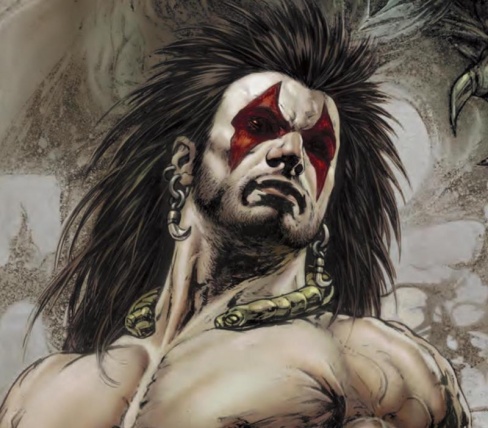
Slaine: Dragontamer Part 1
Credits: Pat Mills (script), Leonardo Manco (art), Annie Parkhouse (letters)
Ryan Pond: When a ruthless spartan army decides to murder an entire village of innocent men and women, only one thing can avene their deaths; Slaine the Dragontamer.
This story is artistically driven with beautiful mural style artwork that utilizes angled shots to present the hero as larger than life and the bad guys small and weak. The art flows well from panel to panel, with neatly outlined boxes as the story is being told. But when the battle starts, chaos ensues and the borders start to disappear, at which point no one is safe.
The color work is beautiful, which dull earthy tones making the characters almost blend into the page with the inks and heavy blacks defining features. At the same time, items of interest are often highlighted with bright colors like gold and amber. The violence is depicted through Slaine’s use of the battleaxe to dismember and dispatch each and every soldier that participated in the murder, and the blood is shown in a bright, vibrant red that pops off of every panel and page.
The script opens and closes the story with parts of a poem about avenging and protecting the British Empire. This is appropriate for the story, but the writer isn’t nearly as good at writing rhythmic dialogue and narration. And in the end it feels like it was going for that, and almost made it work, but it just doesn’t quite hit the mark. It makes something that was almost great, only good.
“Dragontamer” Part One reminds me of The Punisher in a more primitive time, with larger than life figures dominating the battlefield. There is a poetic flow to all the chaos in this story, it just isn’t as effective as I would have liked.

Hershey: The Brutal
Credits: Rob Williams (Script), Simon Fraser (Art), Simon Bowland (Letters)
Christopher Egan: From jump “Hershey: The Brutal” Part One is a stylish side-step from the typical design and writing of a “Judge Dredd” spin-off. In the aftermath of the Judge Smiley scandal, and falling ill from a microbial virus, former Judge Barbara Hershey has faked her death in hopes that it will allow her to fix what she can while out of the public eye.
Living an alternate life in the Ciudad-Barranquilla Territories with another Mega City Judge, Dirty Frank. Hershey and Frank attempt to infiltrate a drug cartel portraying an underground heavyweight boxer and his coach.
Williams’s script is tight, lean, and mean. Cutting to the chase while only giving readers just enough plot to carry us along for six pages. He doesn’t spend time getting too far into how’s and why’s or attempting to usher in new readers. This works both for and against the strength of the chapter.
Jumping in and getting to business is usually the right way to go for these strips as they have limited space in which to tell a complete story, but for anyone attempting to jump in for the first time it can all be quite unclear. It works for the first chapter, but as this strip moves forward, more exposition and connections to the greater Mega City One canon will have to be shown for it to have a fuller meaning.
Continued belowThe overall art style and design are quite different from what we usually see in this universe. Fraser’s characters are full of weight. Muscle, bone, flesh all feel beefy and tangible in his hands. Everyone feels sculpted rather than drawn. Even with his sun-bronzed palette, the story feels rough and grimy. The color work really sets this story outside what we normally get in this world. The design and layout of panels add to the disjointed and gritty storytelling. Each panel and page are full of action and emotion.
A strong start especially from a design standing, “Hershey” is shaping up to be one of the most intriguing new arcs from 2000 AD.

Time Twisters
Credits: TC Eglington (script), Warren Pleece (art), Simon Bowland (letters)
Matthew Blair: Time travel. It’s a thing that’s become a bit of a staple in comic books and especially science fiction stories and it’s something that can give the reader a massive headache if not done properly. In this universe, it’s up to the agents of the Time Hygiene Authority to make sure that the timelines don’t get too dangerous and filled with paradoxes. The story follows two agents who have probably been doing this job for too long since they tend to treat the job with a certain level of sarcasm and disdain, right up to the point where they become personally involved in some pretty dangerous temporal shenanigans.
It’s clear that writer TC Eglington had a lot of fun writing “Time Twisters”, acknowledging and paying homage to everything from the Butterfly Effect to the desire to go back in time to murder Hitler. He also demonstrates a blistering sense of pacing, trimming most of the fat from a story that moves at a breakneck pace. It’s a story filled with wit, humor, and does a great job calling attention to some of the more tired tropes of time travel. Also, there’s a cameo from a character that is very important to the world of 2000 AD, but it’s not going to be spoiled here. However, I will say that said cameo probably helped get this story published.
The art for “Time Twisters” is provided by Warren Pleece, who opts to tell the story in black and white, with the exception of the aforementioned cameo. It’s an interesting artistic choice and an effective one that shows how the medium of comics can use color as a tool to enhance the story. As for the artwork itself, it’s solid with great motion with the action and emotion with the characters, although the whole thing is a little loose and sketchy and would have probably benefited from being in full color.
“Time Twisters” is a fun and engaging story about the familiarity of time travel that presents some interesting ideas and deconstructs one of the most familiar subgenres of science fiction. After reading this, it’s probably a good idea not to engage with any mysterious twins or step on any butterflies.
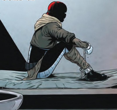
Durham Red: Served Cold, Part 1
Credits: Alec Worley (script), Ben Willsher (art), Jim Campbell (letters)
Brian Salvatore: Many of the regular 2000 AD characters come and go with some regularity, and so it is useful to have stories that can act as a reintroduction to the character. That said, the 2000 AD readers are among the most dedication of any fan base, so you can’t use every first chapter as a new beginning, lest you annoy the regulars. Alec Worley’s script for ‘Served Cold’ Part 1 manages to walk that line well, giving new readers enough information to understand who Durham Red is without bogging down the reader in too many details, nor leaving too many unanswered questions hanging in the air.
The script pulls the classic move of leaving a hole at the center of itself where the main character should appear. Red says one line of dialogue on the second page and one on the last, and in between is talked about by everyone else. Ben Willsher hides her almost completely in shadow or restraints, letting the hyperbole with which people speak of her inform the reader of the details. Red is spoken about like she’s quite literally the devil, and there’s almost nothing Willsher could draw that would match the images constructed in the mind of the reader through the desciptions.
The two characters who act as the center of this strip are not long for the world, and the first act of the story appears to be over already, as next chapter looks to bring Red out of prison and into either custody or a fugitive state. Either way, part one of ‘Served Cold’ is an intriguing and engaging reintroduction to the character of Durham Red. Let’s see if part two can meet the challenge.


