
Welcome, Earthlets, to Multiver-City One, our “2000 AD” weekly review column! Every Wednesday we examine the latest offerings from Tharg and the droids over at Rebellion/2000 AD, the galaxy’s leading producers of Thrill-Power entertainment. Let’s get right to it!

Prog 2311

Judge Dredd: The Rematch part 2
Credits: Ken Neimand (script), Steve Austin (art), Jim Boswell (colors), Annie Parkhouse (letters)
Greg Lincoln: ‘The Rematch part 2’ is a double sized and satisfying conclusion to the tense situation set up in part one. Ken Neimand builds on the tension set up in the lives of the two men set up to fight the rematch between the two Mega-City blocks. Mob-like fight promoters are, well, easy to believe in and to hate for their manipulation they commit. The protagonist is fighting to protect the life of one of his family and an opponent who is a violent man in it just for the money and violence. Neimand even takes some jabs at the Justice department, the Judges who let the fight go on even if it’s illegal, especially as they are early enough to stop it. Finally, and most tellingly, by letting it happen they will get more perps to bust. The tale has some pretty predictable beats but delivered in a satisfying way. There is a bright spot in the telling of the tragic fight and it comes with a line that is so very sarcastically 2000 AD, “who’ll be the winner, who do you think?”
Steve Austin delivers some appropriately gritty and noir art for this arc. It’s full of dark tones, heavy shadows and zoomed in shots of some brutal violence. There are tons of Judges in the story and it makes them feel like faceless threats to Augusto as he tries to save his nephew. The art even makes you feel there are no winners here only the survivors.

Terror Tales: In the Wood
John Tomlinson (script), Lee Milmore (art), Simon Bowland (letters)
Brian Salvatore: The first thing that jumps out from this ‘Terror Tale’ is the art by Lee Milmore. Milmore, only known to US audiences as an irregular 2000 AD contributor, instantly sets a haunting tone with his shadows heavy linework. As the story shifts into more of a midpoint between reality and nightmare, Milmore’s artwork does a fine job of connecting those two states and giving both Kian and the reader a distorted sense of reality.
John Tomlinson’s story is a familiar one of an encounter with a supernatural being/substance/place and having a draw to it. From Dracula onward, this has been a horror trope, and “In the Wood” doesn’t stray too far from what you’d expect. However, a surprising ending and the very well constructed art make for a smooth read. Tomlinson’s script never feels dragged out or rushed and, in a book that often has pacing issues, this is a borderline miraculous occurrence.
Overall, this ‘Terror Tale’ doesn’t offer anything different than what you may expect from such a story, but it delivers an enjoyable and moody interlude.

Enemy Earth Book One: Part 10
Credits Cavan Scott (script), Luke Horsman(art), Annie Parkhouse(letters)
Michael Mazzacane: The first book of “Enemy Earth” comes to an explosive conclusion with the premise of the book fully established and our cast on the way to the highlands. They’re a few body parts short, but as Zoe’s Gran would say, “we’re alive and we got away. That’s all that matters.” But they’re not the only ones who got away a few pieces short.
The engine that pushes Zoe and Jules into the truck is a bit arbitrary; a random monster fox happens to be rampaging by as the cliffhanger for the previous strip. It fits the chaotic nature of the post apocalyptic world. It’s all just a little convenient.
Luke Horsman’s art does a good job of managing the chaos as they break traditional grid structures for panel layouts emphasizing angular designs. These lopsided panels help to give everything a sense of energy. They also make an interesting choice of using gutter white space as a sort of positive space to the negative space of the panel content. This pushes the content of the panels forward and creates an interesting claustrophobic feeling in the reader. The panels themselves are no smaller than normal, but the feeling of the encroaching white space helps to give the impression that it is all much smaller.
Continued below“Enemy Earth” comes to a largely satisfying conclusion that has me interested in what Book Two has to offer. The character work in this book is strong enough that it might stand up against some of the more generic or at least well-worn tropes of this genre.

Hope: In the Shadows – Reel Two – Part Eight
Credits: Guy Adams (script), Jimmy Broxton (art), Jim Campbell (letters)
Chris Egan: The end is near. The gory Barker-esque leather party is coming to an uncomfortable close. Sometimes when you get what you have been looking for, or think you know what you want, the end result is the opposite or simply not at all the outcome you expected. This is that moment, for some of these characters. The script is dense, but moves with a dire sense of urgency. There is pain death and whatever is beyond death on the horizon for these monsters and even those who seem to have had real power are now scrambling for meaning. It’s yet another chapter that feels icky. You almost want to wash your hands after reading it. Nothing is what we’ve expected and part eight has given us some new wrenches thrown into the gears. The uncomfortable nature of this chapter is really what carries the comic this week and keeps interest high for what is to come.

Prog 2312

Judge Dredd: Last Temptation of Joe
Credits: Ken Neimand (script), Lee Carter (art), Annie Parkhouse (letters)
Greg Lincoln:Ken Neimand reminds us many times in this strip that this absurd strip never happened. He makes plenty of references to pretty big parts of Dredd history in this face off between Dredd and an entity that can only be described as the Christian devil, the evil one has escaped from the cubes that Dredd apparently put him in before. It’s a pretty compelling face off, and Neimand makes good points about the people that Dredd hasps failed and lost over time,. The most compelling thing is the offer “Satan” makes him eventually. It’s a clever twist that leads to a clever ending with commentary that questions the logic of the events or the Defence budget of Mega-city One. All in all, ‘Last Temptation’ is a cute one off with some pretty stellar art.
Lee Carter’s art style is super clean and verges on feeling animated. The complexity of his color rendering and the clean approach to design and line work created a definite unique modern feel for this pretty questionable story. Carter’s style blends the realistic with the metaphysical throughout this weird strip in a way that much like the narrations makes you wonder if it’s something that happened or not.

The Out: Book Three, Part One
Dan Abnett (script), Mark Harrison (art), Simon Bowland (letters)
Brian Salvatore: When we last left Cyd at the end of “The Out: Book Two,” she had been assimilated into a warbody that was destroying a planet, but managed to regain control of her life. It was a bold place to end the story, and Dan Abnett and Mark Harrison, more or less, skip to the end, where Cyd is no longer controlled by the Tanikar and is being interrogated about how she escaped. The readers get a glimpse of her time in that role, but we are thankfully spared an entire book of mindless destruction.
A few other themes of “The Out” are reintroduced early on, including Cyd’s propensity for survival, her guilt over her daughter’s disappearance, intergalactic pop music, and the relative outpost nature of her home planet, Earth. All of this combines for a remarkably familiar first chapter for those that have read “The Out” beforehand. As for whether it is a good jumping on point, because the story is essentially resetting itself, if this chapter isn’t too exposition heavy, it very well may be.
What is always going to draw in readers, however, is Mark Harrison’s art. His penchant for bold layouts, beautiful surroundings, emotive figures, and techno-weirdness sets his work apart not just from others in 2000 AD, but also from most comics being published anywhere. Harrison’s art remains as idiosyncratic as ever, and evokes not just classic sci-fi, but also heart-rending sadness and endless exploration. His art gives “The Out” its hopeful beauty, even as Dan Abnett’s script oftentimes puts Cyd, and the reader, through the ringer.
Continued below
Joe Pineapples Tin Man 01
Credits: Pat Mills (script), Simon Beasley (art), Simon Bowland (letters)
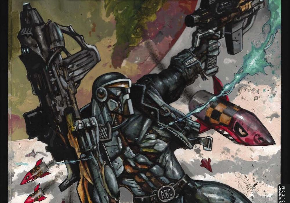
Matthew Blair: Joe Pineapples is a sniper droid and one of the most capable killers in the 2000AD universe. However, the beginning of “Joe Pinapples Tin Man 01” finds him marooned on an asteroid for an extended period of time (long enough to see the life and death of a star) with a sewage droid named Ro-Jaws. How did he get there? What and why was he running? How did he wind up getting stranded on an asteroid with the most annoying of companions? Let’s find out.
The script for “Joe Pineapples Tin Man 01” is provided by the creator of the character Pat Mills, and since the character made his first appearance in the late 1970’s it’s clear that Mills has had a lot of time to hone his craft and perfect the characters. Mills makes Pinapples a fun character to read, with Ro-Jaws snark and somewhat annoying banter foiled by Pinapples straight man routine. There’s a very real chemistry between the two robots, some great opportunities for absurd humor, and Mills does a solid job with giving the audience just enough of a mystery to maintain engagement and leave them wanting more.
While the writing of “Joe Pineapples Tin Man 01” is great, the artwork is the real star of the show. The story is drawn and colored by Simon Beasley and it looks gorgeous. The characters and tech designs have a run down futuristic biker design and it combines with a painted look that gives the whole comic an aesthetic reminiscent of early Heavy Metal covers and comics. Also, Beasley has a great ability to grasp the scale and scope of space, leaving some big panels that look like a gorgeous abstract painting. However, while the big panels look amazing, it does leave a bit pressed for space when Beasley needs to get story elements across, which can leave some pages crowded and difficult to read. It’s a noticeable problem, but doesn’t do too much to detract from the story.
“Joe Pineapples Tin Man 01” is a fun and quirky introduction to one of 2000AD’s most capable killers at one of his lowest points and is presented with whip smart writing and gorgeous artwork that brings an old fashioned sci-fi look back to one of the magazine’s oldest characters.

Judge Dredd: Troublemaker
Credits: Gordon Rennie (script), Robin Smith (art), John Charles (colors), Annie Parkhouse (letters)
Greg Lincoln: Troublemakers make the best kind of writers, they encourage readers to think for themselves and be more critical of the world. Alan Grant died this year, and this strip is a truly fitting tribute to him and his darkly satirical writing history. Sure, the troublemaking perp Dredd is hunting down in this strip isn’t literally named after Grant, but he is surely cast in his likeness. The story, by Gordon Rennie, is clearly a tribute to Grant. He lets Gaunt – the fictionalized Grant – face off against Dredd with little more than his “cigarette,” clearly an illegal substance, his accent, and his wit. The best line is where he tells Dredd he could write him, which he did, but he was never his favorite. He “was the warning.” Other characters, including a prominent non-2000 AD figure, make cameo appearances and help Gaunt escape the clutches of the “law.” It’s a strip the clearly enjoys letting Dredd lose this one, and does so with great style and a love for its actual hero.
The art by Robin Smith is straight up classic Dredd style, right down to the tech and shoulder pads. The people look a bit like how Dave Gibbons might have drawn them, realistic and not afraid to be just a bit homely. The panels a littered with lovingly captured references to books Grant worked on during his career, including a certain caped crusader. The scenery includes comics pages, covers, and the obligatory typewriter. John Charles’s colors capture the the feel of the vibrant days of pre-digital color. It is a fitting tribute to a writer whose work that is foundational for so many current troublemakers and a great send off to someone that is worth remembering.
Continued below
Hope: In the Shadows – Reel Two – Part Nine
Credits: Guy Adams (script), Jimmy Broxton (art), Jim Campbell (letters)
Chris Egan: Seeing the vast destruction and death strewn about the American west the military has decided to take action, and Hollywood is in its spooky disarray. The supernatural is re-molding the Earth and the military is about to do the same in an equally destructive fashion. Touching on the metaphysical, the supernatural underworld, and how these horrors touch those looking for them, or at the very least connected to them, and how they have expanded to affect the world at large. But as it is in truth and fiction, man is just as much a monster than any slimy, toothy creature that slinks its way through a portal into our world. It is always a bad sign when the government or military decide to tackle a supernatural threat. They always make things worse and “Hope” is no different. Like Dr. Strangelove meets Godzilla meets “B.P.R.D.” you know there is no way this is going to end well.

Proteus Vex: CrawlSpace Part 1
Credits Mike Carroll (script), Jake Lynch (art), Jim Boswell(Colours) Simon Bowland(letters)
Michael Mazzacane: The start to this new “Proteus Vex” strip gets off to a strong start with effective use of the extra page limit afforded to this double sized issue. The creative team do an effective job of going over the history of this strip without committing to boring exposition regurgitation.
The core of this strip is continuing to uncover the events that led to the end of the Scorcher War and Imperium Ascendant doing what their name implies. This flashback, archeological approach, Carroll takes does create a certain amount of distance that is a bit dry and as of yet leans into the narrative and factual gaps that exist in the historical record.
Jake Lynch’s art is inventive while still being built on a retro aesthetic. Their figure work walks the line of it being “functional” but still clearly supernatural in nature. What drew most of my interest in this strip was the use of overlapping and near overlapping panels. Paneling is close together but not in such a way that it reads too close, but it’s all crammed together in such a way that it feels like they’re overlapping and overriding one another.

Prog 2313

Judge Dredd: The Night Shift Part 1
Credits: Ken Neimand (script), Nicolo Assirelli (art), Peter Doherty (colors), Jim Campbell (letters)
Greg Lincoln: ‘The Night Shift” starts out with an innocent fast food stop that becomes a deeply disturbing story that hits on many crime drama mainstays. Take, for instance, Luna Aguerra, the woman who stopped for a “hottie” and encountered a nightmare from her past. The pleasant, smiling judge icon used for the 24-hour Judge call box would probably be the most disturbing thing in this strip, were it not for the clichés that follow. Dredd’s interview with Aguerra could have come right from Law and Order SVU, with the way that her status as an immigrant, a protestor, and a woman makes her report questionable. The way the story proceeds is so believable, right down to the moment we learn that the man she reported was absolutely who she thought he was. Yes it’s the expected story, But Ken Neimand told it so well we almost can hope it’s not going to end the tragedy it’s almost has to be.
Nicolo Assirelli did an excellent job of setting the mood of this story. There is so much flat black used in this that it can’t help but feel oppressive and ominous even when all that is happening is the ordering of some food. The robot running the Hottie stand and the cook are so boring and nondescript they are both invisible and nearly have to be up to something being so bland. That blandness for the cook goes away right away when Dredd leaves though as he takes on the full menace of what Luna accuses him of. His face and demeanor change starkly and he could only be the war criminal she said she fears. The art makes Luna sympathetic throughout, particularly when she’s facing Dredd.
Continued below
The Out: Book Three, Part Two
Dan Abnett (script), Mark Harrison (art), Simon Bowland (letters)
Brian Salvatore: While ‘Part Two’ doesn’t offer too many answers to the questions that the are being asked of Cyd, “The Out” is reminding us of its charms even with the setting restricted to a ship, and further restricted to a room where Cyd is being kept, and further restricted to her memories. The Tanikar experience is vitally important to her captors, as she is the one person they know of to ever shirk its control. With the Tanikar still wrecking havoc across the universe, the reasons for her survival and overcoming of the mind control could save thousands of lives.
Mark Harrison gets to have some fun with the setting, as it is totally constructed by Cyd’s memories, and so after mentioning figure skating last strip, she finds herself in a skating costume here. The setting is being changed based on her mood and what her interrogator thinks will calm her down. Harrison gets to have some fun with this because the usual vistas and aliens aren’t really around in this setting.
Dan Abnett introduces a disturbing but realistic wrinkle to this story as well, with the idea that Cyd could be brought up on charges for war crimes due to her ability to ‘control’ the warbody at some point, and whether or not she had control before then. This strip is asking lots of questions and challenging assumptions, but without really moving the story forward or offering any new information. It’s a pretty clever trick that is working for now, but is hopefully moving towards a resolution.

Joe Pineapples Tin Man 02
Credits: Pat Mills (script), Simon Beasley (art), Simon Bowland (letters)
Matthew Blair: Now that the introductions are out of the way, it’s time to delve into the reason why Joe Pineapples and his snarky, sentient trash compactor were stranded on the asteroid in the first place. Long story short, they got into a fight with a group of alien murderers who all believe that killing these robots is their ticket to their twisted and messed up version of heaven.
Buckle up, because this whole section is basically one big fight scene and it is absolutely bonkers.
Since “Joe Pineapples Tin Man 02” is one drawn out action scene there isn’t a whole lot of room for Pat Mills to craft some of the great dialogue and character dynamics of the last story, although he does show that he can block out one hell of an action sequence. Instead what the reader gets is a bit of context as to what the creatures fighting the two robot main characters are and why they are attempting to kill the unkillable robots. Also, Mills continues to demonstrate a great sense of dramatic timing and leave the audience on an even better cliffhanger, presenting Joe Pineapples with a dilemma that looks impossible to get out of.
Everything good and bad that has been said about Simon Beasley’s artwork in the last story rings true for “Joe Pineapples Tin Man 02”, only this time it’s all cranked up to eleven. For a story with such limited space to play around with, the choice to open on a double page spread of the main character firing a cannon twice as big as them is certainly a bold one, and adds a bit of 90’s excess to the already over the top style. Also, there’s some pretty unironic EXTREME pandering going on with a creature design that combines elements of a three quarters naked humanoid female (complete with gratuitous rear end shot) and a mess of gribbly and angry tentacles and teeth. It all combines to create a story that is both awe inspiring and exhausting to look at.
“Joe Pineapples Tin Man 02” ramps up the energy and excess in a giant action scene that is pretty overwhelming and overwhelmingly pretty. It’s fun to read and does a great job of leaving you wanting more.

Hope: In the Shadows – Reel Two – Part Ten
Credits: Guy Adams (script), Jimmy Broxton (art), Jim Campbell (letters)
Chris Egan: There is both a sense of necessary explanation and reflection in Adams’s writing that works as we ramp up to the finale. Even with how much is covered he still brings urgency to the script. Time is of the essence. And Broxton’s art continues to be some of the best to ever grace the pages of a 2000 AD publication. The detailing is incredible as always, everything feels dusty, dirty, and gross. The gore is top tier. “Hope” is the best source for horror coming out of this magazine right now. This chapter has so much going on, but it still feels quite and contemplative. Just as with recent previous entries this chapter one gets us ever more prepared for where this story is going. Whatever the final chapter ends up being, there is no way this is going to have any sort of happy or wholly satisfying ending. And I don’t mean well made, but appeasing to the general reader will probably not be a way this goes. Bleak bleak bleak and we will have to accept it.
Continued below
Proteus Vex: Crawl Space Part 2
Credits Mike Carroll (script), Jake Lynch (art), Jim Boswell(Colours), Simon Bowland(letters)
Michael Mazzacane: Without the excess page budget of the last strip the second entry in ‘Crawl Space’ moves more like a normal “2000 AD” strip. And yet the somewhat extended omniscient narration that writer Mike Carroll peppers into manages to slow things down and elongate it to make it feel different. This strip is one of contrast; you have the somewhat absurdist “interrogation” scene Midnight Indicating Shame and the fierce space battle going on outside. It’s the juxtaposition that helps to illustrate the character of Shame, someone who manages to escape from their prison cell, evade the military, and rush into a new battle, all in plain view. This is a good introduction to the character who is currently a bit more of a legend than flesh and blood.
Jack Lynch’s character designs for Shame and their fellow catapillar-slug-like bodies is creepy but also mixed with cute. Lynch’s art the more I work through it feels very French with their thin lines and heavy use of “detail” that on further inspection is obsessive noodling and scribbling. Jim Boswell’s color palette also does a lot of work cohereing the sort of coldness of the slug aliens with the explosive warmth of the battle outside their window. The choice of colors helps to further the heavy use of juxtaposition in this strip.
I’m still not entirely sure where this strip is going, but there is something about it that has me interested. It’s not obsessively weird, but it isn’t trying to be a mainstream space opera.


