
Got You Covered is back with another look at the best covers of the month. At the end of each month, we’ll be sharing the absolute best (in one writer’s mind) in comic covers for the month. Unlike before, they won’t be ranked, they’ll just be listed alphabetically with explanations as to why each is such a great example in the art of comic covers.
Share your thoughts in the comments about what were the best covers in the month, and thanks for reading.

Elektra #9
Art by Mike Del Mundo
What else can be said about Mike Del Mundo? Some comic artists excel in specific stories and specific environments, and for del Mundo, that means covers. Pound for pound, I’m not sure there is a more talented cover artist in comics, and a piece like this – with the Bullseye logo integrated into the image and the phenomenal color choices throughout – really shows that off. Del Mundo is pretty much perpetually featured in this column, and when you see a cover like this, it’s easy to see why.

Escape from New York #1
Art by Declan Shalvey
While there are a lot of elements I love on this cover – the beautiful sky coloring, the wasteland environment, the base created by the blood pooling at the bottom – but my favorite part is something else: this cover is so damn Snake. Snake Plissken is a legendary cinematic character, and in this cover, Declan Shalvey perfectly nails the character with a single image. Broken, bloody and without hope? That matters not. All that matters is where retribution is, and that’s…well, that’s the direction of the helicopters. So that’s where Snake is going. Tremendously badass stuff.

Fables #147
Art by Nimit Malavia
While I miss the days of James Jean or Joao Ruas being the singular cover artist on this book, this cover by Nimit Malavia – whom I had never experienced before – is unreal beautiful. It’s such an ethereal, gorgeous cover that lays out perfectly the otherworldly feel we can expect from this issue. Throw in the unexpected color flairs and imagery like the rabbit at the top making it feel even more unreal, and you have a hell of a thing. More of Nimit Malavia as we approach the end, please.
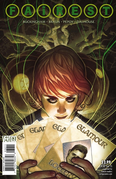
Fairest #42
Art by Adam Hughes
“Fairest” has now come to an end, but holy crap, what a run of covers by Hughes. This is yet another beauty by Hughes, and it incites a real feeling of curiosity out of me as a reader. What’s happening in this story? What darkness lies within those cards? I don’t know what’s going on, exactly, but Hughes’ cover really makes me want to read it. That makes it a great cover.

Gotham Academy #3
Art by Karl Kerschl
You know what’s a drag? School. And Batman. Both of those things. This cover says that, but it says so much more, and it does it in the typical beautiful fashion we can expect from Karl Kerschl on this book. Honestly, we’re getting to the point where we might be able to say that this comic is the best looking comic at DC or Marvel, and between the covers, interiors and colors that absolutely pop, it looks like nothing else in comics. But I love this cover not just for the art, but for the idea. Burying the story in the mundane makes everything else about it so special and relatable. It’s a genius move from a very, very smart book.
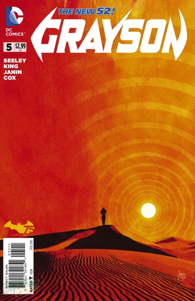
Grayson #5
Art by Mikel Janin
“Grayson” has been a very interesting book, visually, and this cover might be its best yet. I like how Mikel Janin – in a way – sort of emulates the Hickman look on this cover, with the repeated graphic circle element pouring out of the sun. That’s a wonderful touch that we don’t usually see on DC covers, and when you combine it with the approaching silhouette and everything else in the image, it’s all the more effective. Bonus points for the stunning burnt orange on the cover. That’s a potent color that draws the eye even more.
Continued below
MIND MGMT #29
Art by Matt Kindt
Meru, warrior princess! I don’t think any title has jumped more in my book over the past year than “MIND MGMT”, and the covers relentlessly great nature have helped not just draw me in, but make me love it even more. Matt Kindt uses a lot of elements to his art that won’t see from other artists. He often uses paper that have been altered before the work started (see: the smudging on the white space on the right side), his usage of watercolor and ink washes give the book a very otherworldly feel, and I think – think – all of the black on the left side of the cover are just heavy pencils. He’s great at incorporating varying mediums in his art, and this is yet another good one.

The Sandman: Overture #4
Art by J.H. Williams III
I have no idea what’s going on here. Rocks are burning and a dreamscape is crumbling, and the whole thing is absolutely bonkers. But god, does it look good. JH Williams III is absolutely one of the best artists in comics, and his covers are always a contender to make this list. As with the “Fairest” cover above, Williams does an incredible job of piquing my interest and making me want to read the book to find out what is going on within it, naturally making it a great cover.

Secret Six #1
Art by Dale Eaglesham
While this comic itself was…not good, Dale Eaglesham’s cover is really, really awesome. I like the snakes and ladders game design to it, which gives great insight into the “Saw” like element to the story itself. Placing the characters in game boxes and integrating the core conceit of the story – “what is the secret?” – only help elevate the design into something even more special. It’s a really clever idea that is executed with precision by an incredible artist. This book could use more of that (preferably on the interiors).

Wild’s End #4
Art by I.N.J. Culbard
God, I love this book. It’s a really, really good one, and I.N.J. Culbard’s art is a major part of it. Arguably the most important part. His art has been absolutely brilliant throughout, and this cover is a beauty. I love the crop circles, I love the light yellow used on it, and I just love the design. Love love love the design. I don’t spend that much time talking about titling elements here, but the titling on this book is maybe my favorite in comics. The font used for “Wild’s End” and for the numbering is such an era precise choice it makes the covers significantly more effective. The way the creators are presented at the top makes it feel much more special, like they’re showmen delivering a monumental work. It’s such a clever job by whoever the designer is, and I couldn’t love it more.


