
Got You Covered is back with another look at the best covers of the month. At the end of each month, we’ll be sharing the absolute best (in one writer’s mind) in comic covers for the month. Unlike before, they won’t be ranked, they’ll just be listed alphabetically with explanations as to why each is such a great example in the art of comic covers.
Share your thoughts in the comments about what were the best covers in the month, and thanks for reading.
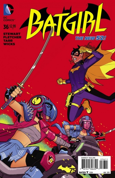
Batgirl #36
Art by Cameron Stewart
It was love at first sight with this cover, as I remember seeing Stewart tweet this out and my jaw just dropping. Everything about this is wonderful. The bold red background. The potent, powerful pose Batgirl has as she approaches the Jawbreakers. The design and look of the Jawbreakers as they descend upon her. The energy of all of it working together. This is a cover that is made of incredible components, but when paired together, it’s all the better. This cover stands out, and in all of the best ways.
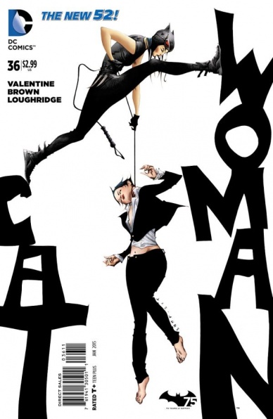
Catwoman #36
Art by Jae Lee
Forgive me for saying it, but this cover? It’s the cat’s meow. The way Jae Lee integrates the titling into the cover as a storytelling element, having Catwoman using it as an interactive prop as she metaphorically and literally chokes the life out of Selina Kyle, is absolutely genius. I couldn’t love it more. Posing it all over a stark white background and keeping all additional colors to an absolute minimum make it pop all the more, and it’s an irresistible image that makes the book all the more attractive.
I’ve said it before and I’ll say it again: Jae Lee is a ridiculously talented dude.

Chew #44
Art by Rob Guillory
Sometimes it’s worth noting when someone does something a little different, and this is undoubtedly Rob Guillory doing something a little different. His covers tend to be more medium shots of centered images, often leaning towards the humorous. This is the first time I can think of one of his covers focusing on what’s ostensibly a detail, but it works incredibly well, both from a storytelling standpoint and a design one. Pair that with the striking red and the white flair that surrounds the Collector’s outstretched forearm and hand, and you have a dynamic piece by an artist doing something a little bit different. Great stuff.

C.O.W.L. #6
Art by Joe Bennett
This cover, man. Sometimes throwback covers can be cheesy, but Joe Bennett so totally nails this that I don’t even care. It’s a perfect fit for the title, which in itself is a throwback to teams like the Minutemen or the JSA in many ways, and it’s just a finally tuned homage to a time that feels like forever ago. It’s not something spectacular or innovative, but it is awesome, and that’s all I need from it.

Deadly Class #9
Art by Wes Craig
This is just an incredibly clever idea. It works on so many levels, from a storytelling one (a student drawing fantasies at their class thrown through the prism of the nature of this school), to a design one (the depth and details integrated, like the textbooks and notebooks leaking into the image), to the fully committed style Craig brings to the page. That last point is one of the things I find to be the most astonishing about Craig, as he’s a chameleon, and when he wants to bring his art back to what a younger, more rage filled artist might have done, he can do that, even filling it with high school details like three dimensional cubes and skulls. This is an awesome idea executed in brilliant fashion.

The Fade Out #3
Art by Sean Phillips
Sean Phillips shows up here a lot, and I’ve talked about one reason why: he comes up with a brilliant design for his covers and he sticks to it. “The Fade Out” has a particularly good one, and it works really well here, but this cover is good even for him. The depiction of young starlet-to-be Maya Silver shows off why Phillips has been a choice for a number of Criterion Collection covers for films, as he’s able to really capture the timelessness of Silver’s era. There’s a Veronica Lake like beauty to the character, and Phillips delivers that in a way that’s realistic yet unattainable in the way a comic book should be. Phillips, both from a design and execution standpoint, is one of the best, and this is yet another example of that.
Continued below
The Massive #29
Art by John Paul Leon
John Paul Leon, you guys. In the hands of damn near any artist, this thing wouldn’t have been much. But Leon can take something ordinary – a dive into murky water, for one – and make it extraordinary by layering in a real sense of reality (those water effects are unparalleled) and a deep, unsettling darkness. The faintest notes of a ship above give us context for the imagery, and thanks to Leon, we know this isn’t a leisure dive. Like he always does, he makes us want to read this book, and damn if that isn’t an incredible gift to have.

MIND MGMT #28
Art by Matt Kindt
Meru’s warrior princess gets her pint of blood and then some, and we get a hell of a cover. Given what’s going on – Meru looming over her dispatched friends and foes, sword and hand – there’s already a certain amount of tension on the page, but thanks to the chaotic, emotional reds behind her black-and-white figure, we know that this is the culmination of something, and we desperately want to find out. Whether its blood pouring from the walls or a towering inferno, I’m not sure, but what a brilliant blend of ideas all in service of the story.
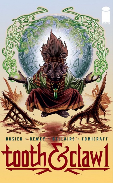
Tooth & Claw #1
Art by Ben Dewey
Sometimes you have cool things to say. Other times you’re just like, “holy crap you guys, there’s a magical warthog on this cover.” My love of it goes beyond that, but in terms of a lead image, this is a notably great one thanks to how cleverly this delivers the otherworldly nature of this story. Bellaire’s soft colors and Dewey’s design and execution make this something truly brilliant (and that’s without even mentioning the incredible work Comicraft did with the titling and logo), but come on guys, sometimes the idea is enough. I love this.

Trees #7
Art by Jason Howard
I’ve loved Howard’s sparse, clean covers, but this one might be my favorite yet. Yeah, it’s a pretty obvious Tiananmen Square homage, but it works oh so well. A big part of that is because what we see here – the blank background, the science fiction nature of the approaching technological beasts – are perfectly grounded by our familiarity of the imagery. That awareness makes it all the more impactful, and because of that, we can feel the fear and terror of the situation.
Plus, I can’t say enough about the titling. So simple. So clean. Such a great sans serif font choice. Brilliant.


