
Got You Covered is back with another look at the best covers of the month. At the end of each month, we’ll be sharing the absolute best (in one writer’s mind) in comic covers for the month. Unlike before, they won’t be ranked, they’ll just be listed alphabetically with explanations as to why each is such a great example in the art of comic covers.
Share your thoughts in the comments about what were the best covers in the month, and thanks for reading.

Alex + Ada #9
Art by Jonathan Luna
I’m a big fan of covers that have a uniform design to them, and “Alex + Ada” has one of the simplest and one of the best uniform designs to it. The top is always the very simple, very technological and clean credits box with the sans serif font choice showing the title and the creators. That’s the base level for this series, and it gives the series a visual consistency that really elevates the book in a lot of ways.
The lower portion of the cover is always art, and it’s fantastic as well. Ada being Jonathan Luna’s subject in a time where the weather matches her emotional state makes the cover match the book’s blue period quite well, and while some art off put by Luna’s very clean, very digital look to his art, I think elements like the rain splashes being really obviously selected square cells is strangely charming. Own what you are, and Luna does that tremendously well.
Combine both elements, and you have an excellent cover for an excellent book.

Batgirl #35
Art by Cameron Stewart
In the words of Multiversity’s resident #Millennial, this is the cover that “that launched a thousand cosplays,” and boy is it. Its introduction of the new Batgirl costume is one of the most iconic moments in comics in 2014, incredibly enough, and found a lot of big subjects in comics – gender equality, sexualization of women, representation of youth in comics – crossing streams (not in a Ghostbusters way) in one piece.
But it’s also a really fantastic cover by one of the industry’s best artists. It’s a simple piece, but Stewart is such a great artist that the detail and the design decisions make it all the better. My favorite element is the coloring of it, as the very deliberate decision to color Batgirl in full only makes the whole piece resonate all the more. Little storytelling elements, like the HOOQ sticker and the “Are you in the Black Book?” writing on the mirror, make it all the better, and it combines to make a fantastic image to kick off an entire run.
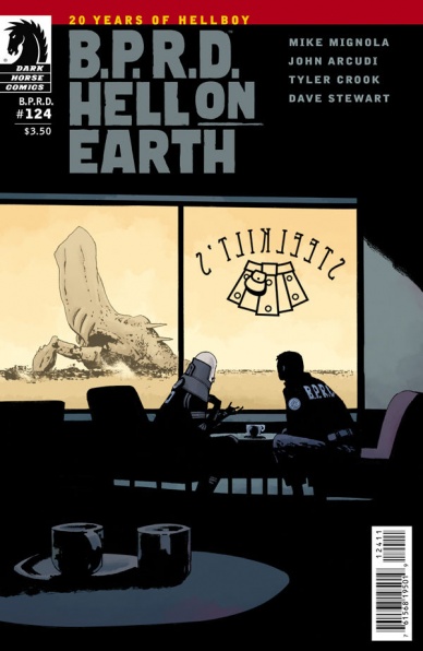
B.P.R.D. Hell on Earth #124
Art by Laurence Campbell
The fact that I loved this issue didn’t hurt it at all. Not one bit. But Laurence Campbell’s move into being the regular cover artist on this book has been a boon to it, and this cover is a phenomenal reason why. It’s kind of an encapsulation of the entire issue into one image, as it depicts a stellar combination of the mundane with the fantastic, causing an enjoyable juxtaposition between the struggle for normalcy in a world where nightmare engines exist. Campbell’s an artist that captures dark, moody situations well, but this is a time where he uses those powers for levity in a way. Great piece.
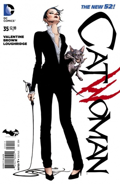
Catwoman #35
Art by Jae Lee
I’ll be totally honest: I’m a mark for Jae Lee. Sure, there’s not a lot going on in this cover, but when you combine the vast openness of the white space with Lee’s potent, powerful and dominant Selina Kyle, it’s an almost irresistible combination for me when it comes to picking up this comic. It’s like Lee is conveying to you, the reader, that Selina has judged you unworthy, yet she still wants you to read her story…if you dare. It’s a provocative and powerful piece by one of the best in comics.

Daredevil #9
Art by Chris Samnee
Speaking of the best in comics, is there anyone more universally beloved in the industry right now than Chris Samnee? I can’t think of anyone who doesn’t absolutely adore his work, which combines all of the things we love about comic art. Big, powerful characters, wondrous and effective cartooning and brilliant design all into one place, and his “Daredevil” covers (and interiors) have been a fantastic example of all of that. While this isn’t one of my favorites that he has done so far – it’s still great, but maybe an A- instead of a A+ like usual – it speaks volumes of his ability to accomplish greatness even in something a person could ostensibly call not his finest work. But man, I just love his storytelling. Showing DD walking blind off the edge in such a way is such a clever depiction of the story within, and it’s a great example of how damn smart he is on top of being such a gifted artist.
Continued below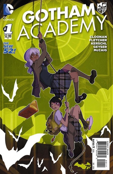
Gotham Academy #1
Art by Karl Kerschl
I loved this issue, and this cover is such a great example of what is in the pages of it. It’s just fun, as Olive and Maps deal with just another day of shenanigans in Gotham Academy. You know, dangling from ropes, bats and batsignals are oh so passe in their day-to-day lives, and it’s beautifully illustrated by Kerschl. That guy is just an amazing artist, and there’s just so much charm here. Plus, major bonus points for the simple but effective Gotham Academy titling, along with the crest that goes with it. Really love that element.

The Massive #28
Art by John Paul Leon
This is my favorite cover of the month, hands down. When I first saw this cover – I don’t read The Massive anymore, so I saw this in an article somewhere – all I could think was “I really, really want to know what is going on there.” I mean, John Paul Leon and his thick, powerful inks are a forced to be reckoned with, but the very concept and scope of this cover are such enticing, attractive things to me that I feel compelled to catch up in this comic and find out what exactly is happening within its pages. That, my friends, is a hell of a cover if it makes me feel that way.

Nightcrawler #7
Art by Jamie McKelvie
The funny thing about Jamie McKelvie as an artist is I think most everyone thinks pop grandeur and charming characters when they think of his art. And that’s rad, as he’s absolutely one of the best at those things, giving books like “The Wicked + The Divine” and “Ms. Marvel” a sense of style and wit that few books can match on their covers. But he’s a guy who also can uncover some real emotional truths, and this more mournful piece he provided for the “Wolverine’s dead” issue of “Nightcrawler” is just a wonderful example of that. It’s a solemn piece and it’s spare and minimalistic, and it is so emotional because of how representative of the characters it’s depicting and their relationship it really is.
It just proves, you can’t put someone like McKelvie in a box as an artist, because he’s someone who will make you realize you were foolish to ever do so when you see something like this.
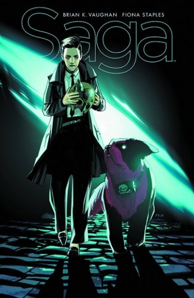
Saga #24
Art by Fiona Staples
It’s not that this is a particularly notable “Saga” cover, except in the sense that almost all “Saga” covers are pretty damn notable. After all, Fiona Staples is – excuse my French – really fucking good at this whole art thing, but this is a rather resplendent piece even for her in its pop darkness. I love how sassy it is – Sweet Boy’s look up at The Brand is perfect – and I also love how it is in a weird way resembles the classic action movie of walking up to the camera in slow motion. This is their badass close-up moment, and The Brand and Sweet Boy are just about the most unconventional duo you could ever have to do such a thing.
And that’s why it’s perfect, and so well representative of the book and this issue.

The Wicked + The Divine #5
Art by Becky Cloonan
I really could have went with either cover from this book, but Cloonan’s cover here got me with the hair. The bold combination of the bright, potent red of the hair with the searing yellow of the background makes this cover one of the most eye catching ones around, and it’s just an absolute beauty as well, giving the characters and their situation a real sense of danger. Cloonan’s character work can level an incredible layer of darkness within the beauty she creates, and this piece is a great example of that.
Plus, the design on this series is just phenomenal. I love the repeated elements of the box, the titling and the credits. So simple. So effective. This is the type of design I like to have on my comics.


