
Our day long look at colorists comes to a close – after a process piece by colorist Marissa Louise and a longform piece about what it’s like to be a comic colorist today – with our staff sharing some of their favorite current comic colorists. While this is by no means a comprehensive list, I reached out to a number of staffers for insight into who their favorites are, and we came up with a pretty great and diverse list of those who work in the comic color game. Take a look at our choices below, and please, share your favorites in the comments! We always welcome perspective from our readers when it comes to subjects like this.
Note: these colorists are ordered alphabetically by first name, not by any predetermined quality. They’re all awesome, but some just get names that happen to be earlier in the alphabet.

Amy Reeder (Rocket Girl)
Mike Romeo: In keeping with my theme of artists who do their own color, Amy Reeder’s work on Rocket Girl is of particular note. Not only is Reeder pushing herself in terms of page design and perspective work, but she’s also investing what seems to be a significant amount of time in coloring this comic. One of the more interesting aspects of Rocket Girl’s coloring is the way Reeder uses it to help the reader see that the time-traveling Dayoung does not belong in the 1980s New York City her story takes place in. But she doesn’t necessarily do this with color, per se. What she does is actually a lot more subtle: it’s all in the way light reacts to surfaces, an effect achieved through color. So Dayoung’s visor has a high-gloss to it, her rocket looks plastic, and the environment she’s traveled to has a concrete grit to it. There’s a separation occurring between character and environment that could have been attempted in a number of ways, but it feels like Reeder has chosen a unique and interesting path toward achieving it. Sure, her linework is where this effect begins, but the look would never be this fully realized if Reeder weren’t such a skilled colorist. She’s shared a few color process posts on her Tumblr, and I highly recommend checking them out.

Dave Stewart (The Mignolaverse)
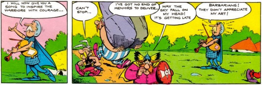
Mark Tweedale: Before Dave Stewart, the comics I had read were very literal with their colours (well, except for the psychedelic stuff in the early Asterix volumes). Dave Stewart was the one that made me realise colours could speak to truths other than physical reality; that they could explore an emotional reality, or a symbollic reality, or dreams, or memory, or… anything else really. He’s not the first colourist to do this, but his work was the first in which I understood it and felt it. His colours are like music for comics and they’re inextricably linked to story and character.
For me, his most impressive recent work was in Abe Sapien #12. In that comic he set up distinct palettes to drift between as the story explored various viewpoints and memories. These palettes were established so clearly, they could be quoted in later issues to recall these moments to powerful effect. I also have to mention the Prospect Park sequence in B.P.R.D. #115. The colouring there has made that one of the most impressive sequences in the comic’s entire run.

Elizabeth Breitweiser (Fatale, Velvet)
Jess Camacho: When you think of artists Ed Brubaker has worked with, you’re most likely to go straight to talents like Sean Phillips, Steve Epting and Darwyn Cooke. But one artist has had just as equal of an impact and with sadly less fanfare. Elizabeth Breitweiser has been colorist on many Brubaker written books, including both “Velvet” and “Fatale” as well as the upcoming “The Fade Out”. She’s a master colorist who takes beautiful art and gives it the noir feel that Brubaker’s scripts call for. Breitweiser gives a certain moody vibe to books like “Fatale” and “Velvet”. She creates shadows on characters to where we can’t always read their expressions fully and it always adds something extra to the page because Brubaker’s characters are not easy to read. Her use of darker colors not only sets the right tone but it’s also interesting to see how she uses darker colors without losing any details in the penciling. Her work adds a cinematic tone to the pencils of both Epting and Phillips creating a deeply engrossing noir world to get lost in. Breitweiser is an asset to the world of comics and every bit as important as the artists she works with.
Continued below
Frank Martin (East of West)
Vince Ostrowski: “East of West” is my favorite comic on the stands right now and though Hickman and Dragotta have received and deserve a lot of attention for it, it is undeniable that Frank Martin is integral to the book’s quality as well. Martin likes to work with certain colors for specific settings or moods. When a heavy sense of doom hangs over the world of “East of West”, Martin employs a variety of reds to maximize impact. In issue #8, when the 3 horsemen of the apocalypse show up to confront Antonia LeVay, the background becomes richly red. It’s serious business when they come around. But each horseman also has a color associated with them. Each horseman has their own unnatural skin color and color scheme that acts like a supernatural aura – they are otherworldly beings moving about a doomed world.
The true power of Martin’s decisions to work in schemes heavily dominated by a major color became fully apparent to me in “East of West” #9, where Freeman – a prince of New Orleans – is stewing in the Entertainment District of his kingdom with the fate of the Seven Nations on his mind. Everything is dominated by rich shades of purple and deep blue. The effect was striking. The mood was perfect. I can’t pinpoint exactly why it was the perfect choice for the scene – maybe it was the jazz music that was supposed to be playing in the scene – who knows? What I do know is that the coloring changed the mood and the feel of the scene and created what I imagine was the intended effect in me, the reader. Colorists are so underrated – it really says something when one can get you to actively think about the choices they made. I like to think that Martin’s work on “East of West” has made me more conscious of that.

Jordie Bellaire (The Manhattan Projects, Zero, Moon Knight)
Matthew Meylikhov: Jordie Bellaire just won the Eisner for coloring this past weekend, so I almost feel like that alone should be self explanatory as to why her work is worthwhile. Bellaire has a fierce palette that makes her work pop right off the page, and she can make her collaborators sing where they’d otherwise just be humming. You can take a look at any book or collaborator she’s heavily involved with and each one comes with a distinct, recognizable Bellaire shine; the colors are always warm and inviting, even when dealing with a book wrapped in almost nothing but cold. We even saw a distinct evolution between Bellaire’s work on something like, say, “Journey into Mystery” to “Moon Knight” — both at Marvel but a complete 180° in style and quality. The smoothness went away, a new grain was revealed and being able to watch her and Shalvey experiment in unison every issue has been a delight.
But she won the Eisner, so of course you know all that. We all know that. But that being said? I think Bellaire is a revolutionary. More than any other colorist, Bellaire has changed the game with opening up conversations about colorists and their importance — and not from being a rabble-rouser, but by having an incredible work ethic. You could pick up any number of critically acclaimed book from the last year and find Bellaire’s name in the credits or on the cover, to the extent that we were for a while just living in a Bellaire world. And honestly? When everything looks as wonderful as she colors, I’m more than fine with it.

Laura Martin (Avengers, Uncanny Avengers, Planetary)
Matthew Meylikhov: A lot of people like to make commentary on what we refer to as “big budget” or even “blockbuster” comics; the books that often seem style over substance, equivalent to what you would see in theaters during the summer with explosions and the like. In comics we have artists like Bryan Hitch and John Cassaday who excel at the widescreen comics format, but the one thing that Hitch, Cassaday and others have in common is that they’re alwmost always colored by the magnificently talented Laura Martin. One of the first colorists whose work I was actively conscious of enjoying across numerous titles, Martin brings this wonderful glow to her work that offers slight realism with a tint of darkness that never seems dismal or dour. With a strong sense of shadow and light, Martin is someone that knows how to bring the real world into comics without the comics losing that sense of magic only available on the pages.
Continued belowAnd, if you want further proof, click here to embiggen the above image and take a minute to really appreciate the intricacy on display there — the depth, the shading, the use of perspective; all things that would lay flat before the colors come to it. How Martin can look at the madness on display from these artists and figure out how to layer it will forever be beyond me, but I will never not be impressed.

Laura Allred (Everything with Mike Allred)
Matthew Meylikhov: There are a couple colorists in this list that are linked with specific collaborators, and while I hate using the phrase most times, it’s never more true that there’s a great woman behind Mike Allred’s work — that being his wife, Laura Allred. Here’s the thing: Mike Allred’s flavor of pop-art is some of the most influential work out there, with his series “Madman” alone inspiring a whole generation of creators. What’s notable about Mike’s work on that series, though, is that it started off in shades of grey and single tones (see: the Oddity Odyssey) and it didn’t become the pop art masterpiece it did until later, when Laura started coloring it. Since then, Mike and Laura have collaborated on everything, and it’s her colors that make his work standout even more from the crowd. Mike’s incredibly talented, but it’s Laura that I think defines it in a way that elevates his work to the state of commercial success that we’ve seen. She’s the one keeping the ghost of Ben Day alive.
And, again, you can see it all in “Madman.” It’s one of the most important independent books from the self-published boom a couple decades ago, and while you can see the influence Mike has had on artists and writers, you can see the influence Laura has had on colorists as well — including a few others on this list! Laura defined the pop style of colors that we see quite often in comics, with that wonderful brightness and eye towards classic CMYK tones and pop culture. Seeing how Laura and Mike have evolved as collaborators since the 90s is equally inspired, and their most recent collaboration in “Silver Surfer” offers up some of the most vibrant and colorful work to date.

Marcelo Maiolo (Green Lantern Corps, Green Arrow)
Brian Salvatore: I have to admit – many times, colorists slip past my radar. This isn’t because what they do isn’t important – it is supremely important. But so many times, colorists, like pencillers and inkers, confirm to a house style, and so their work tends to blend in more than it should. That, however, is never a problem with a Marcelo Maiolo book.
He first came to my attention on “Green Lantern Corps” coloring Bernard Chang – his colors of the various Lanterns were brighter and bolder than just about anyone else’s across the various Lantern books, and it really made the book pop in a way that, sadly, many space-based books don’t. Then I started noticing that he was coloring most of my visually favorite DC titles – specifically, “Green Arrow” and “I, Vampire” for Andrea Sorrentino and “Justice League United” for Mike McKone.
His work is always appropriate for the tone of the book he is drawing, but he isn’t afraid to take risks and do something that will stand out. What more could you ask for?

Matt Hollingsworth (The Wake, Hawkeye)
David Harper: “The Wake” is a critically and commercially successful comic that is also now an Eisner Award winning one, and naturally, two huge parts of that book’s success has been writer Scott Snyder and Sean Murphy. They’re gigantic stars in comics, and they deserve the love they get. But for me, the person who has made that book soar to the highest heights it can reach is colorist Matt Hollingsworth, especially for how it has been broken into two distinct halves. The first half, taking part in a time period that’s more or less “the present”, and the second half, a dystopian future where the merpeople have effectively conquered the world, have completely different color palettes that help define and create each world and the moods within. It’s like the hues that govern Soderbergh’s “Traffic”, and how each story is differentiated by the color overlay.
Continued belowWith this book, Hollingsworth’s deep, dark blues in the first half and his rich, hopeful, bright palette of the second half both fit the settings (one takes place in the depths of the Arctic Ocean while the latter is in what looks like Northern California in a now sea-centric world), but they also reflect the mindset and emotional state of the story to a staggeringly perfect degree. While Lee Archer’s story takes place in a world before disaster, it is in the eye of the storm, and Hollingsworth’s colors loom ominously of the disaster ready to strike. In Leeward’s story, which is actually disastrous, the bright hues reflect the hope that Leeward has as she journeys to find a way to save humanity. The weirdest thing about it is it’s not something you think about. It almost subliminally changes the tenor and the mood of the story, with the first half creeping under your skin and filling you with dread, while the latter makes you pull all the more for Leeward. But that’s what Hollingsworth can do to a story. He’s the invisible artist who can play puppet master to your emotions with a color choice here or a different shade there.
He’s a master of his craft, and in a fashion that’s always present but never forcibly so.

Matt Kindt (MIND MGMT)
Mike Romeo: I first got to know Matt Kindt as a black and white cartoonist. Between 2 Sisters and his Pistolwhip books, I thought I had him pegged. Then I discovered the work he’d colored himself. My first exposure to Kindt’s venturing past using just ink on bristol was Super Spy. It was an interesting evolution in his art. A lot of the book is what appears to be monochromatic: black and white with an accent color. But under closer inspection I discovered the subtle complexity in the book’s color. The blacks are never really black, sometimes they’re a deep brown, others are navy blue. The white is actually an aged parchment color, which affects the accent color. Super Spy is also the first time I saw Kindt experiment with watercolors. It wouldn’t be for a few more years, but Kindt would go on to use almost primarily watercolors in The Tooth. As it would turn out, all of this was preparation for Kindt’s first ongoing comic series: Mind MGMT.
When Mind MGMT was announced it immediately stood out amongst the work Kindt had so far produced. It would be an ongoing, monthly, single-issue comic series that he would color himself. He’d take the watercolor technique he’d been working with for a few years to create a comic that looks unlike anything else on the stands. At times Mind MGMT is moody, at others surreal, and it’s thanks in large part to the coloring.

Matt Wilson (The Wicked + The Divine, Wonder Woman, Young Avengers)
David Harper: Has anyone ever noticed Wilson colors gods a lot? Whether you’re talking about Loki in “Young Avengers”, the young deities of WicDiv, or the regal majesty of Diana in “Wonder Woman”, Wilson’s got his fill of the more omnipotent sector of the comic world.
I’m not sure if there’s something we can extrapolate from that, but it is interesting to me. That’s far from the only thing interesting about Wilson, an ascendant colorist who is quickly becoming one of my favorite comic creators of any variety. His work across the board achieves a look that often is less based around reality and more based around feel, making moments like the bottom panel on this page surge with energy when he needs to, or elevating this one by making it burst with pop art power. Is it what that moment would explicitly look like? Probably not. But his color choices help those moments hit with the proper power. In that way, he achieves a real artistry with his work because his choices go beyond the typical and instead accentuate the art by making the color more than just window dressing, but powerful elements in their own right.
Continued belowHe’s not at all showy, though. A book like “The Wicked + The Divine” is so successful thanks to him balancing the vibrancy of certain moments with an eye for when something needs to be subdued. I loved it in the second issue when Luci shares her origin story, and when you look at everything in her life, it’s all drab whites and dark textures, but when she powers up it’s in a glorious burn of purple heat and smoke. Become a god, get a more robust color palette. Not a bad deal, Luci.
Look across the board at the books he colors, and you’ll find only greatness. One could say he’s just good at choosing projects, but I prefer to think he’s the type of colorist that can make a good project great, or a great project just a little bit better. That’s a hell of a gift if I’ve ever seen one.

Nathan Fairbairn (Seconds)
David Harper: Have you read Bryan Lee O’Malley’s “Seconds” yet? It’s incredible, right? I really, really loved the story, and if you feel like O’Malley’s art had a palpable level up, I’d find it hard to disagree with you. A big reason is he’s just improved since “Scott Pilgrim” wrapped, but a perhaps less talked about weapon is Fairbairn’s colors on the book.
Now, this isn’t the first time Fairbairn has colored O’Malley, as he worked with him on the color editions of “Scott Pilgrim”, but in this book, Fairbairn’s colors are so vitally important to the mood of Katie’s increasingly fragile realities from page one that their power is impossible to miss. Increasingly red overlays to depict Katie’s growing anger in one reality, blue hazes over pages where Katie struggles with the sadness of her plight and other layers increasingly appear as the situation degrades for her, all the while Fairbairn’s work helps orchestrate our feelings like a great symphony conductor. Even beyond that, pages like the one above seem simple, but it really isn’t with so many different directions to go within it. The way he does it is in such a way that makes it feel completely organic and real, just like it needs to be. He’s not a showy colorist, more of a feel based one, and his flat, warm colors never get in the way, only accentuating the work. He’s the pitch perfect collaborator for O’Malley on the project for that reason, and he’s a big reason why this book soars as high as it does.
You can see his superb work with Chris Burnham previously on “Batman Incorporated” and soon on “Nameless”, and previously he stood out working with Yanick Paquette on “Swamp Thing”. That work was all stellar, but more than anything, seeing his craft in such a small yet grandiose setting like “Seconds” helps highlight his abilities as a storyteller of the highest regard in his own right.

Val Staples (Deadpool)
Vince Ostrowski: Val Staples has been kicking around the comics industry for a while, but I first took notice of him on Marvel’s recent “Deadpool” relaunch. As far as I’m concerned, you can look at his work on that series alone and see the immense value in having a strong colorist in the collaboration. He navigated Tony Moore’s hyper-detailed, decaying depictions of “Deadpool’s” ‘Dead Presidents’ arc making the visual humor pop off the page with humor and, sometimes, disgustingness. Then compare that to Staples’ work on the very same series, on the flashback issues that are drawn by Scott Koblish. These issues succeed at putting “Deadpool” in a time and place in the Marvel universe that’s long gone. But it’s not just due to Koblish’s uncanny ability to channel artists from the eras of Jack Kirby and Kerry Gammill. It’s also due to the highly referential and specific way that Staples’ captures the coloring of this era. Staples uses modern techniques to capture the same sorts of schemes and palettes that we’d have seen in the ’60s and ’70s. It makes the throwback art look even more elegant and era-appropriate. I’m a fan of Staples as a colorist, because with a look at just one series he colors on, he proves that colorists are just as flexible and cerebral when it comes to making their artistic choices. They’re not just throwing colors on the page because they’re supposed to be there – they are integral pieces of the collaboration.


