

This 1:10 incentive edition article can only be viewed once for every ten times the regular edition is viewed (not really) and offers a director’s cut version of the top 10. A top 12, if you will.
It also comes with a very rare sketch version of the “look at variant covers” banner.

#12. New Avengers #1 (Marvel, 2010)
Ugh. Look at this thing. It’s one of very few sextuple gatefold covers ever made, and it’s hideous. All the other variant covers of this size at least featured one big image; this is just pieced together clip art. The characters featured here aren’t even focusing in the same directions: Spider-Woman’s gazing at Hawkeye, and Iron Man appears to be attacking the ground. And what’s the deal with Thor’s lightning just stopping at the edge of his section?
If they had let it flow out, it would have given the separate pages some sort of cohesion. This was a pretty rare incentive cover for the ‘Heroic Age’ relaunch, and Marvel didn’t even bother to solicit original art for it. This lazy excuse for a collectible is proof that some fans really will buy anything.

#11. GI Joe #8 (IDW, 2011)
The first big shakeup in IDW’s “JOE” books came with ‘Cobra Civil War,’ the mad scramble among the villains to be named the new Cobra Commander. This was the final chapter of the event, which revealed the winner. To mark the occasion, IDW released this cover with the heads of all the contenders circling the Commander’s helmet. The silver surface of the helmet was like a scratch off lottery ticket, which would reveal the winner to anyone who didn’t want to waste time flipping through the book.
Certainly a unique idea, and a fitting choice since the shiny scratch material looks great on the mirrored mask.

#10. Ultimate Spider-Man #160 (Marvel)
Remember when Ultimate Peter Parker died for good, and was never coming back? Marvel wanted to make sure the plot was only spoiled by the title of the comic and selected media outlets instead of distributors and retailers, so they polybagged the book. The bag was fully opaque to prevent anyone from getting a peek at the spoilerific cover, but this presented two problems: how could they still get people to shell out extra money for an incentive cover they couldn’t see, and how would retailers even know which books were the rare ones?
The solution: Variant polybags. You still can’t see through them, but you know the one inside the red bag is more special than all those black bags. Of course, if you want to actually enjoy the art on the variant, you’ll have to open it. Better buy two to keep one mint!

#9. Bartman #1 (Bongo)
You’re probably wondering how a simple foil-stamped cover found a spot on this list. After all, there have been hundreds of these enhancements printed over the years, and this isn’t even the most inventive or excessive one. “Bartman” #1 ranks because it’s one of the precious few cover enhancements that actually ties into the book’s plot – Comic Book Guy starts charging high prices for rare comic covers, and it’s up to Bartman to uncover the shadowy side of comic book economics.
The book delivers a thoughtful but subtle take on industry practices, and remains relevant after more than two decades later. The foil enhancement (which is on the vat of Silver Ink) was only available for the Direct Market, which really cranked the irony meter up to eleven.

#8. Life with Archie # 23 (Archie)
Behold, the only variant that inspired a miniseries!
When Francesco Francavilla drew this variant cover, it was just a one time play on words. The variant and its punny title would have faded into obscurity except for a chance conversation between writer Roberto Aguirre-Sacasa and Archie publisher Jon Goldwater. The image served as inspiration to Roberto, who was given permission to run with the idea. Together, he and Francavilla turned a joke into a very well received comic series.
Continued belowThis was maybe the first time this had ever happened in comics, if only perhaps preceded by a “Civil War” teaser image featuring the Iron Patriot armor long before it appeared in a comic, though I don’t believe the image was an actual cover, and I’m pretty sure I recall Marvel claiming they had plans for the armor from the get go. That last part is questionable, though, since Marvel routinely confuses “planting seeds” with retroactively claiming something was the plan all along.

#7. Siege #3 (Marvel)
Publishers have offered lots of incentive covers over the last 25 years or so, but this is the only one in history where the incentive is to destroy the competition’s product.
During the ‘Blackest Night’ event, DC offered plastic lantern rings to retailers who increased orders on some of their lower selling titles. This really boosted books like “REBELS” (temporarily), but left retailers with piles of unsold books. Along comes Marvel, who offers a Deadpool variant of “Siege” #3 for every 52 copies of the ring books retailers stripped and sent in. (“Stripping” is the industry term for tearing off the front cover and returning it for credit. It saves shipping costs, and isn’t meant be insulting.)
The exact total of these variants is unknown, but they’re rare enough to fetch upwards of $600 on eBay ungraded. Which is really crazy, because look at that cover. It’s awful. It also has nothing to do with “Siege.”
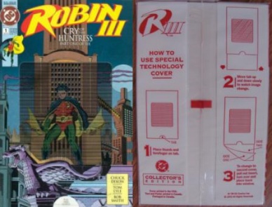
#6. Robin III #1 (DC)
The only cover on this list so complicated, operating instructions were included on the poly bag.
After using hologram covers for the direct market editions of “Robin II,” DC decided a moving cover was the way to go for volume three. This was no simple lenticular cover, though. It actually moved. The cover was folded and sealed to make a sleeve, with an insert visible through a special window in the cover. When you pull the insert down, Robin’s cape looks like it’s fluttering in the wind. The insert is also reversible, so you can also see the mini’s villain KGBeast be menacing in motion. The gimmick only works if you do it just right – if the insert gets cockeyed, the image gets garbled.
It’s tangentially relevant to the plot, because the issue does feature Robin standing on top of a building — just not the one on the cover. The newsstand edition was a standard cover with different art.

#5. Eclipso: The Darkness Within #1(DC)
This was part of DC’s crossover event through the 1992 annuals. The story centered around shards of a gemstone, and each cover featured an embedded plastic chunk of “gemstone.” In theory, this seems like a great idea – it’s story related and it will stand out on the shelves. However, it also comes with some unintended side effects. First, the thickness of the stones made racking multiple copies very difficult for retailers. Then, the weight and placement of the stone in the cover gave the book a very awkward balance, making it uncomfortable to hold while reading.
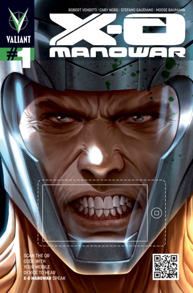
#4. X-O Manowar #1 (Valiant)
Thanks to 21st century science, the cover of this comic actually speaks. Audibly. Well, it can if you have a smart phone. By scanning a QR code and placing the phone inside the dashed line around the mouth, the character on the cover speaks (watch it in action here).
Technically this isn’t a one-of-a-kind cover, because Valiant reused the idea for some of their other #1s as well. Still, it’s innovative and fun… if you have a smart phone, and only for as long as the code is still active. If they ever take it down, well, you’ll be left with a decent looking cover with a box randomly drawn on it.

#3. Superman #30 (DC)
“Superman” #30 was the first (and as far as I can find, only) do-it-yourself variant cover. The cover is shown above on the left. It was a glossy, heavy cardstock cover before such things were popular. It came polybagged with the sheet of stickers showing on the right. This wasn’t a cheap, place-one-wrong-and-you’re-screwed set, though. Those stickers were Colorforms, the puffy, reusable stickers that turned this bland cityscape into a never ending canvas of adventure. The various pieces were even diverse enough to allow a motivated reader to recreate the events of the comic (which did feature Superman fighting Lobo).
Continued below
#2. Warriors of Plasm #0 (Defiant)
This forgotten series had a lot of trouble getting off the ground. In addition to a (failed) legal challenge from Marvel over the name, it also had a spectacular failure of a variant cover.
“Warriors of Plasm” was released at the height of the trading card craze, and packaging exclusive cards inside comics was old news. Creator/publisher Jim Shooter had the idea to really bring the two together, and the number zero issue of this Defiant title was released as a card set, only able to be read by assembling a complete set in order in a “Warriors of Plasm” binder. A print copy was going to be made a few months later for those unable to collect all the cards; unfortunately, production delays prevented the cards from being available until after the print version, rendering the whole thing an exercise in pointlessness. And the story has nothing at all do with cards.
In an ironic twist on that infringement suit from Marvel, the House of Ideas recycled the ‘assemble a card set to read a comic’ idea 18 years later.

#1. Jab #3 (Adhesive)
The number one book on our list had a print run around 3000, and every copy was shot with a gun. Literally.
The creators of the book planned this ahead of time, allowing them to both tell and draw their stories around the hole. In what has to be the most bizarre incentive ever, every tenth issue had powder burns. There was also a range of caliber used, including a 12-gauge-shotgun edition guaranteed to be unreadable.

As you can probably tell from the cover, “Jab” was an anthology. This is the only issue of the series I’ve read, and it has a predictable range of quality. Only two stories utilized the bullet hole to maximum effect, and they were both fantastic. If you can still find a copy for under $8, I’d recommend trying it, just as a novelty.
Now, most people who hear “bullet hole comic” think of Malibu’s “Protectors” #5 (if they think of anything). It turns out the two are related in an unproven case of idea theft. Unlike “Jab,” Malibu didn’t actually use a gun – they just stamped a circle through the book. Without approval from their advertisers. Oops.


