
There’s a lot to cover on Wednesdays. We should know, as collectively, we read an insane amount of comics. Even with a large review staff, it’s hard to get to everything. With that in mind, we’re back with Wrapping Wednesday, where we look at some of the books we missed in what was another great week of comics.
Let’s get this party started.
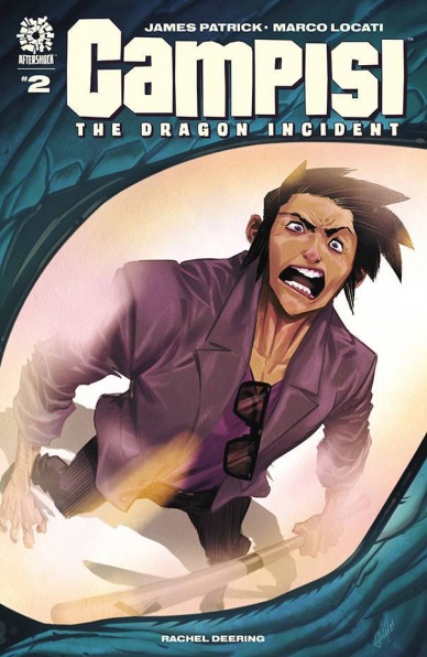
Campisi #2
Written by James Patrick
Illustrated & Colored by Marco Locati
Lettered by Rachel Deering
Reviewed by Alexander Manzo
A young man is fighting for his neighborhood by standing up to a dragon and trying to stand up to his gangster boss. This is the fantasy realism story that James Patrick has created for the readers to enjoy. The protagonist Sonny Campisi is just a guy trying to make things right with the dragon so that nobody else he cares about gets hurt, and hopefully, the neighborhood he grew up in remains there. The thoughts that Patrick shares with the reader help give the character some much-needed depth because he comes off as very stoic and methodical, but in reality, he is scared as anyone else. Yet his continuous steps towards the dragon, even coming face to face, he remains strong and sarcastic with the mythical creature. It’s interesting because Patrick has created a character that also understands the dragon’s actions because of how humans nearly made his kind extinct. He just wishes it wasn’t in his city.
The information on the protagonist’s upbringing helps the reader connect to him by seeing the hardships he went through in being homeless and essentially being taken care of by the people in the neighborhood. His role as a fixer for the gangster leader puts him in a position of being on both sides of the fence. On the one hand, he has a boss that he has to listen to and make sure things get done, but on the other, he knows the people will pay, but it may take a little extra time. The questions he’s starting to bring to his boss have Campisi put under a microscope to make sure he doesn’t make any more mistakes by caring too much.
Marco Locati’s illustrations are top-notch as he sticks to the story’s realism while balancing incorporating a giant dragon. The dragon comes off as a mix of How to Train A Dragon for looks and Dragonheart in his personality, which seems perfect for the events transpiring. During that scene with Campisi and the dragon, this ever-changing perspective works well because it shows the size comparison of the protagonist and the dragon for the power dynamic between the two. While Campisi is obviously much smaller, he has this presence and confidence about him that almost makes up for the size. The characters’ bodies seem rather boxy and stiff; the emotions on their faces help drive the scenes and dictate the mood to connect with the audience.
Lucati also does the colors for this issue, and he does a good job when it comes to scenes that use natural light or inside the barbershop with the boss. However, during the scene when Campisi leaves the dragon at night, all of the color choices look similar, making it difficult to see what should and shouldn’t stand out. Luckily his use of shadows helps negate it, so it’s not just grey shadows.
Final Verdict: 7.9 – Solid mix of character development and witty dialogue to add to anyone pull-list.

Eternals: Thanos Rising #1
Written by Kieron Gillen
Illustrated by Dustin Weaver
Colored by Matthew Wilson
Lettered by VC’s Clayton Cowles
Reviewed by Henry Finn
“Eternals: Thanos Rising” #1 retreads familiar ground by setting up a new story arc featuring the mad uber-villain Thanos who is hell-bent on total destruction of everything the Eternals hold dear. Prior to this, he has been murdering Eternals permanently and “Thanos Rising” sees new stakes being set up that are sure to have ramifications across the Eternals universe.
Writer Keiron Gillen continues a structure set in the recent Eternals series by Gillen and artist Esad Ribic where the Machine serves as narrator explaining the motivations and backstory. In “Thanos Rising” we wind the clock all the way to the events that precipitates Thanos’ creation. Gillen treats us to a philosophical debate between Alarsite, who wanted to extend the line of Eternals through love and sexual reproduction rather than machine-made birth -and Zurasian who fiercely opposed it. To be honest, both arguments seem a bit flat and lifeless, as Alars wants to extend the line more or less just to see what happens, and Zuras opposes on the grounds of wanting things to simply stay the same. This is where Gillen falls flat, failing to propose a compelling argument from either side, despite a full page of text inserted into the book just to showcase their opposing views. Combine this with the predictability of Thanos’s actions as his story has been told already prior to this series, and we have a very mediocre first issue. The one interesting extrapolation is the secondary storyline that emerges unintentionally and perhaps could have been a more compelling thread to pull on. After a civil war is resolved through negotiation, the Eternals who were fighting against each other are mind-wiped and wake up as friends again. Sprite and Ikaris even go as far as to say how disgusting the thought of them fighting on opposing sides. Gillen’s lack of transcendent motivation brings up an important question.. if the Eternals are created without love, and easily reset, what part of their story exactly is interesting to us as readers? They aren’t human and their struggle against Deviants is a repetition of sameness throughout centuries, so why do we care? Gillen sadly does not answer this in “Thanos Rising.”
Continued belowArtist Dustin Weaver’s work seems to bring a classic sensibility born out of the Walter Simonson era in his technique and linework. His outlines are solid and thick with very little cross-hatching, instead favoring sharp straight lines around the edges to denote form and volume. His lines are sparse and loosely rendered scratches within shadows, relying on colorist Matthew Wilson to help define the pages. Wilson brings the modern touch to the artwork by doing things such as replacing solid black lines with a color-fill or blur on background images to create a sense of distance. He also changes color palette throughout the book to ensure each separate location is treated with it’s own sense of atmosphere.
Final Verdict: 6.5 – While the all-but-assured forthcoming destruction by the hands of Thanos is an appealing reason to continue the series, this first issue feels like it could have been fit on a summary page and does not spark a lot of excitement.

I Am Batman #1
Written by John Ridley
Illustrated by Olivier Coipel
Colored by Alex Sinclair
Lettered by Troy Peteri
Reviewed by Quinn Tassin
Before reading “I Am Batman” #1, I would not have said that we needed another Batman comic. To be frank, I’m definitely not convinced that we do need this many Batman books on the stands but with it’s debut, John Ridley and Olivier Coipel’s new series spinning out of “The Next Batman” proves that it absolutely deserves a place in the DC Comics line. Our near-future Bruce Wayne successor Jace Fox isn’t preoccupied with being like the first Caped Crusader. He wants to be his own Batman, a BatMan of the people if you will (5 comedy points to me). The mission isn’t really about breaking bones (though he does do that to one guy) or striking fear into the hearts of criminals, it’s about bringing hope to the people of Gotham. Much love to Bruce Wayne but a new, Black, low-tech Batman seems like the hero Gotham both needs and deserves.
There’s not much by the way of plot in this first issue- mostly it’s vibes, mild world-building, and a neat cliffhanger in the form of Anarky’s corpse- but that’s more than welcome. Taking a second to become acquainted with this new Gotham and this new Batman is honestly more ideal than a flashy, overstuffed first issue. Seeing Jace do things like refuse to beat up a reckless driver, tell a couple of kids not to graffiti on a normal person’s property, and friends with some nice detectives gives us a great sense of what kind of a hero he’s trying to be and a real reason to root for him. He’s not some kind of Ted Lasso funhouse mirror Batman, though, he’s an actual good, layered character who’s holding in quite a bit of rage and experiencing loads of personal conflict.
“I Am Batman” #1 is brought to the next level with legendary artist Olivier Coipel and colorist Alex Sinclair. Together, Coipel and Sinclair put together a gorgeous issue, brimming with energy and packed with imaged you’d pay anything to own. Every moment with Jace on a motorcycle looks awesome and has some of the coolest Batman cape illustrations you’ve ever seen. The easy highlight of the issue artistically, though, is the fight with the militarized conspiracists. This is a new Batman but he’s absolutely well prepared. The sequence is an excellent portrayal of Jace’s physicality and his brutal efficiency; the sense of motion and kineticism that Copiel brings is unbelievably good and helps the whole thing feel immersive.
This isn’t just another Batman comic, people. Ridley, Coipel, and company have put together a take on Gotham and the Caped Crusader that feels fresh and interesting, which is no small feat. Looks like we’ll see how things go in terms of being a great detective next time.
Final Verdict: 8.4 – “I Am Batman” #1 is a great start to the best new Batman comic in a long time.

The Last Annihilation: Wakanda #1
Written by Evan Narcisse
Illustrated by Germán Peralta
Colored by Jesus Aburtov
Lettered by VC’s Cory Petit
Continued below
Reviewed by Michael Govan
“The Last Annihilation: Wakanda” #1 is a truly great comic. Personally, I’m a little in awe at how well it came together. Not just as a complete story but as a part of something bigger. Obviously, this issue is a tie-in to the ‘The Last Annihilation’ crossover. It’s definitely a great tie-in, not something only loosely related and irrelevant to the main plot. It feels connected and vital to the current Marvel cosmic landscape and other titles such as “S.W.O.R.D.”. It also works as both an epilogue of sorts to Coates’ “Black Panther” and a prelude to Ridley’s run. It has to be a lot of things but manages to pull it off.
It is worth noting that being as deep in Marvel lore as it is, the beginning is exposition-heavy (though it feels natural). Also while reading Coates’ ‘Intergalactic Empire of Wakanda’ arc is not required, it offers some valuable context and would enhance the reading experience.
Also worthy of note is the issue’s clear themes and how well they are explored. One particularly striking theme is community. It takes a village to raise young Zenzi, relying on M’Baku and the Dora Milaje. To defeat Dormammu, Wakanda has to team up with the Shi’ar and S.W.O.R.D. and Krakoa/Arakko. T’Challa has to rely on M’Baku to oversee his empire and so on.
Another strength is the characterization. All of the characters have clear voices. Brand and the Shi’ar are standoffish. Manifold and Shuri are flirty with each other whereas T’Challa and M’Baku may find themselves at odds but still trust and respect one another.
The artwork is also great. The characters look good, especially M’Baku. Peralta outfits our star in cool new space armor…the gauntlets are fantastic but my favorite touch is the high-tech mask that echoes MCU M’Baku’s own mask. This is an action-packed action filled with truly impressive space fights. For example, there’s a panel where Manifold covers the sky over an entire city with portals, redirecting lasers back out into space. That’s just one panel, there are plenty of other standout moments. There are also tender moments. It’s touching to see little Zenzi playing with Shuri and Storm action figures, sleeping with an Ironheart plushie. Aburtov enhances the entire issue with vibrant colors. Great writing combined with beautiful art…there’s not a boring page in the book.
Final Verdict: 9.5 – M’Baku leads Wakanda to victory in a spectacular ‘Last Annihilation’ tie-in.

The Mighty Valkyries #5
Written by Jason Aaron and Torunn Gronbekk
Illustrated and colored by Mattia De Iulis
Lettered Joe Sabino
Reviewed by Conor Spielberg
While issue six of The Mighty Valkyries feels like a climax to a long event filled epic, the attempt to recap the previous issues brings up more questions than it answers. Despite the context for the conflict being left in the recap, Jason Aaron and Torunn Gronbekk’s plot manages to sufficiently convey what is at stake without it.
This is in many ways thanks to the phenomenal artwork done by Mattia De Iulis. De Iulis effectively conveys a sense of scale with the giant wolf and the skeletal dragon while making them both look extremely menacing when compared to the relatively puny gods. De Iulis also manages to draw the characters in a photorealistic way while maintaining a sense of personal style through his phenomenal coloring.
The lettering by Joe Sabino strongly conveys the “Asgardian accent” through a unique font that is not as overbearing as it can be in older lettering done for Thor in the Silver Age. In fact it makes you wish there was more variety in lettering character’s dialogue in general. One way in which the lettering falls short is how it is scripted by Aaron and Gronbekk. This is because the omniscient narrator describing the panels is peppered in between character’s dialogue which makes it confusing when narrarations are expressing something in two boxes that aren’t supposed to be read in sequence to one another. This, however, is only a minor inconvenience and does little to detract from the quality work being done by the entire creative team.
Continued belowFinal Verdict: 8.0 – A strong issue with a satisfying conclusion and compelling artwork

Titans United #1
Written by Cavan Scott
Penciled by José Luis
Inked by Jonas Trindade
Colored by Rex Lokus
Lettered by Carlos M. Mangual
Reviewed by Gregory Ellner
As a story introduction, “Titans United” #1 is sufficient for some, but perhaps not many. Cavan Scott showcases the basics of character dynamics through the attention to the Titans, and their abilities are put on display in an unusual manner. The story is not amazing nor perfect, but it is interesting enough to gain rudimentary attention and perhaps to be interested in where it goes. From an unusual quasi-antagonist to the ensemble of popular heroes, many characters have their own time to shine… but their interactions are where the problems come in most prominently. The conversations amongst some of the members of the Titans seem as though they barely know one another and are making things up as they go, at odds with how some elements of the script imply they had been working together for at least some time.
Most notably, some of said characters are seen on such a basic level that they could be seen as borderline parodies of themselves, such as Red Hood immediately jumping to a lethal method to take down a target who is as much a victim as a threat, or Beast Boy being completely unable to ever talk seriously, constantly making one joke or another even in the direst of circumstances to the point of making it hard to take the actual events as significant at all. Yes, we do perhaps need some forms of conflict in the series, but by relying too heavily on the most basic elements of how readers could see these characters, Scott makes them feel as though they are disingenuous.
José Luis does a fine job of picking up the slack, his artwork demonstrating the sheer speed and dynamism of superhero combat or even slower moments. Shock, amusement, and fear are all very effectively shown in the midst of conflict, and the use of perspective really helps to emphasize the sheer heights (literal and figurative) that the heroes reach toward. Physical damage and overall stress, along with anguish or confusion, seems borderline palpable, with even the moments that have a background of just speed lines working very well to show intense focus. Meanwhile, Jonas Trindade’s inks are smooth and flowing, helping to add life to the characters and scenarios.
Rex Lokus does marvelously with the colors, showing a vibrant world of action and bright lights. The harsh reds and oranges of certain forms of conflict contrast against some of the cooler colors of the heroes. Differences of bright, blinding lights and deep, mysterious shadows are enough to easily examine the tone of the piece, with the excitement of combat tempered by varying hues and shades. The characterizations may leave something to be desired, but Lokus’s colors make it a little easier to maintain interest on the events on the pages.
Final Verdict: 6.0- Despite exciting artwork and colors, this debut’s shallow, at times inconsistent characterizations makes it hard to care too much about following going forward.

Usagi Yojimbo #22
Written, Illustrated and Lettered by Stan Sakai
Colored by Hi-Fi Design
Reviewed by Elias Rosner
One of the great strengths of “Usagi Yojimbo” is its ability to revisit the same situations over and over and still find ways to make them interesting and feel fresh. Issue #22 brings us another (mis)adventure featuring Kitsune, a thief who often runs into Usagi, and her new-ish ward, Kiyoko. The two are staying hidden from, who else, someone powerful they’d stolen from and most of the issue is spent with the two in lively conversation with Usagi & his cousin Yukichi, who’re just coming off a misadventure of their own. It’s a really clever way to (re)introduce the characters to readers, whether this is their first issue, their first issue in a while, life-long readers, or anywhere in between.
Sakai’s art continues to be pitch perfect. Because this is a lighter adventure, he keeps the expressions warm and open, though Usagi is given plenty of reasons to put on his stern face. His backgrounds, too, are wonderful to look at, immersing us in the town and inn they’re in but he knows when to drop them without breaking that immersion. My favorite example of this is in the second panel Kitsune is in, where she’s clearly putting on her innocent act, and the background is a yellow/orange gradient. It gives the impression of a sun or halo, deepening the humor of the moment.
Continued belowIt’s moments like those that show how Hi-Fi’s coloring is a wonderful compliment to Sakai’s art. Another is, even though the story takes place at dusk, Hi-Fi’s coloring keeps the comic looking bright without sacrificing the cues that indicate different lighting environments. This extends to the backgrounds and the characters’ shading too, though there it’s subtle enough that you don’t notice the more complex colors on the background, which allows the much flatter colors on the characters to set them apart without making the two look disconnected. While I still prefer the black and white aesthetic, Hi-Fi has proven to be the right successor to Tom Luth on colors after his retirement.
All this is to say, “Usagi Yojimbo” remains a highlight of my pulllist, month in and month out, doing its thing with such aplomb that even when the story feels very familiar, that familiarity breeds comfort rather than boredom. Each issue is a chance to catch up with old friends and to see life as it is, repetitious, wondrous, exciting and ever changing and “Usagi Yojimbo” #22 is no exception.
Final Verdict: 8.9 – Some frequent readers may find the familiar story a bit rote but Sakai’s mastery of the form keeps the issue strong and engaging, for all readers new, old, and lapsed. Cheer for the return of old favorites and marvel at the effortless success of the world of “Usagi Yojimbo.”


