
There is a lot to cover on Wednesdays. We should know, as collectively, we read an insane amount of comics. Even with a large review staff, it’s hard to get to everything. With that in mind, we’re back with Wrapping Wednesday, where we look at some of the books we missed in what was another great week of comics.
Let’s get this party started.
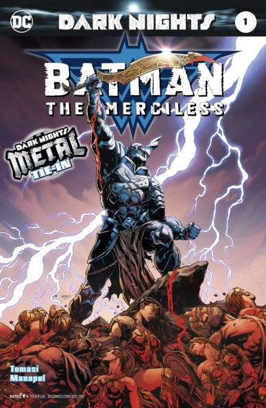
Batman: The Merciless #1
Written by Peter J Tomasi
Illustrated and coloured by Francis Manapul
Lettered by Tom Napolitano
Reviewed by Frida Keränen
All the Nightmare Batman “Dark Nights: Metal” tie-ins have up to now included the Nightmare Batman of the issue fighting their corresponding Justice League member, but with “Batman: The Merciless” #1 that isn’t possible since Wonder Woman is otherwise occupied. So instead of getting to see Diana fight a Batman who is a god of war, we have to settle for an array of characters linked with various organizations and the military.
Steve Trevor is of course present as a character strongly linked to Wonder Woman and I wish there had been more interaction between him and The Merciless. General Sam Lane has never been a likeable character and here Tomasi demonstrates it by having him deliver some hard decisions and petty blows. Someone who retorts to saying stuff like “You’re soft, Trevor – That’s why Wonder Woman left you!” in an emergency situation where millions of lives are at stake doesn’t really invoke respect. On second thought, after several pages of pretty bad and long dialogue it doesn’t stand out that much and loses its effect. The plot isn’t top notch either, as the scenes without The Merciless feel like a drag instead of bringing variety and depth to the narrative.
Francis Manapul is responsible for all the art duties of this issue. He remains faithful to his unique style and doesn’t use too dark colouring even if the point of these one-shots is to revel in the dark broken reflections of Batman’s story. The layouts work well even during the slightly unclear parts of the plot. The characters look good except for minor errors. The moments where Batman holds Wonder Woman’s body have more detailed backgrounds than any other scene, depicting a horrible site of war, making it a heavy moment that keeps your attention much longer than for example the military meeting scenes.
At first this issue didn’t feel as extremely grim as the previous one-shots but the reveal on the last page amps up the darkness of the story quite a lot. Still, it fails to be a memorable moment. It might have been more shocking if presented differently, but now it’s a lame afterthought the nightmare Batman has while sketching a picture of him and Wonder Woman kissing on a piece of stone. Like the whole of the issue’s writing, it feels like a confusing letdown.
Final Verdict: 5.5 – Nice art, but the writing is somewhat flawed in every aspect.
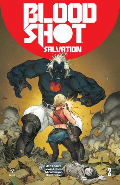
Bloodshot: Salvation #2
Written by Jeff Lemire
Illustrated by Lewis LaRosa and Mico Suayan
Colored by Diego Rodriguez and Brian Reber
Lettered by Simon Bowland
Reviewed by Michael Mazzacane
Can Bloodshot be a good father? Likely not, and Ray Garrison certainly cannot when he’s off being Bloodshot. “Bloodshot: Salvation” #2 continues the dual narratives of Present and Not Too Distant Future by artists Lewis LaRosa and Mico Suayan, respectively. This issue however sees writer Jeff Lemire further delineate the two narratives with differing narrative styles.
Bloodshot can’t be a good father. All he does is think about threats and destroying said threats. Garrison-Bloodshot is consumed by the knowledge of Daddy’s existence and they can’t let it go. Twisting Bloodshot, a banner metaphor (and parody) of ’80s hard-body masculinity, into a metaphor for retrograde alpha male protector thinking is surprisingly effective. Lemire writes this sequence from Bloodshot’s perspective and it’s just one big cycle of justification and feigned helplessness. Ray knows what he’s doing is a bad idea, but won’t admit it.
The present storyline by LaRosa benefits from the artists dynamic use of perspective. With Lemire’s narration and what happens to baby Jessie, everything is so deliciously melodramatic. LaRosa is constantly playing with high and low angles. As Magic runs through the house looking for her ghostly partner, there is only one panel that’s relatively straight on with a very expressive facial design. Everything else is from high and low angles that create a dramatic energy for what should be a parental nightmare.
Continued below
While LaRosa milks angles for their dynamism, he also uses them to show just how apart Ray Garrison is from normal people. It helps that he’s costumed like the Terminator, but what puts it over the top is the consistent low angle perspective that makes him look like Greek statue. The smooth color blends in LaRosa’s segment also add to this statuesque presentation. All the smooth blending defines all the little nooks, crannies, and many veins popping out of Ray’s body.
Mico Suayan’s section of the book doesn’t have the interiority, or the dynamic perspectives it just has a cold hard look at what’s happening. Action occurs, and it hurts. Super human bodies are smashed into things and you see the force of impact ripple out. Bodies are broken and then they are healed. The perspective doesn’t really change but the use of a free-flowing panel design gives pages the dynamism to that allow this action to land.
Final Verdict: – 7.5 – The dueling narratives of “Salvation” continue to diverge and make for a well done and varied reading experience.

Dark Ark #2
Written by Cullen Bunn
Illustrated and Colored by Juan Doe
Lettered by Ryane Hill
Reviewed by John Schaidler
If you’ve ever been to a community theater performance or a high school play chances are pretty good that you’ve seen a guy (and I do mean male) whose idea of dramatic intensity is to say everything as loudly as possible. He hits one level and stays there, variety and nuance be damned. To the performer, it doubtlessly feels intense and super important. To the audience, however, it’s monotonous and uninteresting. With no variety, no rhythm, no natural peaks and valleys, the narrative becomes tiresome, droning on and on as it saps energy from the room.
“Dark Ark” #2 intensifies almost immediately. At the bottom of the first page, Shrae’s son exclaims, “Father! Down Below! The beasts! They’re rioting!” Turn the page and sure enough, you’re hit with a double-page spread of glowing eyes and flashing fangs in a sea of fiery yellows with occasional oranges and pale greens.
Generally, Juan Doe’s character designs are outstanding, especially when it comes to the monsters. This tableau, however, clearly misses the mark. As the centerpiece in a Dungeons and Dragons “Monster Manual” it may work great, but narratively it’s simply a mess. The characters seem like they’re posing as much as rioting, and with so many razor sharp fangs, talons, and claws, it seems incredibly odd that there’s not a single drop of blood. All of that aside, the composition is simply muddy. Other than a handful of distinct, well defined characters who frame the action, the rest just blurs together, a mass of ill-defined blobs.
From there, more characters exclaim, more beasts flash their fangs and Shrae gets super pissed off, helpfully allowing us to finally see his eyes instead his perpetually downcast, furrowed brow. Throughout the rest of the book, there’s even more dialogue, more monster posing and the slow realization by the random humans on board that they’re probably food for the Dark Ark’s diabolical denizens.
Truthfully, Juan Doe’s artwork is almost worth the price of admission (the cliffhanger image is brilliant). Sadly, Cullen Bunn’s story – and especially his one-note dialogue – continues to fall well short of the book’s clever premise. Who knows, in the end, maybe that’s just how it is. Perhaps this book’s execution is doomed to pale against its grandiose vision.
Final Verdict 6.0 – Everybody wants this book to better than it is. Unfortunately, it’s not.
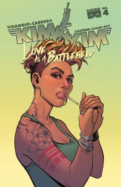
Kim & Kim: Love is a Battlefield #4
Written by Magdalene Visaggio
Illustrated by Eva Cabrera
Colored by Claudia Aguirre
Lettered by Zaak Saam
Reviewed By Kate Kosturski
And so, the latest saga of the bounty hunters named Kim comes to an end. Kim and Kim are still fighting ninjas but now IN SPACE aboard the Contessa. Turns out that Laz is on board the ship as well, and of course, Kim D. finds her ex with the vial. It takes a crash landing back onto Kestallan, a little bit of hand-to-hand combat, and a lot of tears for Kim D. and Laz to work through some of their issues and get the vial. Kim Q. also comes to realize that her relationship with Saar isn’t exactly the healthiest for her emotion, and she goes the “just friends” route. But Kim and Kim don’t have time for any downtime in the van…it seems their mutual friend Kathleen has some big plans for our girls.
Continued belowThis is the second closing arc issue I have read in as many weeks, and while “Faith and the Future Force” last week definitively closed the door on Faith Herbert’s time travel antics, Visaggio leaves it open for a new story with Kathleen and the Kims to start something very, very big. Praise is due to Visaggio for providing closure with Laz as things stand right now — but only her story, not the whole of Kim D. and Laz’s relationship. We’ve only scratched the surface of that, and I have a strong feeling Laz will be back. Eva Cabrera has the task of producing various emotional states across our stars’ faces, and she handles it very well. There’s a lot of close-ups in these panels, and every pencil stroke you see speaks more than the text ever could. Unlike previous issues that worked in glorious 80s inspired color palettes, Claudia Aguirre keeps it somewhat muted (but with more than enough signature Kim & Kim pink), matching the mood of finality and chickens coming home to roost.
This isn’t an issue designed to dazzle the eyes, it’s one to get at your heart. Thanks for the memories, Kim D. and Kim Q. And even you too, Laz.
Final Verdict: 7.7 – Visaggio and co. finish this story of Kim and Kim beautifully, with room for the next round of adventures — and I can’t wait.

Thanos #12
Written by Jeff Lemire
Illustrated by German Peralta
Colored by Rachelle Rosenberg
Lettered by VC’s Clayton Cowles
Reviewed by Matt Lune
Jeff Lemire’s time with the Mad Titan comes to a close with this issue, and for oncoming creative team Donny Cates and Geoff Shaw, the slate has been wiped particularly clean. One imagines this will make for a thrilling collected edition, one that encompasses the fall and rise of Thanos in a truly satisfying manner, pitting him against what felt like cosmically insurmountable odds. Here though, in this final issue, there’s a feeling that the best has been and gone, and that the job of “Thanos” #12 is merely to tie up loose ends.
The issue is a very short read – 20 pages with no less than three double page spreads – that concludes the series-long conflict between father and son (Thanos and Thane) at the exact halfway point, leaving the remainder of the issue to reset the pieces in a way that feels like a satisfying end to this current iteration, but reminds you that there is actually an issue 13 next month. It may be unfair to compare this to the previous issue in terms of action set-pieces; after all, when the last issue saw Thanos literally punch his son through a planet, where else can you go from there? As such, this feels like the second part of what should have been an oversized finale rather than its own issue, again a reason for it faring better when collected, perhaps.
Peralta’s artwork has managed to capture the epic cosmic nature of the storyline for this past arc, and here in Issue 12 that’s no different. While the use of double page spreads does shorten the reading experience, it’s used in moments deserving of the grandeur and scale, like a wide shot of the God Quarry, or the final fate of the Phoenix Force. Equally, Rosenberg’s colors have never been afraid to capture the rich palette of purples, oranges and reds that make up the traditional Marvel cosmic aesthetic, and for an entire issue that takes place on a desolate planet with what’s basically a pit that traps gods, “Thanos” #12 is gloriously bright and bold.
In times to come, Lemire’s run on “Thanos” will be regarded as one of the recommended collections when talking about the definitive Mad Titan books. The grand, sweeping, almost Homeric journey undertaken by its lead character has given this book a weight and relevance that should ensure its continued success and popularity. In single issue format, this final chapter feels a little lacklustre, but as a conclusion to the greater narrative, Lemire leaves the book on a high.
Final Verdict: 7.7 – Not exactly anti-climatic, but nowhere near as epic as what’s come before.
Continued below
“Underwinter: A Field of Feathers” #1
Written, Illustrated and Colored by Ray Fawkes
Lettered by Steve Wands
Reviewed by Elias Rosner
Ray Fawkes’ comics have always been hit or miss with me, especially his watercolor ones. “Intersects” lost me after two issues, with its impossible to follow plot and confusing lack of special awareness or facial recognition, and, because of that, I skipped over “Underwinter.” But, as with all artists, time can improve their work, so I decided to give him another chance.
I can’t attest to whether this works as a sequel but as the start to a standalone, Ray does a good job at setting the tone and some brief characterizations of the people we’ll be following. Story wise, it’s pretty thin at the moment, setting us up with a bunch of mysterious characters, who’s relationship to each other is confusing at best. I’m sure some of these are character from the previous series so it’s something I can look past for now.
What I can’t look past, and what has always bothered me about his art, is the vast amounts of empty space in many of his panels. There’s this glut of white space as backgrounds, making it feel like characters are just floating in a void, with the physical relationship to each other constantly shifting. Yet, this creates an uneasy tone and heightens the unsettling nature of some of his images.
Same goes for his character’s faces. They’re significantly more defined here than in “Intersects” which is a blessing, I can (for the most part) tell the characters apart and follow the action but they still feel of, unfinished or incomplete. Like they are masks on top of blank faces, they don’t quite fit with the body their attached to and don’t convey nuanced emotions, or most emotions at that. Fear, a frown, or a dull look is the most we get, especially in long shots.
But, my favorite part of the comic has to be all the birds. They’re drawn in black and white, as if they were sketches flying around a real world, and this layering gives these scenes a texture and a mystery. Why are these birds here and what do they represent? Why are they drawn so differently than the rest of the comic? We get the start of an answer by the end but this alone has gotten me to stick with the book.
Hopefully next time there are some more answers so I can start to get my bearings on the world of “Underwinter” but if not, more of that creepy shushing man and bleeding hooded person would be sufficient.
Final Verdict: 6.9. A lot of great imagery and creepy visuals but light on plot and heavy on the empty space. Fawkes’ fans will love it, others might have a harder time getting into it.
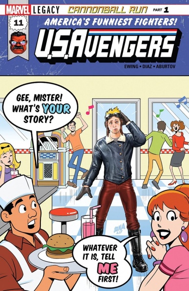
U.S.Avengers #11
Written by Al Ewing
Illustrated by Paco Diaz
Colored by Jesus Aburtov
Lettered by VC’s Joe Caramagna
Reviewed by Alexander Jones
Nearly a year into publication, “U.S.Avengers” #11 has been all over the map stylistically. This comic has been taking big risks, but not following through and retaining some of the focus with the characters over the past few issues. Perhaps the biggest sin of “U.S.Avengers” is how the series constantly shifts focus and doesn’t direct the attention it should with introducing big ideas in crazy storylines. This new installment of the series has incredibly lofty ambition, setting up a riff on the classic Archie formula and channeling the lost word John Byrne-era “Fantastic Four” storylines meant to channel the next big aspect of the series. While this comic is at least tackling a storyline which isn’t a one-and-done arc, the pacing of this issue is an aspect of the narrative already has me incredibly worried.
Writer Al Ewing’s take on Archie is fascinating, but the writer doesn’t take the chance to get in-depth with the characters or premise. This is where the problematic pacing on this comic aggressively derails the weight which this narrative could have had. Over at DC Comics, “Detective Comics” has placed Tim Drake in a false reality for nearly a year–due to the slow, plodding nature of the storyline there was more of an impact over the past couple of issues when the character finally made his return. Sam Guthrie may not get that triumphant moment if this series resolves the arc so cleanly in just the course of a couple months.
Continued belowPaco Diaz’s art in this title continues his streak of impressive pencils over at Marvel comics. Diaz’s pencils feel more refined than ever even though a few faces can be drawn slightly inconsistently and panels have sparse detail work in the backgrounds of the book. Diaz’s figure work continues to be expressive, as there is a lot of emotion to convey between the characters in the Archie planet. If I had to lob one criticism at the book, it’s the idea of the art not switching up as deep as the cover might suggest. Instead of having Diaz try his hand at the traditional Archie style, this issue looks like most others in the series cover aside.
Despite pacing problems and a fairly traditional plot, there’s still fun to be had in “U.S.Avengers” #11 the comic is just more than a little rough around the edges. If the title devoted more time to the comic and the exploration of this where the Archie world could go next, Ewing may be onto something. The most important lesson Ewing could learn from this storyline and the past couple of issues however, is to stop and smell the roses so readers can get a better handle on this cast and get more invested in the comic.
Final Verdict: 6.9 – “U.S.Avengers” #11 is whirlwind of cool comics ideas doled out in a rapid clip that doesn’t stick.
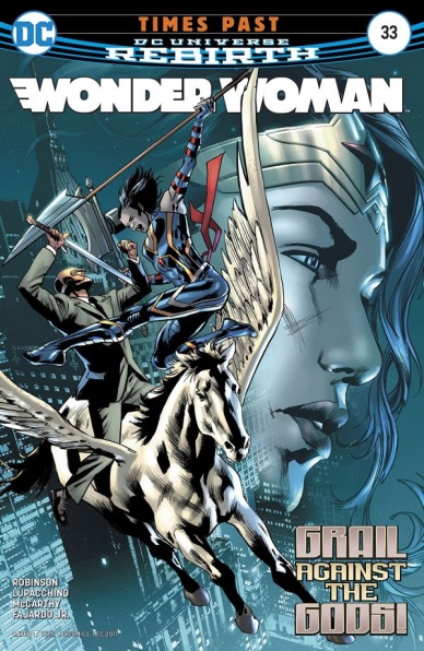
Wonder Woman #33
Written by James Robinson
Illustrated by Emanuela Lupacchino
Colored by Romulo Fajardo Jr.
Reviewed by Gregory Ellner
James Robinson’s writing on “Wonder Woman” #33 is surprisingly comedic for a chapter involving the (pardon the pun) dark side of ‘Children of the Gods.’ Centered around Grail’s attempts to artificially mature the infant version of her father back to adulthood and his prime in terms of power by way of a serial killing of Zeus’ demigod children (which given this is Zeus, are very numerous), a lot of attention is given to the fact that despite being the God of Tyranny and being emotionally as mature as he was as an adult, he keeps some immature habits, including teething as a baby.
Emanuela Lupacchino’s artwork is very dynamic, aided by Romulo Fajardo Jr.’s coloring to give it a dark, divine bent, but does have its issues in terms of the storytelling. Whether due to Robinson or Lupacchino, there is an inexplicable change in Grail’s weapon of choice from a scythe in last issue to a trident in this one. This difference is never actually mentioned, even more notable for how her appearances both before and after the scene shown have the scythe.
“Wonder Woman” #33 is a fun flashback issue that doesn’t give away much (relegating some to future issues of other series in the ‘Metal’ crossover), though it does have some continuity errors. And besides, it has a baby Darkseid, which is worth the price of admission alone.
Final Verdict: 7.0 – A well-done summary of the villainous side of the ‘Children of the Gods’ arc, with a hefty dose of situational black comedy.


