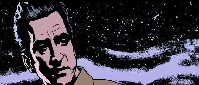
Today on Zuda Weekly, I spoke with two of the three members of the winning creative team from March: Ray Nayler and Steven Finch. The two of them put together Night at the Western, a throwback noir that really captures the look and feel of one of the most frequently misunderstood genres out there. While they started in fifth place on the initial rankings, they had a late run to get them all the way to a commanding win – amazing work!
Check out our talk with them after the jump.
Talk with Ray Nayler – Writer of Night at the Western:
As near as I can tell, you’ve had a successful career writing prose and traveling the world. Why did you decide to start writing comics?
RN: I really was looking for something more collaborative, and writing comics has been in the back of my mind for quite a long time. I grew up, like so many American kids, on comics, but writing them was something that first occured to me about ten years ago. Then, because I left the US and started working overseas, I forgot about it for a long time. I picked up the idea last September again, and started practicing converting my own stories to the visual format. Then I got on the Penciljack boards and started looking for an artist to work with. I had no real idea where I was going with this.
 How did you decide to take your concept to Zuda Comics?
RN: This was entirely Cesar’s idea. I had actually never heard of Zuda.
Were you surprised by the win?
RN: Absolutely. I had been working hard all month for it, but nothing clicked until half of March had gone by. Then, suddenly, the votes started to pour in.
How did you develop Night at the Western? What were your influences to your very noir story?
RN: Night at the Western is based on a short story that I wrote a long time ago/ The short story is very influenced by three things: my own roadtrips across the United States, film noir (especially The Postman Always Rings Twice and Detour) and my literary theory studies at UCSC.
Your collaborators on the project were superb, with Cesar Sebastian Diaz providing beautiful art and Steven Finch really solidifying the look and feel of the book with his lettering. How did you get paired up with them?
RN: I met Cesar and Steven on the Penciljack boards. First Cesar contacted me because of an ad I had place there for an artist to collaborate with. He penciled the first few pages of another story, “The Ride,” before suggesting Zuda. Later we put up another ad for a letterer. I had naively thought I could do ithe lettering myself, but realized very quickly how silly that would have looked. I have a real appreciation now for the art of lettering: I think it may have been that final piece that put us over the top.
How far do you have Night at the Western planned out, and where do you see it going? It’s definitely one of the most mysterious entrants in recent memory.
RN: The short story is complete, so I know where I’m headed, but I’m also changing things as I go. My goal is to use the medium as well as I can, and tell the best, most surprising story I can. I can change direction at any time, but the skeleton is certainly there.
 2 weeks in, you were in fifth place. When the dust settled, you had a commanding victory. How did you do it? Where do you think the onslaught of love came from?
RN: I think this silly trailer that I did and sent to everyone I could think of really helped us along. It also helps that I’m part of a big expat community in Dushanbe. They were hugely supportive in putting the word out, as were my friends all over the world. My wife pushed me to promote harder after we ended up in 5th place, and I listened to her, as I always do. In the end, I think it’s just a matter of how many people you can put your work in front of. It was an exhausting month, and I’m glad it’s over.
Continued belowWhat other projects do you have going right now?
RN: Right now I’m working on a comics mini-series that is much more of a superhero piece, though it would fit into a few other genres as well. It’s definitely not noir, though: it’s very different from Night. I’m having a lot of fun with it.
Talk with Steven Finch (Fonografiks) – Letterer of Night at the Western:
 How did you get onboard with Night at the Western? Were you involved with the development of the idea?
SF: Ray found me through a want ad at Penciljack.com. I’d been thinking about joining up with a Zuda-aimed project, and this was the first that I’d pursued. I really lucked out. There hadn’t been any mention of genre in the ad, so finding out it was pulp crime was a pleasant surprise. I didn’t have any hand in its development.
Were you surprised by the win?
SF: When we jumped from fourth place to second, I knew we had a good chance of going all the way. The support was there, and our stats were climbing well, so I wasn’t even surprised when we hit first. I was surprised that we managed to stay there. Aleksander Christov seemed poised to make a comeback in those last few days.
To me, your lettering was a very important but perhaps unheralded aspect of the quality of this project. The font choice really solidifed the look and the feel of the story and drew me in as a reader. What did you look at to develop that aspect of Night at the Western’s visuals?
SF: Well, unheralded would have been fine for me. It’s generally the letterer’s aim to go unnoticed, so I may not have done my job as well as I thought.
I just wanted to make it look like a book DC would be happy to put out in through any of their imprints–they have some of the best letterers in the business working in-house at DC–and Ray and César were certainly bringing professional quality work for their parts. One of our commenters said NATW could have been a Vertigo book, which was satisfying as it’s exactly what I was shooting for. To that end, I tried to keep the lettering fairly restrained. Flashy sound effects, dynamic balloons, and fancy captions work great for the superhero and high fantasy stuff, but crime usually requires a subtler approach, and so much of the tone of the piece was achieved through Ray’s prose that I really just had to get myself out of the way and present the words as simply as possible. Typefaces do have their own personalities though, which makes the right choice essential. I feel like this one has a certain maturity about it among comic fonts that makes it suitable for the darker stuff.
For those that don’t really think about it, what about lettering is so important to a comic?
SF: It’s the last of the creative steps before the work reaches the reader, and therefore can control how they engage with the story. It’s also very easy to do badly, and nothing will bring down the overall quality of a comic like poor lettering.


