
As mentioned in the post for this week’s Casting Couch, we have some cool “Saga” stuff to share with you today and we’re very excited to get it to you. As it so happened, this year at New York Comic Con we were actually given a set of process pieces by the good folks at Image Comics of Fiona Staples’ original process pieces for “Saga,” showing how Alana and Marko came to be and the original variations of the now iconic “Saga” first issue cover.
As we are told, these have never been shown outside of conventions, so if you are a fan of the book you are in for quite a treat.
First up, we have Fiona’s Alana sketches:
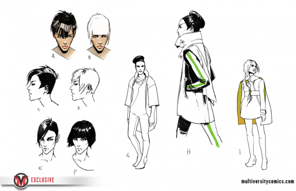
As you can see, Alana’s look could have been remarkably different from the final version we’re now used to. Fiona clearly had some fun with the hairstyle with this one, with quite a few variants in style originally pitched. Not only that, but Alana’s dress even had different variations at first, from what looks to be a futuristic bomber jacket and a Calrissian-esque cape-adorned outfit.
This of course all led to the Alana we’re familiar with today:

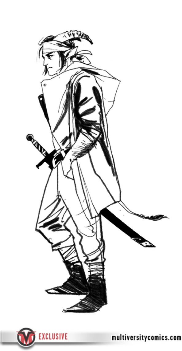
Next up we have Marko:

Once again, the immediately visible variations is in the hair, although Marko also has the addition of the horns which were played around with. The second variant is particularly interesting, which features gold bands attached to the horns, which assumedly could’ve been a sign of some form of royalty to the character. The other variations are interesting as well, with the smaller and antelope-like horns playing particularly well against the more familiar ram style. And how about that tail?
It also looks like at one point Marko was almost more of a pirate than a ronin:
Finally, a look at the original sketches for the covers of the first four issues:

It’s interesting to see how just slight changes in the set-up can change an entire cover. The middle version is clearly the one that they went with (although Alana’s gun is much bigger there), while the version on the left ended up being the trade cover. The blank space behind the characters ultimately makes them feel more isolated, while the variations with space behind them open things up a bit more. The version on the right is also interesting to see how it plays with the space background against the circle behind them, and it’s fun to muse over the possibility that that bar across could’ve become a recurring cover element. That said (and maybe this is because of what we’re used to), the middle iteration is clearly the best.
In addition to all of that, but as you can see only the second cover was kept of the additional three, with issues #3 and #4 being given character-based covers instead.
So how cool are those? Not everyone is admittedly a process junkie, as some prefer just to see the final product. Getting a peek behind the curtain like this, however, gives a truly unique insight to what our favorite characters could have been — and if nothing else, it’s rather great to see Fiona’s artwork in it’s earliest stages.
And, just because we like you, take a look at an additional process page from issue #6 of the series:

“Saga” returns with issue #7 in November.


