
Gerry Duggan has proved with his mainstream work that he’s a diverse writer. Having handled successful runs from “Deadpool” to “Nova” and even “Guardians of the Galaxy,” he’s someone who’s taken the the time to understand what makes these kinds of comics work and keep his distinct tone running underneath. So what happens when he teams up with artist David O’Sullivan on a creator-owned tale about a not-too distant and not-entirely-unbelievable future?
Written by Gerry Duggan
Illustrated by David O’Sullivan
Colored by Jordie Bellaire
Lettered by Joe SabinoCHAPTER ONE Five years from now: the security of the internet has been totally destroyed. Secrets are no longer sent over the web, they’re entrusted to armed couriers called “Ledger Men,” like human punching-bag Jack McGinnis. He’s got a gun in one hand and a briefcase handcuffed to the other. Danger lurks around every corner, and Jack has to watch his back—because he had a part in the cyber attack that changed the world. Get in on the ground floor of this new ongoing series and thrill as we slam Jack’s fist into the faces of spies, mercs, fascists, and eventually less punchable adversaries like a very grumpy artificial intelligence. From your new favorite artist, DAVID O’SULLIVAN, and GERRY DUGGAN, The New York Times bestselling author of such indie titles as Deadpool, Star Wars: Chewbacca, Guardians of the Galaxy, and Uncanny Avengers!
Duggan has a great noir tone nailed down here that feels campy and moody, reminiscent of the first cut of Blade Runner, considering they both share a neo noir setting. Our main man Jack McGinnis loves to sustain internal monologue throughout the piece, which normally isn’t something I can get behind, but as I said, it works well to establish tone. Plus, it means Duggan gets to infuse some of his signature humour subtly to comment on setting and social standards, in a manner that’s less blatant than his work in “Deadpool” but just as hilarious. It does wear a little thin in more expository settings, like the flashback with Allan Oppenheimer, however, mostly just retelling what is already being told through dialogue and visual storytelling, but the humour does build Jack’s character well and give audiences something more to latch on to.
I do like how subtly Duggan has built a world that still feels mostly familiar but with subtle yet affecting changes. I love that in the five years from our present, self-driving cars have become mainstream to the point where people are ‘eating, sleeping or jacking off’. It’s great social commentary that works at placing us in a future that feels realistic. I also find it interesting how much the older generations seem to be back in power. As McGinnis himself states in his dialogue, the Gen Xers are the ones that grew up pre-internet, so it makes sense that they’d be thriving the most in a post-data cloud world. It’s interesting especially when a millennial walks into a bar McGinnis is at, and is told off for having ‘networked shit’. This is not commonplace nowadays, but it was more the reaction that placed us: that the millennial seemed embarrassed and immediately turns off his ‘wearable.’
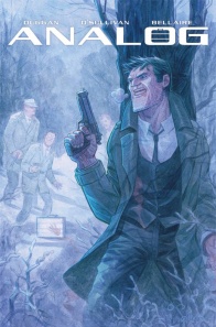
David O’Sullivan has a very crime-fiction art style that works well in “Analog.” It’s something that’s most visible through his character work. As soon as you pick this book from the shelf, you’ll see on the cover immediately our protagonist Jack McGinnis is the spitting image of a middle aged, hard boiled, no-bullshit detective. Sullivan tops this off by giving him the most well-defined and square jaws I’ve seen in modern comics. But it only gets better from then on in. As you enter the first few pages, the hostiles that McGinnis encounters all look like classic noir thugs. One has a pencilled moustache, another has a brown fedora, it’s all stereotypes within these pages. But what makes it work so well is that it’s not set in the 1950s or any other normal period typical of noir fiction. O’Sullivan renders these characters with that old timey panache, but still goes to great lengths to show behind it all this is still a firmly modern world. There are drones and security cameras flying through the streets that gaudily clad couples strut through carelessly. It’s culture shock working at its finest and O’Sullivan understands how to make it best work here.
Continued belowO’Sullivan’s rendering of the city of St. Louis is another feat to marvel at. Going with the theme of subtle contextual contrast, a lot of the city is a recreation of how it might look present day. O’Sullivan gets that there’s only a five-year difference between now and the comic, so this isn’t a super cyber-punk take we’re looking at. But this is in no means a negative to his work. What we get is really beautiful urban work that fits well within the noir tone, hailing back to classics not just of the genre but of bygone eras too. The opening scene possibly feels the most modern, with a backdrop of skyscrapers and wintery parks, but the snow and desolation of the place makes it feel like an old-school stand-off. Similarly, Allan Oppenheimer’s party mansion is one of modern aesthetic and architecture, with elegant glass balconies, but overall feels reminiscent of the Gatsby Mansion from, well, The Great Gatsby. There’s a good blend of modern and classical ideas in the environments O’Sullivan uses, and it works well to boost the tone and aesthetic.
Industry superstar Jordie Bellaire handles colors here, and we’re given a palette of almost pastel blues and beiges that feels like a wintery take on neo-noir and sci-fi. The opening scene is beautiful with foggy blue skies and massive buildings highlighted by golden lights piercing through the haze. But it still invokes a feeling of isolation that even the warm lighting can’t seem to shake. I like how the palette shifts to the golden beige when focusing on the city at daytime, and in true cyber-punk fashion, uses flashes of neon and brighter coloring to highlight advertising or high-tech elements. The scene with McGinnis walking through the crowded St. Louis streets represents this best, with the cool beige as a backdrop highlighted by a couple’s purple outfit complementing the man’s hi-tech glasses. It’s clever coloring that brings attention to the interesting aspects of the art, something Bellaire has nailed to a T.
“Analog” is in no way re-inventing the wheel. It’s a story that hails to great noir stories with its heavy interior monologue, social commentary and character work. It uses moody artwork with good recreations of urban cityscapes and classic designs to evoke this old-school tone amidst a neo-modern setting. But it’s because of this celebrating of older themes that makes “Analog” so fun. Duggan, O’Sullivan and Bellaire all create a solid opening story that deserves attention.
Final Score: 8.0 – A fairly straightforward noir tale with futuristic elements, “Analog” is a fun blend of classical and modern storytelling with moody and evocative art.


