
The “Dark Nights: Metal” event has kept the DCU busy fighting Batman’s nightmares, meanwhile Batman himself is tackling his nightmares in a less concrete way inside the Dark Multiverse. Take a look into his visions in this review, unless you want to avoid slight spoilers.
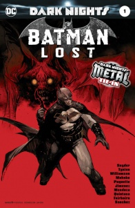
Written by Scott Snyder, James Tynion IV & Joshua WilliamsonCover by Copiel and Stewart
Pencilled by Doug Mahnke, Yanick Paquette & Jorge Jimenez
Inked by Jaime Mendoza, Yanick Paquette & Jorge Jimenez
Coloured by Wil Quintana, Nathan Fairbairn & Alejandro Sanchez
Lettered by Tom Napolitano
Trapped in the Dark Multiverse, Batman must face his greatest fears!
“Batman: Lost,” a one-shot not about the nightmare Batmen, offers a chance for the creators to do a character study in what is essentially an extended dream sequence. The setting and tone switch often, so having three different creators on every duty (except lettering) makes for a good choice to differentiate the sequences. Settings range from the caveman period to a spaceship. Transitions into the historical settings are also indicated by a certain unusual panel shape at the start of the page, which is an interesting detail. Story elements like Bruce as Alan Wayne falling into the sewer like he did in Snyder’s ‘The Court of Owls’ are used to give the transitions some meaning and variety as Batman descends deeper into the Dark Multiverse. The layouts in general are captivating and always coherent even though there is a lot going on.
The issue draws a lot of elements from the character’s history, from Batman’s first case in “Detective Comics” #27 to Grant Morrison’s work to Scott Snyder’s own run. The writers resort to many references and easter eggs, but knowing the events of the “Dark Nights: Metal” should be enough to understand the majority of the plot. A more casual DC reader might wonder why for example founding father Thomas Jefferson is trying to summon a demon, but it’s easy to gloss over. The dialogue transitions from scene to scene aren’t as smoothly done as the visual ones. The dialogue, in general, lacks much subtlety (but then again the same can be said for most Batman comics).
Mahnke, Paquette, and Jimenez have done an amazing job with the pencils. Right from the opening scene, something about the art gives the hint things are not quite right in this peaceful family moment. Those suspicions are confirmed: how Bruce’s imaginary granddaughter looks at the end of the issue is some pretty horrifying fuel for nightmares. Yanick Paquette’s style is simpler but not any less interesting. It is suitable for the noir mood of Batman’s early career. Jorge Jimenez is responsible for the most outlandish imaginary scenes of the far past and a near dystopian future. Jimenez’s art has simultaneously a flowing look and sharp lines which suits the feeling of this being just imagination, especially in the prehistoric part. The coloring of the scenes from Batman’s early history is quite flat while the scenes set in the modern times or the future have more shine and detail, kind of mimicking the coloring process of the eras.
A lot of the elements are nothing we haven’t seen before, nor is the jumping dream-sequence structure, but they make for a combination that works well together. Some ideas are expanded further than they have been in the main series. Ever since the start of the event I’ve been wondering when will Batman’s connection with bird-related people that don’t have anything to do with Hawkman show up. My wait paid off as this more positive relation comes up now that the writers have time to explore Batman’s inner thoughts on the matter. The most important element of the story here is the window which the bat that inspired Batman’s name and appearance flew through. It’s interesting to see focus on that element instead of for example Martha Wayne’s pearls, the gun she and Thomas Wayne were shot with or even the bell Bruce called Alfred with, since there have already been a lot of deeper meanings attached to those objects by multiple writers.
The unnerving tension of the story ramps up towards the end with Barbatos finally showing his face and Batman shouting in terror. This is why the final page and especially the final panels feel somewhat anti-climatic. Bruce being lulled back to the seemingly innocent family dream is fine and kind of creepy in itself, but what makes the ending a bit of a downer is that final panels are very similar to the ending of “Dark Nights: Metal” #3. Even if the stories are happening in the same situation and part of the same event, the endings needn’t to be so similar. Except for this minor complaint the issue holds up well as a whole and is an enjoyable read with varying and even beautiful art.
Final verdict: 8.0 – Interesting and well illustrated but suffers from a slightly weak ending.


