Whenever I read the fourth issue of a comic I enjoy, I begin to notice familiar elements that hint at a style unique to the creators and the story they’re telling. By this time, I expect compelling characters, rising action and an overall sense of structure and pacing in order to have a pleasurable reading experience. Furthermore, I begin to notice meaningful contributions the artist, colorist and letterer make that ensure the story is perfectly suited to the medium.
Written by Jay FaerberCover by Scott Godlewski
Illustrated by Scott Godlewski
Colored by Ron Riley
Lettered by Thomas MauerSheriff Clara Bronson sets a trap while Deputy Boo chases down a lead-both figuratively and literally.

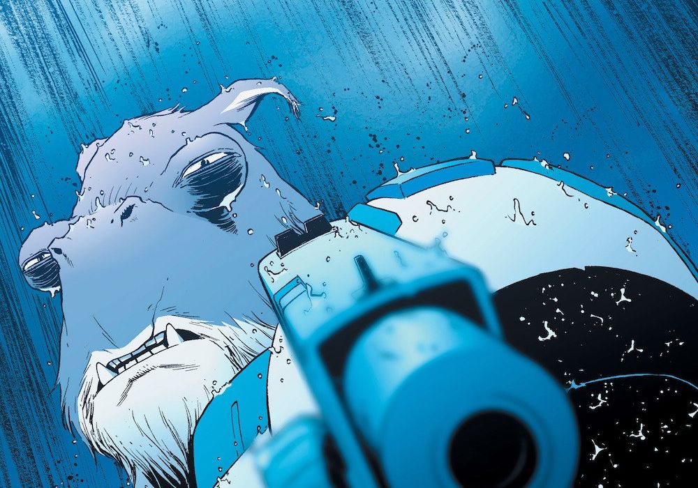
The cover image is similar to the previous issue. Boo is shown drenched in rainfall as he points a gun at some unseen foe. The cover’s cools blues are in stark contrast to the warm yellows of “Copperhead” #3’s cover. Additionally, this image does a fine job of cluing the reader to the fact that Boo will have a bigger role in the narrative this time around and that an action sequence is to be anticipated.
The writing in “Copperhead” #4 moves at a brisk pace. The challenge of character introductions, world building and conflict setup was achieved brilliantly in the previous chapters. This issue does a fine job of putting some of the characters in conflict and slowly teasing bits of backstory.
Clara is the kind of protagonist readers root for. She is capable, has a low tolerance for fools and is a caring mother to Zeke. In performing her duties as Sheriff, the simmering tensions with Benjamin Hickory, hinted at in previous issues, comes to the surface. Having attempted to corrupt her upon her arrival, Hickory makes contact with Clara’s superiors hoping to get her fired from her new job. This exchange provides the reader with a first glimpse of the impressive Sheriff Headquarters and allows the writer to cleverly put in some backstory about Clara and solidify Hickory’s role as her antagonist.
Another element of the writing that I enjoyed was the air of mystery surrounding Ishmael and his intentions. We know from various character interactions that Artie’s are disliked because of their role in the war. However, having seen him in action when he rescued Zeke from certain death, we know that he is an honorable man despite the fact that he is the prime suspect in the murder of the Sewells. This makes it interesting for the reader because we know that Clara and Ishmael are on a collision course yet we find ourselves rooting for both characters.
Scott Godlweski’s artwork keeps getting better and better with each issue. The “Marvel style” writing used since “Copperhead” #2 has done wonders for this series. I’ve noticed a structure to his pencils. Each issue from 2-4 has begun with a dynamic splash page that picks up on plot threads from the previous issue and sets the tone for the chapter. His linework is impressive and he excels at capturing emotion and body language. Props to him for his outstanding establishing shots. The panel where he reveals the Sheriff Headquarters on a distant planet looked like Coruscant from “Star Wars.”
Panel layouts in this chapter were quite inventive. There’s a page in which Hickory talks with Clara’s superior via video call that made good use of negative space. The page had a sort of checkerboard design with a closeup of each character on alternating panels. A lesser artist could have gone with a standard 2 x 3 grid layout but this was an elegant solution that made the word balloons flow more organically and not overwhelm the pencils. Crosscutting was also used to good effect. There’s a chase scene that occurs towards the end of the comic that contrasts the foot chase going on in the present with a war taking place in the past — another opportunity to provide hints of Boo’s backstory.
The focus on visual storytelling was much more apparent this time. There are sequences that take place entirely without dialogue or sound effects. These moments pack an emotional punch. For instance, there’s a page where Clara drives off into the night that’s done in a mere three panels and effectively fills the reader with a sense of foreboding.
Ron Riley’s colors utilized both the nighttime setting and the rain. The evocative blues of the moonlit night, the splashes and droplets on the street, the ripples on puddles of water — all very effectively realized. Finally, Thomas Mauer’s selective lettering of sound effects brought emphasis to the visuals and made the action sequences more exciting. For instance, the sudden “HONK” of a vehicle during a tense chase scene or the unexpected ‘CLICK” of an assault rifle as a hidden Clara reveals herself to Ishmael made subtle yet effective contributions to the story.
The comic’s spectacular cliffhanger promises an action-packed confrontation between Clara and Ishmael. The reader is left hoping that both these likable characters survive this encounter in the next issue.


