
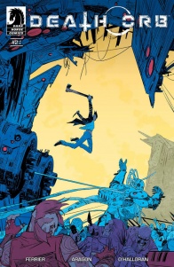
“Death Orb” #2 roars into life with Rider in chains, Father besieged by betrayal and a very large mech intent on beating its way into a desert bunker. Just another day in paradise!
Written by Ryan Ferrier
Illustrated by Alejandro Aragon
Colored by Chris O’Halloran
Lettered by Ryan FerrierIn a post-apocalyptic American landscape controlled by roving marauders and suspicious death cults, the ax-swinging hero, Rider, risks all in a search for his wife. He joins a rebellious group of wastelanders in a quest to take down the mad scientist Father, who seems set on bringing complete destruction to the world.
Apocalypse is on our collective cultural brain these days, and there’s no shortage of fine comics out there that explore the wreckage of human civilization. “Death Orb” takes a familiar and decidedly gruesome view of what happens to society after the fall.
Despite the gore and drama, Ferrier’s not afraid to have a little fun in this book. Whether it’s a wordless panel of Rider’s smirking face right before he throws himself into the fray or a string of graphic threats from Aleeya, these little moments help contrast Father’s lofty monologues and the urgency of Rider’s quest. Rider’s grim sense of humor continues to come out in issue #2, and adding a little personality to the team’s lanky, head-choppin’ hero is a good choice. Overall, “Death Orb” reads like a nifty love letter to a wide array of comics, movies, and other media Gen-Xers grew up with, from Conan and The Road Warrior to 2000 AD and Grendel. What sets it apart from its current peers is its solid craft.
“Death Orb” tells its story with structural style as well as narrative flair, and Ferrier & Aragon’s extra effort to set up their action sequences in issue #2 pays off. Angular panels with small square insets help guide your eye through the high spots, and there’s one page in particular that begins with standard rectangular panels that transition to these irregular shapes, almost as if the action causes the story to “drop” its panels down the page. This can be done badly, but Ferrier & Aragon add just a few to highlight the story’s quick assassination attempt, and the detailed background helps ground the moment of chaos. These pages are a great example of how panel structure & page layout can elevate a comic.
Speaking of structure, the choice to maintain white gutters is interesting and helps carry off the disjointed, post-apocalyptic effect showcased by Aragon’s excellent art. If the gutters were any wider they’d be disruptive, but they help contain Ferrier’s “shot” choices and let O’Halloran play with a gorgeous, broad palette that otherwise wouldn’t blend well. The gutters also give Aragon some freedom to layer inset panels almost like photographs, and the collage-style pages enhance the chaos. These choices make the book’s locale feel like it’s incomprehensible and hard to digest except in small snapshots or chunks, but there’s continuity on the page to help us through.
O’Halloran’s colors are top-notch and chosen with care to elevate Aragon’s sketchy style. Even the smallest panel pops with gradients and textures, and I’m impressed by the cohesion between interior and exterior pages. Inset panels often utilize reds and oranges that contrast the deep purples and blues O’Halloran chooses for interior backgrounds. Similarly, these single-color panels enhance daylight scenes and blend very nicely. No panel feels buried in a dark background or blown out by daytime action. O’Halloran also plays with a few shafts of light in the scenes where Rider’s chained in the survivors’ hideout, and the effect is really beautiful.
If I had to pick one thing about Aragon’s art to showcase here, it’d be Rider. Physically, he’s a great foil to Father’s more substantial bulk, and that plays into both the realism of the landscape (I doubt there’s much to eat in the wasteland) and his character. He’s tall, slender and almost spectral when Aragon pulls out to show him obliterating his foes in action scenes, yet weirdly joyous in all of his splayed-limbed glory. His goggles obscure his eyes but draw attention to the rest of his face, so his expressions carry more meaning while maintaining hostile distance from everyone around him. And, frankly, he’s just cool to look at. Cool hair, cool jacket, cool bike, cool style. Character design isn’t the only thing Aragon lends to this book by far, but it’s certainly one of the most engaging.
The team’s craft chops help elevate a pretty simple story. However, simple doesn’t translate to inferior. Put another way, “Death Orb” explores some common post-apocalyptic tropes to good effect: the lone rider with a single purpose, roving punk gangs, esoteric spiritual cults, charismatic hooded baddies, etc. In issue #2, Ferrier digs a little deeper into Father and expands his desert landscape as Rider encounters a small band of survivors. For me, the tension-breaking moment between them lands flat because the creative team did a lot of work in the first issue to show that trust is a luxury in this world, and words don’t mean much. However, it functions as a plot lever to get them onto the next action set piece, and in a single issue, a choice like that doesn’t always throw us out of the story. Consider it a little hitch in an otherwise well-formed comic.
Final Verdict: 8.5 – “Death Orb” #2 dresses up the familiar wasteland concept with fine art and cohesive styling. A visual feast for almost any comic lover to enjoy.


