
Ales Kot has penned some seriously thought provoking indie comics as of late, but none felt as profound or well-executed as the first issue of “Generation Gone”. The idea of hacker-spawned superbeings is such a compelling one, and with André Lima Araújo on artwork, the idea becomes fully realised in beautifully pencilled art. Let’s see how the teams continues to unravel this conspiracy.
Written by Ales Kot
Illustrated by André Lima Araújo
Colored by Chris O’Halloran
Lettered by Clayton CowlesPower up.
I’m enjoying what Kot is giving us here in terms of neutrality. There’s a sense that every character has an agenda and no one is strictly right and wrong, and that makes me pay extra attention. This is evident in the character Nick, who seems the most complicated of them all from his interactions with everyone. In a way, he’s a token white guy – he feels like he’s the victim of society and can be a little judgemental and snappy. He’s headstrong and arrogant, but part of me can’t help but feel there’s more to him because of the smaller moments of good he takes part in. When Nick and Baldwin figure out what the former’s superpower is, there’s a moment of innocence and camaraderie that they share that makes me feel like maybe Nick’s just a little childish. Similarly, although he seems to give Elena a hard time on the surface, he seems to always stick by her and support her claims – saying he’ll stay with Elena instead of running. It’s impressive when a writer can have me so invested in a character within two issues, and Kot does just that.
I also find the pacing exceptionally handled. Kot doesn’t waste time in dealing with the aftermath of the children’s metamorphosis – instead he chooses to skip ahead right to them testing their abilities. It’s a great technique that drives the plot along smoothly, when a more inept writer could’ve spent countless issues trying to carefully depict their transformation scene. Kot still does refer to the scene, mind you, but in tactfully handled flashbacks later in the book. The flashbacks are shot like trauma experiences, but not fleshed out enough to bog down the main plotline or be depicted inoffensively. I only hope that Kot doesn’t choose to dwell on flashing back to this point in future issues, as it could become repetitive and droll, but at this stage it feels intriguing and mysterious in the best ways.
My major gripe here is that there’s not enough put into the context of the conflicts that occur. On the surface, the position of the ‘General’ is a little vague. We get through setup and illustration that he’s got significant influence in the US government, but it’s never shown to what extent or what specifically. I get why Kot is going for this option, choosing to show the character rather than bog us down in backstory, but the clues are a little too vague in this instance, and leads more to confusion than intrigue. The second example of this is the riot that occurs towards the end of the book. I feel like the scene would have more impact if we understood why the children are there, but the only reason given is that it’s in opposition to a ‘peaceful demonstration’. It doesn’t have to reflect modern times and concerns, but I feel like it needs a little more substance than that feel meaningful.
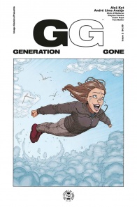
Just like on the first issue, Araújo knocks it out of the park, with beautifully detailed artwork that bears a razor-sharp edge to it. As some of you may notice from the cover of this book, Araújo excels in drawing human emotion at its logical extremes. The character in point, Elena, is making the only appropriate response I feel for someone who has just found out they can fly. She’s tearing up, which I feel is not only an emotional response but probably a natural reaction to having wind whip past your face at high speeds, making this comic more realistic and immersive on a deeper level. There’s several more moments that show Araújo’s deft hand at crafting emotion: when Elena flies towards the sun with a determined look, when Akio expresses great fear at losing his family, and when Baldwin angrily reacts to the crowd rioting. All of them are intense, yet feel appropriate for the intricate style of cartooning Araújo brings to the table.
Continued belowWhat I admire is that Ales Kot gives sections that he clearly trusts with Araújo to tell the story visually. Luckily for all of us, Araújo has a great understanding of sequential action. One of the most moving sections is when Elena flies through the atmosphere and towards the sun. There is dialogue over the top, but it’s Akio talking to the general with only small relation to the scene at hand. Araújo takes the subject matter of each discussion and physically portrays it through Elena’s actions, which really drives home the plot with excellent visual storytelling. When Akio refers to the red tape he must go through, Elena is punching through the atmosphere in a way that metaphorically represents Akio’s speech. I’m not sure how intentional it was on the artists part, but it’s a lot of fun to watch unfold.
I could talk for pages about intricate aspects of Araújo’s effort here, but the other thing I find especially impressive is his eye for unique environments. What’s interesting is that in theory these should be mundane settings to depict – a farm, an office, a crowded street, nothing should be particularly eye-grabbing here. And yet Araújo lends a lived-in feel to each one of them. The farm is a beaten down, wreckage of a place that has charm in its tractor skeletons, its misshapen fences and the decaying wooden framework it sports. The office in which Akio and the General talk has an American flag, two ceramic busts (one of which is Julius Caesar) and a table with a whisky bottle and two shot glasses, all of which tell so much about the General without directly saying it. There’s a lot of intricacies to Araújo’s environments which add to the believability and immersion of the overall experience.
Chris O’Halloran brings a cold emotion to the coloring that somehow never feels bleak or dull. Some of the best moments of the issue are accentuated by dynamic palette changes that O’Halloran uses. It happens in the first few pages, changing to an aggressive red-and-blue reminiscent of four colour 80’s comics when Baldwin smashes Nick over the head with a wooden plank. The rest of the opening is mostly realistic coloring, which is still really pretty to take in, but the smaller scenes like this really stand out – the shift occurs again in the flashback to the metamorphosis scene to indicate a shocing moment. Something unexpected that O’Halloran used, however, is in the Akio flashback scene, he uses a muted purple and green palette – which evokes feeling of nostalgia and dread at the same time. It’s a very powerful sequence that uses tone differently to the rest of the book to great success.
Comics can be as thought provoking as they can be fun, and “Generation Gone” #2 exemplifies this. It’s a great continuation of the first issue that escalates the conflict and fleshes out characters with serious nuance. The visual team of Araújo and O’Halloran knock it out of the park together, creating a thoroughly visceral reading experience that evokes many, many feelings in me. I’m excited to see how this mystery will deepen in future issues.
Final Verdict: 8.5 – Kot’s “Generation Gone” feels like conspiracy theories done right – great characters, interesting conflicts and ideas, all with stellar art from the one-two punch of André Lima Araújo and Chris O’Halloran.


