![]()
The further we get into “Hellboy and the B.P.R.D.: 1956,” the more apparent it is how well cast each of the artists are for their segments.
Written by Mike Mignola and Chris RobersonCover by Dave Johnson
Illustrated by Yishan Li, Mike Norton, and Michael Avon Oeming
Colored by Dave Stewart
Lettered by Clem RobinsDr. Trevor Bruttenholm is drawn deeper into his off-the-books investigations, leaving the B.P.R.D. struggling to stay one step ahead of their Soviet counterparts. Meanwhile, conflict within the Soviet occult team flares as the tension between team leader Vavara and her subordinates comes to a head.

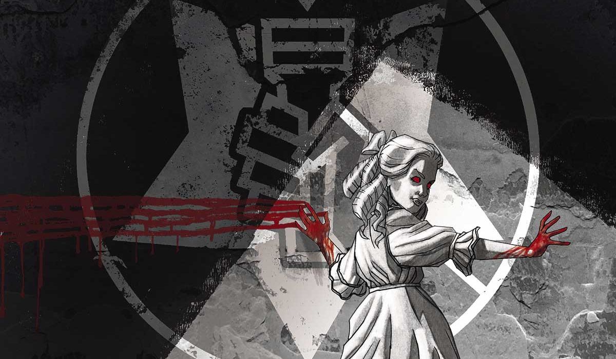
Mark Tweedale: Before we get to the review, I have to mention that Dave Johnson cover. It’s fantastic. I’m really glad he’s back in the Hellboy Universe again. He really knows how to craft covers that don’t simply stand out—they’re iconic. So when he does one that stands out against even his usual impressive work, you know it’s something special. Johnson captures the essence of Varvara’s character beautifully.
Christopher Lewis: Dave Johnson’s art is always a delight, and I am glad to see him being used again for covers.
In the last two reviews we have discussed how “Hellboy and the B.P.R.D.: 1956” is using three different artist to tell various aspects of the larger narrative. This changing of artists has led to some interesting conversations in our reviews, however I have to say this time I barely noticed the shift throughout. I think a lot of it is that I am finally used to the change in artistic styles.
Mark: I still feel the changing of gears, so to speak, but that’s part of the ride with this one, and it’s a ride I’m enjoying.
It’s funny, for a series titled “Hellboy and the B.P.R.D.,” there’s not much Hellboy in this issue—he’s only in a single panel—and yet it works. More than works, I feel like this is something the series needed. We’ve seen so much growth in the other B.P.R.D. agents in ‘1956’ so far, especially Margaret Laine and Jacob Stegner. In fact, there was a nice moment in this one, just a simple line, to show how much Jacob has grown to trust Susan. For a character that struggles with trust and is generally full of doubt, it’s nice to see him have no reservations in putting his faith in her. We’re starting to see the B.P.R.D. become a team.
As for Susan herself, I feel like she’s been put in a time-out box. Her plot is so isolated from the other characters, so it has a completely different feel from the other Bureau scenes. And of course Varvara’s scenes are something else entirely, almost belonging to another world.
My point is that when I feel the shift between scenes drawn by different artists, it’s not just coming from the art. It’s in Roberson’s writing too. The differences are a part of the scene structure and then amplified by the art.
Chris: Interesting. While there were a few good moments here (like the Stegner one you mentioned), I felt like this issue was a lull in the series as compared to the previous two issues, and now I am asking myself if the reason I feel this way is because I didn’t notice the shifts in art.
Mark: Perhaps, though I agree that this issue is quieter than the previous two. Every story has it’s natural lulls, but here we have four major plotlines (Trevor’s, Margaret’s, Susan’s, and Varvara’s) and they’re all lulling at the same time, so there’s a cumulative effect at play here.
Chris: I think it would have been good to keep the momentum up in one of the storylines, that way the cumulative lull could have been lessened.
Mark: One side effect of having multiple artists on the title is that the switch can create expectation. I went into ‘1956’ with the expectation that each artist would have their own story with a beginning, middle, and an end, but at the moment the Susan plotline is still stuck at the beginning. It’s hard to imagine enough happening in the next two issues that it’ll feel complete. If ‘1956’ had been drawn by a single artist though, this would just be a small side story progressing Susan’s overall plotline from where it left off in the ‘1955’ stories. But the switch to Yishan Li’s art made me expect something more from it.
Continued belowOn the plus side, the switch in art reinforces how disconnected Susan’s feeling. Switching to another style for the S.S.S. scenes is one thing, but when literally every B.P.R.D. scene is drawn by the same artist except hers, Susan’s scene feels cut-off and separate. She’s stuck with Myron, who wants to get her out of field work and back behind a desk, something she doesn’t want to do. And worse, it seems Bruttenholm doesn’t seem to trust her, which after Jacob’s discussion about trust makes Bruttenholm seem like even more of a dick. I wish the opening scene and this Susan scene had been back to back though, so that the contrasting points about trust jumped out a little more. It loses its impact when there are two other scenes separating them.
Chris: I do think there is potential for a full arc with Susan. I don’t think it will be anything big, but maybe a personal epiphany about her place in the organization and where she stands with the leadership. We’ll have to wait and see.
On a separate note, the depiction of Woodrow when he was talking to the new recruits and Margaret really bothered me. I felt like his hair, facial bone structure, and nose continued to change from panel to panel. It was so noticeable that it pulled me out of the story. I remember you discussing inconsistencies in Woodrow’s appearance whenever a new artist would draw him in the past, so I wondered if you noticed this as well.

Mark: This continues to be a problem with “Hellboy and the B.P.R.D.,” where the human cast changes appearance dramatically depending on artists. Archie’s the most extreme example of this, to the point that sometimes he’s utterly unrecognizable as the same character, but Woodrow’s a close second. The artists need a consistent point of reference, like character model sheets.
Personally, I’m OK with Mike Norton’s take on the character. This is his first time drawing him, so there’s going to be a little bit of fluctuation, but it didn’t pull me out of the story like it did for you. Still, there was that pause when he first showed up and I was trying to figure out if he was Woodrow or not, and then he dropped a cryptozoological reference and I was fine from there. At this point I think any artist is going to have that problem because of the inconsistent foundation. It’ll take several arcs of consistent Woodrow before there’s solid bedrock there so that Roberson can confidently write a scene without name-dropping or mentioning cryptozoology to let us know that, yes, that guy is Woodrow.
Chris: I hope we can get past the cryptozoology thing soon too. Not because I dislike it, but because it is becoming the centralized thing that defines the character. Back in “Hellboy and the B.P.R.D.:1955—Secret Nature” we learned Woodrow’s backstory, which gave a lot of depth to him, so not seeing much growth in Woodrow thus far has been surprising to me.
Mark: I don’t expect we’ll see him stray far from that until he gets a more central role in a story. For now, he’s basically a cameo, so it makes sense to stick to his specialization.
We haven’t really spoken about Michael Avon Oeming’s segment yet, but it was my favorite part of the issue. We don’t get to see much of his work in the Mignolaverse, but whenever he shows up, it’s always fun. His style lends itself to dramatic, larger-than-life characters, so he’s an excellent fit for the Varvara storyline. And the environment design on his pages was fantastic—lots of lovely opportunities for dramatic lighting. I’m enjoying his pieces more and more with each new issue of ‘1956.’ Honestly, his few pages in this issue have me hoping we’ll see him again on the title sooner rather than later. Perhaps it’s because this is a quieter issue that his pages stood out the most to me.
Chris: Let’s grade this one. Overall this is a book setting the stage for the final two issues of the story, which made for a lull in the series. I am going to give it a 7.
Mark: A 7 feels right. There’s not a lot going on in issue #3 that we didn’t already know or guess from #2. The art continues to impress though, and I’m engaged to the point that I’m already anticipating ‘1957,’ so that’s a good thing.
Final verdict: 7 – A solid comic, if a little subdued.


