Meet the Jetsons . . . for whatever time they have left. Yes friends, we’ve reached the end of yet another Hanna-Barbara comic. So, let’s join Jane, Judy, Elroy, and Astro as they watch the world come to a close in a gut-wrenching finale to this 6-issue tale of family and loss. Or, at least, that’s what I would be saying had this mini focused on the Jetsons as a family unit instead of whatever it is we got these last few issues. Join me after the break for spoilers . . . and an explanation.
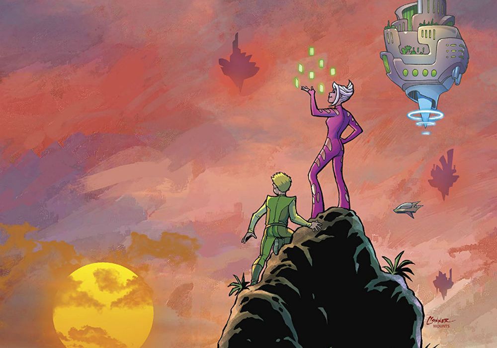
Written by Jimmy PalmiottiCover by Amanda Conner
& Paul Mounts
Illustrated by Pier Brito
Colored by Paul Mounts
Lettered by Dave SharpeIt’s the end of the world! Or is it something more that no one could foresee? George Jetson makes the ultimate sacrifice for his family and for the planet Earth. Jane and the kids see something they never expected to see happening before their eyes!

“The Jetsons,” in the broadest of strokes, did what The Jetsons did: situate us within the model, nuclear sit-com family and place them into a future society modeled on our views of what the abstract “future” of Earth would look like. We retain the flying cars and the floating cities. We have Spacely Sprockets and George Jetson the engineer. Yet, with the comic, we’ve lost much of the aesthetic of the original, much of the optimism. This is the Jetsons as imagined by today.
The world, instead of being a semi-utopia, is ravaged by climate change and natural disasters. There was always this implication in the original that the ground below was uninhabitable but here it is explicit. This isn’t a bad thing. Reinterpretations are important, especially as we demand more from our media. The optimism of the original was born from a sit-com tradition that hid the undersides of a post-war society grappling with complex social issues. One which chose to sweep them under the rug, to pretend they didn’t exist.
I say all this as a preface to my analysis of this particular issue simply because the issues with “The Jetsons” #6 are the problems of “The Jetsons.” That in trying to update the world that the Jetson family inhabits for the modern day the comic lost much of its heart.
Much of the focus of the series, and especially this issue, has been on what happened to Earth and the impending doom that is the strange meteor that Jane discovers. It is supposed to be the catalyst for much of the family drama but instead shifts the focus of the narrative onto each of the Jetsons trying to, individually, find a solution to the problem. They don’t. And thus, we arrive at issue #6, where a good portion of it is spent on an alien spaceship, listening to a giant green alien exposit at us.
I find this choice baffling. Yes, I know that last issue set up the survival of George and Rosie and there was always a nagging suspicion that the meteor was more than it was presented as but did we need to spend 5-7 pages having fairly uninteresting, well-trod sci-fi twists thrown at us. We didn’t need to know that it was this “highly advanced alien race” that caused the meteor crash 104 years before. We didn’t need to know that it wasn’t a meteor but some kind of terraforming device that does…something. Honestly, I’ve read this explanation two or three times and I still don’t know what was going on with these aliens.
None of this is helped by the art. There’s nothing wrong with it, per say, but it’s all very bland. From the environments to the paneling, nothing pops and everything looks and feels flat. Characters are distinct from each other, true, but they always look dirty and aged up. The crosshatching causes this, adding what seems like wrinkles to bodies where there shouldn’t be any. People’s faces are stiff, their posing is stiff and there is no real emotion in any of the panels. For example, there is one page, near the start, where we get a reaction shot of a series of people, some we know, some we don’t, all watching the meteor arrive. All awaiting death.
Continued belowIt’s split across a series of 12 panels and is supposed to evoke sadness but instead caused my eye to skip. People are crying but all in the same way; their mouths limply hanging open or agape in a scream, two trails of tears streaming from their wide-open eyes, a close head shot of them looking up. It feels disingenuous. There is no variety of reactions beyond a couple variations on the above. The panels with Spacely and Jane are especially egregious, with Spacely looking more like he’d just stubbed his toe and Jane with a face like a flipped, carbon copy of one of the women earlier on the page. That being said, there are a couple good panels in this section. An old couple looks up at the sky in silent solemnity and another has a man diving into a pool.
This page was supposed to be gut-wrenching, the tearful moment before the end that, upon turning the page, is reversed. Yet it falls flat due to the art and due to the fact that we don’t really have a reason to care for these people. We’ve spent most of the series watching them interact with each other in the context of them trying to stop the world from ending instead of as a family. What moments we get are undercut by the reams of dialogue we’re subjected to.
The other, other problem with this issue is that it should have been over by page five. As I said earlier, I understand the need for the aliens, as that’s what had been set up earlier in the series, but all that did was take away from pages that could have been spent with the Jetsons living their last days. I also understand that, because this is “The Jetsons,” it had to end on a positive note but nothing in the set-up of this series was positive in the way the original was.
The ending that was set-up, the ending that was proper for the tone set by earlier issues, ends with the destruction of the world or, at least, with the sacrifice of George and Rosie not being in vain. Melancholy and sadness but ultimately hope. This would involve changing the end of #5 but for an ending that fits, that is a small price to pay.
The ending we get, instead, drags on, shambling towards the end like a bloated corpse. The final page, even, leaves a sour taste in my mouth. It is a repetition of the The Jetsons theme that introduced the series…with a twist. One which, much like the first issue, breaks the theme pattern in ways that rubs me the wrong way. This is a personal complaint so take it with a grain of salt. Why insert Lake between Elroy and Jane? What purpose does that serve? It’s not even formatted in a way that keeps with the rhythm set up by the other panels. It’s a small nitpick but one that makes me think that the creative team cared little for the people their story was supposed to be based on.
So, take away the name Jetsons and what do you have left? A bland sci-fi story that’s been done a million times before. Disagree with me as you will but this is one series I’m glad to be done with.
Final Verdict: 2.5 – There is nothing truly horrible about this comic but as the conclusion to the mini, it serves to remind us how little actually happened and how utterly bland and overly-done its premise, and execution, was.


