
Nathan Fairbairn takes the unusual leap from colourist to writer for “Lake Of Fire”, a new series from Image. The book takes us a-Crusading, as 13th Century French Knights take on surprising foes in the shape of extraterrestrial monstrosities. There are a whole ton of stories out there that try, and fail, to blend a heavy sci-fi fantasy element with a dry, historical backdrop. In this review, we take a look how this latest example fairs.
Written by Nathan Fairbairn
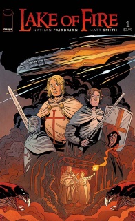
Illustrated by Matt SmithSERIES PREMIERE It is 1220 AD, and the gears of the Albigensian Crusade grind on. When an alien mining-craft infested with a horde of bloodthirsty predators crash-lands in the remote wilderness of the French Pyrenees, a small band of crusaders and a Cathar heretic are all that stand between God’s Kingdom and Hell on Earth.
I’m going to be honest with you, my early French history is not as sharp as it should be, shocking I know. In fact, other than knowing that it was a thing that happened, I’m not too clued up on the whole Crusades thing either. So naturally I wasn’t that compelled to pick up “Lake Of Fire” #1 going off the synopsis alone however there was something about how this book looked in previews, thanks to Matt Smith’s art, that kinda drew me in. Smith’s art is very modern and accessible, primarily in the way he crafts the world on the page, yet never loses his stylishly classic flair. Not only that, but Nathan Fairbairn, who has been working in comics for years (albeit as a colourist), was down as writer. You always get something special when an artist decides to take on writing a book. They bring a sensibility to their scripts that often feels missing from many who just exclusively write, building their narrative in a way that lets the artist expand and flesh out the plot. This type of transition doesn’t always workout for the best, but in this case, I think it has been a huge success.
Fairbairn proves himself to be a very competent and thoughtful writer with his opening issue. The story sees a ragtag band of French knights, nobility and clergy men sent on a fool’s errand to flush out heretics in some small, rural French village; only to discover it is fact besieged by aliens, or, as the villagers believe, demons. There is a whole ton of historical detail built into this issue, Fairbairn has obviously done his homework and then some, there is plenty of evidence to prove a deep and wide knowledge of the time period, with many references to the conflicts, geography and social structures of the era. It is so refreshing to see a historical book like this one that sees its premise supported with strong context, which at no point becomes too dense or obscure. The whole issue, which could have easily crumbled under it’s own weight, is wonderfully immersive, told with gripping pace and thrilling action sequences. It’s true that he may have created a rod for his own back, through his large ensemble cast, but characters never feel wasted or unnecessary, each member is distinct and fleshed out enough that together it creates a dynamic force that allows Fairbairn to explore all aspects of his story. You can see Fairbairn is trying to tell a very specific story and to explore specific themes, but I have to say, it never comes across preachy or ham-fisted. Ultimately, what comes across most in “Lake Of Fire” #1 is a desire to entertain.
Reading through this issue, you can’t help but feel as if the whole this is counter-intuitive. On paper, Knights vs Aliens sounds hackneyed and cheesy. Throw in an exploration into religious extremism and freedom and it doesn’t make for a fun ride. Yet “Lake of Fire” #1 is fun, while still remaining insightful and smart about its themes. It’s almost Tolkinesque, though definitely not as dense, you see it strongest during times when our “fellowship” are interacting. Be it bickering, swapping war stories or fighting together. This is what Fairbairn does so well, he can take recognisable elements from popular genres, like historical, fantasy and sci-fi, and produce his own versions that are just as well written yet always original.
It’s is a good thing then that Fairbairn is joined by artist Matt Smith because Smith’s art matches the playful, high-adventure tone of the script. For all the detail about religious practices in 13th Century France, Smith is here to balance it with swashbuckling and derring-do. The issue is such a delight to look at, yet interestingly, there is an earthiness to it, which fits the setting perfectly. You can see it all in his environments, dirty yet lush backdrops filled to the brim with realistic and subtle details. Smith’s character’s have a real weight to them that doesn’t get lost during times of action. In fact, Smith carries that weight over to provide us with some very dynamic, very palpable action. Though what I love most is how stylish his designs are, Smith to me seems inspired by the same things as Doc Shaner and Chris Samnee. Bold and simple line work with a flair of Golden Age design, all his characters have those wonderfully expressive faces with the good guys having suitably square jaws. It’s unfortunate I haven’t come across Matt Smith’s work before as I have a feeling he’s going to become one of my favourites, take away everything I’ve said and you’d still have a capable storyteller.
Final Verdict: 9.0 – A fantastic start to a new series with a strong new voice and stunning art. It’s educational, it’s entertaining, it’s edutainment!


