
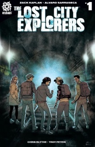
Adventure comics are a genre that feels somewhat underrepresented in comics. With the market dominated by superheroes and sci-fi, there are few comics out there that seek in their main goal to explore a fantastical new environment. In “Lost City Explorers”, creators Zack Kaplan, Alvaro Sarraseca, Chris Blythe and Troy Peteri resurface the age-old myth of Atlantis, positioned as an ancient city once existing on Manhattan. With a young cast of interesting and diverse people, does this comic have the potential to put this genre back on the map?
Written by Zack Kaplan
Illustrated by Alvaro Sarraseca
Colored by Chris Blythe
Lettered by Troy PeteriLost cities aren’t just the stuff of myths. They exist hidden right under our noses. But when a mysterious expedition is disrupted by supernatural activity, and an antiquities professor goes missing, his teenage daughter and her friends must become underground urban explorers, follow his tracks on a coming-of-age journey through subterranean tunnels, and ultimately find the holy grail of lost city: Atlantis buried right under New York City!
Explore science fiction and archeology in this new adventure series by Zack Kaplan (Eclipse, Port of Earth) and Alvaro Sarraseca (Magnus, Turok).
Let’s start by analyzing the characters and their motives. The focalized character that the cast essentially revolves around, the maybe-dead Dan Coates. Kaplan established this character as a good-natured man in the first scene, making him likable compared to his somewhat negative colleagues. It’s great that this is established early on so that when the narrative presents the idea that he may be still alive, we as readers are compelled to want to find him along with the characters. Then, there’s his daughter Hel Coates, the arguable protagonist of the book. She’s a realist, full of angst and annoyance with a world around her that she sees as fake. Her aggression can wear a little thin at times but works well put against characters with opposing ideas. For example, when everyone is gathered at Dan’s funeral, Hel’s brother’s girlfriend tries to take a video for social media about not taking loved ones for granted. She seems well-intentioned, but Hel immediately shoots her down for being inappropriate, and as readers, we’re inclined to agree with her. Kaplan sets up this protagonist, and her father and narrative goal as somewhat different in personality, but both have a good heart under everything, making readers actively root for them.
The actual plotline feels a little predictable and hits a lot of familiar beats, however. Reading this made me think of Jules Verne stories that were adapted into Hollywood movies, like Journey To The Center Of The Earth, especially with the idea of a familial relative landing in supernatural or otherworldly trouble, before the relative’s associate comes to the family for help. Granted, this is really the bookends of the story that follows this convention. I found the content focusing on Hel’s school-life crisis to be as entertaining as the concept of a sub-Manhattan Atlantis, if not more due to how much more substantial it is in this issue. It’s a little typical, sure, with Hel feeling like a lot of other angsty teens with a feud against their overly scientific father. However, through the context of a modern lens, with Hel constantly quipping about how a college degree may or may not even be relevant anymore, it feels somewhat fresh, especially Kaplan including her partner Maddi to bounce these ideas off. It’s a good way to break up the overly familiar story beats on either side of it, highlighting instead the solid character work.
Art is handled by Alvaro Sarasecca, who has a great, clean realistic style to give the story a cinematic feel. I almost feel like the art at times feels like a more realistic version of the TV series Archer, with characters having normal, almost rounded body proportions and soft skin, all highlighted by a bold, inked outline. There’s some great character action because of this, as everyone looks comfortable and always captured in motion. The scene opening onto the gig Hel is attending encapsulates this with many people, having the band look super comfortable and almost photo-realistic on stage, while the next panel has a shot of the crowd where everyone looks individual, whether they be mid-dance or mid-makeout. However, this combination of emotion and bodily action doesn’t always sync up as smoothly as this. This occurs early on when we first see Dan taken by the animated water behind him. His head seems partially severed or misplaced, his expression looks like one of anger, but his body is in a state of panic. It’s not totally immersion breaking, but it doesn’t flow as easily within the solid pacing of the opening sequence.
Continued belowWhat works well across the board is Sarasecca’s excellent designs and environmental setpieces. Something that struck me the most was the water apparition that grabbed Dan Coates before he disappeared. The design is sleek, being just a tall, humanoid body of water with a few bold blue lines appearing over its upper breast. It’s the lines, however, that are super intriguing. As a reader, it makes me ask: is this Atlantic skin/fashion? Or is this a kind of organic machinery? Either way, it’s clever design weaving into the narrative to incite reader speculation. We also get some fantastic cityscapes of Manhattan, with the big double page delivering a poster birds-eye view of the city, with an almost highlighted focus on the water to suggest significance to the readers. Then we get to delve further into it through Hel’s viewpoint. We see grimy subways, dirty sidestreets, all showing the real city beneath the luster of skyscrapers, and it feels lived in and realistic.
Chris Blythe uses a soft, gradient approach to coloring that gives the book an animated realism in tone. I love the palette of the opening scene, and how it uses this soft approach to its benefit. The pages pop, looking truly like a lost subterranean cavern with the mechanical lights reflecting delicately from the small pool of water in a combination of light blues and greys. I also love that we get intensely vivid orange coloring during the concert, but that seems to fade as we get closer to the revelation of Dan’s alleged death. In contrast, the palette almost seems to build back up with specks of vibrancy until we get the great cliffhanger on the last page. It’s great storytelling through coloring work, with vibrancy influencing the tone and how readers might judge a page at first glance.
“Lost City Explorers” can feel a little too familiar and generic at times, with a somewhat predictable plot twist and story beats not uncommon in Hollywood Cinema. However, there is a certain charm to its character cast that will keep you rooting for the good guys. Hel Coates, as a protagonist, may feel too overtly aggressive at times, but she certainly feels timely and relevant. The artwork brings a smooth, almost animated finish to the table, with smooth flowing action, intriguing character designs, and vibrant environments. In the end, this feels like a comic that wants to be ambitious but is still keep the best content to come.
Final Score: 7.0 – While some narrative beats are a little too familiar, “Lost City Explorers” combines great characters and smooth art to convey a solid debut.


